Here's what's new in the Google Pixel 2 launcher
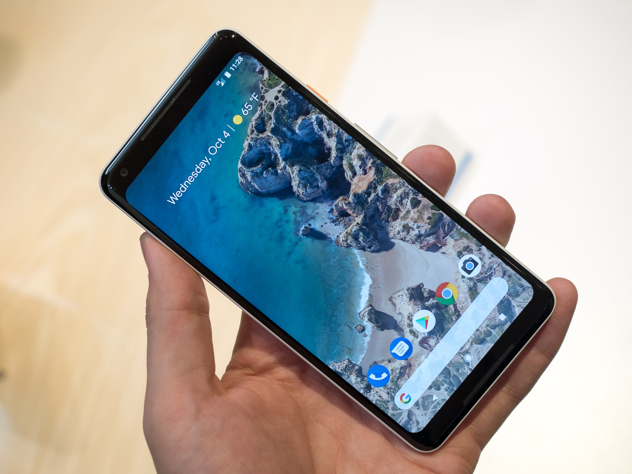
Google's Pixel line, like the Nexus line before it, features Google's vision for Android, and nowhere is this truer than the home screen. The Google Now Launcher (is that ever retiring?) is still one of the most popular launchers on Android, even though it hasn't had an update since 2015.
The Pixel Launcher is Google's current vision for the home screen, and this is what will be coming to it with the Google Pixel 2.
Search moves south
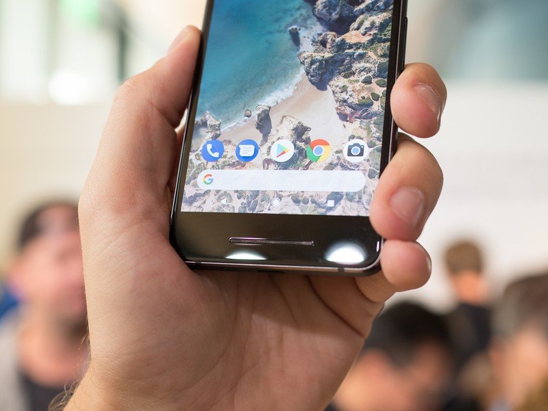
Google has kept the search bar top and center on its home screen for many years now, and it's still a major part of the home screen on the Pixel 2 and Pixel 2 XL. It just moved from the ever-more-distant top of the home screen to the bottom, where it'll be easier for users to tap. I don't quite see the need in having the search bar there when Assistant is a tap away on the home button directly below it, but Google wants users to use Search more, and having it right there, between your dock apps and navigation bar, should raise its visibility and hopefully its use. It also stays present when swiping between home screens
The search bar now has rounded edges to help it fit in with the default circular Adaptive icons on your home screen. It'd be fun to have the search bar adapt along with the other masks available to Adaptive icons, but who knows what the future will bring to the Pixel Launcher.
Get Google's notifications at a glance
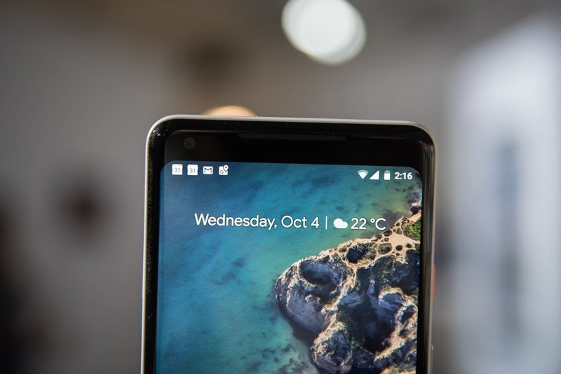
With the Google Search bar at the bottom, the Pixel Launcher's home screen is a little bottom-heavy. To help things even out while still allowing the beauty of your wallpaper to shine through, Google has a new, completely transparent widget up top giving you information from Google Calendar and Google Assistant a glance, like upcoming meetings and, soon, traffic. Google's previous widgets from Google Now were bold, white, and completely clashed with most home screens. This version is much more refined and theme-friendly. Here's hoping it makes its way to more devices.
Living Universe Live Wallpapers
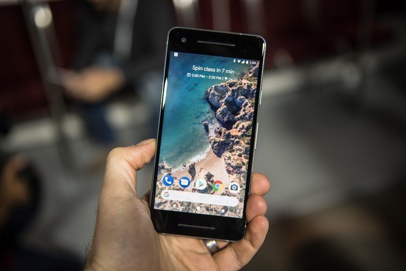
Live wallpapers, which have fallen into relative Android obscurity, are getting some beautiful new life in a series called Living Universe. These wallpapers feature movement, both when you switch between home screens and movement within the scene, like waves on a beach. They're quite beautiful, and we're looking forward to seeing the rest of the series. Last year's Pixel wallpapers came from the Google Wallpapers app, and then to the rest of Android. It's not yet clear if Living Universe will be Pixel-exclusive or eventually come to Google Wallpapers, but we can only hope.
Your turn!
Which home screen element from the Pixel 2 are you most looking forward to? Does moving the search bar throw off your home screen balance? How long do you think it'll take for these new features to come to third-party launchers? Tell us in the comments!
Be an expert in 5 minutes
Get the latest news from Android Central, your trusted companion in the world of Android
Ara Wagoner was a staff writer at Android Central. She themes phones and pokes YouTube Music with a stick. When she's not writing about cases, Chromebooks, or customization, she's wandering around Walt Disney World. If you see her without headphones, RUN. You can follow her on Twitter at @arawagco.
