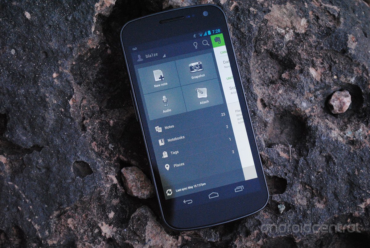
Now that Android 4.0 Ice Cream sandwich is spreading we've seen a lot of apps get UI updates to conform a little better to Google's design philosophy and now, we can add Evernote into that group. The latest update available in the Google Play Store brings a whole new design to Evernote along with plenty of changes for the better:
- A redesigned Home Screen, with improved note and notebook lists across the app
- Responsive Action and Navigation Bars, which relate to the screen you're viewing and disappear for easy reading or note viewing
- Swipe navigation horizontally to scan through Notebooks, Tags and Places easily
- Location tagging for all your notes, if your phone is "Location Services" enabled
Aside from the visual changes, Evernote has worked plenty on the engine below the surface that powers the app. You'll find plenty of bug fixes and improvements overall. If you're looking to see it in action before giving it a go, you'll find a video below along with the download link.
Source: Evernote
Be an expert in 5 minutes
Get the latest news from Android Central, your trusted companion in the world of Android
LATEST ARTICLES

