ESPN ScoreCenter updated with refreshed and improved UI
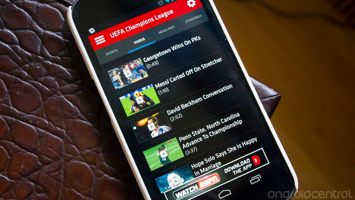
ESPN has just made a pretty substantial update to its ScoreCenter app for Android, bringing in a completely refreshed UI experience. The app now follows most of the general Google design guidelines -- aka "holo" -- throughout the app, from removing the legacy menu button to using sliding panels and tabbed navigation. This is a big step forward in design for the app, and it really makes a difference in terms of usability and overall aesthetics.
When the big companies like ESPN start getting on board with the latest design guidelines, it's a good sign that people are starting to take notice of the large numbers of devices running Android 4.0 and higher. This is what we like to see. YOu can grab a download of the new and improved ScoreCenter app from the Google Play link at the top of this post.
Be an expert in 5 minutes
Get the latest news from Android Central, your trusted companion in the world of Android
Andrew was an Executive Editor, U.S. at Android Central between 2012 and 2020.

