eBay updates item listing UI, home screen layout

Proper scaling to larger tablet screens improves the experience
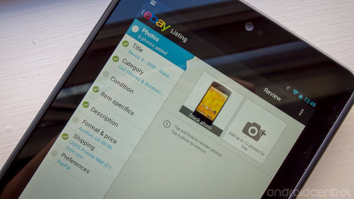
The official eBay app has just been updated in the Play Store with several improvements to both the main home screen and the item listing experience for devices of all sizes. The main view when you open the app has changed to be cleaner and more prominently display your recent searches near the top, with a similar interface for both tablets and phones. The item listing function has received a bit of an overhaul, with the ability to see a full preview of your listing before posting, access to draft listings between devices and a proper tablet UI that takes advantage of large screens.
eBay is also expanding the ability to list items through the app to Ireland, Singapore, Malaysia, and the Philippines. You can grab a download of the newly improved eBay app at the Play Store link above.
Be an expert in 5 minutes
Get the latest news from Android Central, your trusted companion in the world of Android
Andrew was an Executive Editor, U.S. at Android Central between 2012 and 2020.

