Early Tweetdeck build leaks out; we take it for a spin
We're still waiting for the official beta period to begin for the Tweetdeck Twitter client for Android. But in the meantime, a Version 1 build has leaked out. It's an early build, CEO Iain Dodsworth says (update: it's coming Thursday), so we're going to give Tweetdeck the benefit of the doubt and not post the file link. (It's found easily enough.) But we are, however, going to take it for a spin, with the understanding that some features might not be complete. So keep that in mind.
But let's take a look, after the break.
Again, to reiterate, this is an unofficial build. Features and performance may well change (and improve) in future builds.
So Tweetdeck is the popular aggregation app that pulls in social networking sites. In the Android app, we have access to Twitter, Facebook, Google Buzz and Foursquare. It compiles all of the posts and updates into a single stream, which you can then read through in one giant waterfall. And if you're signed in to multiple accounts -- I've got two Twitter accounts, Facebook, Foursquare and Buzz all logged in at the moment -- it's pretty unmanageable. If there's a way to sort by account, I haven't found it yet.

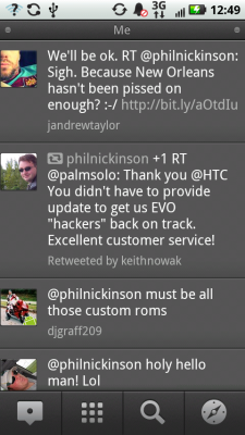
The full stream, left, and replies, right.
Swipe right on the screen and you'll get only your @replies. Swipe one more time for direct messages. You can delete any and all of these columns, but I've yet to find a way to add them back without reinstalling the app. Beta, ya know.
At the bottom are four buttons -- post, profiles (which includes your profiles and any favorite friends you want to add, as well as a Twitter profile search), a Twitter search query, and a "lookup on map" function for items that have location info attached.
Get the latest news from Android Central, your trusted companion in the world of Android
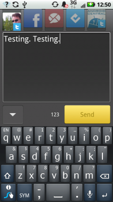

Composing a tweet, left, and the actual tweet, with options, right.
Tap on an individual tweet, and you have the option to reply, retweet, star as a favorite, and what appears to be an inactive "more" button.
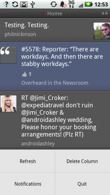
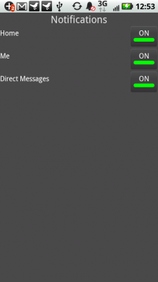
Notifications are on by default, which, again, get's pretty ridiculous if you're signed into several accounts. You can choose to turn them off, however. There's also a manual refresh button, and a quit button, which is a nice touch. Another nice touch: The top bar shows what time the tweets came in as you scroll through them. Tap it to jump to the top.
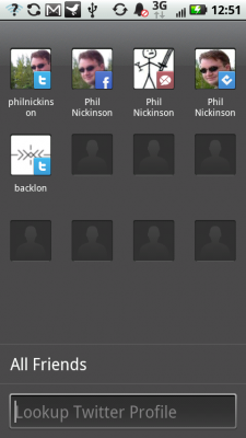
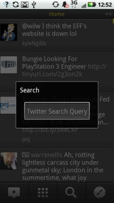
Profiles and the search query.
The user interface is attractive, with rather large text that's easy to read. But you don't get as many items without scrolling as you might in other apps. To each his own. But otherwise, it's pretty intuitive.
It's definitely still in pre-release form, as it can be a tad laggy. That's not a knock, however. And the inability to view items by account rather than one giant waterfall is a deal-breaker for me, and something I hope is added by the beta, or in early release. But it's easily going to become one of the top Twitter and social networking applications, and we expect good things from it in the future.

