Dynamic color won't bring the Pixel look and feel to every phone
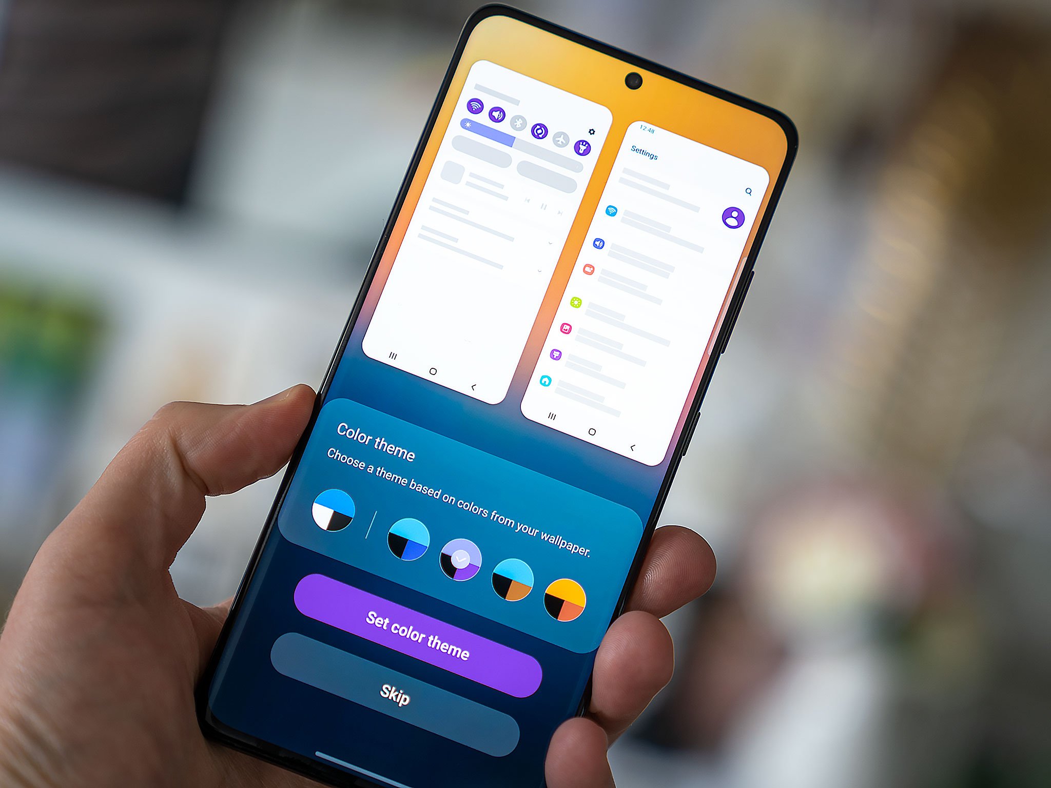
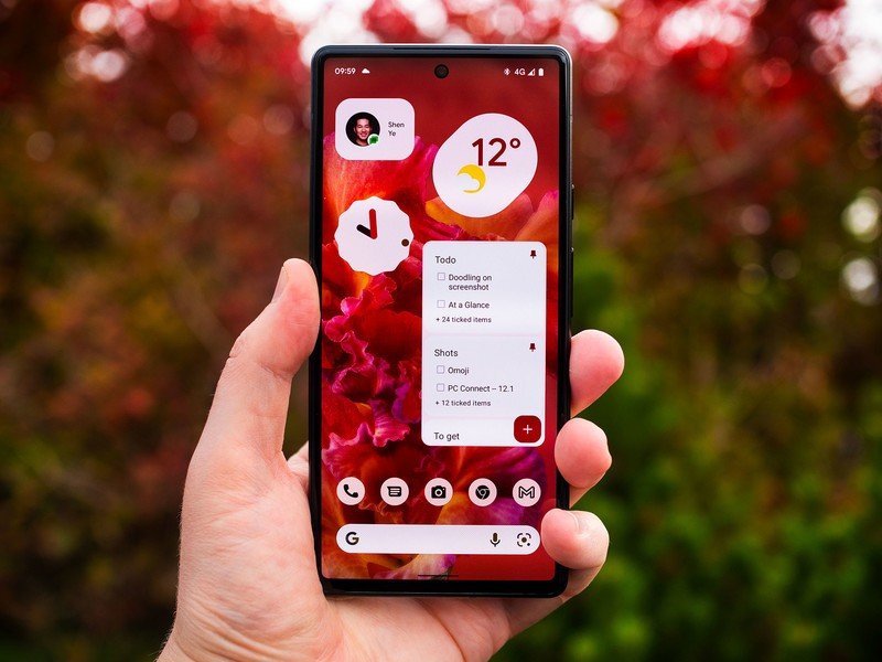
Material You is one of the most prominent new features of Android 12 on Pixel phones, and a major part of that is the dynamic color feature. With dynamic color, the entire system UI — and many of the built-in apps — are decorated with a color scheme from the "Material" color palette based on your choice of wallpaper.
Per recent reports, it also appears other manufacturers will be getting in on dynamic color. Recent code commits confirmed the feature will be heading to phones from major brands like Motorola, OnePlus, and Oppo.
But based on what we've seen from early dynamic color implementations so far, it's likely we'll see plenty of variation in the feature's implementation across the Android ecosystem. What's more, as apps move towards adopting dynamic color, the countless phones running Android 11 and earlier could find updated apps looking less appealing on their phones.
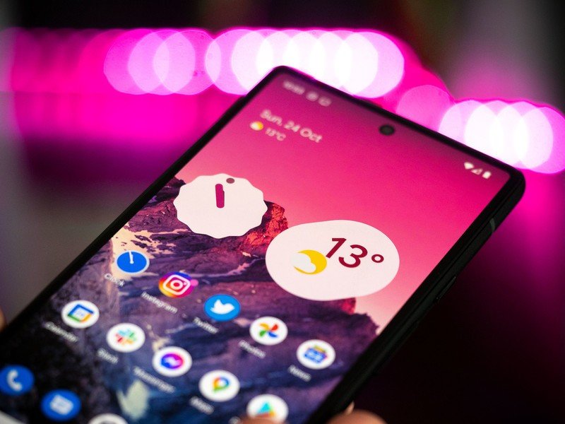
Take Samsung, for instance. The Korean firm's version of dynamic color in its One UI 4 uses a much lighter touch when customizing parts of the system UI. The white background — or black, with dark mode enabled — is emphasized much more than accent colors compared to Google's Pixel UI. Samsung's color palette also diverges from the pastel-heavy hues you'll see on a Pixel.
Oppo's ColorOS takes it a step further and lets users select four color points from the wallpaper as a basis for the UI theme.
Dynamic color is going to look different depending on which phone you're using.
While Google has given the same building blocks to manufacturers in Android 12, the way each company assembles them will vary. Every phone from approved manufacturers will have the same number of background and accent colors to fill, but they'll go about filling them in their own way.
While you wouldn't expect to see a combination of deep blues and browns in Android 12 apps on a Pixel 6, that's definitely a combination Samsung offers up on a Galaxy S21 — One UI often offers up darker hues than the Pixel palette. That's one of the reasons it's worth tempering expectations a little as Android 12 updates start to roll out. Chances are existing phones updated to the new version won't get much of what we understand to be Material You, even if dynamic color is technically included. Expect plenty more growing pains as manufacturers figure out the best way to skin their own apps to fit an ever-changing color scheme.
Be an expert in 5 minutes
Get the latest news from Android Central, your trusted companion in the world of Android
There'll also be challenges for smaller developers when testing these various interpretations of dynamic color across the Android 12 install base.
Then there's the question of phones left behind on Android 11. While many newer flagships will be updated to Android 12 in the months ahead, some of the best Android phones of the past couple of years won't get the update until well into 2022.
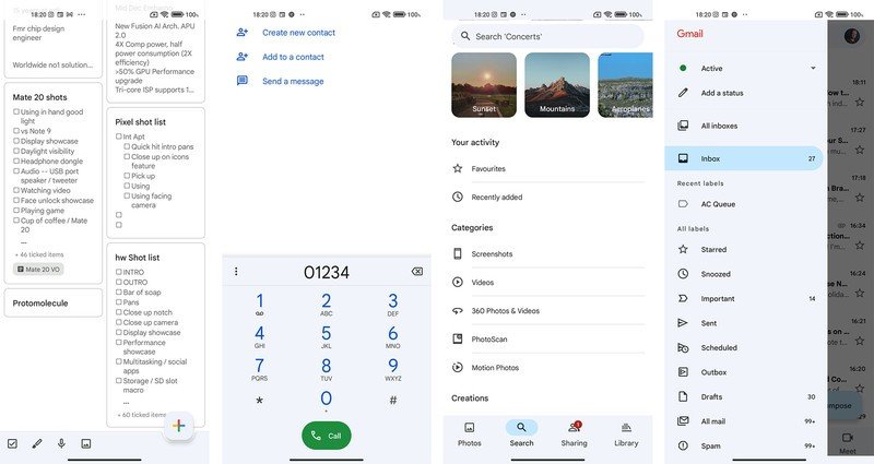
Still running Android 11? Expect to see a whole lot of blue.
Meanwhile, Google continues to update its own Android apps to support dynamic color, often stripping out elements of color that were there before. Google Keep is an excellent example of this: previous versions combined a bright white interface with subtle yellow hues, in line with Keep's branding. The updated version uses dynamic color on Android 12, but on older phones defaults back to "Google blue' — the off-blue color that's now the default in many of the company's own apps.
The same applies to other recently updated Google apps, like Photos and Gmail. Admittedly, it's been a while since these apps had a strong visual identity of their own, but nevertheless, it's a shame to see this relatively bland color scheme applied across Google's entire loadout. Hopefully, Google will eventually find a method to let apps fall back on app-chosen colors when the dynamic colors aren't available.
Android is a big ship to steer, and manufacturers still significantly influence how their software looks and feels. As Android 12 reaches more devices, we'll inevitably see a period of adjustment as everyone figures out how to make apps and color schemes play nicely together. Nevertheless, Material You and dynamic color are essential parts of Android's design language and a great way to make the most personal computer you own more unique to you. Hopefully, any early teething issues won't derail Google's design ambitions in the long run.

Alex was with Android Central for over a decade, producing written and video content for the site, and served as global Executive Editor from 2016 to 2022.
