Dropbox app updated with refreshed UI and photo improvements

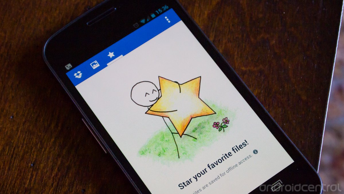
Dropbox is the long standing king of consumer-focused universal cloud storage solutions and it continues to update its Android app with new features and refinements. The latest update -- version 2.2 -- brings a new UI for the entire app and several improvements around managing photos.
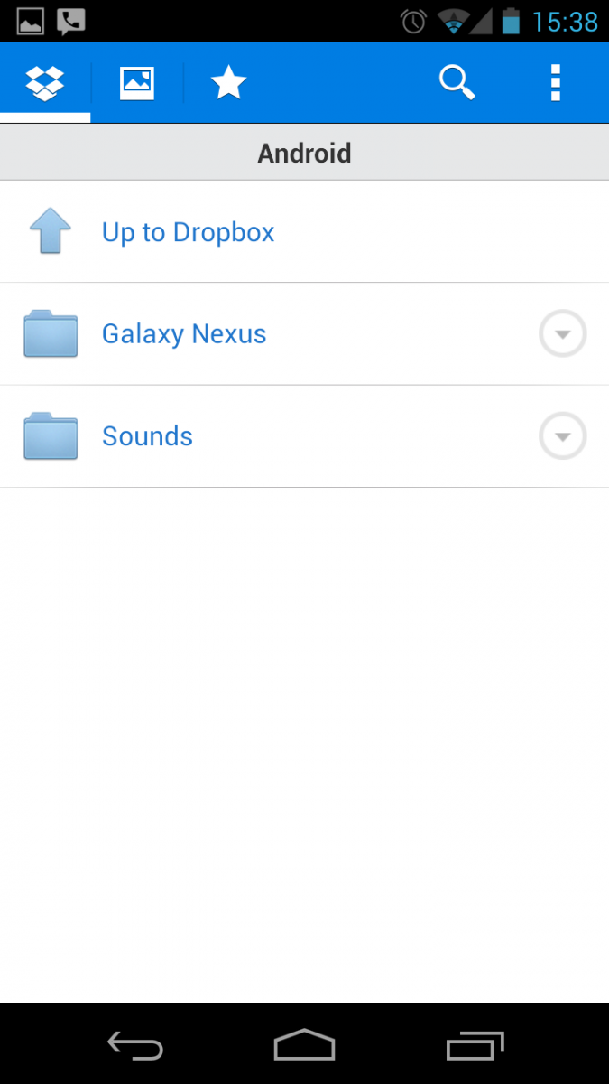
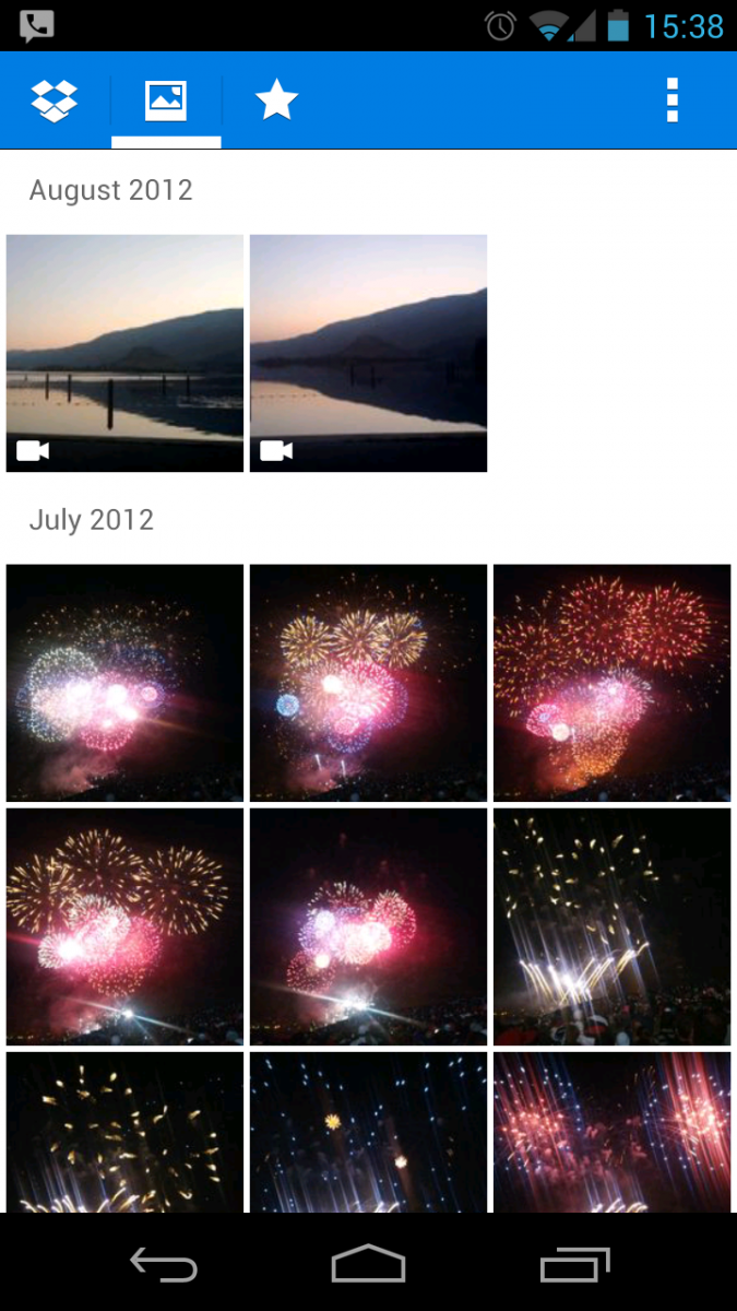
The blue and white contrast UI is still here but with a more intense blue, with small tab buttons on the top and more pronounced contrast with the white icons. Folder views are the same, except now your camera upload list is in its own tab with more of a "gallery" feel. Images are loaded with thumbnails and categorized by date. One tap on an image brings you to a full screen view with the normal favorite, share, export and delete keys. We're happy to see that Dropbox has also integrated the "holo" design standards insofar as the search and overflow settings button are concerned.
You can grab the app or an update from the Google Play Store link above, and stick around after the break for a few screenshots of the UI improvements.


Be an expert in 5 minutes
Get the latest news from Android Central, your trusted companion in the world of Android
Andrew was an Executive Editor, U.S. at Android Central between 2012 and 2020.

