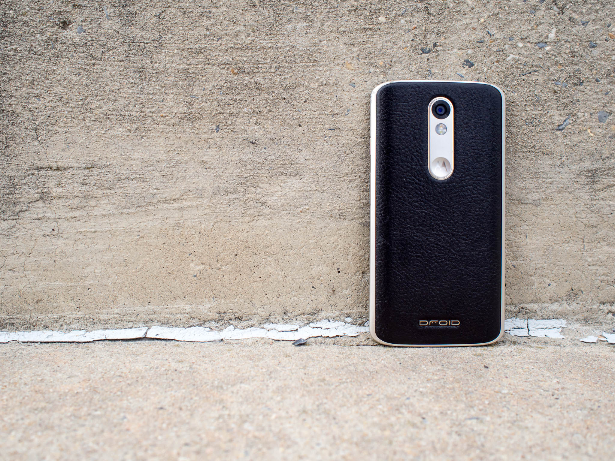
It really doesn't matter who you ask, the two things every smartphone owner wants are to never have to worry about their phone getting through the whole day and to know their phone can survive a drop or two. We've all had that cringe when a phone slips or is bumped and goes crashing to the ground, too often ending with spiderweb of cracks across the front of the phone. And all too frequently we hear those who have shattered a phone mid-contract ask why manufacturers don't consider these features a priority.
Verizon and Motorola can now hold up the Droid Turbo 2 as the answer to those pleas.
Rugged phones and phones with big batteries aren't new concepts though, and usually the trade-off with these features is usability. We know Motorola's software is already a joy to use, so ultimately it comes down to whether this shatterproof phone is designed well enough to be used by everyone.
Here's our review.
The good
- Ridiculous battery life
- Motorola's features are still the best
- Shatterproof screen is shatterproof
The bad
- Little on the thick side
- Camera is inconsistent
- Launching with Android 5.1.1 Lollipop
About this review
I (Russell Holly) am writing this review after 10 days with the Droid Turbo 2, split between New York City and Glen Burnie, Md., both being places with strong Verizon Wireless XLTE networks. This Droid Turbo 2, which was provided by Verizon Wireless, is running Android 5.1.1 build LCK23.130-32.
A Moto 360 2015 was paired with the Droid Turbo 2 for most of the review.
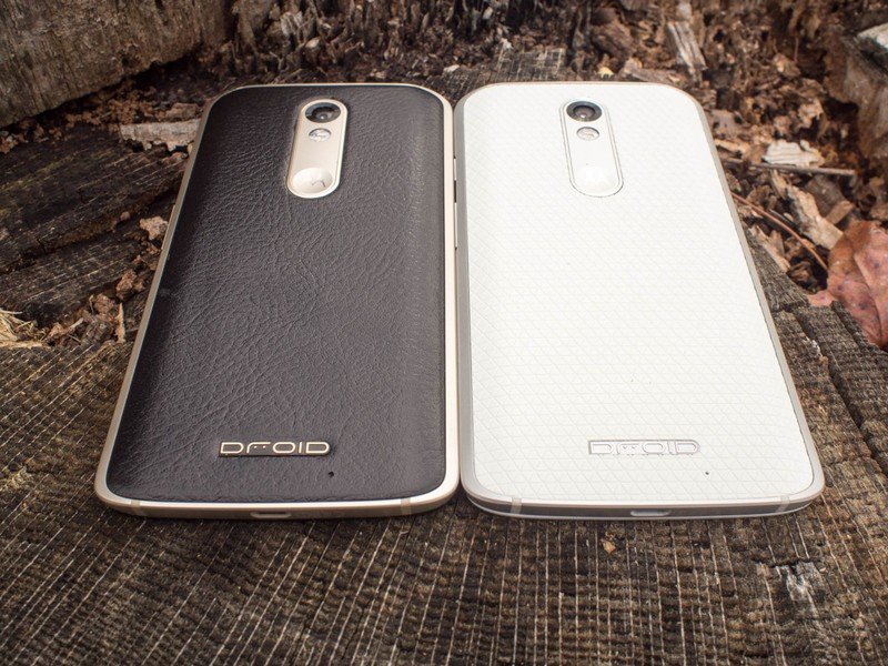
Just shy of indestructible
Droid Turbo 2 Hardware
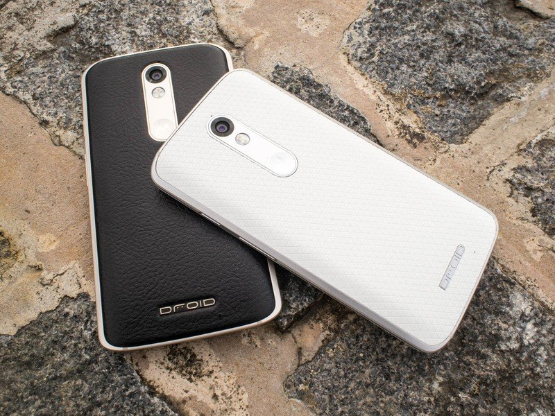
If Motorola can be credited for one thing over the last year, it's picking a hardware form and sticking with it. The Droid Turbo 2 could easily be a Moto X Pure Edition or a Droid Maxx 2 from a distance, because all three of these phones are strikingly similar all the way around. The curved back with a metal frame around the sides, volume rocker just below the power button on the right, headphone jack and SIM slot up top, and microUSB port at the bottom. It looks more like a Motorola staple than any of the previous Droid phones, and as an added benefit this is now the first Droid that can be customized on Moto Maker.
Looking up close, you start to see the differences a lot more clearly. The Droid Turbo 2 doesn't rock a curve all the way around the back of the phone, opting instead to be mostly flat so the included Qi and Powermat receivers can better charge the massive 3760 mAh battery inside. A secondary benefit to this flatter back is the removal of Moto Wobble, an imaginary feature I use to describe what happens when you try to use any other Moto X when it is flat on its back. Like the Galaxy Note 5, the curves are only on the sides to try and be a little more ergonomic. But unlike the Note 5 those curves don't do nearly enough to accomplish this goal.
- 5.4-inch Quad HD main display
- 2560 x 1440 resolution
- P-OLED display
- 21MP rear camera
- ƒ/2.0 lens
- 5MP front-facing camera
- 3760mAh battery
- Turbo Charge ready
- Octo-core Qualcomm Snapdragon 810 processor
- 4x1.96GHz cores + 4x1.56GHz cores
- LTE-A Cat. 6
- 3GB RAM
- 32GB internal storage
- microSD expansion slot
The curve stops at the corner of the aluminum frame, which then takes a sharp slant inward to the screen. This flat area is where the phone sits in between your index finger and thumb as you hold the phone, and it's just thick enough to make using the phone with one hand uncomfortable.
Some of this added girth is to be expected, after all the battery in this phone is a full 760 mAh more than the Galaxy Note 5. But the part of this design where the back is technically wider than the front and tapers in on the sides just doesn't work for large phones.
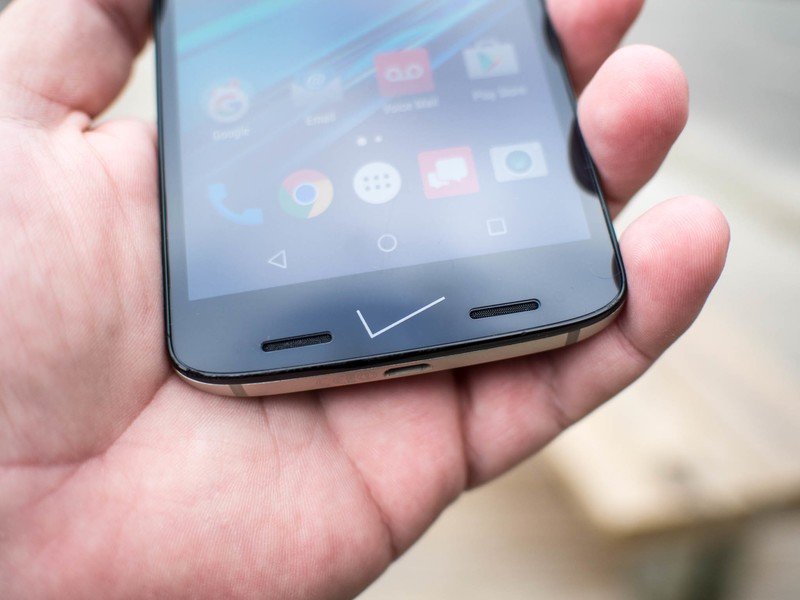
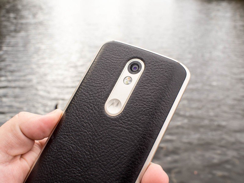
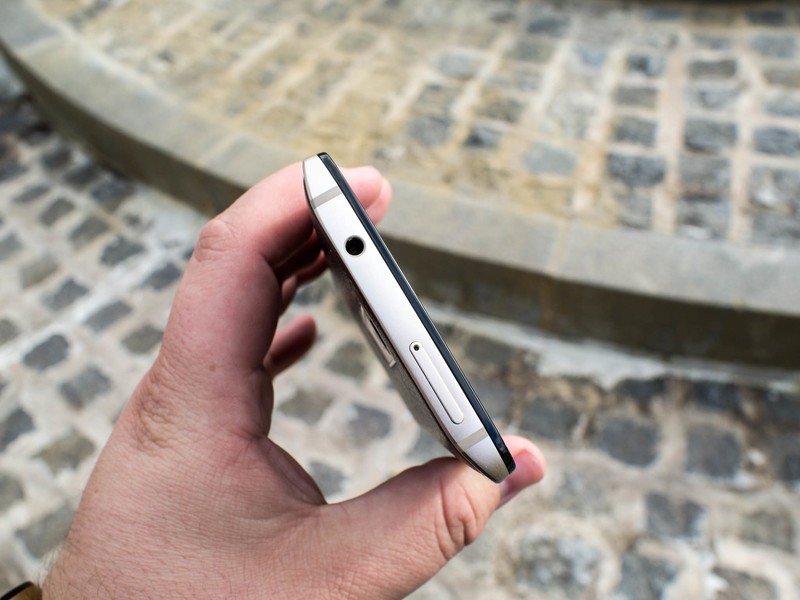
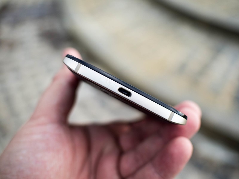
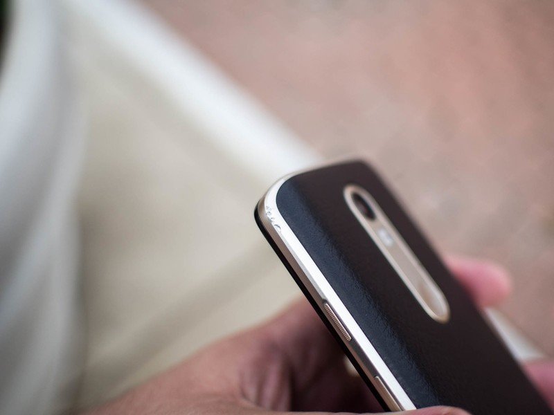
There's also something uncomfortable about the way Motorola chose to recess the power button on the Droid Turbo 2. On the Moto X Pure Edition these buttons stick out and couldn't be easier to use, but on the Droid Turbo 2 there are notches carved into the aluminum to move these buttons almost flush with the casing. Motorola tried to compensate for this by making the power button ridged, but it's not quite enough to avoid occasional frustration when trying to wake the screen. The volume rocker, on the other hand, is plenty easy to reach and use with no problems.
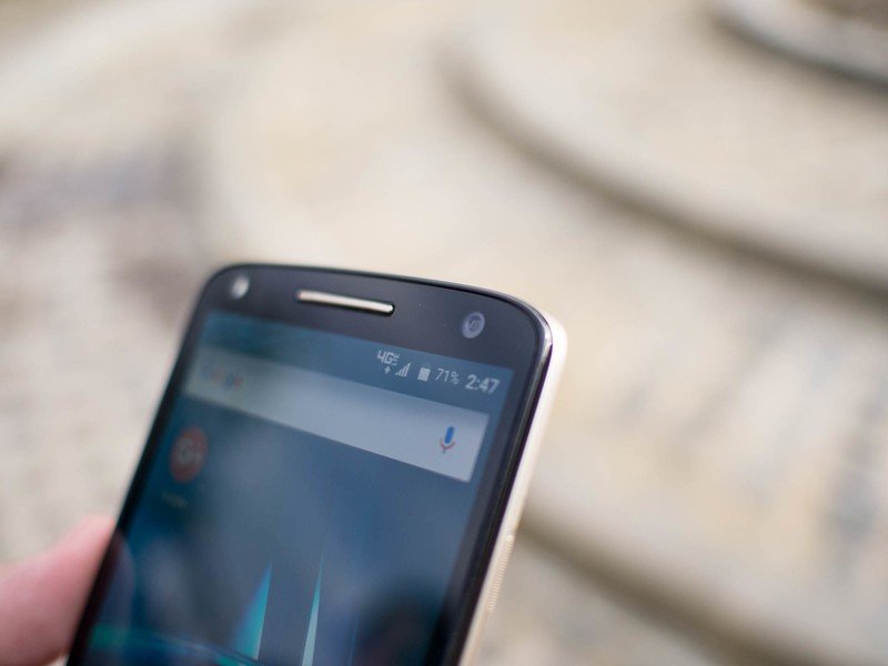
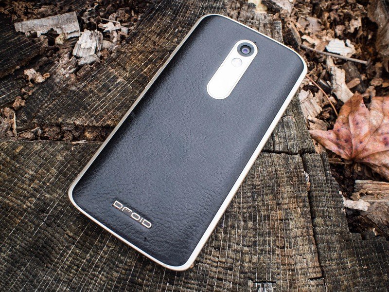
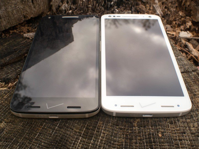
The only place you need to look in order to immediately know this is a Droid-branded phone is the an inch of material toward the bottom of the phone on the front and back. On the back you've got Verizon's Droid logo, stamped into whatever material you choose, and on the front you've got an enormous Verizon check mark. This check mark — which for reasons passing understanding is the old Verizon check and not the new one they've been using on ads and in stores for months — splits the bottom speaker grill into two parts in a clear demonstration that you were wrong when you said Verizon couldn't do anything more obnoxious than that time they put the check on the Samsung home button.
We were encouraged to perform similar tests on our own review units, and we did.
The other noteworthy thing about the front of this phone is that it's all but indestructible, or at least that's what we were told. Motorola has been working for the last three years on ShatterShield, a layered process that leads to better impact absorption when your phone is dropped. (Or, more precisely, when it lands.) Instead of the glass shattering, or the display being destroyed, you can just keep on going. ShatterShield on the Droid Turbo 2 includes a 5.4-inch 2560x1440 P-OLED display, which is flexible to help absorb impact and avoid damage. This sounds incredible, and seemed true when Rick Osterloh and several other Motorola employees dropped their Droid Turbo 2 units at the launch event, revealing no damage as they picked the phone back up. We were encouraged to perform similar tests on our own review units, and we did.
But our Droid Turbo 2 broke on the first drop, and it became clear that "shatterproof" has its limitations.
The first drop of our Droid Turbo 2 happened in a regular paved driveway, but instead of hitting flat on the concrete like we intended the Droid Turbo 2 landed on a small pebble. That pebble dug a notch in the outer plastic layer of the display, and the damage from the impact had made its way straight through to the P-OLED display underneath, ruining a small cluster of pixels in the process. To Motorola's credit the screen didn't shatter, and in fact remained perfectly usable as long as you could tolerate the bright pixels serving as a constant reminder of your mistake.
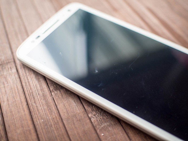
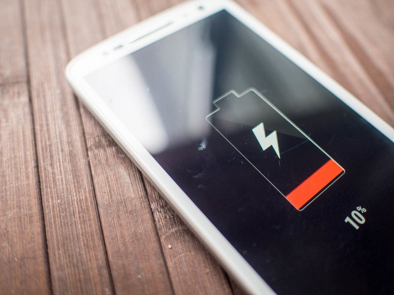

A quick email to Motorola about the damage resulted in a replacement Droid Turbo 2 and some clarification in the warranty of this phone. The kind of damage sustained in the drop is covered by Motorola, which means even though the phone was damaged by a drop Motorola's ShatterShield guarantee would replace the phone if this happened to a customer. Motorola also claimed this drop was an anomaly, and was unlikely to happen again. Our second phone has been dropped 24 times on everything we could find and so far the display has yet to actually take damage. The plastic over the display is a little scuffed, and the bezel around the outside has some clear signs of battle damage, but no other phone available today would stand up to this kind of torture and be even remotely usable, which is amazing.

While the damage resistance of the Droid Turbo 2's screen is impressive, it's also very plastic. It's clear Motorola worked hard to make this plastic feel better than the ruggedized phones we've used in the past, but it's still not quite as nice as glass when running your finger across it. You should also never ever use a white version of this phone if you care what the front of your phone looks like. Not only does the white front look like an incomplete science project due to the five sensors, three speaker grills, a camera hole and a front-facing flash, you can see where the three layers that make up the front part of this five layer setup stack on top of one another. The black version of this phone is significantly nicer to look at, but still not quite as nice to touch as the Moto X Pure Edition. Then again, you can basically hurl the Droid Turbo 2 through a Moto X Pure Edition and record yourself laughing at the broken husk on the ground with your nearly armor-plated Droid, so there's that.
If you like big, if you like durable, and if you like black, the Droid Turbo 2 is a compelling phone. It probably wouldn't kill Motorola to look at a curved bezel for some ideas, but we've seen many other companies do way, way worse at making a damage resistant phone. This still looks and feels like a phone, which is much better than the faux armor plating with massive screws and horrible plastic bumpers we've seen in the past. It may not be the most stylish thing out there, but it's a huge step forward in durable smartphones.
Everything we already knew about
Droid Turbo 2 Software
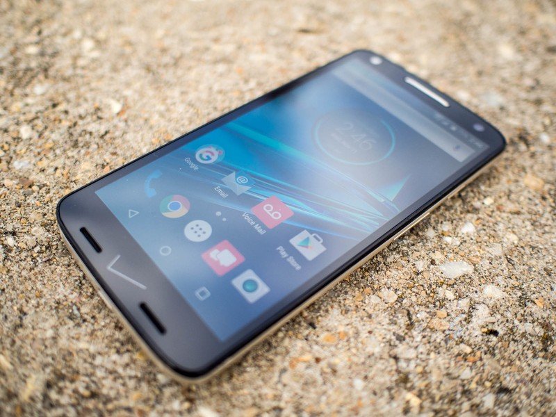
This is usually the part of the review where you read about all of the clever new software things happening on this new phone. Only, this is a Motorola phone, which means you get Android 5.1.1 and very nearly the same experience you get on every other Motorola phone, going back to the Moto X 2014. This happens because Motorola pushes almost all of its special software to the Google Play Store and continuously updates it throughout the year instead of releasing a bunch of new features with a hardware release. It's a unique level of software stability, and something we've come to really appreciate from Motorola.
This being a Verizon phone, one with the Droid branding no less, you know there's a lot more than just Motorola software onboard. The launcher has a dark background instead of the white we see with the Google Now Launcher typically used on Motorola phones, but the UI is mostly the same. Verizon's bloatware is also mostly unremakable, but there's more than enough of it to go around. Amazon's app suite, four games, the nine red Verizon customer apps, and of course NFL Mobile and Slacker Radio are scattered among the core Google apps and system apps. The games are full games and not stub apps so they take up a healthy chunk of storage, but they can also all be uninstalled and not just disabled. The same can't be said for almost all of the other Verizon bloat apps, unfortunately for those who will never use them.
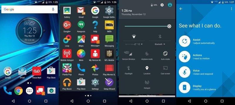
The one unique and noteworthy app in the Droid Turbo 2 is Moto Loop, and app made in partnership with Verizon Wireless to offer family communication, tracking, and smart home control. It's a simple app that can be installed on any other Android phone you want to add to the group, be they Verizon customers or not, but the person to initiate the family group needs to own a Motorola phone. Currently the app uses Verizon's Message+ as the default group communication mechanism, hence the current exclusive. What makes the app useful outside of a quick location tracking service is the ability to share smart home controls without handing off your login, making it so family members can control smart lights or the Nest thermostat if you give them permission to do so. As smart home controllers go it's fairly basic, but overall Moto Loop is a nice first step towards a decent family app.
If you take a Moto X Pure Edition and load it up with Verizon apps and this new Moto Loop app, you've got the Droid Turbo 2 software experience.
The Snapdragon 810 in the Droid Turbo 2 didn't offer any noticeable performance gains over the Snapdragon 808 in the Moto X Pure Edition, with a single exception. The double-twist gesture to launch the camera is noticeably faster on the Droid Turbo 2, which means getting to the camera app is just a hair faster than the already fast experience on this year's Moto X. It's not something most folks will notice, but it's also a demonstration of how little real-world difference there is between these two processors right now.
Outside of the camera launch, if you take a Moto X Pure Edition and load it up with Verizon apps and this new Moto Loop app, you've got the Droid Turbo 2 software experience. Moto Voice is still fantastic if you want to extend Google Now with your own activation command — mine is still "Computer, Respond" because I'm a huge nerd and it works really well — and Moto Display is still miles more useful than Google's Ambient Dsiplay. The rest of the Motorola gestures all work exactly as advertised, and Moto Actions are still super useful once you've gotten everything set up.
Basically it's a Motorola phone, which means the software is great and continues to improve while you use it.
Still mostly awkward, but slightly less so
Droid Turbo 2 Camera
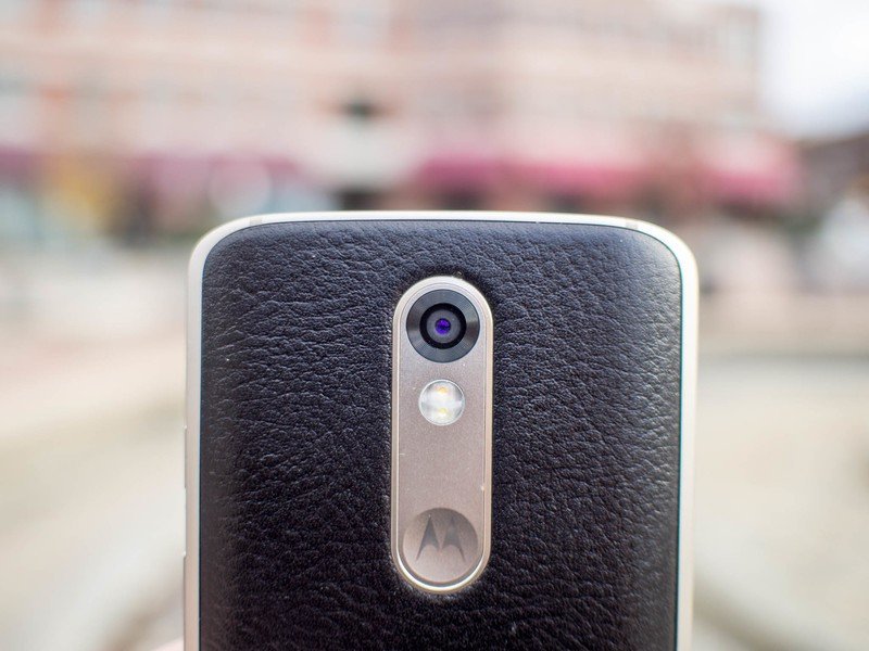
Motorola's camera app has also not changed at all from the last software update that went out to almost all Motorola phones, and the hardware powering this experience isn't really any different from the Moto X Pure Edition. The autofocus is just a hair faster, but not in every situation, and because the Moto Camera app is designed to be a basic camera app that gets out of the way of the user there's not a lot going on when you want to take a photo.
The autofocus on this phone also is slightly more accurate. Situations where previous Motorola phones would be slightly out of focus seem largely resolved without having to use the manual ring for selecting focus. It's much more of a point and shoot experience here, which is what Motorola has been aiming for with this camera for a long time now. As long as you're in great lighting and everything is perfect, you're going to take the shot you want every time.


If you are in a place with imperfect or low lighting, things are still mostly inconsistent. The Moto Camera software still struggles with HDR, often resulting in blown out highlights or a depressingly dark shadowy mess. Exposure controls don't seem to help at all, the software just doesn't handle the exposure stitch well if you're in a shadow with a bright sky or vice versa. Low light shots are also hit-or-miss, resulting in either a grainy mess or a great night shot. There doesn't seem to be a middle ground, and while the second option is a marked improvement over its predecessor it's a little frustrating to keep playing with exposure controls to hope you got the shot you wanted.
Unfortunately we're saying a lot of the same things we've been saying for a while. Motorola has nailed simple, and they swear that's what its customers want, but some consistency would be really great. It doesn't really matter how well your camera performs in laboratory conditions if you struggle to reproduce those results in the real world, and that's the challenge Motorola is facing right now. On paper they have a great camera, one of the best in fact. In practice, not so much.
The shatterproof mic drop
Droid Turbo 2 Experience
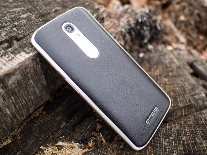
It can't be overstated how nice it is that the Droid Turbo 2 looks and feels like a Motorola phone this generation. While it is even less usable in one hand than the Moto X Pure Edition, the black leather variant used for most of this review period looks and feels great. Even the white plastic version with its textured backplate looks great, and the sheer number of backplate options available to Droid Turbo 2 users who choose to purchase through Moto Maker is incredible. This is by far Motorola's strongest asset right now, and Verizon's support of this customization is fantastic.
The decision to put two smaller speaker grills on either side of Verizon's check mark and have speaker audio only play out of those speaker grills feels like a mistake. The Droid Turbo 2 is still plenty loud, but the audio quality is a little muddy and the overall experience suffers with this design. That sound only comes from the right side certainly contributes to that. Audio from the headset jack is just as strong as it is on the Pure Edition, which is great, but these speakers aren't quite as good as other experiences Motorola has created this year. Also, that check mark is terrible, just in case you missed the last time we said that in this review.
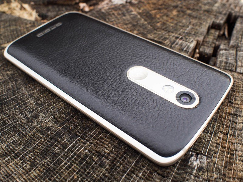
Motorola's been switching back and forth between LCD and OLED displays this year, and the Droid Turbo 2 offers a stern reminder of how great and terrible P-OLED can be right now. The colors pop nicely due to saturation, but the color temperature between the white and black Turbo 2 we have here are wildly different. One is a little on the yellow side, while the other is a little on the blue side. Both work alright in direct sunlight, but there's still nothing out there to compete with the crazy sun mode Samsung has baked into its displays.
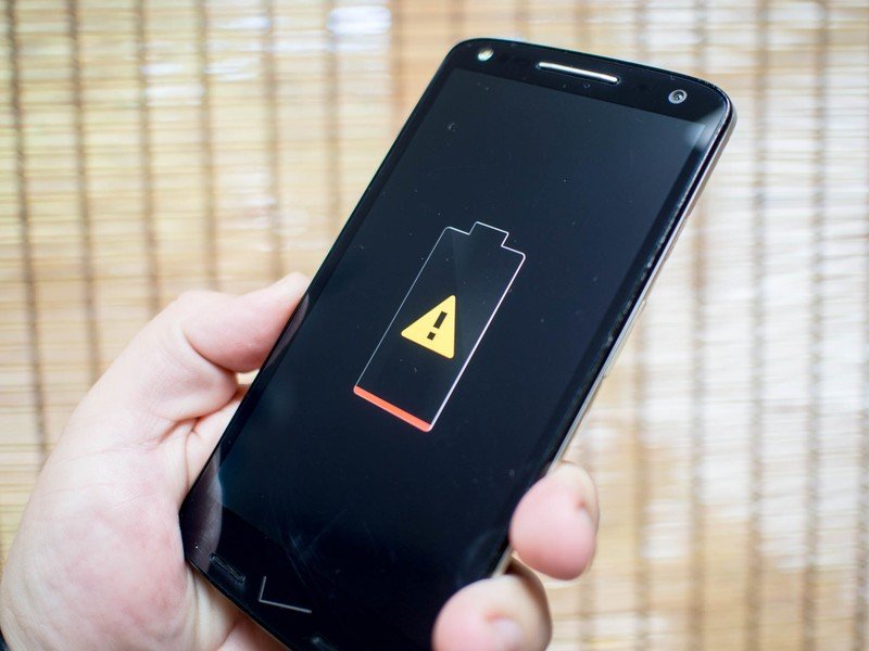
Verizon's big claims with the Droid Turbo 2 are a shatterproof screen and up to 48 hours of "mixed usage" that never really gets defined any further. We've talked about the screen already, but anyone who can do basic math can tell you that adding 760 mAh to the 3,000 mAh battery in the Moto X Pure Edition isn't going to get you a whole extra day. It's just never going to happen, and we've done this dance with Motorola and Verizon before. What you will get is the peace of mind associated with never worrying about your phone lasting 24 hours of regular usage. Unless you sit and play games all day long, you'll get a full day out of this phone every day.

Motorola's software is still some of the best out there when it comes to removing tedious things for you to do on your phone. Starting up music when the phone knows you are in the car, flipping into silent mode when you have a meeting in Google Calendar, and stopping notifications from waking you up while you sleep are all things that don't work quite the same way anywhere else. Combined with Moto Display letting you peek into your notifications and Moto Voice working incredibly well when the display is off, and the Motorola software experience is still unparalleled.
It feels great to have wireless charging on a Motorola phone, even if it isn't the crazy fast wireless charging we saw on the Galaxy Note 5 earlier this year. Wireless charging is one of those things we tell ourselves we don't want or need when it isn't around or we don't want to pay for the platters, but as anyone currently upgrading to an older Nexus to a Nexus 6P will tell you going from having wireless charging to not having wireless charging sucks.
A serious phone for serious people
Droid Turbo 2 Bottom line
While we are usually quick to dismiss a carrier exclusive, the Droid line still exists on Verizon because it works. There's an audience that loves this line of phones because of what they bring to the table. They are serious phones for serious people, and these are people who want killer battery life and a shatterproof screen over just about anything else. In that respect, Motorola and Verizon delivered.
At the same time, Motorola has released a reasonably priced phone that radically changes our expectations for how a durable phone should look and feel. This doesn't have the weird armor plating of the "rugged" phones we see trying to reach this audience, it's a phone that looks and feels like a normal phone while offering a lot of those same features. As a phone designed for this audience, Motorola has delivered in a big way.
Is this a phone for everyone else, by which I mean the folks currently eyeing competitors like the Galaxy Note 5 or Nexus 6P? No, because people buying those phones are looking at the best possible display and camera or the latest from Google. The Droid Turbo 2 is never going to compete in those places, but it's going to give Verizon users a solid if slightly awkward answer to wondering why no one seems to care about durability and battery life anymore. This phone exists specifically to offer those features, and there aren't many people who wouldn't choose this over the awkward rugged phones out there today.
Should you buy it? That depends
This is one of those situations where you have to really know what you want to appreciate the Droid Turbo 2. It's a chunky phone that isn't quite a comfortable to hold with one hand as a lot of the other offerings out there today, and the camera has some usability issues, but it's going to survive things no other high-end phone will survive and the battery will just about always get you through an entire day with plenty of battery to spare.
Software is also a concern given Motorola's recent behavior with the Moto X 2014 on Verizon Wireless, and the extended history of delays with updates on Droid-branded phones. Motorola's insistence that the company is committed to deliver regular updates is unproven at this point, and that's an important caveat to any purchase.
For $650 off contract, that's a lot of caveats to swallow when the user experience with the $500 Nexus 6P is way better and the $400 Moto X Pure Edition is a more fragile version of a slightly better day to day experience. On the other hand, neither of those phones will survive a 20 consecutive 6-foot drops onto concrete and neither come with a display warranty and an offer to completely replace the phone after 2 years if you buy the 64gb version. If those features are worth the cost to you, this is your next phone.
