Droid RAZR M review

It's been just over a year since Motorola took the wraps off of the Droid RAZR, the device the company was counting on to keep it competitive. And with an intense push by Verizon, the RAZR managed to hold its ground in 2012 against blockbuster competitors such as Samsung's Galaxy line and HTC's One series. And with its follow up RAZR Maxx, Motorola managed to finally break away from the pack into a niche that has attracted an almost cult-like following. For those craving as much juice as their battery can produce, there is simply no other alternative.
With its revamped RAZRs, Motorola opted to add a third device into the lineup — the Droid RAZR M. It's an interesting choice, considering that Motorola could have simply dropped the price of the RAZR and turned it into the entry-level device, ala what Apple does with the iPhone. Instead, Motorola took the original RAZR, added next-generation internals, shrunk it down without touching the screen, and slapped on a $99 pricetag. The result is a phone that impresses in both performance and aesthetics, and raises the bar for what entry level smartphones can achieve.
Pros
- The RAZR M's performance is on-par with other flagship Android devices thanks to its top-of-the-line S4 processor. The M's size is compact without sacrificing the integrity or beauty of the healthy-sized 4.3-inch display. Motorola's hardware is unmatched in terms of quality and beauty.
Cons
- The RAZR M's battery life isn't all it's cracked up to be, and its cameras are poor in both performance and quality. The M's display is of mere qHD resolution, a noticeable downgrade from 720p technology.
The Bottom Line
The Droid RAZR M offers stunning performance, a gorgeous (albeit qHD) display, and unmatched design for the ultra-cool price of $99 on contract. It retains a large display despite its compact design, and with its top-of-the-line internals and Jelly Bean just a way's away, the M has earned itself a place among the best (and most unique) Android phones on the market today.
| Hardware reviewSoftware reviewCamera testsWrap-up | Droid RAZR M specsDroid RAZR M forums |
The one-take walkthrough
Motorola Droid RAZR M hardware
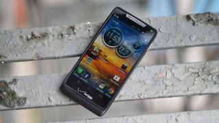
To boil this entire review into one word: Stellar. There is simply no other Android hardware on the market today as solid, tight, and stunning as what Motorola has cooked up with its latest RAZR line. The RAZR M, the runt of the litter, is simply stunning from top to bottom, an engineering marvel that instantly earns itself a place among the best designs of any Android phone. At the unveiling of the new RAZRs, Eric Schmidt said that consumers looking for the best Android hardware will find it in Motorola — I am now a believer.
Be an expert in 5 minutes
Get the latest news from Android Central, your trusted companion in the world of Android
Despite its smaller size, the M is first and foremost a RAZR at heart. The sharp corners, the tapered bottom, and the Kevlar coating add up to a phone that is both instantly recognizable and perfectly unique. The M feels solid without feeling heavy, and study without feeling dense. It's unlike anything Motorola has ever done before, while retaining that signature Motorola style akin to every phone before it.
Unlike the first Droid RAZR, there is not one square inch of this device lost to wasted space. Everything looks like it's in place here — where the Droid RAZR couldn't shake the hump introduced by the Droid X, the M has slimmed down into a perfectly level device. Despite slight tapering on the bottom, the M's design is nearly as uniform and compact as the iPhone 4S.
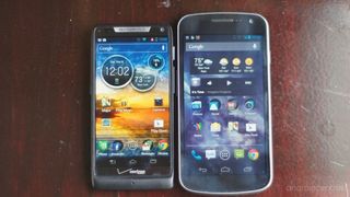
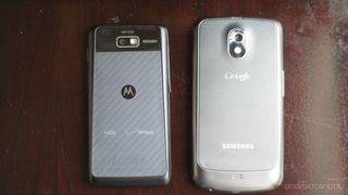
What's most exciting about the M is the 4.3-inch display, an achievement that boggles the mind despite its humble qHD resolution. The rumors were right—Motorola managed to shrink the bezel into oblivion, squeezing a healthy sized screen into a pocketable, one-handed phone. Think 4.3 inches stuffed into a 3.5-inch device. It's simply stunning, and an exciting sign of things to come in terms of large screens in small packages. The only small snaggle I have is that since the M doesn't have any hardware keys, the on-screen real estate is decreased a bit by the softkeys. Other than that, I'm smitten, even with that 960 x 540 resolution: it's sufficient, and I'm having a hard time finding much fault in it. You'll notice degraded quality if you're coming from one of the upper echelon devices, perhaps, but it's a small sacrifice for such an amazing overall package.
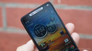
The RAZR M's 2,000 mAh battery is non-removable, which means that the M's SIM and microSD cards are behind a rather a swiveling door on the left side of the device. And despite Motorola's claims of 20 hours of talktime on a single charge, the M doesn't have the best (or even close to best) battery life in the world. It's actually pretty average-- I got through nearly 3/4 of my workday with heavy usage before having to find an outlet. Acting conservatively, I was still out of juice by 6 p.m. This is probably the biggest disappointment for me about the RAZR M, especially considering the promises Motorola has made. To put it in a proper perspective, the similarly-rated 2,100 mAh battery in Samsung's GS3 lasts nearly five hours longer while pushing the same processor, double the RAM, and a 720p display. The M's battery is simply a step in the wrong direction.
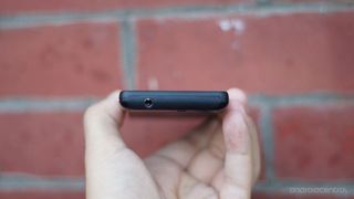
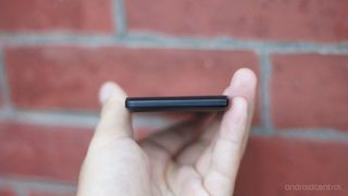
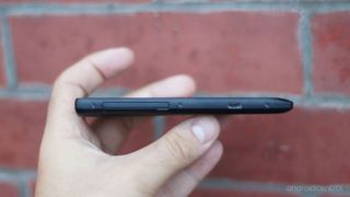
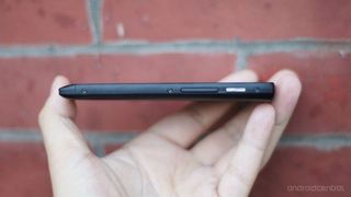
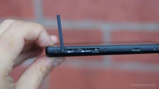
To be fair, though, this battery is supporting some of the most powerful internals on the market today. The M packs a 1.5 GGz dual-core Snapdragon S4 processor, identical to the brain behind stunners like the GS3 and the HTC One X. Coupled with a gig of RAM and nearly stock ICS (more on that in a minute), the heart of the M is just as brave as its top-tier competitors. This thing flies, and defies everything you've ever assumed about budget-friendly devices. I've yet to stump the M, and it hasn't hesitated once, whether it be in gameplay, opening apps, watching HD video, or performing severe multitasking. I'm on pins and needles waiting for Jelly Bean, and I think It may be just the push the M needs to considered one of the best phones on the market today.
Software
At the time of publication, the RAZR M is running Ice Cream Sandwich 4.0.4, with an ever-so-subtle Moto skin painted on top. This UI has undergone a long and at times painful (think Blur during the Bionic ages) evolution and has become perhaps the best spin on Android from just about any manufacturer. It's lean and fast, and won't let you forget for even one second that you're using an Android device. Whereas Samsung has turned TouchWiz into a bloated and brand-centric experience, Motorola has taken Blur in the other direction, stripping it down to its most powerful and useful parts and scrapping the excess. What we're left with it some really handy tools from Motorola in an experience that still looks, feels, and acts like stock Android.
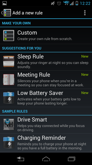
Among those handy tools is Smart Actions, Motorola's signature automation app that we first met on last year's RAZR. For those unfamiliar, Smart Actions is designed to assign different behaviors to your RAZR based on location, time, and other customizable "triggers." Think Samsung's TecTiles, without the TecTiles. It's a truly useful piece of software and with enough TLC, you can harness its potential to squeeze a surprising amount of both battery life and power out of your RAZR M.
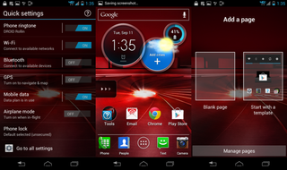
Moto has added another cool feature with this round of RAZRs called "Quick Settings": from your homescreen, simply swipe to the left and you'll have access to your most common settings, including toggles for ringtone, Wifi, Bluetooth, GPS, Data, and Airplane Mode. One thing to keep in mind about Quick Settings—it completely changes what you've come to know about Android home screens. Before, your home screen was always centered in the middle, whether you had one, three, five, or seven screens. Now, your homescreen will always been the furthest to the left, enabling a quick slide to Quick Settings. You can still add as many homescreens as you'd like, but they'll all arrange themselves to the right of your homescreen.
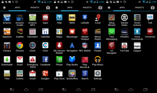
While Motorola's tweaks are few and far between, we unfortunately can't say the same for Verizon's. The M is loaded to the gill with Big Red's bloatware, which includes some interesting choices including Audible, IMDb, Viewdini, Slacker Radio, and Zappos (yes, the shoe store). The usual suspects are also present, including Color, NFL Mobile, QuickOffice, and Verizon's own suite of apps. New to the lineup, though, is a whole host of Amazon-branded apps, including Amazon's shopping app, Amazon MP3, and the Amazon App Store. Yes, you read that right—Verizon has included a competitor to the Google Play Store on one of its new flagship devices. We don't know if this is a sign of things to come, and you won't find us complaining (we love those Free Apps of the Day), but it's an interesting choice nonetheless, especially considering how buddy-buddy Motorola, Google and Verizon have been.
The Motorola Droid RAZR M cameras

For a few days I dreaded opening the M's camera, fearing that it would be the first thing to disappoint me. Sadly, I was correct. The M's 8 MP camera lacks the sophistication of its competitors' technology in terms of both quality and functionality. Motorola's camera features are anemic, and its UI isn't exactly robust. This would all be fine if the M were able to produce stellar photos; alas, the results are spotty. Autofocus takes an unusually long time, and there is a noticeable shutter lag that will catch you off guard if you're used to shooting with speedy optics. On more than one occasion I was left with a blurry mess thinking it was safe to move after the photo was taken. And while the RAZR M's camcorder can shoot in 720p, you won't be able to trust it for your kid's first birthday party.




The M doesn't perform all that well in low-light, though in ideal situations the image quality isn't all that terrible. The front-facing camera cannot be counted on for much more than video chatting and the occasional check-your-hair shot. All in all, the M's cameras are by no means a deal-breaker, though you've got to go into it knowing you're dealing with dated technology.
The bottom line

I've been reviewing Android phones for about a year and a half now, and I cannot remember the last time that I was so thoroughly pleased with a device. Don't get me wrong—I love my Galaxy S 3, and its screen runs circles around the RAZR M. I also love it's camera, which can easily replace my point-and-shoot for just about every shooting situation. But remember: on contract, you'll pay double the cost of the RAZR M. The M might not be the biggest and greatest phone on the market today, but for the price, you'll be hard pressed to find many complaints.
Other than being a really solid smartphone, the M is a step in a new direction for manufacturers, and achieves something that countless companies have tried or at least pondered. Motorola has managed to fit a gorgeously large display onto a compact, pocket-friendly phone, a feat that deserves high praise indeed. I'm excited to see what phone makers come up with now that Moto has opened the door.
If you've ever thought, for even a second, that you'd love a larger display but fear the consequences for your small hands, run and don't walk to your local Verizon Wireless store. This is the moment you've been waiting for. And if you're in the market for top-of-the-line hardware and simply won't budge on your $100 budget, there is no clearer choice. The screen isn't quite as sharp as I'd like, and the camera leaves a bit to be desired, but these are insignificant sacrifices for the power, beauty and value of the Droid RAZR M.


