How to make the dock the most powerful part of your launcher
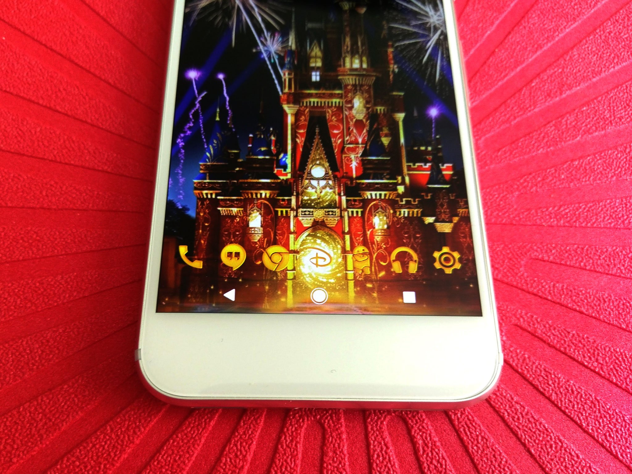
It's where you put your most-used apps, it's our quick-launch guide to our device. What we keep on our dock says a lot about who we are and how we use our phones, and what most docks today tell us is... they are woefully under-utilized. Docks aren't exactly the sexiest thing to talk about, and I seldom mention them in my themes beyond an icon pack because you don't tell someone else what to put on their dock. I'll tell you what widgets to use and what app shortcuts to place where, but the dock is yours; the dock is sacred.
The apps on your dock are there for a reason, but that's not to say they're the only things that have to be there, Docks may look boring, but trust me, they can be functional, fashionable, and downright sneaky.
To app drawer button, or not to app drawer button
With the Pixel and its launcher brought a number of tweaks to the traditional home screen interface, but the biggest was eliminating the app drawer button and instead using a gesture to open the app drawer. That's not to say users hadn't done it before, but few phones had ever come out of the box without an easily recognizable button on the home screen that led to your apps.
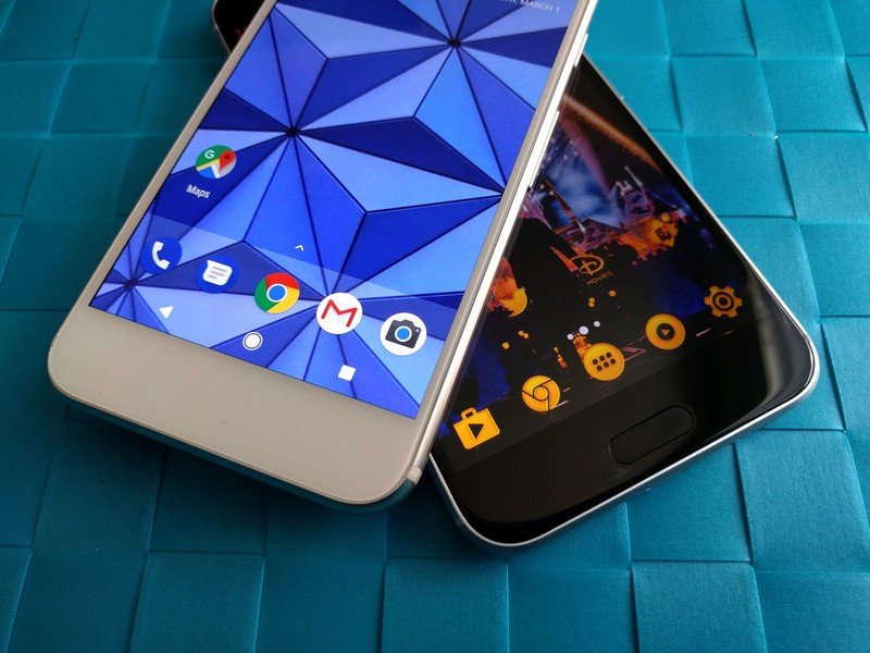
Using a gesture instead of a button frees up a space on your dock for another most-used app, and our Pixel theme will tell you how to get that gesture set up. The Pixel also added a slight white bar over the dock and the nav bar, but that's entirely up to you and your wallpaper.
There are also plenty of ways to add more functionality to your dock without eliminating our precious app drawer button, such as...
Dock size and dock pages
Be an expert in 5 minutes
Get the latest news from Android Central, your trusted companion in the world of Android
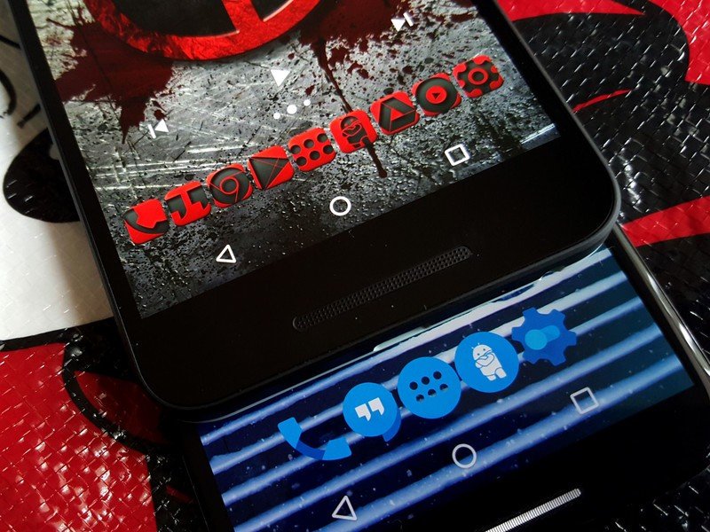
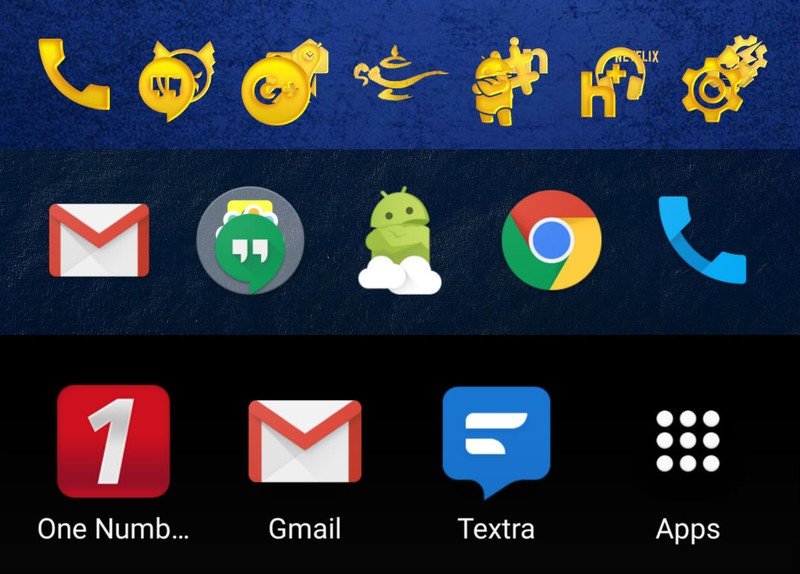
The biggest and easiest way to bring more functionality to your dock is to add more slots to it. This isn't always an option with some launchers, but if your launcher supports more than five icons in the dock, it's worthwhile to consider adding another item or two — or more. Some launchers like Action Launcher can support up to 12 icons in their docks, though this is more for tablets than for phones.
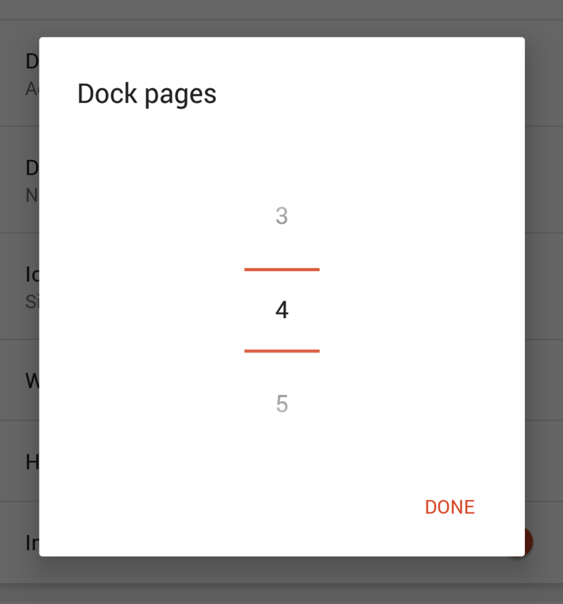
The more icons in your dock, the smaller each of your icons get, so if you want to add space to your dock without downsizing their look, see if your launcher supports dock pages. Dock pages allow you to double or triple the amount of icons by simply swiping your dock back and forth like the pages of your home screen. Dock pages are not for everyone, but if you'd rather scroll through dock pages than pages in your app drawer, give them a try.
Folders and gestures
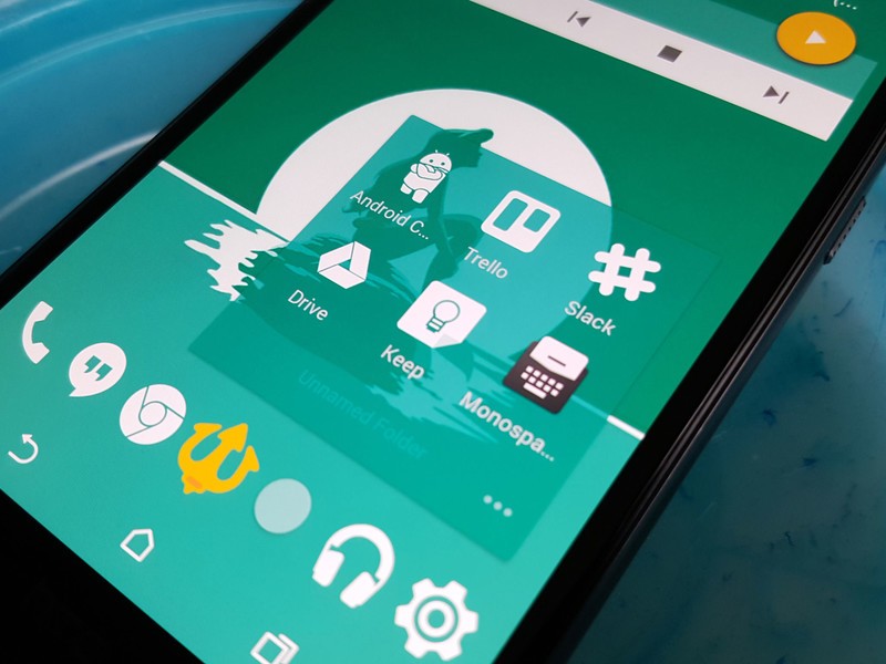
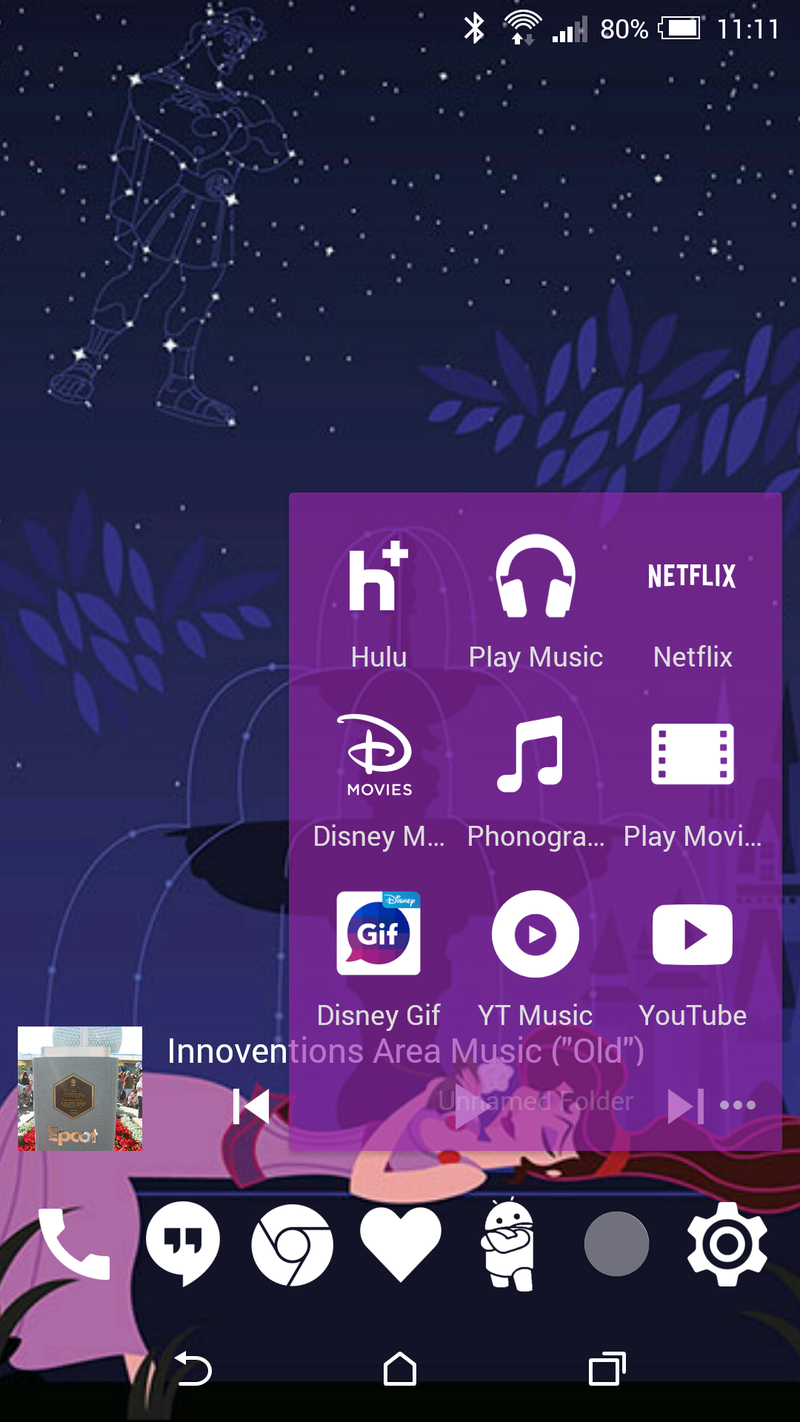
Another way to let your dock pull double duty is to stick folders in it. As mentioned in our guide to home screen folders, putting folders in your dock can help you achieve a cleaner home screen, or simply make way for more widgets and apps on your home screen. Folders allow us to take one tiny space on our dock and squeeze several apps into it. Folders are like TARDISes, and we can make them look as sexy as one, too.

In Action Launcher, Covers let these folders look like a simple app shortcut and act like one in a tap, but you can swipe it open to reveal a folder of useful apps inside. Gesture actions are quite useful in folders, and in some launchers like Nova, the regular apps in your dock (and on the rest of your home screen) can, too. Gestures allow you to hide one app within another, or hide specialized shortcuts. You can have the phone on your dock, and a gesture shortcut can let you swipe the phone up to instantly dial your best friend, or your better half, or your mother.
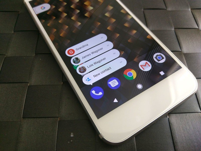
Android 7.1 Nougat introduced App Shortcuts, which allow you to swipe up — or long-press, depending on the launcher — on supported apps to reveal a small list of direct action shortcuts. If you use Google's Phone app, for instance, you'll be treated to three direct dial shortcuts.
Theming docks
As mentioned above, themers sometimes neglect docks, and that's a shame because theming a dock is simple and can either show off the apps in your dock or hide them from prying eyes and fingers. Docks can look uneven and unruly, especially when mixing apps and folders. The key to a successfully themed dock is symmetry and individuality.

Try to keep your dock looking even, whatever "even" looks like to you. If that means having six icons so there's three on each side, fine. If you need to keep three icons on each side of your app drawer to keep things even, that works, too. When choosing icons for your dock, pick one icon from your folder to represent the whole folder (if you're in Action Launcher, this decision is made for you) so that rather than a mix of bigger app icons and smaller icons in the folders we have one consistent line.

There's a fine line between a dock being consistent and a dock being boring, which is why I always try to add a little more spark to mine. Something as simple as a custom app drawer icon can pull your dock together with the rest of your theme.

Custom dock icons are another tactic I frequently employ, as they can be subbed for any icon or folder and they can camouflage important apps. You see a line of Disney Parks icons, you laugh and hand back the phone. You see someone's email app, photo gallery, or banking app, and you might start getting ideas. It may make it harder for a stranger to find their way around, but so long as you remember what apps are on your dock, hiding the actual icon behind a custom icon can also had a small degree of protection.
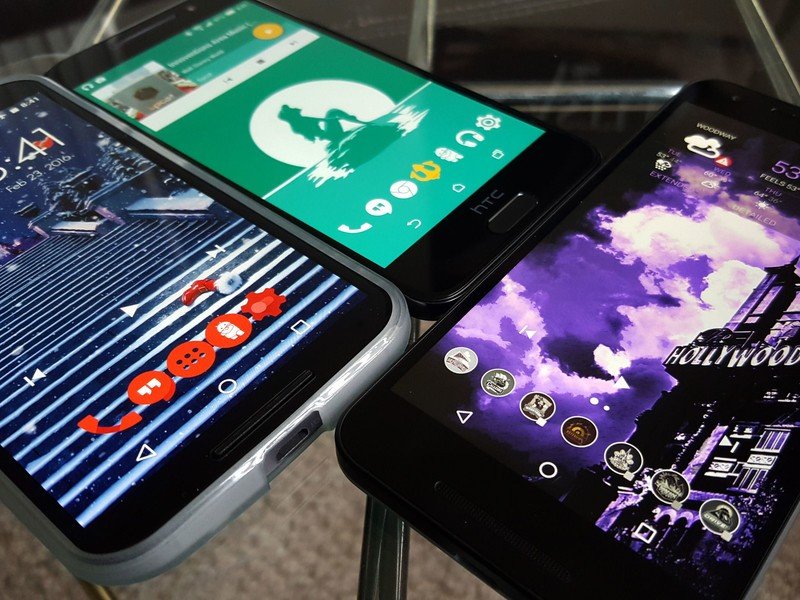
Whether you try to add more pages to your dock or just a custom app drawer icon, we hope these tips can make your dock more vibrant and more versatile. How does your dock look? What apps and folders have a place of honor upon it? Share your dock in the comments and stay tuned for more theming tips here at Android Central!
Ara Wagoner was a staff writer at Android Central. She themes phones and pokes YouTube Music with a stick. When she's not writing about cases, Chromebooks, or customization, she's wandering around Walt Disney World. If you see her without headphones, RUN. You can follow her on Twitter at @arawagco.
