2011
Android 3.0 Honeycomb, the Motorola Xoom and 'real' Android tablets
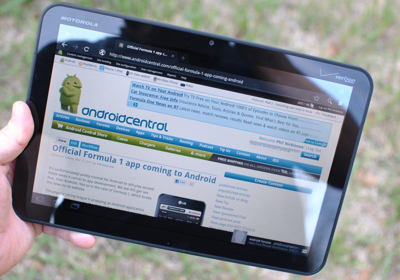
Google's 2011 was defined by its entry into the tablet space. Seeing Apple's success with the iPad, Google jumped into action to start making Android tablet-friendly — up to this point, Android was distinctly a "phone" operating system, even though some companies had shoehorned it onto small tablets. Google clearly got to work quickly: Android 3.0 Honeycomb was shown off in January, debuting a brand new interface that was made specifically for tablets. Honeycomb was made for big landscape screens, including a new home screen design, fresh navigation bar layout, notification and settings screens, and most importantly, frameworks for app developers to take advantage of the extra space.
Honeycomb was about more than just tablets — it was a complete rethinking of the design of Android.
But Honeycomb was about more than just tablets. It was a complete rethinking of the design language of Android, introducing a new "holographic" redesign. The interface was flat and angular, with an emphasis on blacks, dark greys, transparency and neon-like bright blue highlights. A departure from Android 2.3 Gingerbread, for certain, and one that really grabbed everyone's attention.
Things started off rocky, with Honeycomb launching on the Motorola Xoom in late February. The software was, frankly, unfinished — and we all knew it. Third-party app support was understandably lacking, considering this was Google's first-ever tablet interface, but the operating system itself was generally less stable than Gingerbread and early users dealt with regular app crashes and other problems. It stands to reason, then, that Google quickly followed up the first release with an update to Android 3.1 to address the problems.
Google had a strong set of initial partners, but Android tablets just … never took off.
Google had a strong set of initial partners to launch Android tablets, of course starting with the Motorola Xoom but also the Samsung Galaxy Tab 10.1, LG G-Slate, Toshiba Thrive, Acer Iconia A500 and more. In the same year, we got a second wave, with two Motorola Droid Xyboards, multiple ASUS tablets, the Sony Tablet P and Tablet S, and new sizes of Samsung and Acer's tablets. Looking back now, the tablets seem downright silly in terms of size, but this was a whole new era for Android's expansion to large form factors.
It could easily be argued that Google's first attempt at tablets, and a tablet-focused OS, was a failure — and it was clear even in the first year. Its inability to get Android app developers to support large wide-screen landscape tablets was a constant issue, even with months of development time and a relatively robust market of Android tablets available. Even many of Google's own apps were glacially slow to update with tablet support. That was compounded when Google released its own tablet, the Nexus 7, in 2012 with a 7-inch display and portrait orientation that frankly just worked like a large phone. It wouldn't make another push into large landscape tablets until the Nexus 10 at the end of 2012.
First LTE-powered Android, the HTC Thunderbolt on Verizon
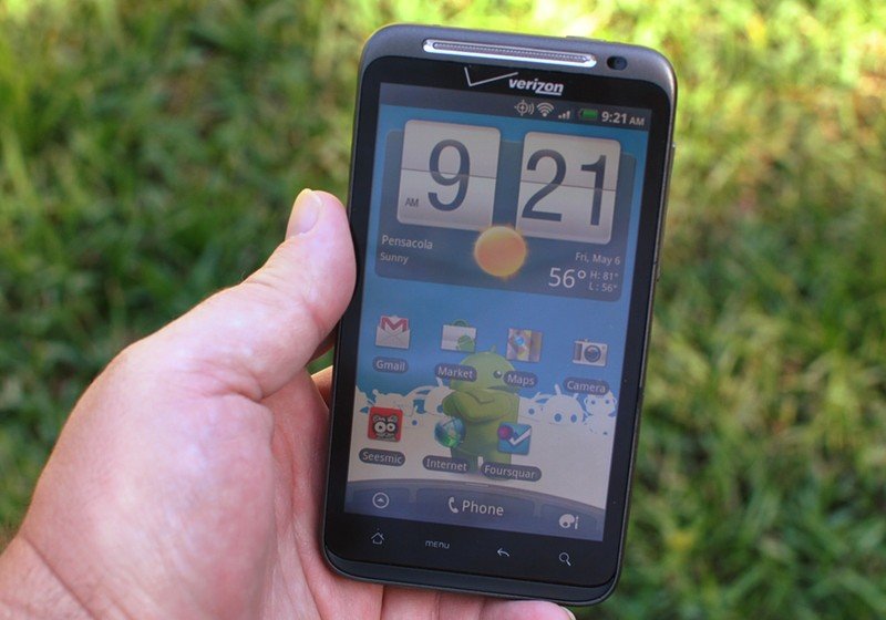
Amid all of this focus on tablets, we hit a major milestone: the first LTE-powered Android, the HTC Thunderbolt on Verizon. The phone itself wasn't particularly exciting, as it was effectively a small refresh of the HTC Evo 4G that launched with support for Sprint's WiMAX network — but the introduction of a proper 4G LTE network to an Android phone was amazing after the debacle that was the Wimax launch.
The first LTE phones were loaded with compromises, but it felt like the future.
We were blown away by LTE speeds on the Verizon network, which are tiny by today's standards: roughly 8 Mbps on the download and upload. But our first taste of LTE showed us the future: phones with big screens and more processing power to take advantage of being able to have media and apps served up in a fraction of the time we were used to. You got a rear camera that could capture 8MP stills and 720P video, a huge (for the time) 4.3-inch display and a super-loud speaker with a kickstand to prop up the phone for viewing.
Be an expert in 5 minutes
Get the latest news from Android Central, your trusted companion in the world of Android
It also introduced us to the reality of being the first ones to use a next-generation network: the hardware and battery were not ready to handle the extra LTE radio. The Thunderbolt would die in a matter of 4-5 hours of use in an LTE area, and there was quickly a robust market of third-party batteries to give you an extra 200-400mAh so you could try and make it through a day. The first LTE phones were truly compromised, but we didn't care — this was the future, in our hands now.
Google+ becomes the social glue for all of Google
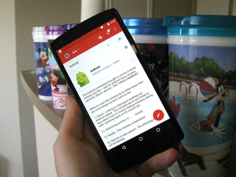
In an attempt to ride the wave of making seemingly everything on the internet a "social" experience, Google launched its social network platform Google+. It was a bit of a combination of ideas from around the social world, with elements of traditional blog platforms, but also new services like Facebook and Twitter, plus location check-ins like Foursquare, and then also integration of text and video chats.
Google tried to do too much at once with Google+, but it helped unify all of its services with one social framework.
Needless to say, Google tried to do a lot at once with Google+. In the first year, Google+ changed a ton — features came and went quickly, and there were radical changes to the website and Android app. Google also quickly pushed Google+ tendrils into seemingly every possible nook of its business, turning G+ into the glue that connected all of its other services. All while it was, ostensibly, a social network for people from around the world to meet and exchange ideas.
Understandably, Google+ was populated early on by a more tech-savvy, and Android-focused, user base. It was an incredible place to keep up with Android news, exchange tips and tricks, and learn all about what people were doing with their phones and tablets. From this perspective, Google+ launched at a perfect time, when Android was at mass adoption levels and filled with interesting products.
Samsung launches the first Galaxy Note
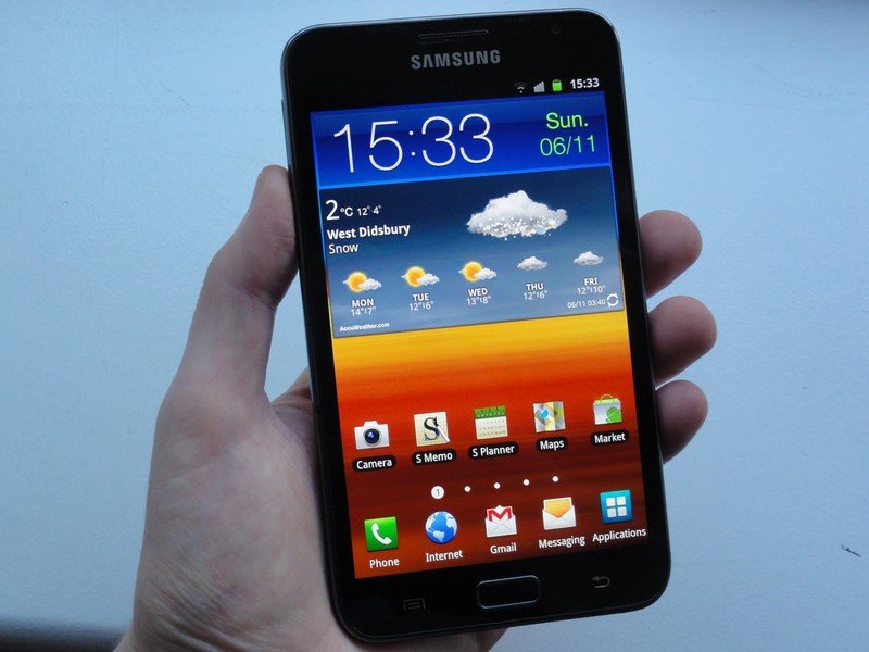
November 2011 brought us the original Samsung Galaxy Note, which we only fully understand the importance of today. Coming just six months after the positively huge HTC Thunderbolt, the Galaxy Note took everyone by surprise with a display that was a full inch larger at 5.3-inches. It was massive, and it was a gamble for Samsung, which following the release of the Galaxy S II hadn't necessarily cemented its spot in the Android world yet.
Samsung completely detached the Note from what we considered a 'normal' smartphone.
Completely detaching from what we considered a "normal" smartphone size opened up tons of possibilities for Samsung. It had better specs than anything else out there, plus a huge battery that offered over a day of use. It also reintroduced the idea of a smartphone with a stylus, which brought many of us back to the good old days of Windows Phone and Palm devices. This was very much the start of the "let's try it all" era for Samsung, and it really went all-out on the first Note.
Samsung really can take credit for launching the big smartphone craze with the original Galaxy Note, even though it may have been a little ahead of its time. Even though people generally considered the Galaxy Note a niche device that was too big for anyone to comfortably use or fit in their pocket, Samsung soldiered on, releasing Notes for years while the rest of the market caught up — and now, phones all follow the big-screen formula.
Android 4.0 Ice Cream Sandwich debuts with the Galaxy Nexus
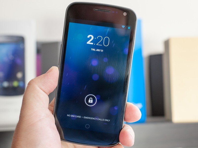
Android 3.0 Honeycomb may have been mostly a failure in terms of bringing Android tablets to the mass market, but it did bring something useful to the fold: the design underpinnings we saw in Android 4.0 Ice Cream Sandwich. After seeing dozens of tablets launch with Honeycomb software that looked dramatically different from the Gingerbread-based phones on the market, we got our first look at Android 4.0 on the Samsung Galaxy Nexus at a very odd launch event in Japan.
ICS set the groundwork for Android's design all the way to Lollipop.
Matias Duarte, the eccentric designer credited with leading Google into this new futuristic design, showed off this new software that was a massive change from Android 2.3. ICS was a departure from Gingerbread in all the right ways. It was faster, simpler, cleaner and felt decidedly modern. Gone were the skeuomorphic interface elements that mimicked real-world objects, replaced with a flat interface built on thin lines and high-contrast colors.
Like other Nexuses before it, the Galaxy Nexus itself wasn't nearly as important as the software. Samsung had already partnered with Google to make the Nexus S, and the Galaxy Nexus was very clearly built on the Galaxy SII platform. Still, the combination of that sleek and modern Galaxy Nexus hardware along with the total change to the look and feel of Android made for a change that felt like a massive step forward for Android. Jelly Bean, KitKat and even Lollipop could very easily trace their design roots back to the changes introduced in ICS.
-Andrew Martonik

