The death of bezels isn't as great as you think
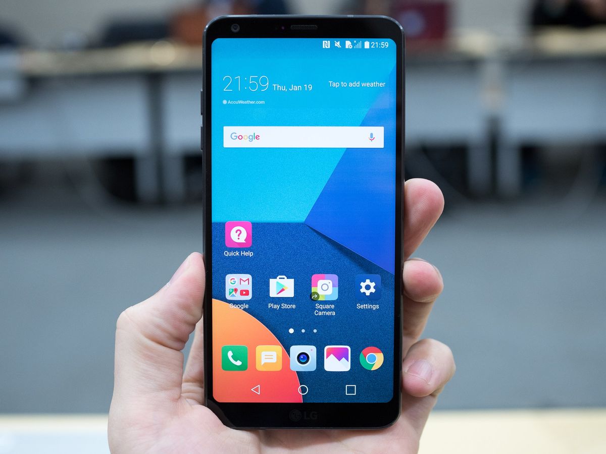
I've been lucky enough to use an LG G6 for the past three days, and it's great. The phone is well-built, it's fast and stable, the extra-tall screen is wonderful, and it's compact. So compact, in fact, that LG claims it fit a 5.7-inch phone into the same physical space as a typical 5.2-inch device from another company.
LG claims it fit a 5.7-inch phone into the same space as a typical 5.2-inch device.
How LG did this remarkable thing was by removing as much of the excess area around the LCD panel itself — typically known as the bezel — as possible, increasing the so-called screen-to-bezel ratio. The way the company pulled this off is quite ingenious, too: instead of sticking with a typical 16:9 aspect ratio, which forces the phone to get wider as the screen gets taller, it changed it — to 2:1.
The G6's screen is exactly twice as tall as it is wide — 18:9 — which gives LG more breathing room to distribute the phone's necessary parts while minimizing overall space. Everything that needs to be in the phone is still there — it's just up higher, instead of wider.
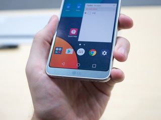
So we're left with a relatively narrow phone that has almost no bezel above and below the screen. This has proven popular with the vocal group of people who have decried that particular reality of phones since touch screens were invented, and based on the response from the release of the Xiaomi Mi Mix late last year, and the rumored near bezel-free Samsung Galaxy S8, the G6 is in good company.
I foresee a few days of unintended screen touches and awkward readjusting.
But buyer beware. I've been using the phone for the last few days, and all isn't perfect in the world of infinity. For a long time, bezels existed out of necessity, as a way to hide various components underneath. We're moving away from those physical constraints, so if bezels are to continue to exist, they need to be there for a reason. And not having them on a device like the G6 makes it pretty clear why they exist, aesthetics aside:
- On Android, bottom bezels force your thumb to rest at a natural point above the pinky, which rests underneath the phone in a cradle. Without that extra space, the pinky is thrust out to allow the thumb additional room to move lower, which either stretches the tendon or compromises the hand's grip on the already-slippery device.
- The lack of bottom bezels also make it difficult to grip the phone from the bottom, as I enjoy doing while reading an article or watching a video in portrait mode. Granted, this isn't a common occurrence, and I could merely wrap my hand around the phone, but I've always found gripping the bottom between thumb and forefinger a comfortable and stable way to hold a phone for long periods without tiring. On a device like the G6, the virtual buttons are so close to the bottom that such a grip isn't possible.
These are not game-ending issues, and in the few days with the phone I've already grown accustomed to the new form factor. But I foresee, for early adopters of the LG G6 and Galaxy S8, a few days of unintended screen touches and awkward readjusting. I also wonder whether, after years of criticism against bezels, the industry is overcorrecting by eliminating a necessary tenet of phone hardware that people don't realize they need merely because it mars the aesthetic.

One way to mitigate this problem is by ensuring that devices with slim bezels are not too wide, so they're relatively easy to grip and manipulate with one hand. The 5.7-inch LG G6 is just narrow enough for my thumb to reach from one end to the other without strain; the 5.8-inch Samsung Galaxy S8, which is rumored to have a similar 18:9 aspect ratio, may be slightly too wide.
Be an expert in 5 minutes
Get the latest news from Android Central, your trusted companion in the world of Android
The end of bezels is surely coming soon, but there may come a time when we yearn for the simpler days of having a place to grip, and a respite from the endless screens we spend all day staring at.
Daniel Bader was a former Android Central Editor-in-Chief and Executive Editor for iMore and Windows Central.

