Celebrate the eclipse with this dark-as-night theme pack!
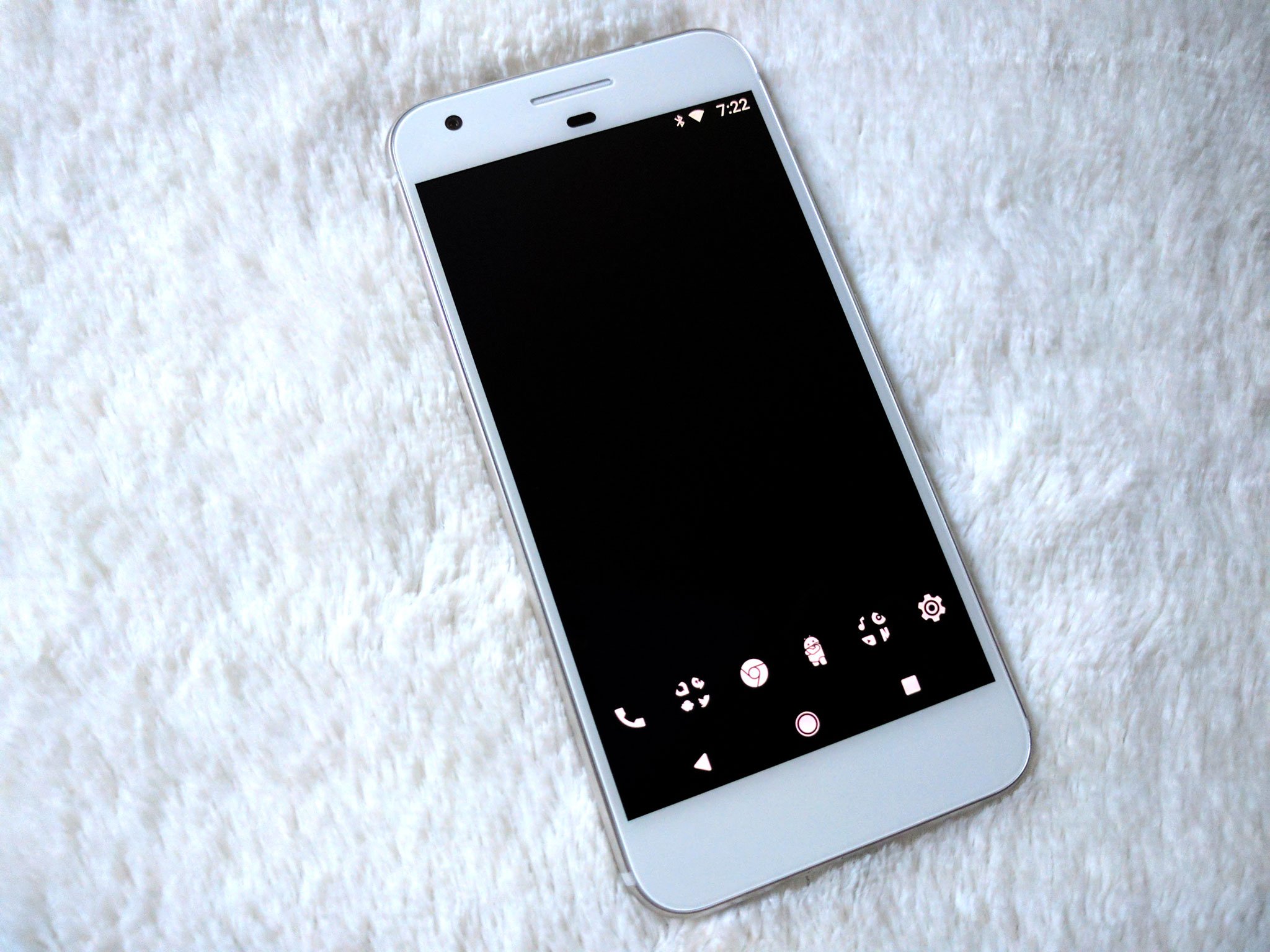
Dark themes are more than an expression of taste and emotion. On devices using AMOLED displays, dark themes can help you save a little bit of battery. Because on AMOLED screens, true, hex black #000000 is displayed by turning off the pixel completely. The more black on an AMOLED screen, the fewer pixels being powered and lit. Now, some apps have AMOLED black themes. Some phones have AMOLED black system themes, like the Samsung Galaxy S8, and if they're available for your phone, that is excellent.
For the rest of us, there's always dark home screen themes, which are an excellent exercise in balance, minimalism, and Android ingenuity.
Come to the dark side!
Wallpapers
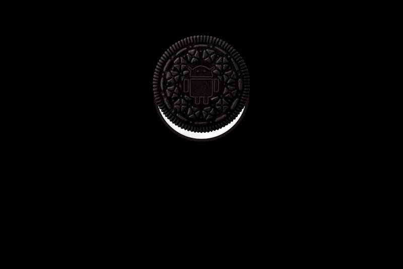
Android Oreo is here! Let's have a nive dark wallpaper to celebrate our new, beautifully chocolately dark Android mascot! It's just teasing you, begging you to reach out and have a taste, isn't it?
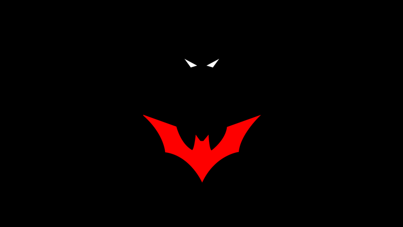
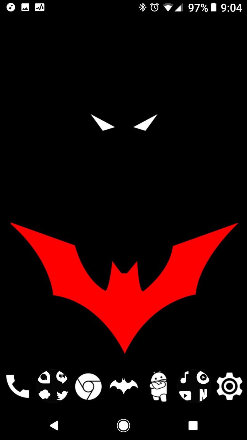
Batman Beyond was the first Batman show I regularly watched as a kid. He'll always hold a special place in the Batcave of my heart. And this background of Terry McGinnis in the darkness of Gotham, only visible by his bright red bat symbol and two white, dangerous eyes makes me wanna curl up on the couch and watch a few seasons.
Batman Beyond AMOLED wallpaper{.cta .large}
Be an expert in 5 minutes
Get the latest news from Android Central, your trusted companion in the world of Android
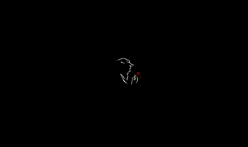
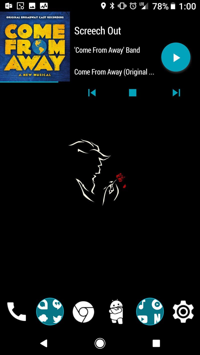
This Beauty and the Beast Minimalist Wallpaper by chrisaloo is proof that sometimes less is more, and it also adds an air of refinement to the often drab world of AMOLED themes. We've had to tweak the color balance and exposure on this wallpaper slightly to ensure that it's turning on as few pixels as it can, but it's worth it for a wallpaper that conserves energy while inspiring enchantment.
Beauty and the Beast Minimalist Wallpaper by chrisaloo (modified for AMOLED)
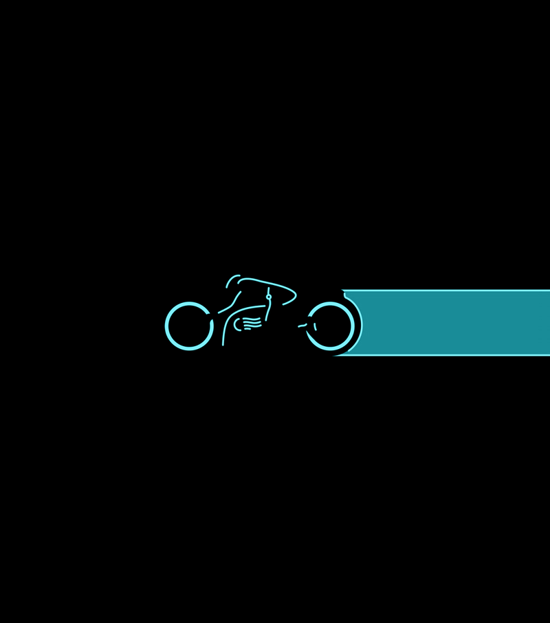
Tron is a franchise that was made for dark themes, with the lights of a lightcycle and its rider cutting across the home screen and the abyss of the grid with precision and power. This is another wallpaper we've featured before, any it's also a wallpaper that needed its levels tweaked, both to make it AMOLED black and to better match the icon pack to come.
Tron Lightcycle (modified for AMOLED)
If you want as few pixels as possible turned on, then you're going to want a completely, 100% Hex Black wallpaper. It's not showy, it's not stylish, but it is black as the abyss and it is ready to apply to your home screen.
Black Hex Wallpaper by Siege36
How to apply your wallpaper
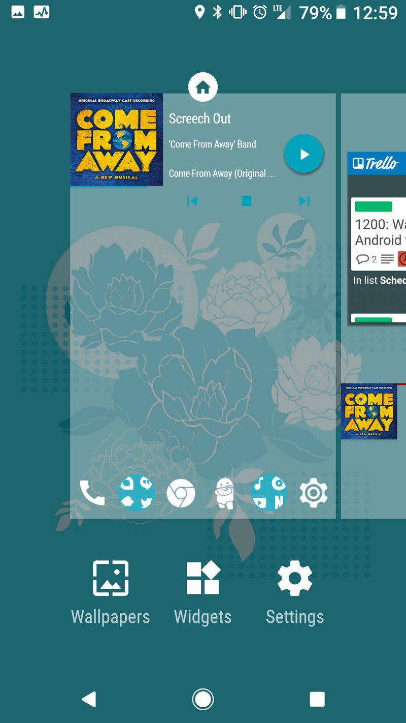
- Long-press an open space on your home screen.
- Tap Wallpapers.
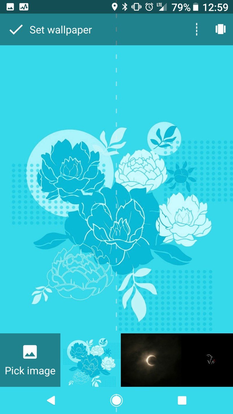
- Tap Pick image.
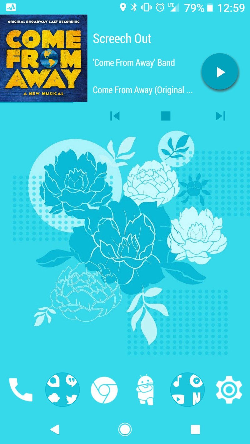
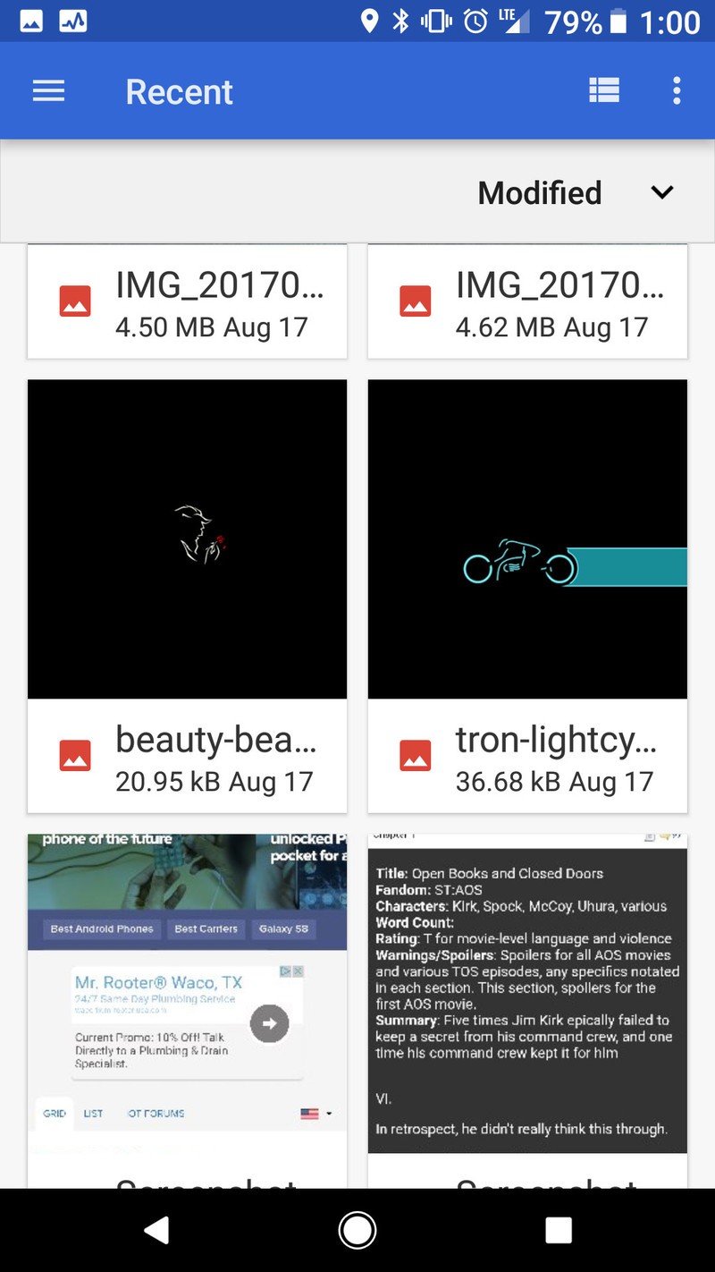
- Select your downloaded wallpaper.
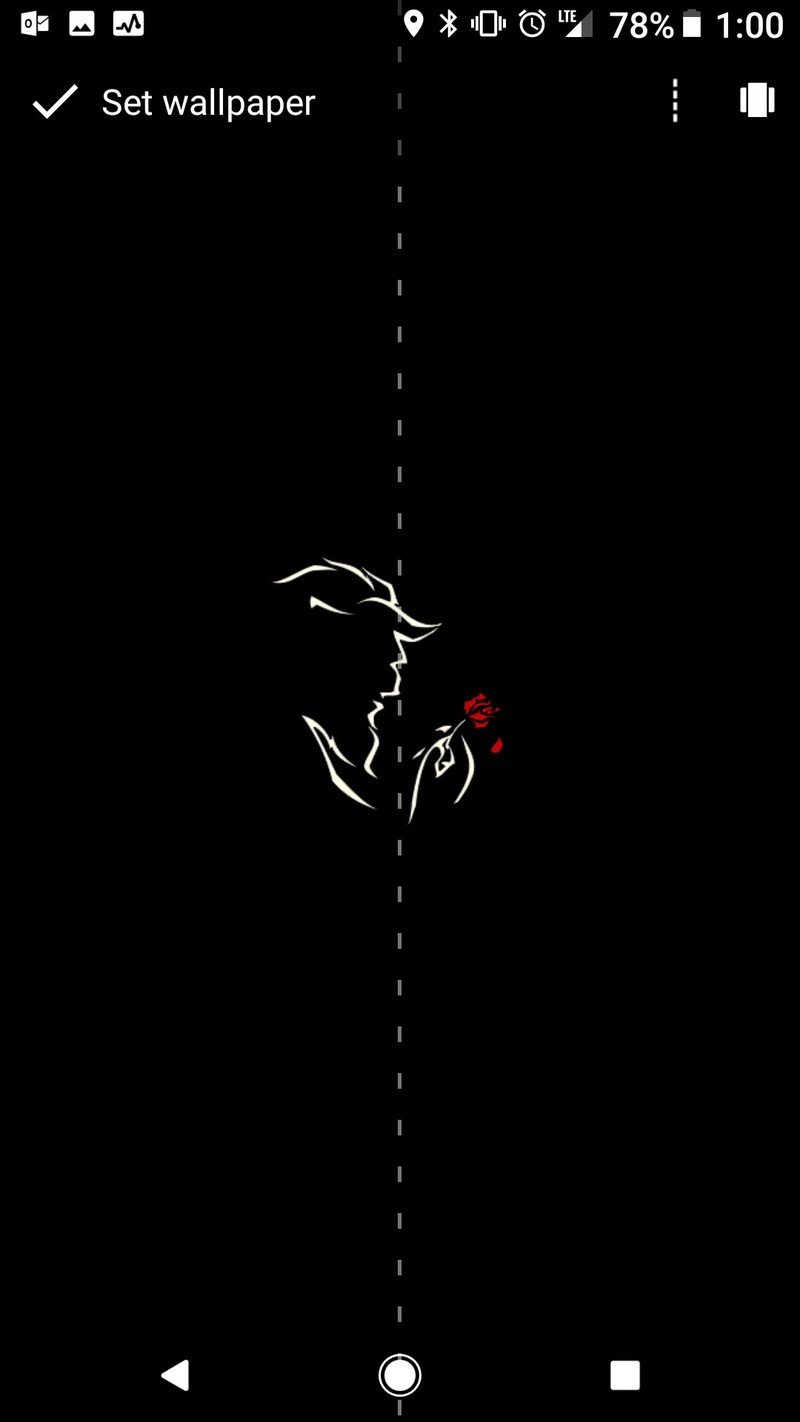
- Make sure your image is centered on the screen to your liking.
- Tap Set wallpaper.
Icon packs
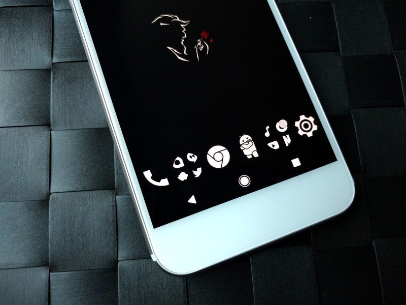
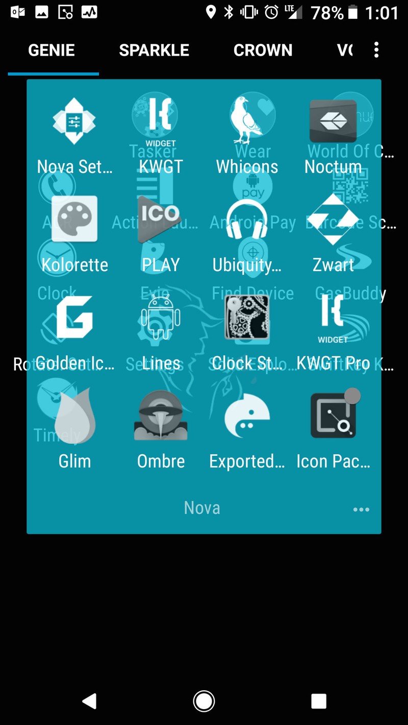
There are a lot of white icon packs out there, but few have the style and the sheer number of supported icons as Whicons by Randle. Whicons will light up more pixels than the next icon packs, but I'm willing to take that for two reasons. First, there are far fewer holes in my app drawer with Whicons. Second, I find that Whicons are easier to recognize, especially on first glance, which means I can open my app and get done to turn off my screen that much quicker. If you really, really want to fire fewer pixels with Whicons, consider turning down the icon scale on your launcher to shrink your icons down.
Also, Whicons just goes better with the Batman Beyond and Beauty and the Beast wallpapers.
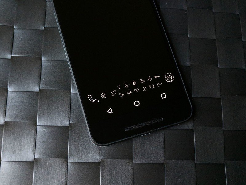
Want to get clean icons with as few pixels lit as possible? You need Lines, an icon pack that consists of outlines. Lines is one of the most popular packs on Google Play, but even for its popularity and pedigree (Lines has been around for a long time), it isn't without faults. The pack's mask for unthemed icons is paltry, and a number of system and Google icons included in the pack are vintage, to put it nicely. But if you want as few pixels lit as possible, it's hard to beat the thin white Lines icon pack.
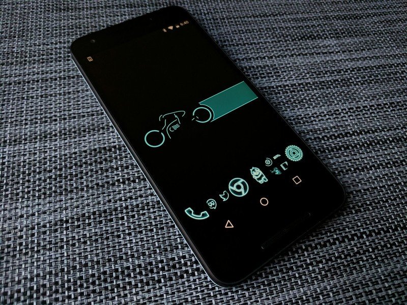
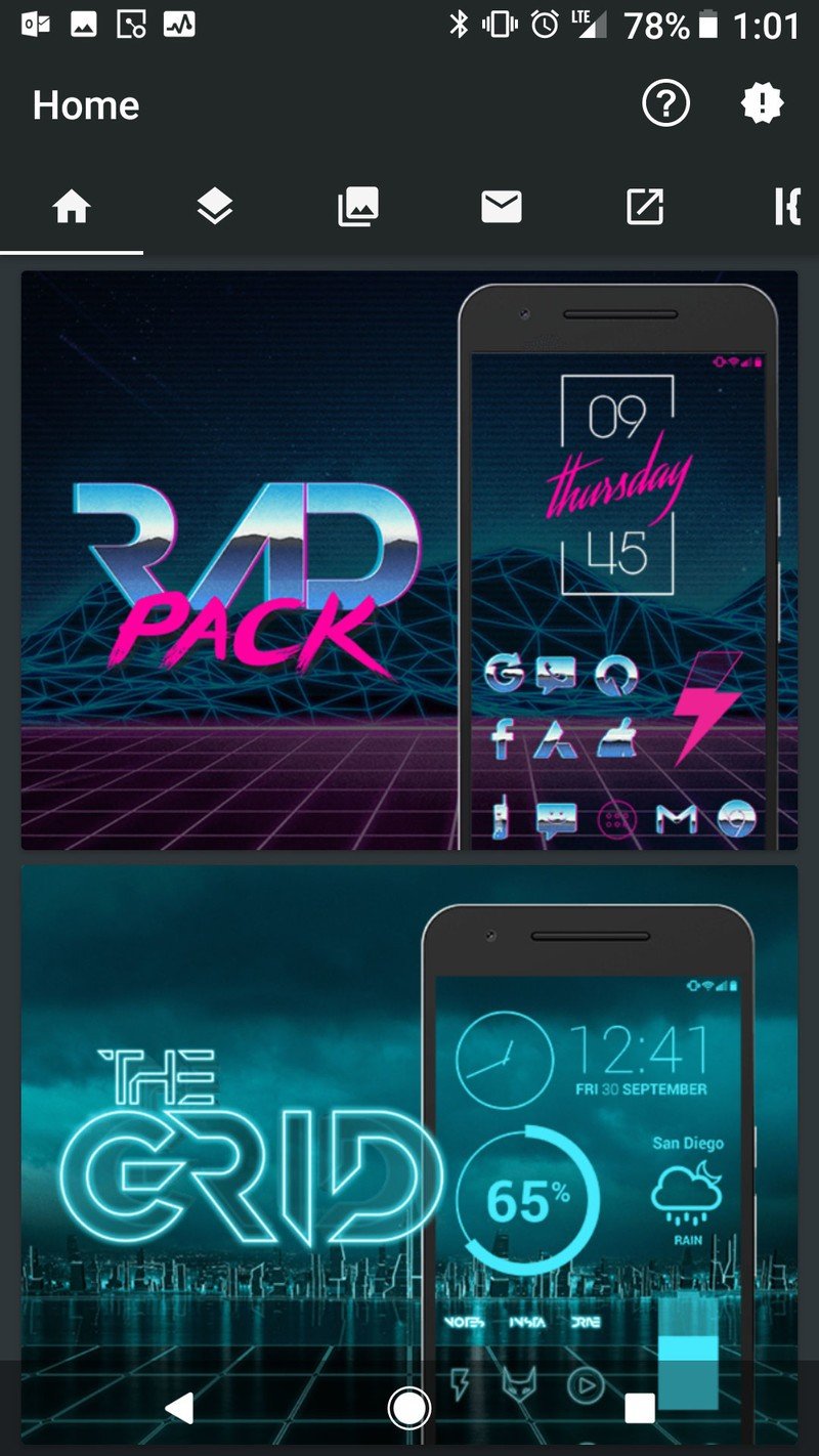
For our Tron theme, we of course need some icon from The Grid. This icon pack is a variant of Lines, but with a blue glow and subtle reflection for depth. As with Lines, it's got some older icons for some Google apps, and there's bound to be a few holes in your app drawer, but you should be able to fill your dock with beautiful, electric blue icons.
How to apply an icon pack
- Open your desired icon pack.
- Tap Apply (the icon with the arrow in it).
- Tap your launcher.
- Tap OK or Apply, depending on your launcher.
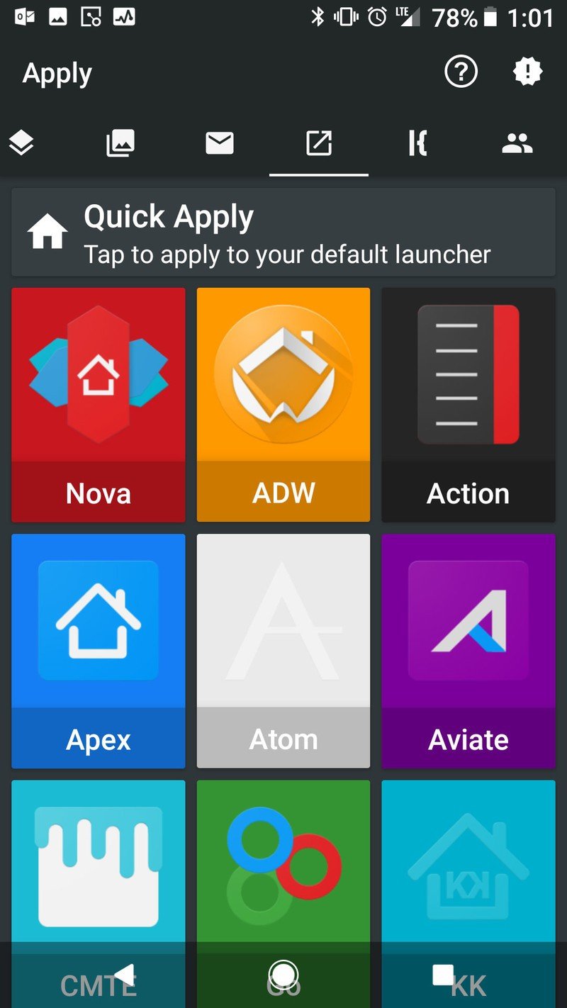
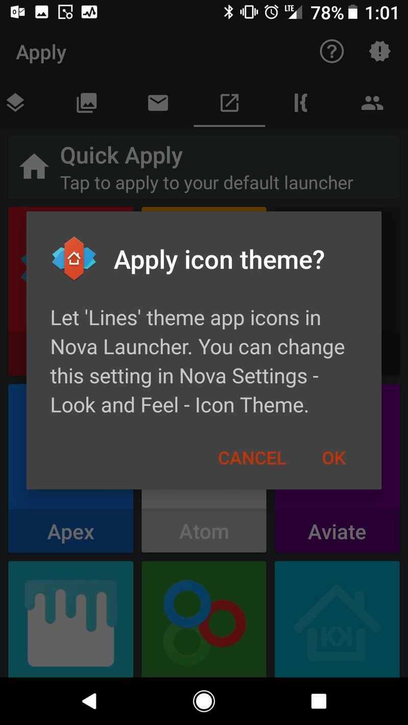
If your launcher isn't listed in step 4, your launcher might not be supported. Check the icon pack settings in your specific launcher, and if your launcher isn't supported, consider using another launcher.
How to apply an individual icon
- Long-press an icon you wish to change.
- Tap Edit.
- Tap the icon window to change the icon.
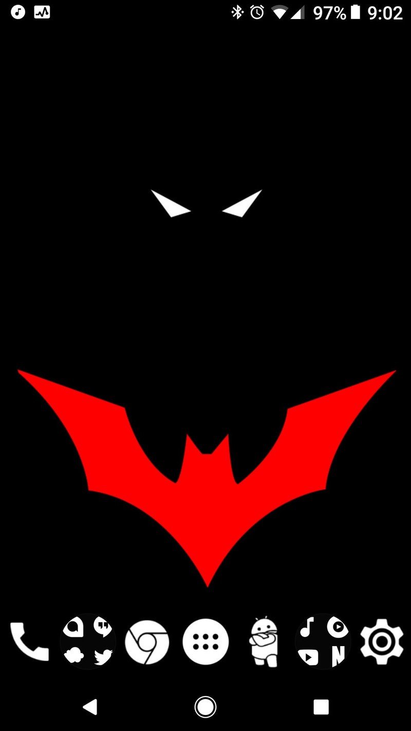
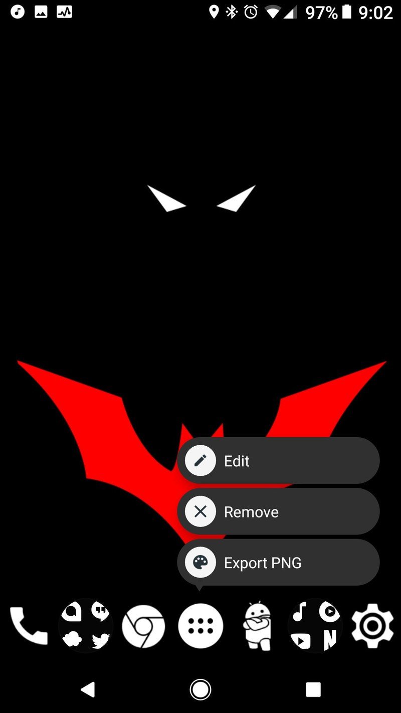
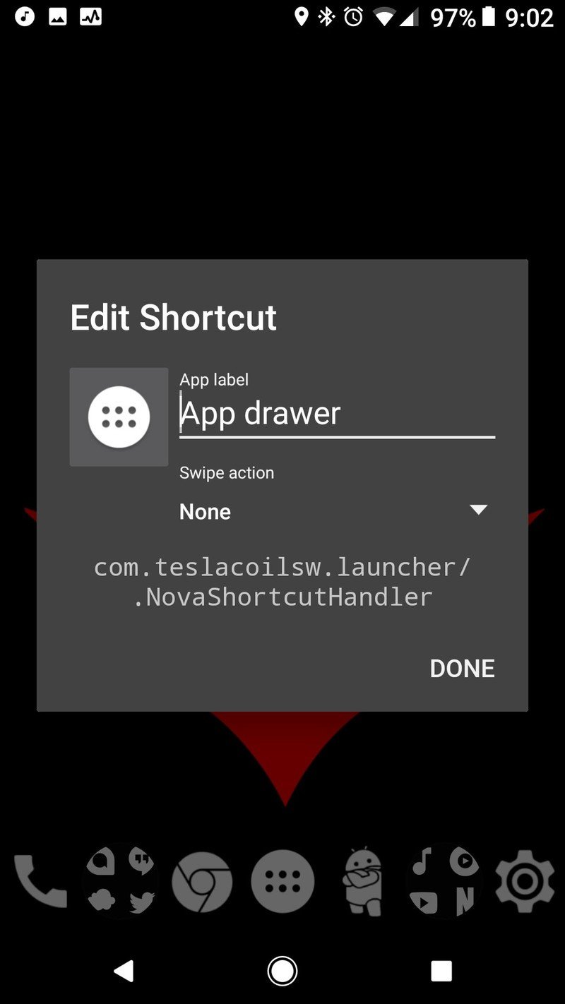
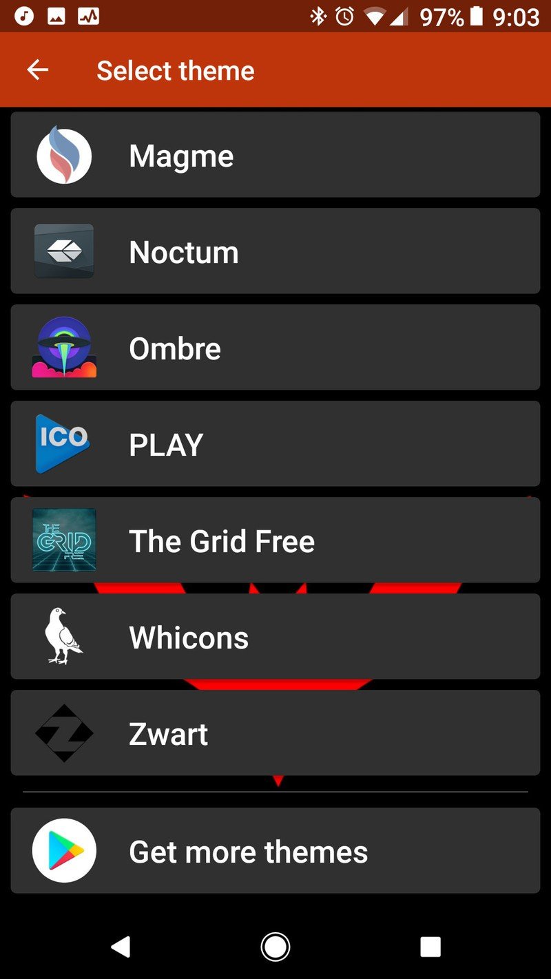
- Select your desired icon pack.
- Tap the open app icon in the top right corner of the screen to enter the pack's icon picker. It's hard to see the white icon on the white bar for Whicons, but it is there.
- Search for the app icon you wish to use using the search bar at the top of the screen.
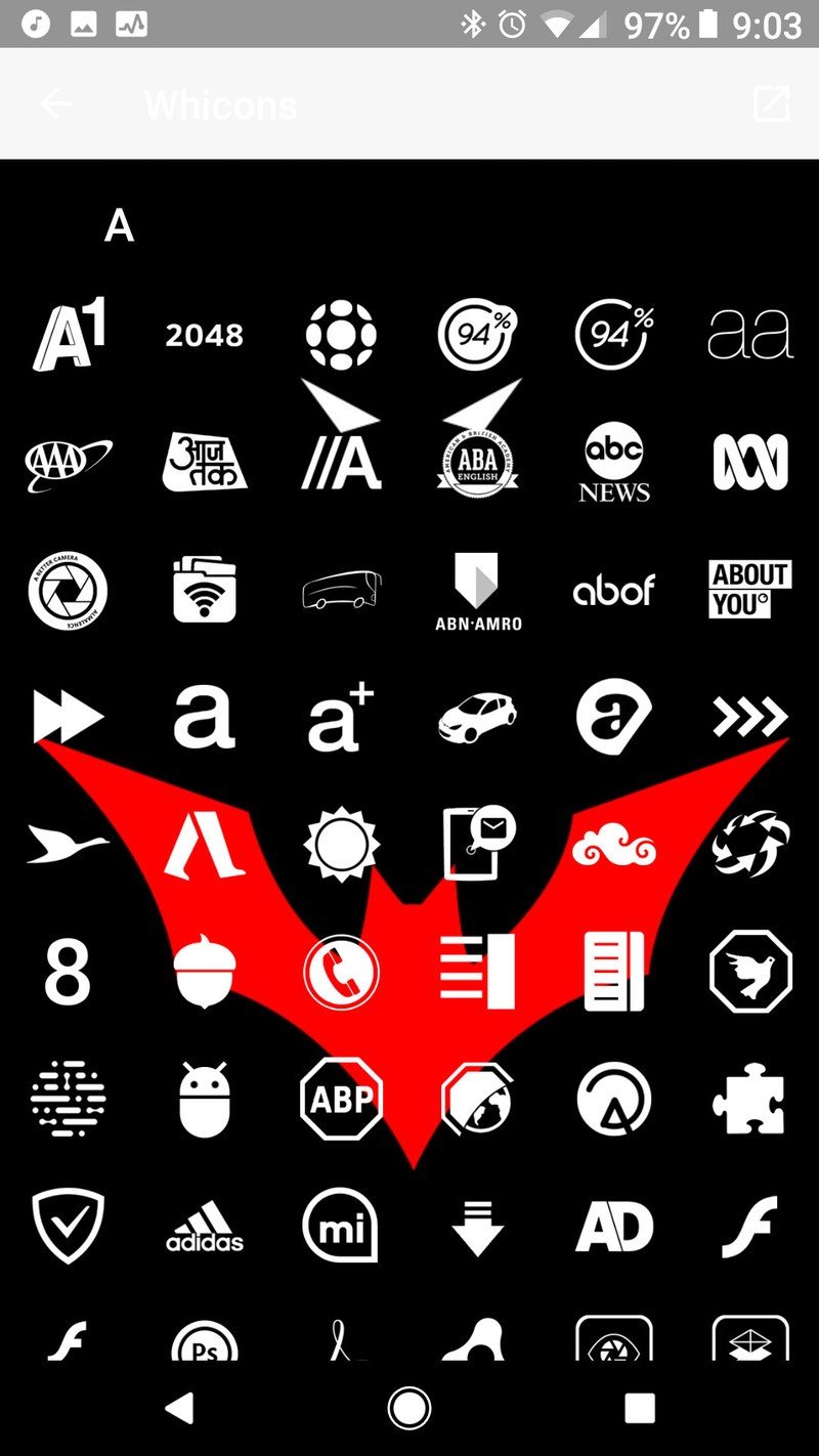
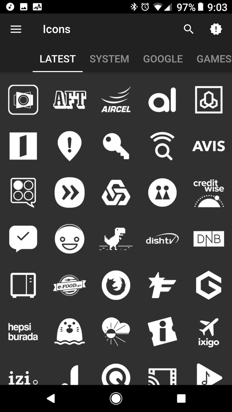
- Tap your desired icon.
- Tap Done.
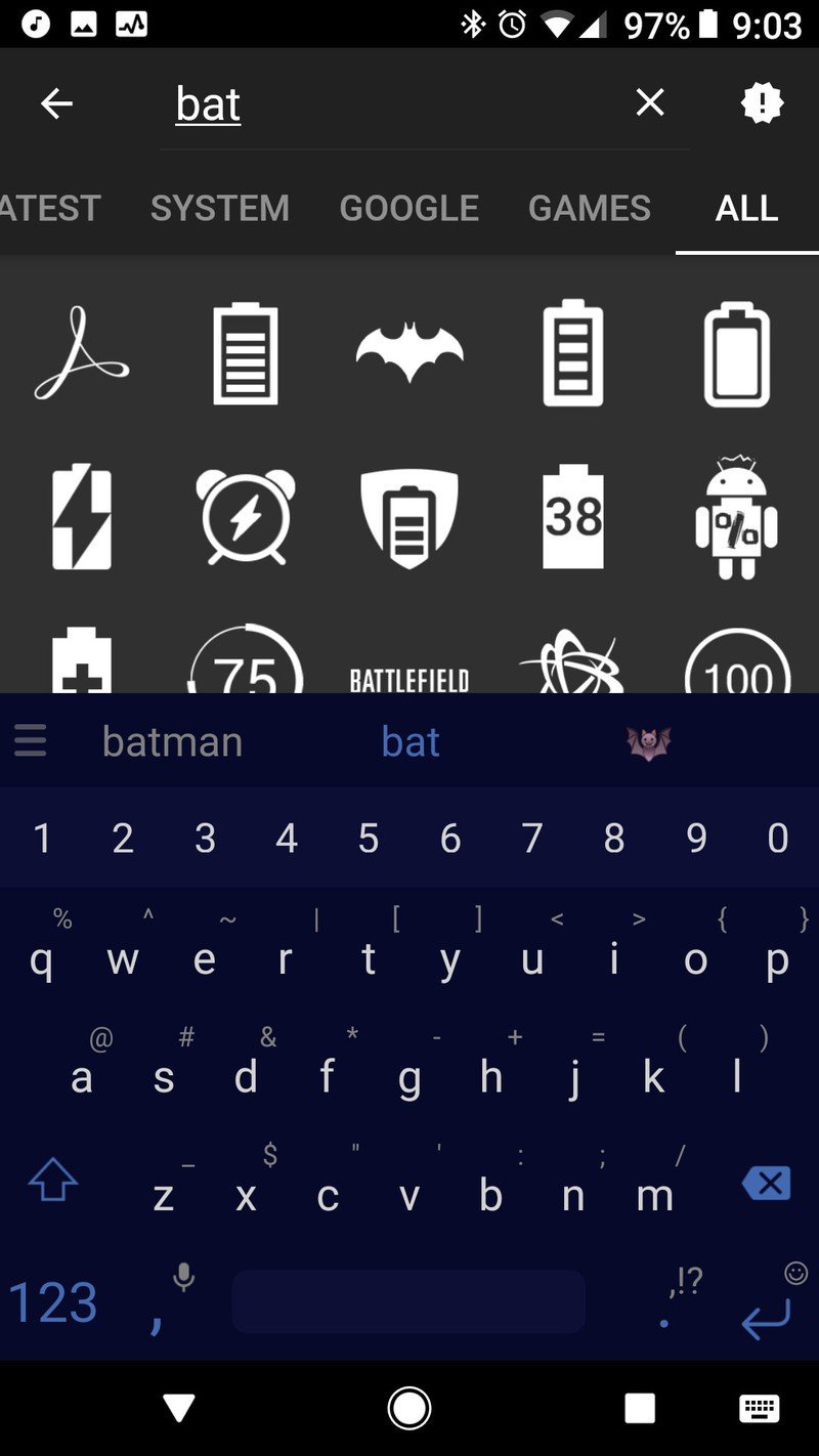
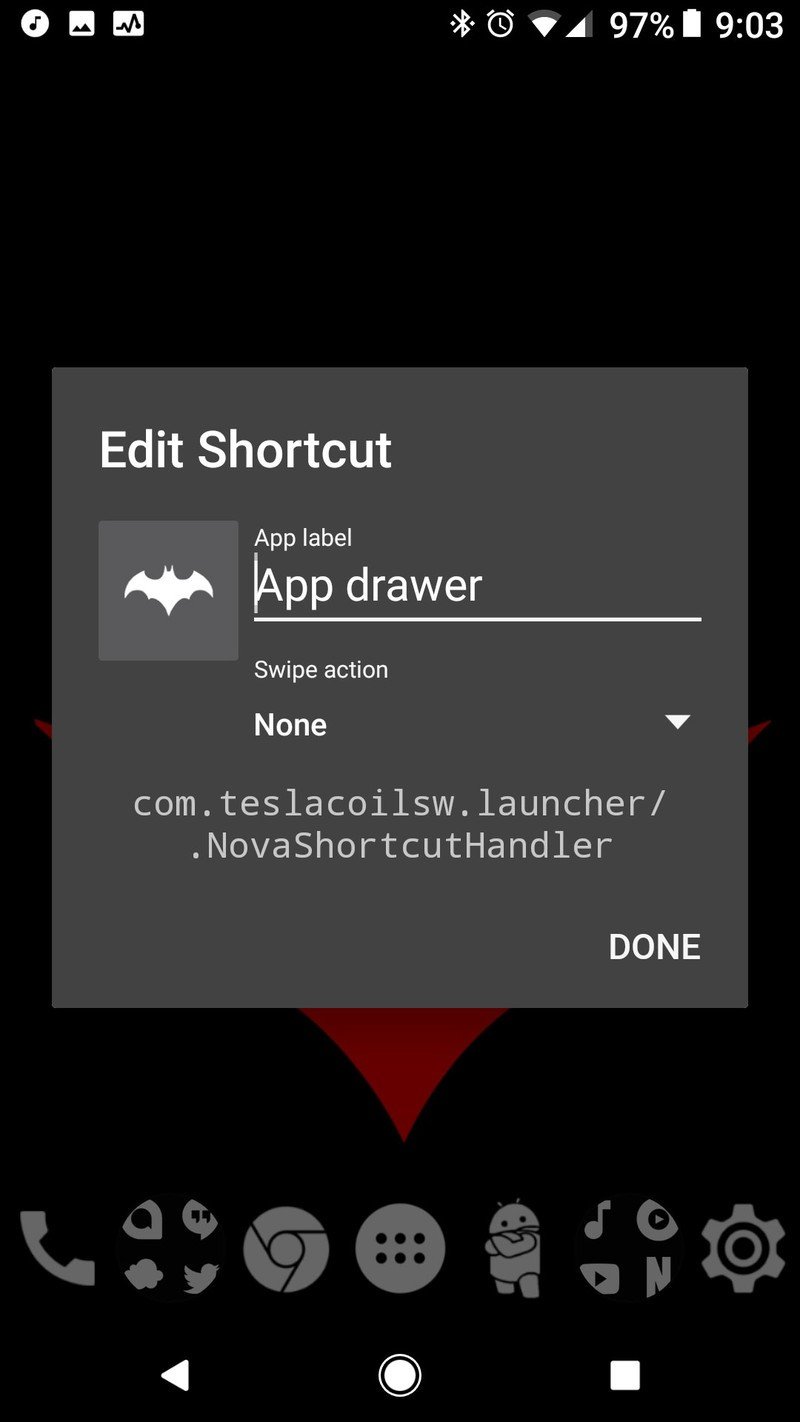
Widgets and why we're not using them
Now, this is normally where we'd get widget-happy, but we're not going to do that today. See, most AMOLED black themes are designed to light up as few pixels as possible, and widgets will light up pixels for little or no real benefit. If we want to see the weather, we can open our favorite weather app or just ask Google Assistant. If we want to control our music, we can swipe down and use the notification.
If you have a widget you absolutely get a lot of use out of, feel free to use it. After all this is your home screen. In the spirit of AMOLED minimalism, however, we're leaving them out of the guide.
Folders, app drawers and gestures
Now, in lieu of going overboard with widgets, we're going to tweak our home screen launchers in order to get maximum usefulness out of minimum pixels. There's a number of ways we can do this:
- Remove widgets and the Google Search bar, should your launcher allow it. Search bars can look great when themed properly, but why have it taking up space when you can get to Google by simply long-pressing the home button?
- Use gesture shortcuts to replace app shortcuts on your home screen. Same functionality, zero extra pixels.
- Some launchers allow you to turn off the status bar on the home screen, blanking out a few more pixels. I personally prefer seeing the status bar so that I don't use a clock widget to see the time, but to each their own.
- We can turn off the transparent white dock overlay that was applied with the Pixel style on some launchers like Action Launcher and Nova Launcher These overlays are under Dock settings and are easily disabled.
Home screen folders and how to theme them
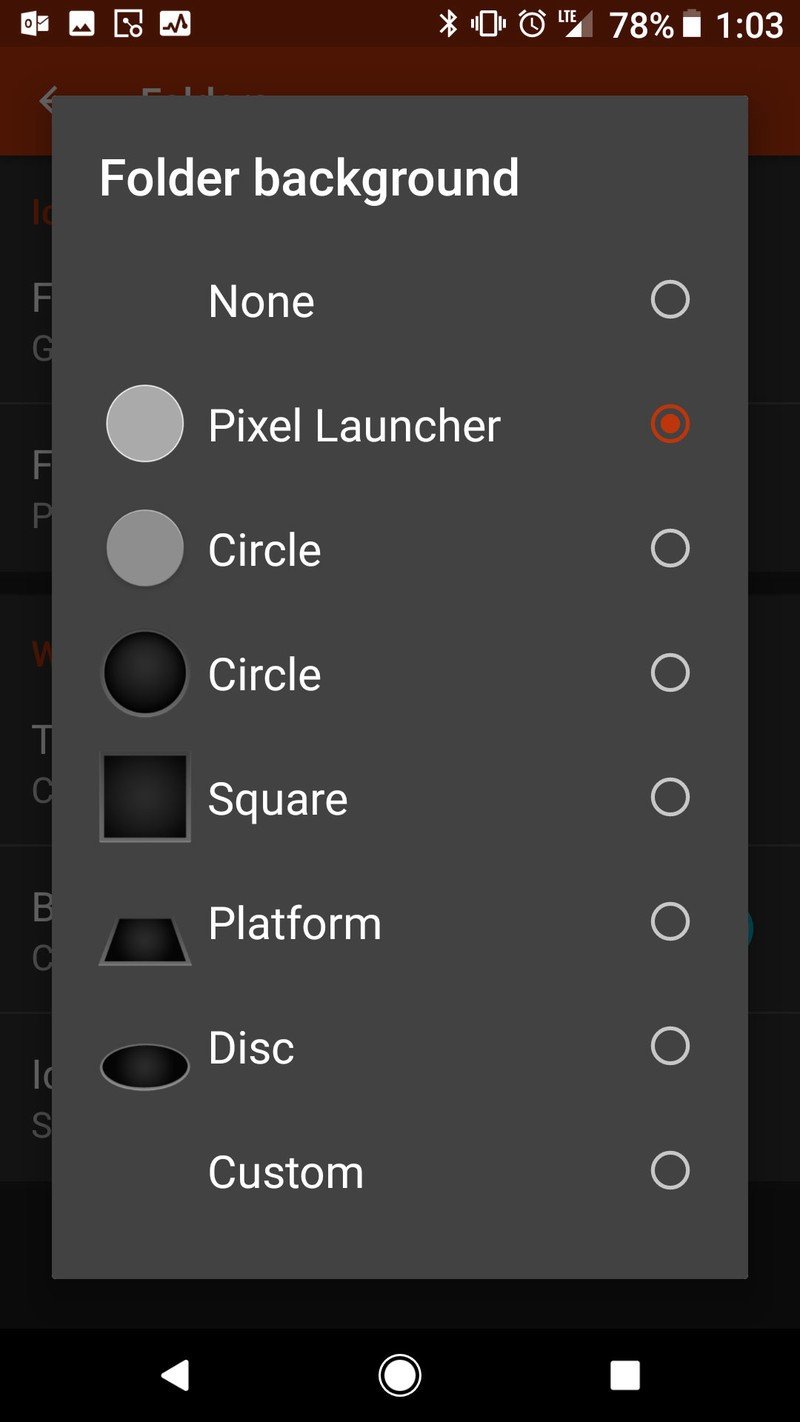
Home screen folders can help you squeeze more icons into your home screen without turning it into a sea of icons, allowing you to keep your apps closeby and organized while keeping fewer pixels turned on at a time. By tinting your folder background black, you can actually turn off some pixels on both the folder icon and when you open the folder itself.
- Open Nova Settings.
- Tap Folders.
- Tap Folder background.
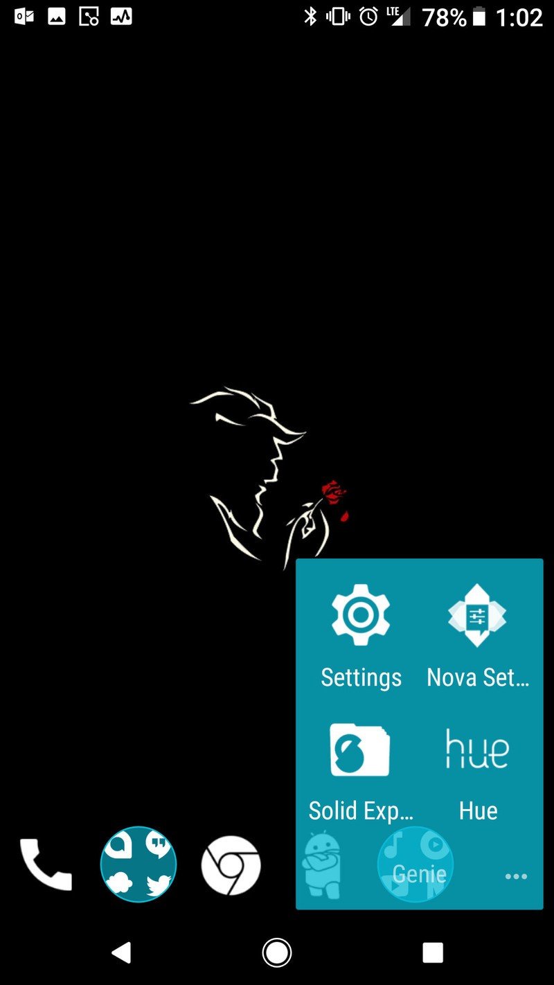
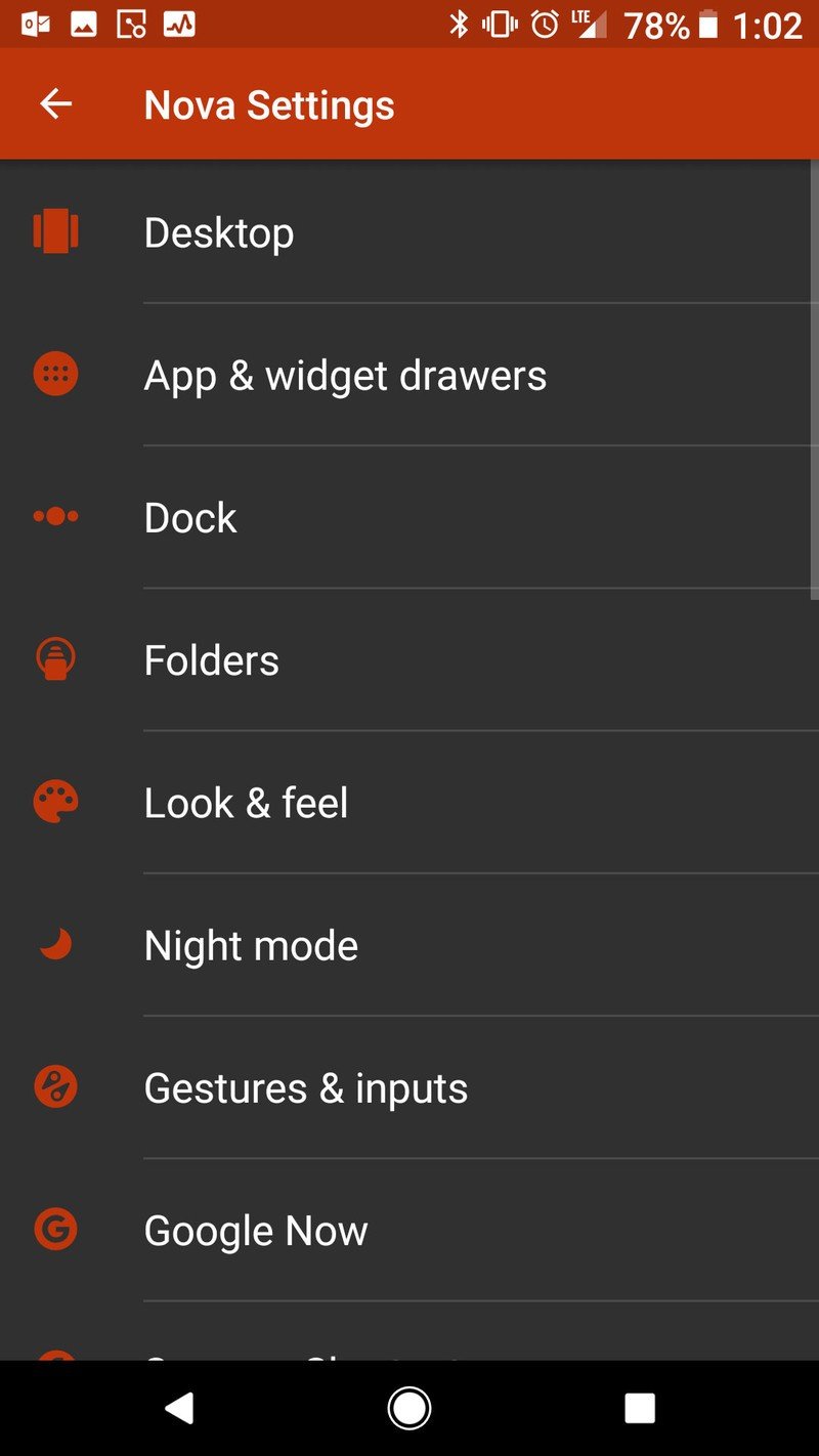
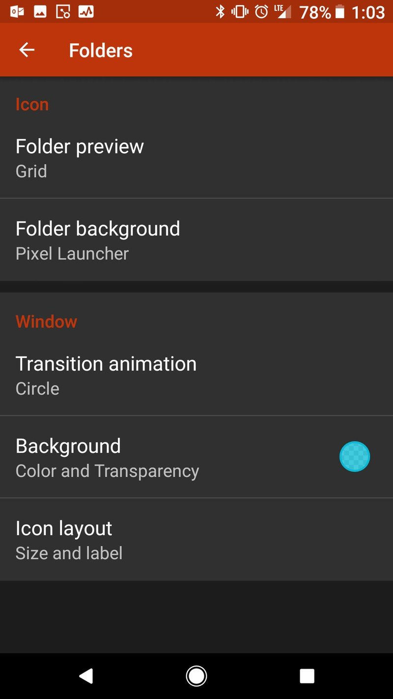
- Tap Pixel Launcher.
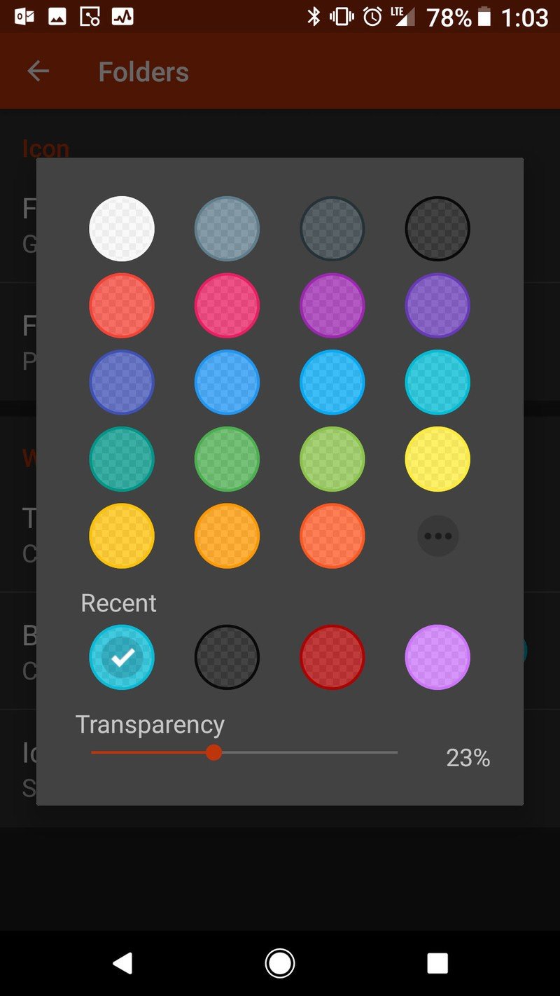
- Under Window, tap Backgrounds.

- Drag the Transparency at the bottom of the window to 0%.
- Tap Black.
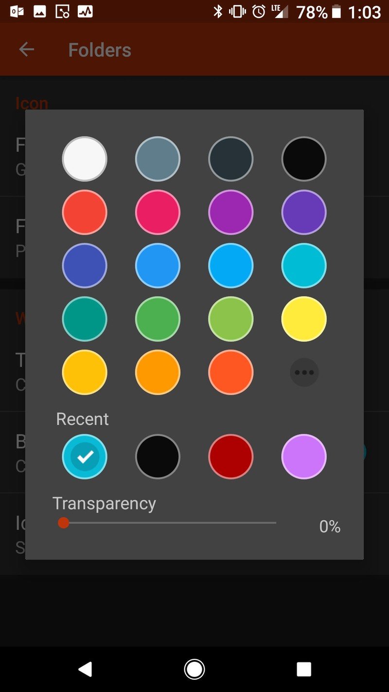
Here's how to theme your folder in Action Launcher.
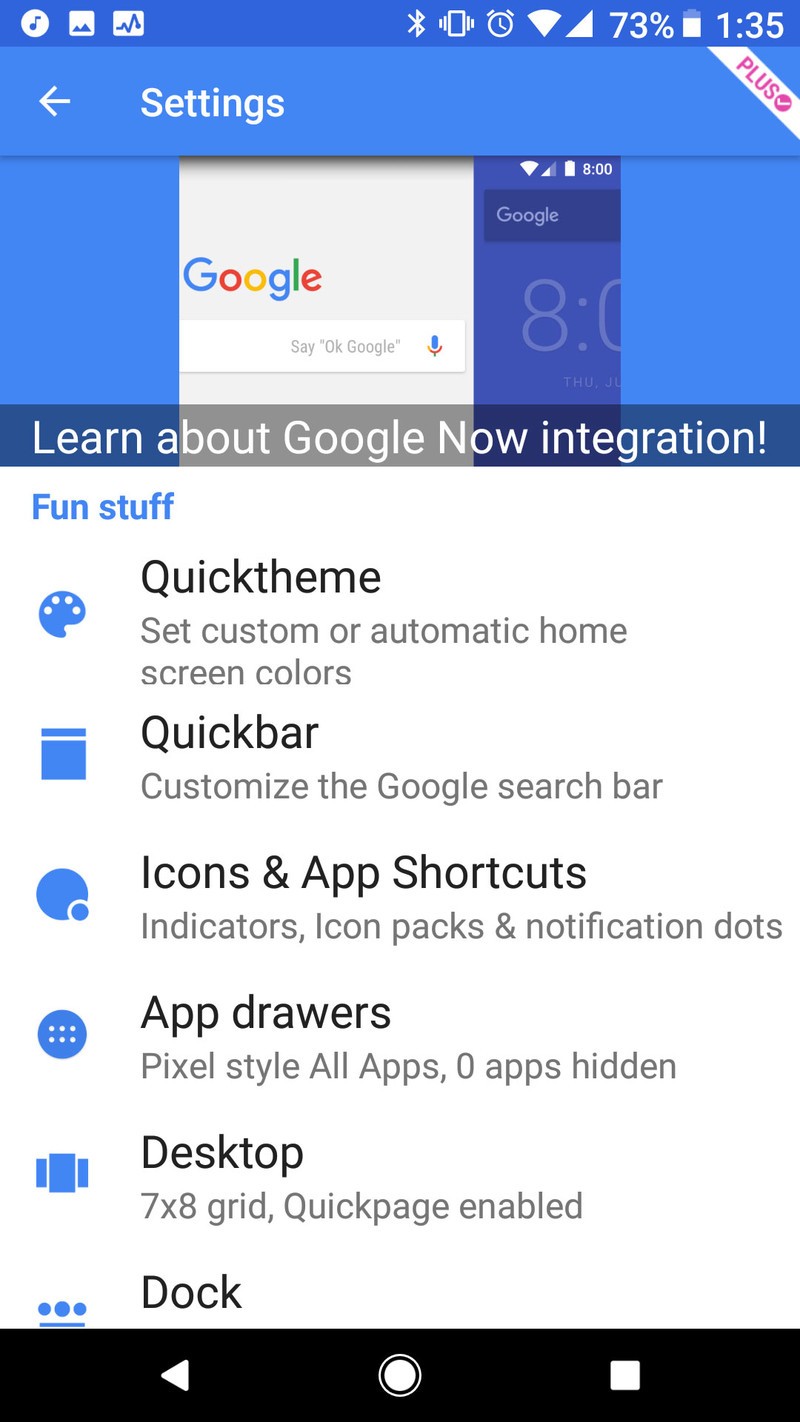
- Open Action Settings.
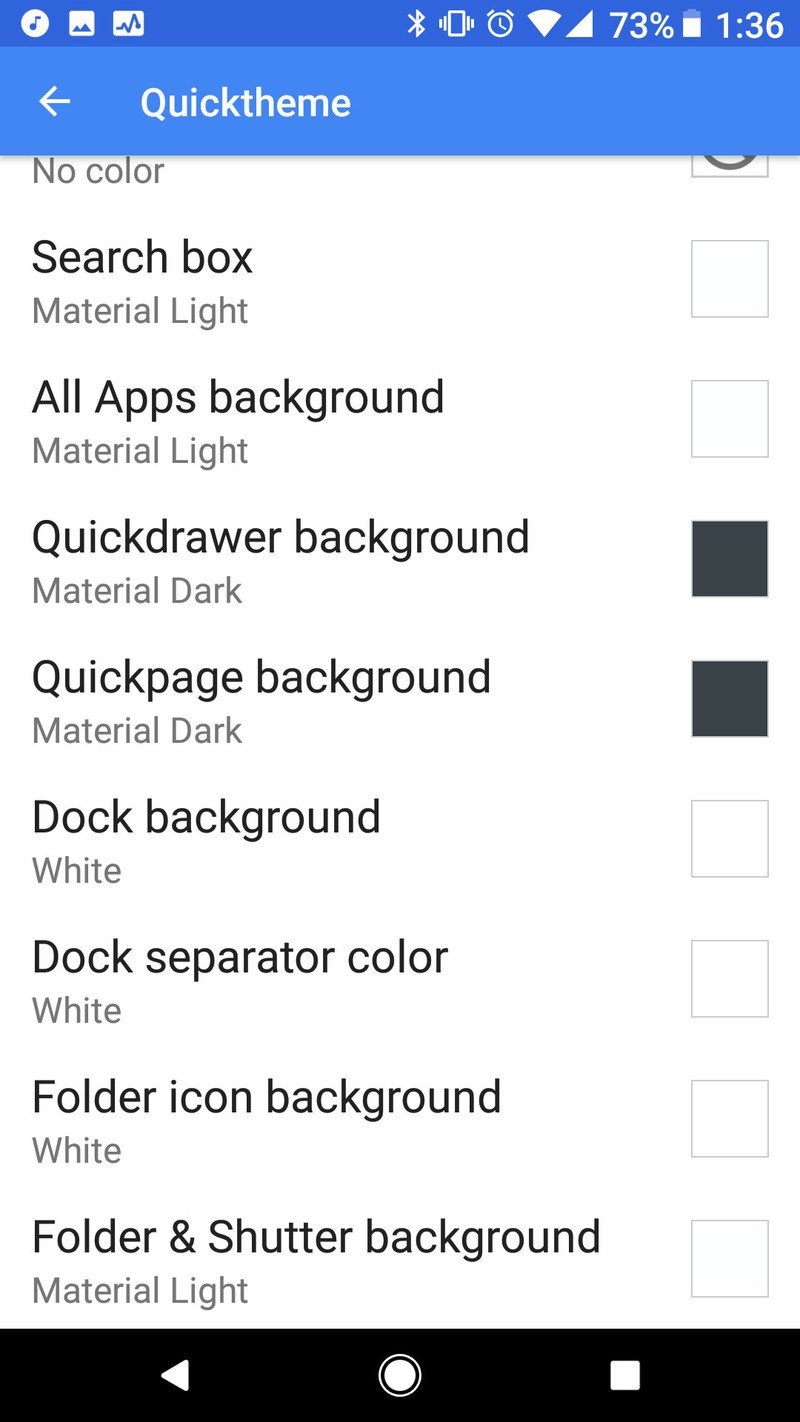
- Tap Quicktheme.
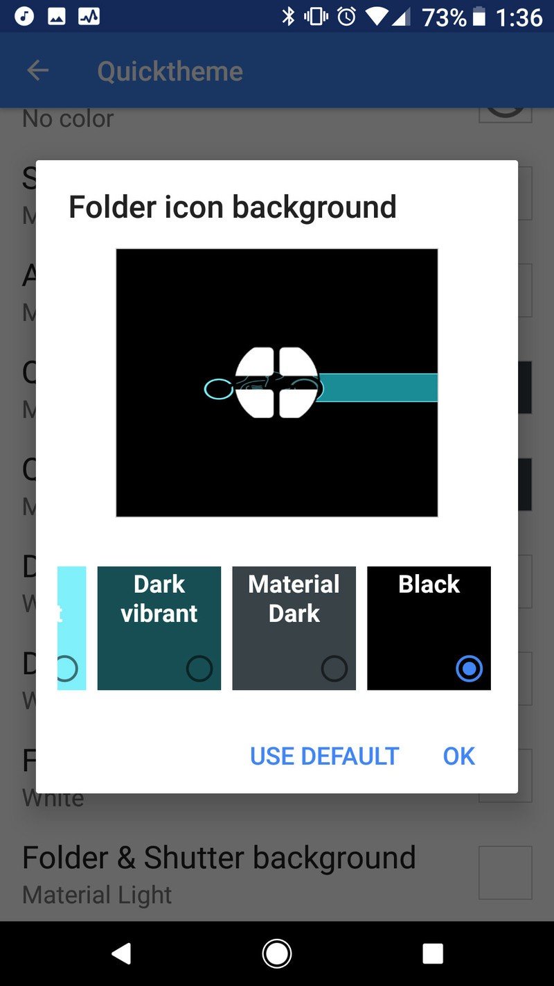
- Tap Folder icon background.
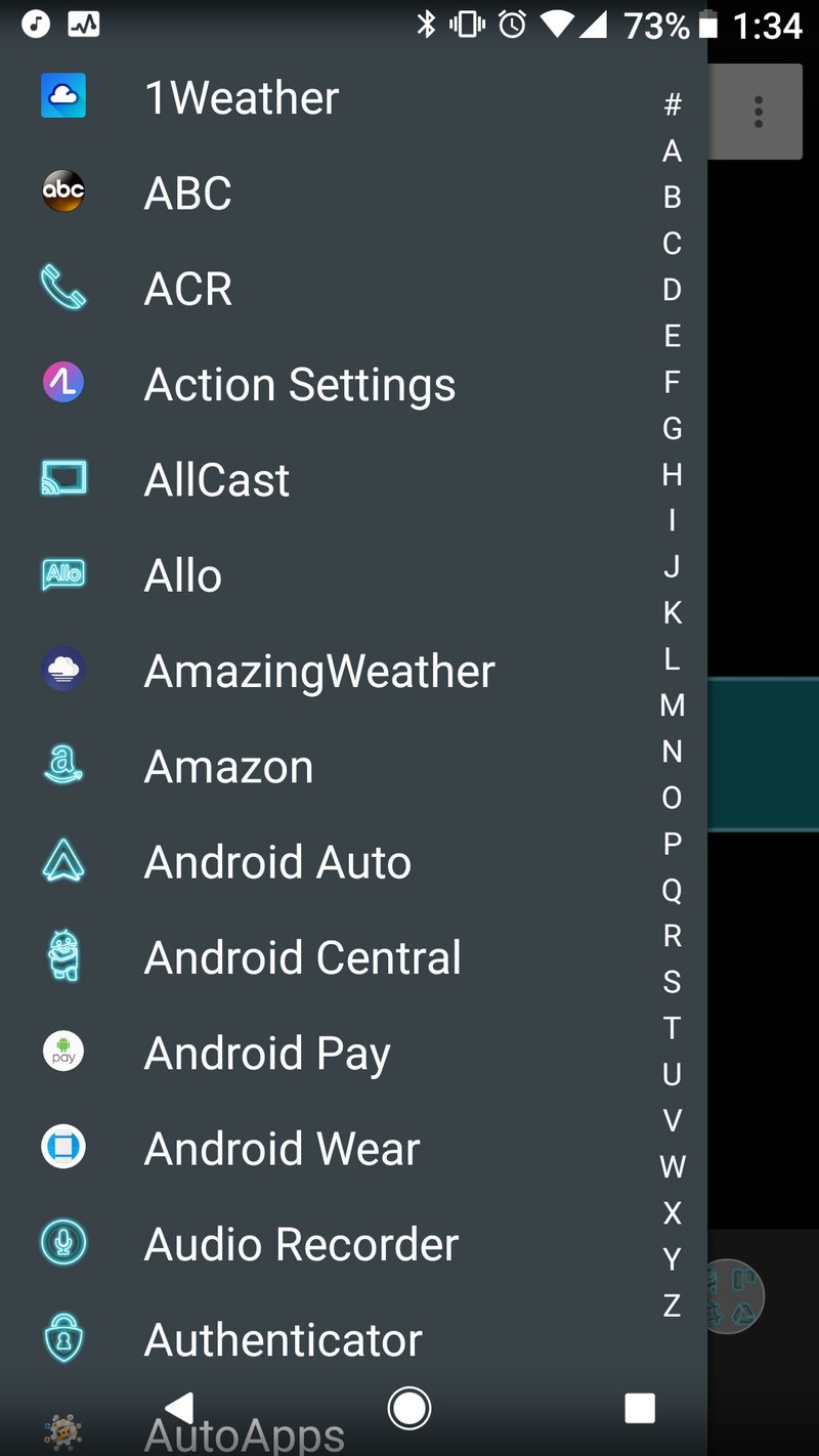
- Tap Black.
- Tap OK.
- Tap Folder & Shutter background.
- Tap Black.
- Tap OK.
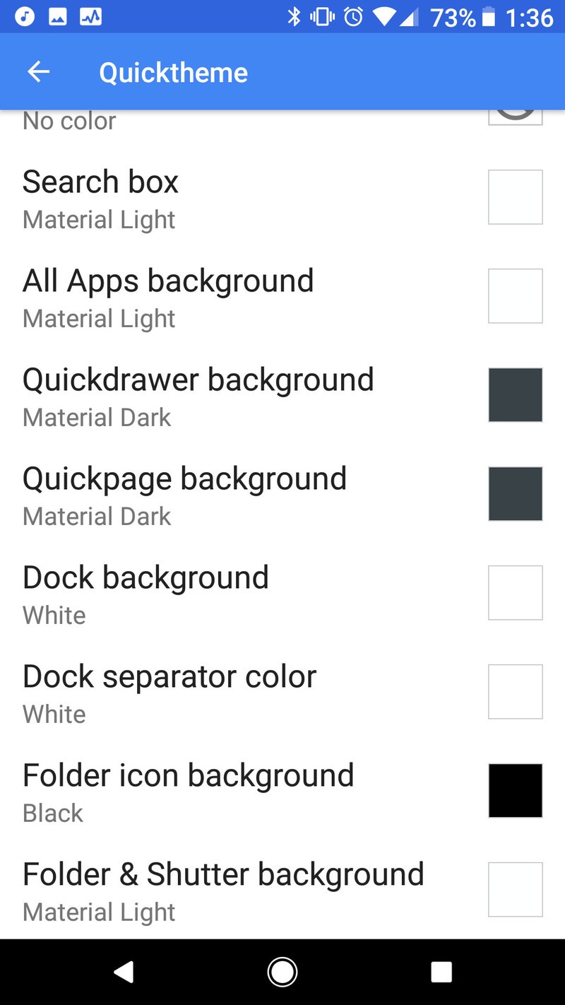
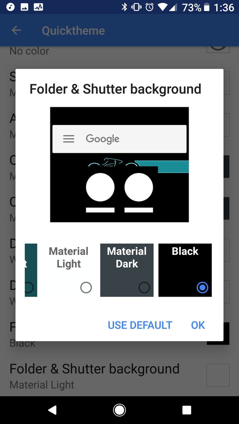
Actually, while you're in that Quicktheme menu, you can pretty well black out your launcher by just going down the whole menu and setting everything to Black.
How far will you go?
There's ways to get a dark theme down to absolute minimum pixels. Some users have completely replaced their on-screen app shortcuts with gesture shortcuts so their home screen is pure black. Some forgo app shortcuts altogether and just search for apps as needed. Some of us are willing to turn on a few extra pixels for some personality in our AMOLED theme. It depends on your level of creativity and devotion.
So… how far are you willing to take a dark theme?
Ara Wagoner was a staff writer at Android Central. She themes phones and pokes YouTube Music with a stick. When she's not writing about cases, Chromebooks, or customization, she's wandering around Walt Disney World. If you see her without headphones, RUN. You can follow her on Twitter at @arawagco.
