Critiquing the Critique: 'ICS Paper Cuts'
Operating systems need to be critiqued. They're meant to be. It helps us all understand more about them, and it gives perspective to those who created it. But Android is not a simple operating system. Even the most savvy Android user can learn something new. And that means that critiquing Android can be even more difficult for someone who doesn't know the OS inside and out. That brings us to the ICS Paper Cuts Tumblr by Grant Paul. He's a "big deal" in the iOS jailbreak community, and rightfully so. This doesn't mean much to normal, non-smartphone-geeks, but it made me read read Paul's critique instead of dismissing it offhand, and I expect it has the same effect on other folks as well. Since he took the time to share what's wrong with something he didn't have any hand in creating, it's my turn to do the same. And I'm going to, after the break.
ICS Paper Cuts sucks. </big loud bold font>
Notice I'm not saying I think it sucks, or saying I have issues with the content and misinformation, I'm saying it's crap and you must agree. Overall, this is my major beef with the ICS Paper Cuts Tumbr. Everyone is allowed to (and should) have an opinion, and lord knows I don't expect everyone to agree with mine, but to present anything that's a writers opinion and come off like it's factual just feels wrong. There are a lot of people who think some of the changes Google made in Ice Cream Sandwich aren't for the better, even some of us here at Android Central. Everyone has his or her own tastes, and the whole UI/UX culture is all based on individual user's likes and dislikes. To put it bluntly, I don't have to like the same layout, fonts, or buttons as anyone else, and I'm not wrong if I don't. And that's one of the great things about Android.
I'm going to ignore all the "style-font-nerd-UI" stuff because, like I said, you can't judge another person's taste. But I'll take this opportunity to give a little input and answer a few questions Paul had. No need to thank me, just agree because I'm on the Internet.
What, exactly, is a “Mediaserver”? Why do I care?
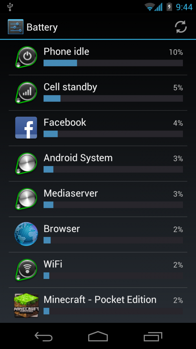
That's a good question, actually. It's a binary file, located at /system/bin/mediaserver. It runs as a service so you can listen to music, play videos, even look at photos. It scans your phone's storage and can get hung if you have a bad media file.
Is it very intuitive in this list? Nope. And that's OK. It's just an entry in the "what's using my battery" screen -- it ran and used some of your battery. Since you're looking at a troubleshooting tool, don't you think you should get some troubleshooting information?
Photos are items, too
Be an expert in 5 minutes
Get the latest news from Android Central, your trusted companion in the world of Android
This menu should say “Select photos” rather than “Select item(s).” If you want to select one photo here, you just tap on it. Therefore, that menu item is only useful for selecting multiple. Secondly, although there can be both photos and videos, the word “item” is unnecessarily abstract. There’s no harm in using “photo.”
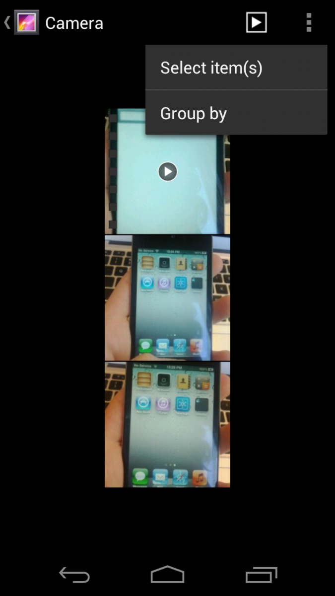
There's no harm in using "item" either. In fact, you point out that you could be selecting photos or videos, so why say "photo"? Shouldn't it say Select photo(s) and/or video(s) if you want to get technical about it?
Welcome to widgets
Everywhere else in the OS takes a single swipe to switch tabs. Here, it takes a variable number to reach the Widgets tab, depending on how many apps you have installed. Instead, the app list should scroll vertically, as in Android Gingerbread, and only require a single swipe to see Widgets.
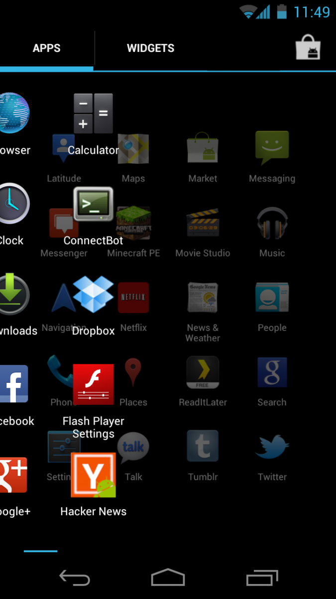
Actually, it takes just two motions here. One tap to open the drawer, another to tap the "Widgets" tab up top there. There's an argument to be made for Paul's suggestion -- Google loves swiping left and right now as well -- just check out the Android Market. But there definitely could be confusion with that in the app drawer.
Long button is long
I can’t see why this button should be the full width of the screen: nowhere else on the phone is there anything like this.
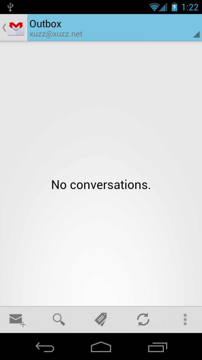
If your e-mail address was "jerry.hildenbrand@androidcentral.com," you would. Seeing the full text in a list (you can have more than one Gmail account) comes in handy.
Twitter is not Android
These buttons in the Twitter app remind me of Android 1.6. They also remind me of how — even in Windows 7 — you have buttons that look like Windows 95. This shit should not be allowed.
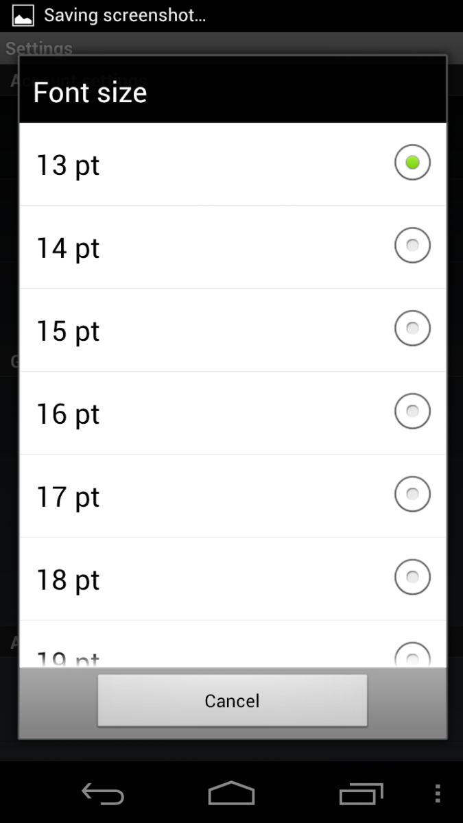
Is "Twitter Paper Cuts" coming next? Surely Paul realizes that Google doesn't write the "official" Android Twitter app, and it does work with Android 1.6, where it fits in very nicely.
Dropbox also is not Android
Another remnant of older Android releases. I understand that Dropbox hasn’t been updated for Android 4.0 yet, but that doesn’t mean that Android can’t show the new style on old UI elements.
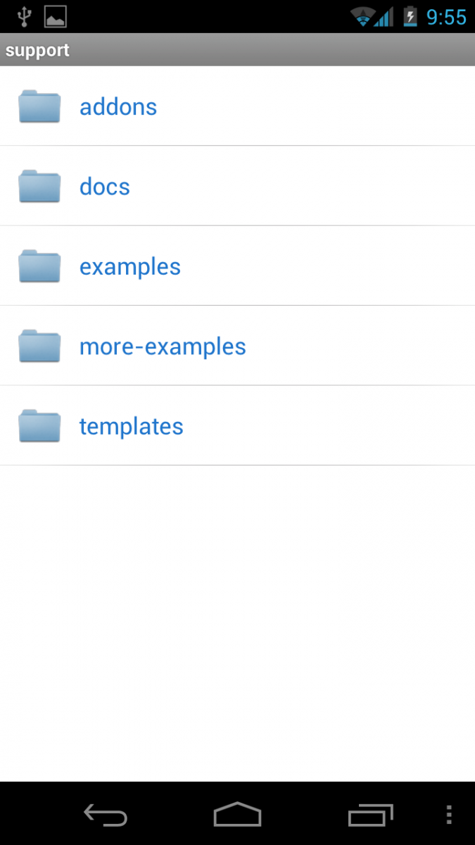
Again -- the Dropbox app isn't written by Google. And the update that has been made with the new visual style looks pretty damn good. But what if I like the old style?
Spelling it out for you
What is “Wi-Fi Direct”? I have no clue, but this popup alert certainly doesn’t help.
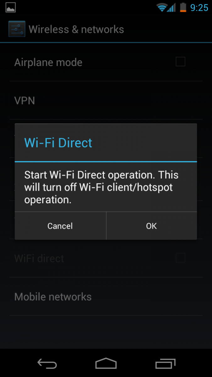
"Siri: What is Wi-Fi direct." It's also covered in the Android 4.0 platform highlights, where people might look to see the advanced features of their new smartphone. And certainly the people in the store selling you your new phone could tell you. Any of these options is preferable to a multipage description that explains the Wi-Fi direct protocol and its capabilities, don't you think?
If you need a cute name, try Airplay.
Tabbing with tabs
Not sure why the Android Market felt the need to completely re-invent the standard tabs UI with ones half the height that you can’t tap on to switch. As seen in the YouTube app, it’s possible to scroll the native tabs horizontally, so that isn’t the issue here. This screen should simply use the standard tab control.
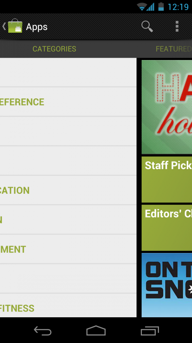
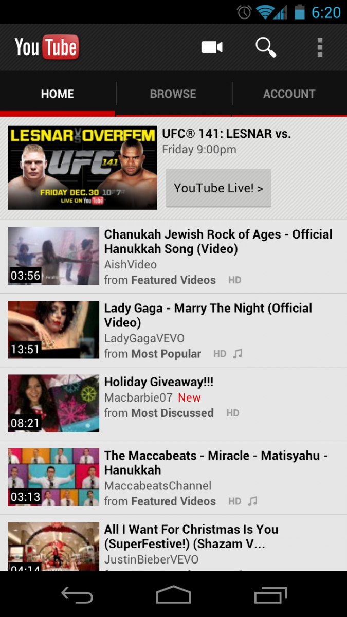
Paul didn't bother actually showing the Youtube app, so we will. And he's right -- they do look a little different. And we agree (or at least some of us do -- we're "open" like that) that we'd like to see a little more consistency between Google apps. (And we bet that we soon will.) But Paul's wrong when he says you can't tap on them to switch tabs. Like on the Widgets tab in the app drawer, we have to wonder if he even bothered to try.
Swipe your thumb left or right in the Android Market -- or in Youtube -- to change views. You didn't like having to tap the "Widgets" tab in the app drawer, why do you want to do it here? And, in fact, on Android's larger screens -- a feature, not a bug -- it makes sense to swipe rather than reach.
Uncle Jerry's point
The point is this: Critiques are good. They're important. And maybe even more so when coming from someone not intimately familiar with what's being critiqued. But they at least need to be accurate. And there are methods to Google's madness. This is not an operating system and apps designed for a single phone -- a point conveniently left out in all of ICS Paper Cuts. What Google's doing with Android isn't easy. But it allows for a flexibility unseen in other platforms and, yes, it means you'll run into a little inconsistency here and there. We guarantee you, Google's working on it.
Besides, we could say plenty (and do) about iOS. Starting with this:
iOS Paper Cuts
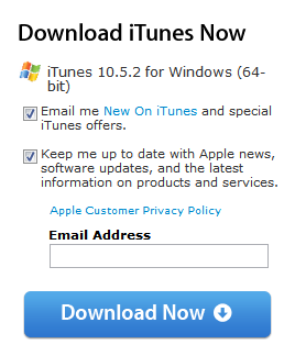
More than a few people would agree with me, but that doesn't mean I'm right.

Jerry is an amateur woodworker and struggling shade tree mechanic. There's nothing he can't take apart, but many things he can't reassemble. You'll find him writing and speaking his loud opinion on Android Central and occasionally on Threads.
