Creating beautiful and functional Android apps: an interview with Stitcher Radio's Tyler Pearson

Get the latest news from Android Central, your trusted companion in the world of Android
You are now subscribed
Your newsletter sign-up was successful
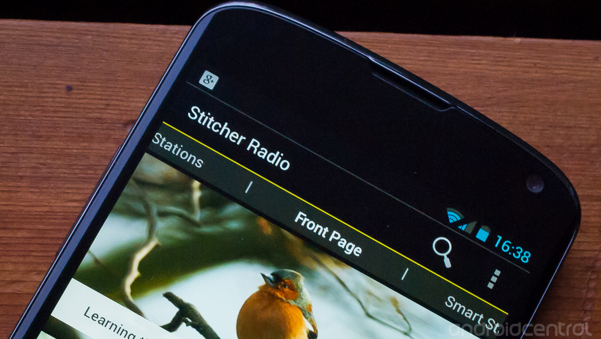
Stitcher Radio, one of the most popular news, radio and podcast apps on Android recently underwent a complete redesign. Lead Android developer at Stitcher, Tyler Pearson, was kind enough to take some time out of his day after the launch of the new app to talk to us. We had a chance to (virtually) sit down and talk to Tyler about their newly redesigned Android app, Google design guidelines and the state of the Android ecosystem.
Stick around after the break and see what he had to say.
How big is the team managing the Stitcher Radio Android app?
Article continues below“Right now we’re two... and a half people we’ll call it. We have one person that works on both Android and iOS. While we were rebuilding the app we brought in some outside help so we were as big as six people for a little while. I’m really proud of what we were able to do, we really only started this rewrite back in September, and in basically 5 months we rewrote it from the ground up.”
How do you manage a complete rewrite and redesign of such a large app?
“Starting around August, we were getting a lot of feedback from users having problems using Stitcher on the newer Samsung devices, problems streaming content, where it fundamentally didn’t work. So we started looking at what the problems were, how we would fix them, and that corresponded really well with timing of ‘hey, we look really out of place, let’s rewrite it, let’s make it look better’. The tools are there to develop really quickly, we’re using standard Android Media API’s, we’re leveraging everything the platform offers.”
What issues, if any, have you seen by having to support so many different devices?
Get the latest news from Android Central, your trusted companion in the world of Android
“We really started noticing issues with Samsung devices once they were upgraded to ICS, and this pretty much corresponded with the release of the Galaxy S3... so we had this massive user base that just couldn’t use our app anymore, so at that point we had to do something.”
Do you test on multiple devices? If so, which ones?
“You have minor differences between devices. We have a fair number of Android users in the office, they all have whatever personal device they have, and then we have a ton of test devices. It’s a combination of the most popular phones at the time, and then phones that we’re seeing issues on through feedback. Over the summer, the Galaxy S3 was a good example... we started seeing lots of feedback of ‘hey I’m having trouble getting content to play on my device’, and we saw this common device having issues so we went out and got a couple just so we could test on them.”
So once you started to dig into it, you decided that if you had to change so much you might as well roll that into the redesign as well?
“We had been talking about a redesign. Our old app, if you look at it, it’s very much an iOS app that’s sort of just ported to Android. This was back in the day before there were any strong design guidelines from Google, anything like that, so it felt old and felt out of place. So we were talking about both of these things independently, then it kind of came to the point where we said ‘hey, why don’t we just rebuild it from the ground up and see what we can do?’.”
You guys have made such huge strides, it doesn’t even look like the same app anymore, it’s clear that you put a lot of work into it.
“We used the Google Design Guidelines as a starting point. We have a really strong in-house design team... they were able to do some amazing things and come up with some neat interactions. I was lucky to work on a project that was not only well designed, but well designed within what the platform gives you.”
The “holo” UI is clearly the future of Android design, does it feel restrictive or does it promote good design choices in apps?
“I think they’re amazing. If you look at the evolution of the Android ecosystem, you sort of had this initial mismatch of ‘hey I want my app to look this way, another app looks completely different’. So I think if you use the design guidelines as a starting point, there’s plenty of room for customization on top of that. You can make the app look and feel like your own, but still make it feel like it fits within the Android ecosystem.”
For such a popular app, how do you go about redesigning it to make improvements, while not alienating existing users?
“Starting this past summer, we started doing a lot of user experience research around our current app... people who had actually used it, Android users who hadn’t used our app, people who are podcast users who didn’t use Stitcher. We did a lot of research basically trying to figure out what people would use it for most, and from there our design and product teams worked hard to figure out how to highlight those features and make them easily accessible. Unfortunately we did have to pull out a couple features to get this release out. There were some hard compromises we had to make, but because we had this research we were able to do that with a minimal amount of disruption.”
It feels like there’s an increasing contingent of people that view “proper” design in Android apps as a positive, and that’s not something that has traditionally been part of the Android culture. What are your thoughts?
“I agree with that entirely. I think that Google really deserves a lot of credit there, they finally have this very strong set of design guidelines. They have obviously spent a lot of time researching what a good app would look like, what it would feel like. They’ve done that in their own apps, they’ve shared that research with us and I think that makes the platform stronger as a whole.”
Was it important to have the web version of Stitcher follow a similar design as the new Android app?
“I think it's great that I can recognize the same colors in both places and navigate around. As an Android developer and user myself, my primary priority was making it look good and work well on Android... looking like the web app is an added bonus.”
Stitcher is so much more than just radio, you aggregate so many sources, has there been any talk of rebranding to just “Stitcher”?
“We’ve redone that a little, even recently. If you notice the splash screen when you start the app it used to be “Stitcher Smart Radio” and now it’s “Stitcher - Radio On Demand”, so we are playing with the branding some. The problem is if you aren’t familiar with Stitcher and you just see “Stitcher” you might not know what it does. The foundation of the company was bringing this “talk radio” experience to your phone, so I think maybe there’s some pressure to keep “radio” in the name.”
You integrate things like talk radio alongside other news and podcasts. When an app does so many things, is it tough to figure out who you’re competing against?
“I’d say we’re 50-percent overlap with podcasting apps, 50-percent with radio apps. That’s a huge market space for us to be in, and I think its a huge opportunity for us... it gives us this nice niche carved out. The problem is if you’ve never heard of Stitcher before, and you’re not really a podcast user, how do we quickly explain what we do?”
Podcasts are still not quite as easy to explain as “radio” to a normal user, wouldn’t you say?
“That was sort of the goal from the start, to distance ourselves from the word “podcast” in a sense, because it’s so much more than just that. We always go back to the analogy of the car radio: where you sit in your car, turn the ignition and the radio turns on and you’re listening to content... it’s sort of ‘zero effort’ on your part. You left your radio tuned to that station, or it’s one of your presets, it’s what you want to listen to. We’re just applying that to more of an on-demand fashion so you don’t have to miss half of a show or try to time your commute for when your favorite show is on NPR.”
So you guys shipped the update, everything seems smooth, are you seeing any issues?
“We’re kind of obsessively checking Play to make sure nothing is going wrong... everything seems to be going smooth so far.”
It's great to get some insight from a developer who has just went through the huge task of rewriting such a popular app. It's impressive to see that just two (and a half) main developers can make such a big change in a relatively short time. It's also reassuring to know that Google's new design guidelines and tools are being seen (and used) in a positive light by the developers.
With this update, Stitcher Radio has put itself back on top of the list of highly functional and beautifully designed apps available in the Play Store today.

Andrew was an Executive Editor, U.S. at Android Central between 2012 and 2020.
