Chromebook vs. iPad: Closer than ever to being actual computers
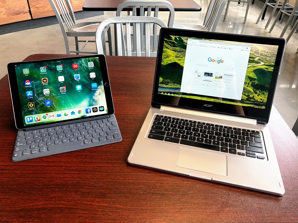
It should be abundantly clear by now that Android tablets are never going to catch on. Instead, it looks more and more like Google is positioning Chrome OS with Android apps to fill that space. Chromebooks have been tremendously successful in the quest to replace the traditional computer over the last couple of years, especially in school settings. At the same time, Apple's iPads are the only reason the tablet market continues to exist today. Lots of people own iPads, and many claim these tablets are just fine as a replacement for a computer.
To get a feel for what Chrome OS and iOS offer people who want an alternative to their computer, I spent a week using nothing but a 10.5-inch iPad Pro with a keyboard cover and an Acer Chromebook R13 Convertible. While I didn't find either of them to be a computer replacement for me, in many ways both Google and Apple are damn close.
Hardware
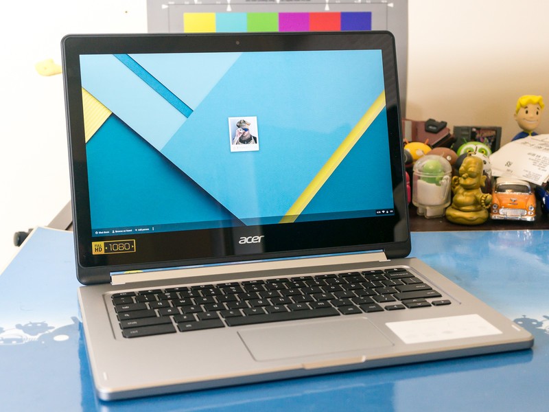
While Chromebooks come in a lot of different options, from a lot of different companies, including soon a keyboard-free tablet form factor, these machines are by and large an inexpensive PC. Google offers the premium Pixelbook for those eager to shell out that much money, but most of the time what you are buying is a fairly standard laptop or convertible with a unique operating system on board.
You can find decent Chromebooks for not a lot of money, whereas the cheapest iPad and keyboard costs close to $400.
This Acer model is an excellent lower-end Chromebook with a fair look at what you can expect from most Chromebooks, by which I mean it's an OK laptop with an okay-ish experience. The body has tons of ports, so I can attach a flash drive or a printer or a microSD card if I want. The display, speakers, and camera are ok but not exceptional in any way. The keyboard is nice for a laptop keyboard, but the trackpad is pretty gross compared to just about everything. The convertible hinge makes flipping between laptop and tablet super easy, and the design is just bulky enough to convince me it will survive a drop or two without any serious damage.
Where this machine really stands out is the battery. Rated for 48Wh, this battery gets me through two full work days before it needs to be charged. And since it charges via USB-C, I can charge it with the same cable and battery and wall plug I use with my phone.
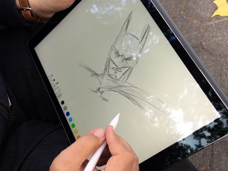
Apple's iPad Pro comes in two sizes, and choosing between the two has everything to do with how you intend to use it. I did not need the 12-inch version, but the smaller 10.5-inch iPad Pro travels with me quite well. It's super thin and ridiculously light, with a beautiful display and surprisingly loud speakers. The only port is the Lightning port on the bottom, and the headphone jack is at the top, but there are adapters for connecting flash drives if you need one.
USB-C charging makes all the difference.
To type on this, I need to attach the $160 Smart Keyboard or try to use the virtual keyboard. Imagine the stuff on the outside of a regular iPad cover over a set of small keys, and you've got some idea of how this feels. The individual keys are decently spaced apart, making typing even on the smaller keyboard surprisingly comfortable. The wedge design lets you comfortably use the iPad like a laptop on your lap, but it removes the ability to control the angle the screen sits. There are other cases which offer a little more flexibility, but they're not nearly as lovely as this keyboard.
Be an expert in 5 minutes
Get the latest news from Android Central, your trusted companion in the world of Android
Battery life on the iPad Pro 10.5 is enough to get me through a work day, but not usually enough to get me through much more than that. Apple claims the 30.4Wh battery in this model will get you up to 10 hours of use, but when you've got more than one app running on this machine that battery drains quite a bit faster. The good news is you can charge these iPads fairly quickly with a USB-C to Lightning cable and a Rapid Charging adapter. Unfortunately, Apple doesn't include either in the box with the iPad Pro 10.5, and the included charger isn't particularly fast.
Software
Apps rule the world these days, but there's a lot of discussion around how much "work" you can do in an app-only ecosystem. Many of the apps Chromebooks and iPads have access to were designed with Android phones or iPhone in mind, and not built to support a workflow where you're using the app for hours on end to get a big project done, right? These days this is less true than you might think, but there are still some usability issues with both platforms.
Chromebooks started out by giving you Chrome as the only interface, and nothing else. This works for several groups of people, since so much if done in the browser these days anyway. Recent builds of Chrome have way more features, including offline mode for people who aren't connected to WiFi and access to a vast majority of Android apps available in the Google Play Store. This means I can use the mobile version of Adobe Lightroom, which gives me the ability to edit RAW photos and syncs everything back to my desktop. While it's not exactly as capable of the Desktop Lightroom, it's way better than most alternatives. Having access to a full desktop browser is something you don't get on mobile devices, no matter what platform you use. When you add Android apps to this, you get a healthy mix of usability options.
It's common to dismiss iPad as just big iPhones, but when you attach that Smart Keyboard and dig into apps you get quite a few features that don't exist on the phone yet.
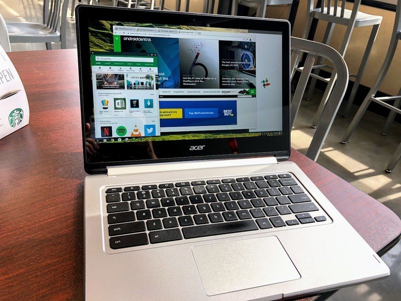
For example, instead of letting Slack and Trello live in browser tabs on Chrome OS, I can give them their own windows and let them run as Android apps. These windows snap in place quickly so I can switch between them with a tap or a click, and everything I see on the screen is running in the foreground. I can control how big each window is on the screen, offering up quite a bit of flexibility in setting up my experience. I can get crazy and have 10 apps open on my desktop, or keep it simple and focus on getting work done.
Unfortunately, a lot of this experience disappears when you turn the Chromebook into a tablet. When the keyboard goes away, Chrome OS turns all of the Android apps into full-screen apps, which means I now have a big clumsy 13-inch Android tablet that also has Chrome. This is not ideal, and something Google is working to fix in the next couple of Chrome OS updates. Updates, by the way, are one of best things about Chrome OS. They are constantly rolling out, install with the greatest of ease, and every Chromebook gets the update as soon as it is available.
It's common to dismiss iPad as just big iPhones, but when you attach that Smart Keyboard and dig into apps, you get quite a few features that don't exist on the phone yet. Apple has implemented split window support on iPads so that you can run two apps in side-by-side windows. When these apps are stuck to one another, they stay stuck even when you leave the apps to run something else. You can come back to those apps days later, and they will both be there just as you left them. In some cases, apps that are stuck side-by-side like this have file sharing features to make it easy to send things from one app to another.
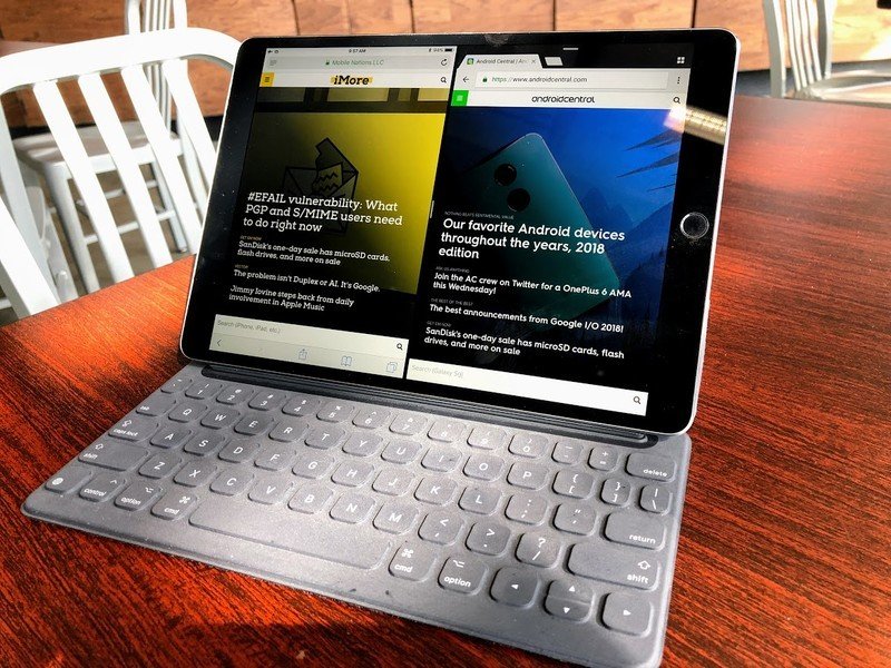
You can also combine split window with picture-in-picture, which means I can have a video playing in the corner while I'm photo editing and keeping up with my co-workers in our group chat. Suddenly the app-driven experience that was once limited to a single app on the screen at a time is now running three apps simultaneously with adjustable app sizes for each. On a 10-inch screen, that's a lot to have running all at once and easily dismisses any feelings that this experience isn't a "real" computer while using it.
But it's not perfect. For starters, very few apps support all of these features. The Apple apps will, of course, but deviating from that frequently causes problems. Splitting the screen with another app required a lot of trial and error, as well as having the app in my dock for convenient switching. Not every video app supports picture-in-picture either, which causes other problems. It's not a universal experience, and that means you have to work to find the apps which support the workflow you want to create.
Summing it all up
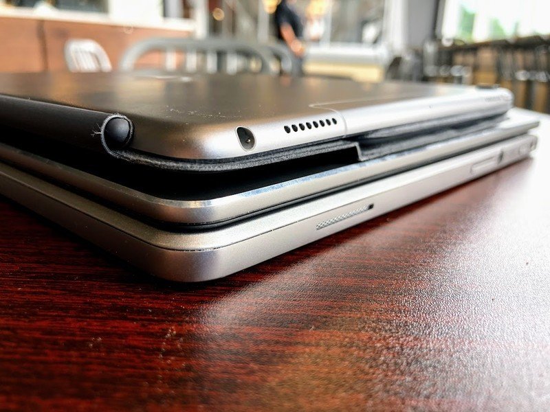
I reject the "real work" argument against Chromebooks and iPads, but there's a lot of improvements needed to make these experiences feel polished. If Google is planning to go all in with Chromebooks as tablets, the software needs to be a lot more flexible in that tablet mode. Before I reach for an iPad to take with me as my only computer, I need a way to know what apps are optimized for my workflow before figuring out the hard way. The irony of my conclusion isn't lost on me; iPads make great tablets which sort of make OK computers in a pinch, where Chromebooks make great laptops which sort of make ok tablets in a pinch.
But if I were to choose between the two experiences right now, I'd go Chromebook without hesitation. Having access to a full desktop browser is a huge deal, and the things you can do in that browser on a Chromebook simply can't be done on an iPad. Being able to create my own filenames shouldn't be something that requires a hacky workaround, but Apple has no native solution for this seemingly obvious thing. Safari on the iPad still opens many websites in mobile view by default, and when the answer to that problem is "just use the app" there needs to be a guarantee that app isn't also offering a mediocre experience.

