Chrome OS media controls are about to get a lot more like Android's

What you need to know
- Chrome OS's media controls might soon look a lot like Android's.
- Google last revamped them with the big Chrome OS 89 update.
- A new change may seem them gain a more advance scrubbing bar as well as a background matching color theme.
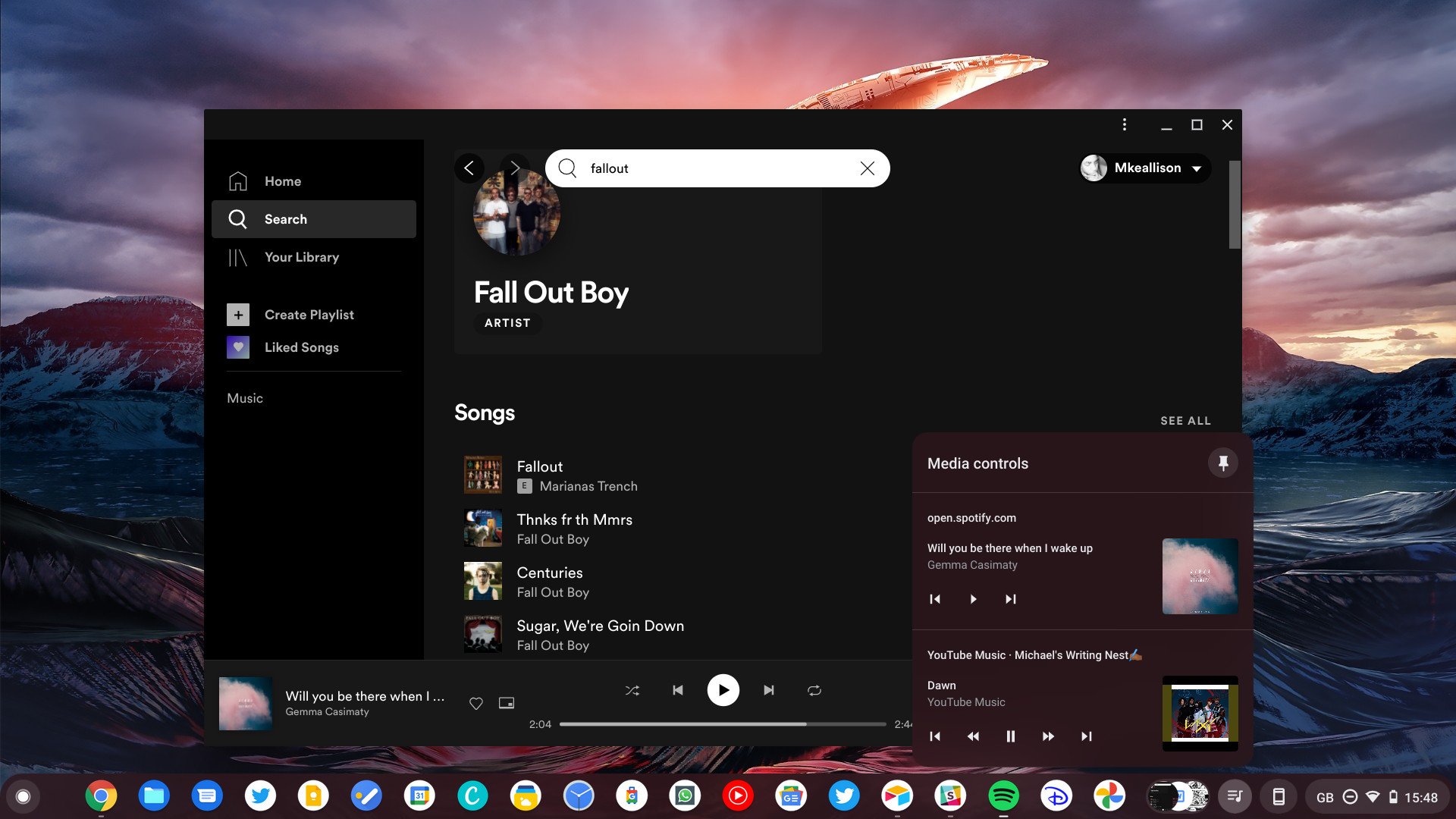
Google is working on a revamp of Chrome OS's media controls shortly after redoing them for Chrome OS 89. The company had given them a modern overhaul in the latest Chrome update and allowed users to pin them to the taskbar alongside its new tote feature.
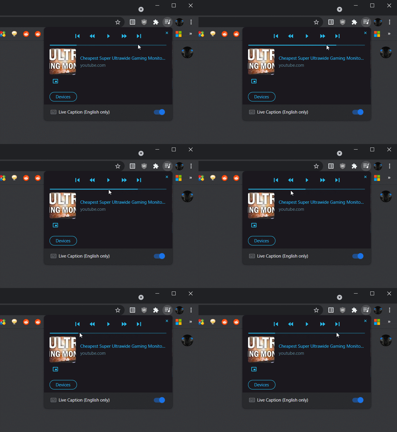
Now, the company plans to go a bit further as spoted by users on reddit (via Android Police). There are a few things to note. First, there's the scrubbing bar. While you can skip forward or backward on a Chromebook currently, you can't currently scrub like you can on Android. That's going to change.
Second, Google is going to make the background color dynamic and have it match the color of the album being played. This used to be the case in older versions of Chrome OS before Google's revamp, so it's more like Google is reverting to type here than adding a new feature entirely.

The earliest users can expect to see this is in Chrome OS 91, so that's set for May at the earliest even with Google's new sped up Chrome update cadence.
In the meantime, you can try this by finding the flags at "chrome://flags/#global-media-controls-modern-ui" if you're on test versions of Chrome OS 91 or Chrome 91 for Windows or macOS users.
Chrome OS's media controls are already pretty good with Chrome 89. This just refines the experience. Though you'll still need to be using one of the best Chromebooks around to get the best media experience, but that just goes for all operating systems regardless.
Be an expert in 5 minutes
Get the latest news from Android Central, your trusted companion in the world of Android

