Chameleon launcher review
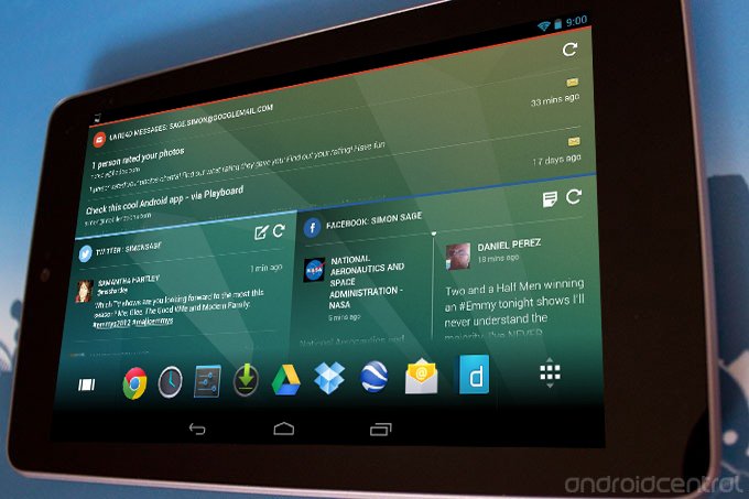
Following a successful Kickstarter campaign, Chameleon released its widget-heavy launcher for Android tablets last week. The unified look and feel of the widgets make for a great show, and the context-based triggers for home screen launches are cool, but how easy is it to get along with most of your apps tucked away in a dock?
Style
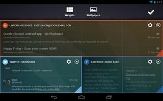
Chameleon earns high marks for style. Animations from one home screen to the other are sharp and responsive, and scrolling through content in the widgets is perfectly smooth (though a bit more notification that one is reloading after you pull to the top would be nice). The widget layouts shift to portrait or landscape orientation as appropriate, though content isn't always ideally adapted. For example, a long thin column e-mail widget in portrait is a full-width column in landscape that only really fits one e-mail at a time. Less extreme proportions tend fare the transition much better.
Function
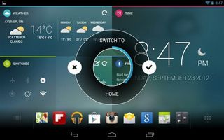
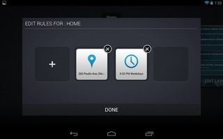
Chameleon earns its name by automatically switching to home screens when you enter a specific Wi-Fi zone, approach particular GPS coordinates, or the clock strikes a certain hour. This is a nice start, but I would like some more refined control over those triggers, even if they're still limited to GPS, time, and wireless network. For example, I'd like Chameleon to switch to a different home screen when I leave a Wi-Fi network (either a specific one or any network). Some boolean logic would be nice too, so certain screens could launch if I'm at a particular location and it's a certain time of day. When the triggers are reached, a pop-up prompts you if you want to make the switch, giving options to cancel or go ahead and initiate it, or Chameleon will just go ahead and do it after about five seconds of no input.
The widgets offered at launch include Twitter, Facebook, Instagram, YouTube, Gmail, RSS feeds, power switches, time of day, and weather. That might be a little limited, especially if those are the only things you have to max out five home screens, but Chameleon has a development environment that allows just about anyone to cook up their own widget.
The biggest limitation for these triggered home screens is that there's only one screen for each scenario. HTC's Scenes changes an entire set of home screens, which I generally find needed if I'm going to be using a bunch of widgets and a wide variety of apps.On the plus side, switching between home screens (or dashboards, as they call them) is the same as ever - just swipe left or right. There's an overview mode from which you can add new dashboards (up to five), delete existing ones, and edit conditions for their launch.
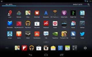
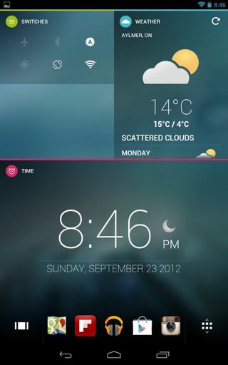
The bulk of each home screen is populated exclusively by widgets, while app icons stay in a dedicated dock along the bottom. Unlike the standard system dock, it's not limited to four or five, and can scroll horizontally to access as many icons as you like. Unfortunately, there's no folder mechanism here, which would cut down on excessive scrolling, but seeing as the dock changes as you switch home screens, enabling to you set up the most useful apps for any particular use case, plus the whole standard app grid is available through one of the on-screen buttons.
Wallpapers need to be imported manually from the Gallery app through the Share menu in order to show up as options in Chameleon, which is a bit of a hassle, but not a deal-breaker by any means.
Be an expert in 5 minutes
Get the latest news from Android Central, your trusted companion in the world of Android
There are a few serious usability limits on the individual widgets. Tapping a specific item in an e-mail widget doesn't load up Gmail to that message, or even the right mailbox if you have multiple accounts loaded up. Facebook and Twitter widgets will only launch into the native apps, no third party ones you may prefer. If they aren't installed, you get shunted to the web browser. For whatever reason, the Facebook widget needed regular re-authentication.
The Good
- Sharp design
- Innovative and useful trigger system
The Bad
- Some usability limitations
- Relatively high price
The Bottom Line
It takes a bit of mental rewiring to get used to home screens that are predominately full of widgets instead of shortcuts to apps, but the challenge does get you to rethink how you use your Android tablet; instead of just being a side-show, the widgets are the main event.
For $10, Chameleon may still be a little bit too much of a work-in-progress for some people, considering there are some fully-matured free ones, and even the big-name premium launchers only cost $4. Once Chameleon has a wider set of widgets available, the trigger system is fleshed out a little more, and the price is dropped a few bucks, Chameleon stands a good chance of having a long and healthy life in Google Play; who knows, maybe we'll even see a version cooked up for smartphones someday.
