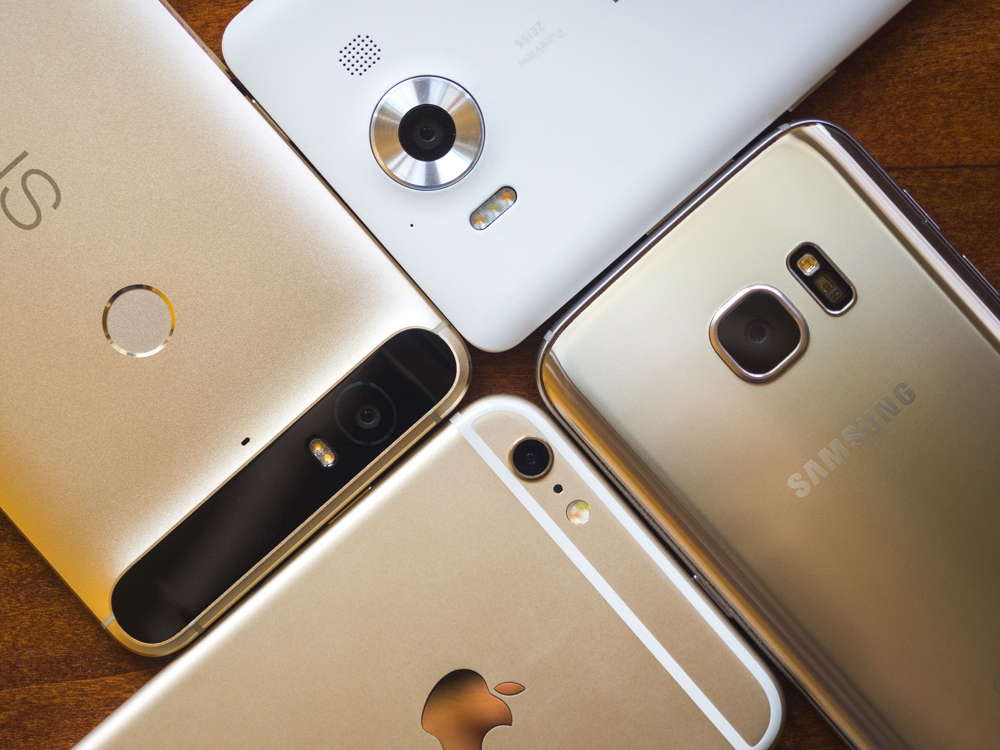
Recently a new smartphone waltzed onto the scene, throwing a gauntlet to the ground: we have the best smartphone camera, Samsung said. There are already some excellent smartphone cameras out there — we learned that from our previous smartphone camera showdown, and with the new entrants into the field the time has come to do a proper comparison between them all. So let's do this: it's Apple iPhone 6s Plus versus Huawei Nexus 6P versus Microsoft Lumia 950 versus Samsung Galaxy S7 (otherwise known as the challenger and the new kid on the block).
Why these phones?
We went with four phones for this cross-platform showdown to keep things simple, picking what we know to be among the greatest and latest cameras. So there's the iPhone 6s Plus, which has the same sensor and lens set up as the smaller iPhone 6s, but adds in optical image stabilization for improved shake reduction and better nighttime shots.
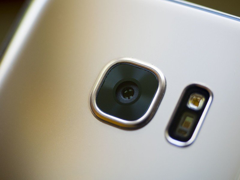
On the Android side there are so many phones to chose from that we went with the big brother of the barely winner from the last time around: the Huawei Nexus 6P. It has the same sensor and lens system as the smaller LG Nexus 5X, but the Nexus 6P has a more powerful processor and picks up electronic image stabilization in the process.
Article continues belowThe Samsung Galaxy S6 was one of the strongest contenders the last time we did this, so it was only natural to include its successor: the Galaxy S7. It sports a wider aperture and a sensor that's larger yet packs fewer pixels for a claimed dramatic improvement to nighttime performance. Both the 5.1-inch Galaxy S7 and the 5.5-inch Galaxy S7 edge have identical cameras, so we went with the slightly more pocketable S7 standard.
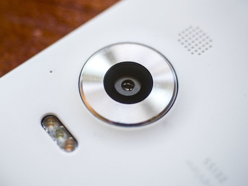
Lastly, there's the Microsoft Lumia 950. The flagship Lumia phones have always had incredible cameras, and the Lumia 950 promised to pick up that torch and keep running with it. It packs a 20MP sensor behind an ƒ/1.9 lens with OIS. And unlike the other phones on here, there's a dedicated camera button to make launching faster and easier. (OK, Samsung allows for a double-tap of the home button.) Like the Samsung sister phones, the Lumia 950 and its bigger 950 XL sibling have the exact same cameras.
The LG G4, another strong contender from last time around, was left out of this round. With the LG G5 coming soon, it didn't seem fair to include last year's model in this comparison. Fret not, we'll come back to it all again when the G5 finally arrives.
How we shot
Over the course of a few days we took these four phones to various locations to try them out in a variety of settings. While a few feature advanced manual controls, we left each camera in full automatic mode with automatic HDR enabled. Keeping with the expectations of how you would use a smartphone camera, we shot every photo hand-held. The only alteration made to any photo before uploading was resizing as needed.
Get the latest news from Android Central, your trusted companion in the world of Android
Technically, yes, both the Galaxy S7 and the Lumia 950 offer the option to shoot with manual controls and spit out RAW image files that are better for editing than the JPGs we know and love. But, the truth is most people who buy these phones aren't going to bother with manual modes — they're daunting and finicky and RAW files take some time to fully wrap your head around. There are apps available for the iPhone and Nexus 6P that add some of those controls, but again, that's not a thing a "normal" person is going to be include to do.
And let's be honest: If you're the kind of person who cares about setting your white balance, fiddling with the ISO and tweaking the shutter speed, then you already know what phone you want when it comes to the camera. Fact is, you probably don't want to do any of that on a phone at all — you want a real camera with real controls and a nice big sensor and lens to go with it.
You can shoot some really nice photos with a quality smartphone on auto. We're not professional photographers, and we don't expect you to be either. But if you want to get technical with your smartphone, there are phones that'll let you do that.
Spec showdown
One final thing before we dive into the photos: let's talk specs.
| Category | Apple iPhone 6s | Huawei Nexus 6P | Microsoft Lumia 950 | Samsung Galaxy S7 |
|---|---|---|---|---|
| Megapixels | 12MP | 12.3MP | 20MP | 12MP |
| Resolution | 4032x3024 | 4000x2992 | 4992x3744 | 4032x3024 |
| Aspect Ratio | 4:3 | 4:3 | 4:3 | 4:3 |
| Sensor Size | 1/3" | 1/2.3" | 1/2.4" | 1/2.6" |
| Pixel Size | 1.22μm | 1.55μm | 1.12μm | 1.4μm |
| Aperture | ƒ/2.2 | ƒ/2.0 | ƒ/1.9 | ƒ/1.7 |
| Focal Length | 29mm | 29mm | 26mm | 26mm |
But what do all those numbers mean?
Megapixels is shorthand for the total number of pixels on the camera sensor. The pixels are arranged in a grid, with "1 megapixel" meaning "1 million pixels." So the Lumia 950's 20MP camera has 20 million pixels on it. More megapixels equal a more detailed image. Smaller-resolution photos might look fine on your phone or computer, but once printed at poster size they might fall apart in quality. Thankfully, the minimum 12MP sensors we're looking at here have enough detail that an 8x12-inch print would look fantastic, and even a full 24x36-inch poster would look pretty good.
Resolution is essentially a different way of looking at the pixel count. Megapixels are computed by multiplying the horizontal pixel count by the vertical pixel count, and those two numbers just so happen to be the resolution.
Aspect ratio is an abstraction of the resolution that will give you an idea of how "wide" an image is. Your smartphone, computer, and TV all likely have 16:9 displays, which is to say that for every 16 units on the long side, you'll find nine on the short side. The 4:3 aspect ratio is a more "traditional" shape, narrower but taller, and what were used to from old film photography and pre-HD televisions. Most phones give you options for aspect ratios and total resolution.
Sensor size is a the physical size of the sensor. Having more megapixels doesn't necessarily mean you have a larger sensor, it might just be more but smaller pixels packed into the same space. Sensor size is measured in fractions, to the larger the number (i.e. the smaller the denominator), the larger the sensor. Of our four phones, the Nexus 6P has the largest sensor while the iPhone 6s has the smallest, but they're all fairly close to the same size — just 0.1 inches separate the two.
Pixel size is where sensor size and megapixels meet — it's a measure of the actual size of the actual individual light-sensing pixels on the sensor plate. Because we're talking about putting millions of pixels on a plate roughly the size of your pinky finger nail, we measure these in micrometers (μm). The larger the individual pixel, the more light it collect, and thus the better quality and brighter image it should able to produce. Still, we're talking about impossibly small things here — the Nexus 6P has the biggest pixels in our comparison at 1.55μm, and that's still 1/50th the width of a human hair. In a word: tiny.
Aperture is the size of the opening through which light flows to the sensor. It, too, is expressed as a fraction (the ƒ is standing in place of the number 1). The larger the number, the wider that opening, and thus the more light that gets through. (Because of this fractions thing, it seems a bit backward. An aperture of ƒ/1.7 lets in more light than ƒ/1.9 — because fractions.) A consequence of the wider aperture is a narrower depth of field — the range in front of and behind your focused subject that will also be in focus.
Focal length is a holdover from the olden days of film cameras, measuring the distance from the lens to the film. In essence, it's an indicator of how wide your photo will be, except that it's an inverse — the longer the focal length, the narrower your field of view. Think of it as looking through a tube — the longer the tube, the less of what's on the other end you'll be able to see.
The Photos
Okay, let's get to it. We've laid out the photos in a grid so you can easily compare them side-by-side. They are arranged in this order: iPhone 6s, Nexus 6P, Lumia 950, Galaxy S7.
Indoors

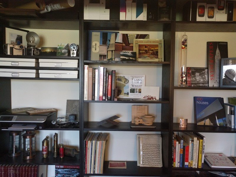
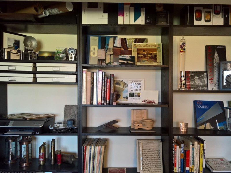
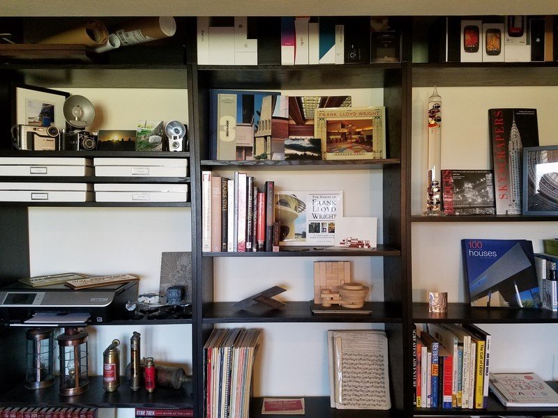
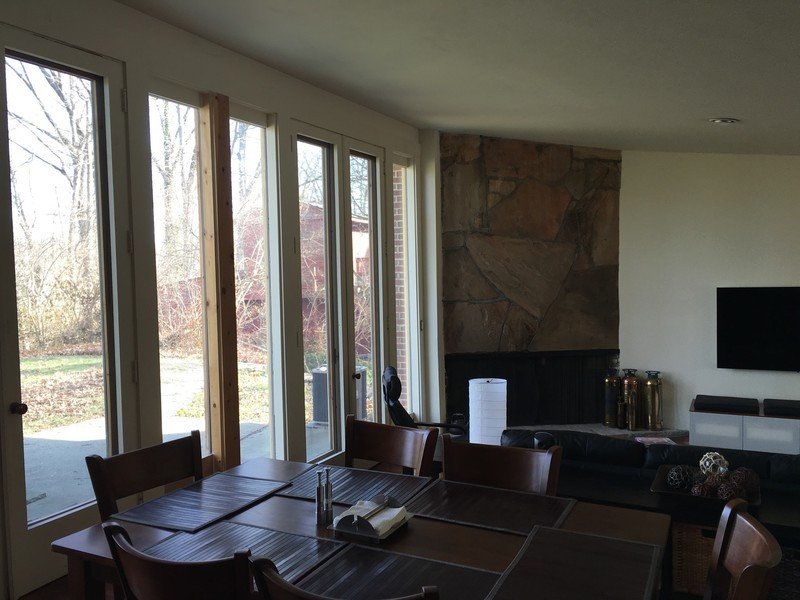
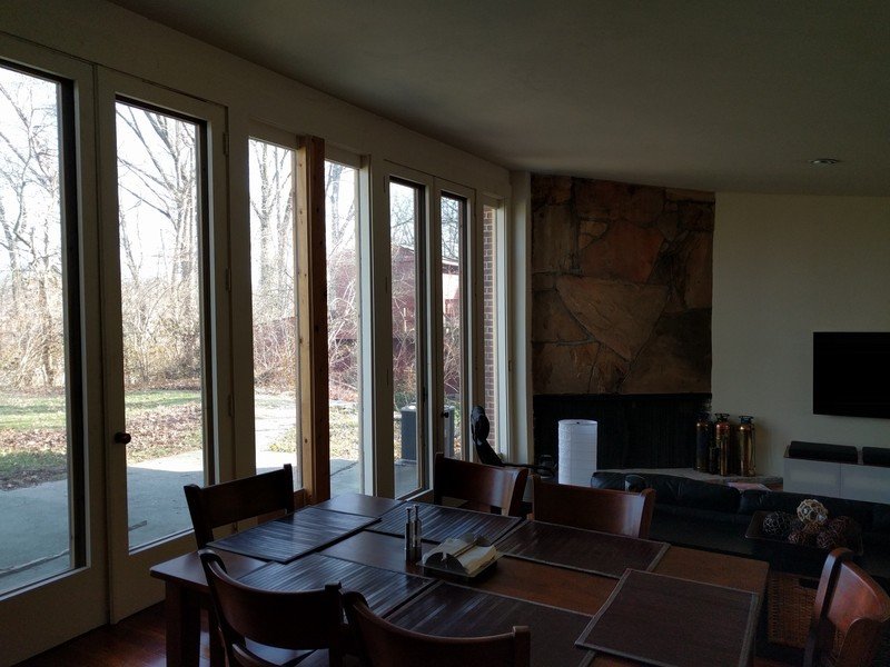
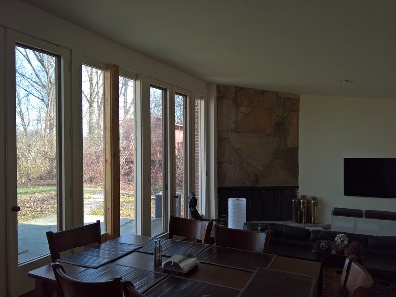
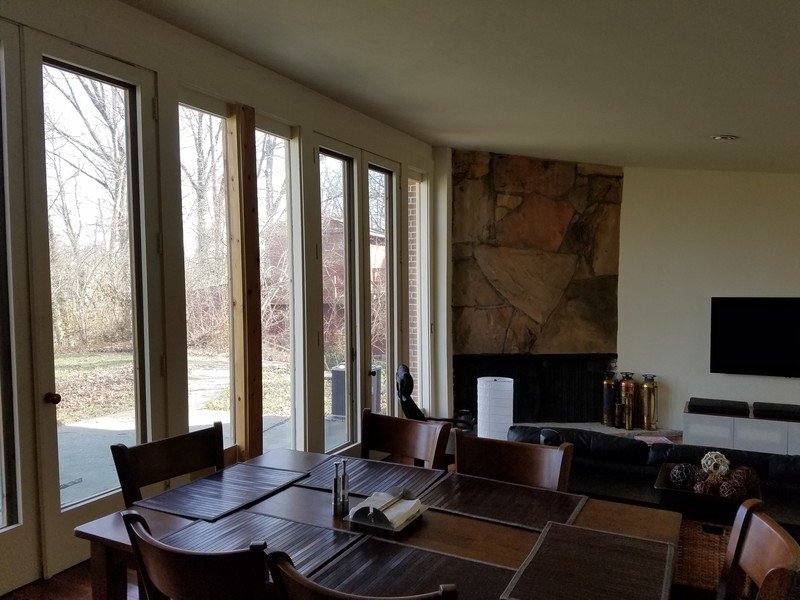




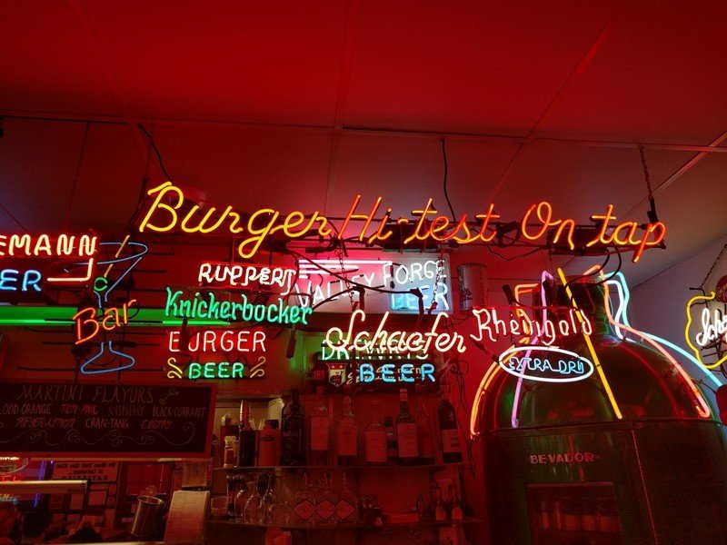

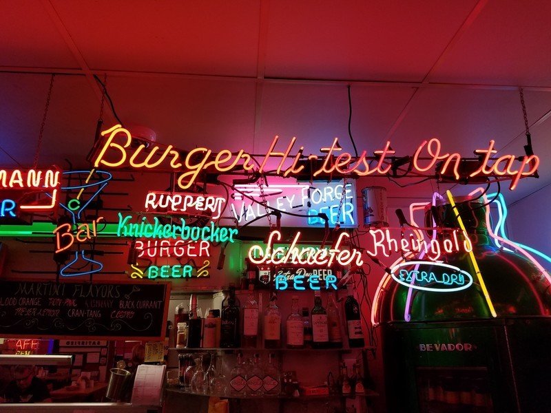


As you might be noticing, none of these is a particularly bad camera. In fact, we'll say they're all pretty great, so our analysis here is going to trend towards nit-picky preferences. Your opinion may differ, and that's OK. When it comes to indoor photography, none of these phones come up short. The Galaxy S7 tended to produce photos that were a little more saturated than the rest, but when it came to balancing darks and lights it was hard to top the Lumia 950's HDR "Rich Capture," which was able to accurately and cleanly bring out detail and visibility in the windows photo. As things got darker the iPhone and Lumia struggled a bit, though, with the iPhone producing a photo darker than the rest and the Lumia ramping up the brightness too much to the point that it was blowing out light sources and washing blacks with gray.
Daylight
















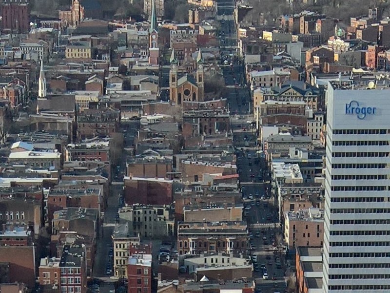




When it came to outdoor shots, things started to get interesting. The Nexus 6P occasionally struggled with brightness, sometimes producing photos that were overexposed, and other times offering conspicuously dim photos in acceptable lighting conditions. The iPhone 6s Plus, Lumia 950 and Galaxy S7 all were consistently great in direct sun and under cloud cover, though the GS7 tended to produce images that were more vibrant and a touch brighter. While the iPhone's colors may have technically been more accurate, it's hard to argue that the GS7's results don't look better.
Panoramas unfortunately leave the Lumia 950 out of the equation (as with the RAW and manual photography statements, we're going with the default app on these phones, and the Lumia Camera app does not support panoramas). The GS7 and iPhone both offer sweep-style panoramas, while the stock Google Camera app on the Nexus requires the user to pause and let the phone take photos at specific points. Under favorable lighting conditions either method will produce fine results. But under less-great conditions (backlit, or dark as you'll see below), the Nexus-style approach seems to yield sharper, brighter, and better balanced results.
As dusk began to set, the iPhone and Lumia photos reflected the yellowing of the light, while the Galaxy and Nexus compensated by tweaking things towards toward the blue side of the color spectrum. For portrait photography that may be ideal, unless you're into the jaundiced look, but it's not exactly an accurate reflection of the conditions in which the photo was taken.
Nighttime
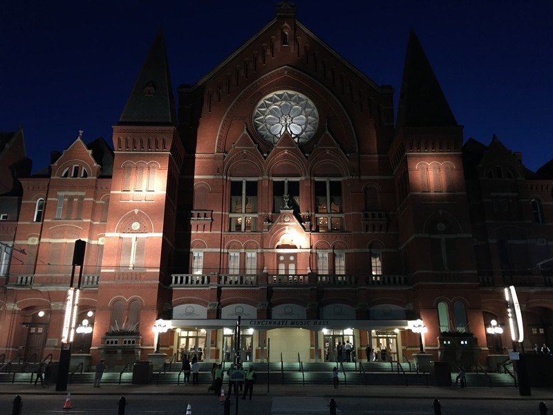















When it started getting dark is when things started to go south for the iPhone. While it excels at well-lit photographs with accurate colors and sharp details, the small sensor and tight aperture mean that there's simply not nearly as much light getting into your photos. And so the cameras with larger sensors and wider apertures tended to perform better.
The Nexus 6P occasionally struggled with blown-out bright spots in the darkness and noticeable oversaturation. When it came to preserving detail in the darkness, the Lumia 950 was king thanks to its large sensor, wide aperture, optical stabilization, and a significant bump in pixel count over the competition. The difference is very noticeable on close inspection of the vertical lines of the bridge railing where buckets of fine detailing comes through that's lost in the muddled results of the other phones.
But the greatest darkness struggle came with the panorama (again, leaving out the Lumia). The iPhone, even with the benefit of OIS, produced an image that was hilariously dim, losing all sorts of detail into inky blackness. For all the true-to-life tendencies of the iPhone's image processing, it falls far short here. The Nexus went to the other extreme — its dark panoramas were crisp and bright, too bright, actually. Where the iPhone lost detail to the shadows, the Nexus blew out the brights like it was nobody's business. Somewhere in the middle you'll find the Galaxy S7. None of these phones produced a panorama that was close to what the naked eye saw or the regular photographic capabilities of these cameras.
Challenging Lighting


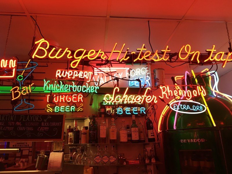
This section originally was going to be titled "Food" (because we all apparently love to take and share pictures of our meals), but it ended up being a better test of how these cameras perform under challenging lighting conditions. In particular, that delectable Nueske ham sandwich on grilled sourdough with asparagus, grilled banana peppers, and a melted mix of gruyere and gouda, was illuminated by the red glow of the neon signs seen earlier in this overview and indirect sunlight coming in through the windows behind the photographer.
That sort of lighting is something our eyes are perfectly capable of adjusting to — we know that it's red light and we see the asparagus and lettuce as green, the banana peppers as yellow, and the ham as pink. But a smartphone camera, even the vaunted LG G4 with its color spectrum sensor that's supposed to be able to compensate for that, struggles in that light to portray what we see. The iPhone was perhaps the closest to reality, although the Lumia did a commendable job of preserving detail and sharpness at the edge of the sandwich — if it had been even remotely closer to the correct color temperature it could have been a really great photo.
The beer photo was taken after a fresh pour of Breckenridge's Nitro Vanilla Porter in a dimly-lit bar, and the Galaxy S7 performed admirably here, with a capture bright and crisp enough that you can almost make out the individual miniature nitrogen bubbles. The other phones? Not so much.
Macro


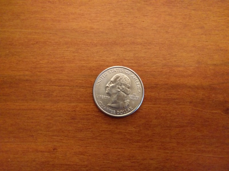
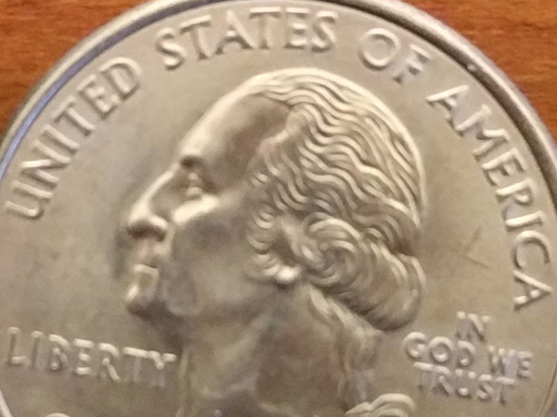
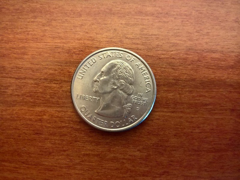



The minimum focusing distances of each camera were surprisingly different. The Lumia 950 let us get closest, but only marginally more so than iPhone 6s Plus and Samsung Galaxy S7. The Nexus 6P was roundly disappointing in comparison, requiring nearly twice the minimum distance before it would focus cleanly.
When you crop in, however, the Galaxy S7 surprised with a comparatively sharp capture. The other phones claimed to have been focusing, but even after repeated attempts we weren't able to get a straight-on macro shot that approached the GS7's sharpness. Coming at the coin from an angle surely would have helped to produce more in-focus captures, but that's not really pushing the cameras to the limit.
Selfies





When it comes to the front cameras on these phones, all but the Nexus 6P have 5MP units, while the 6P (and its 5X little brother) have 8MP front-facing cameras. Regardless of how many megapixels you're working with there, we're talking about a camera that has a smaller lens and a smaller sensor ... and something you'll generally be pointing at your face (as you do with a front-facing camera).
As with the rear cameras, in excellent lighting they all perform incredibly well. But throw in challenging lighting conditions and things start to fall apart. The iPhone was the only camera that was able to consistently and accurately focus on my mug every regardless of lighting, but its comparatively tiny sensor and aperture meant that photos in the dark were, well, quite dark — and it struggled to balance the bright light in the first set against the relative darkness of where I was standing. But my face was the closest to well-exposed than the others, even if that resulted in a horribly blown-out background.
Even when it good light the Galaxy S7 struggled with detailing on my face. Where the iPhone, Lumia, and Nexus all picked up copious skin detailing, something with the Samsung phone resulted in smoothed-out skin — and yes, the "beauty mode" that was enabled by default was turned off before these photos. That said, the front-facing HDR that both the Galaxy S7 and iPhone 6s Plus fired off resulted in the closest-to-balanced photos between my spot in the shade and the sunlit city behind me.
Upon heading into a darker environment, things got even more difficult for each of these cameras. The Lumia and Galaxy struggled to focus — despite poking the screen to tell it where to focus. The iPhone struggled in the dim light, but at least its facial recognition saw my face and accurately focused. But the award in this round goes without question to the Nexus 6P. Not only is its bigger 8MP photo more details, it also had zero trouble focusing and producing a crisp and relatively bright selfie as a result.
Video
For all this talk about photos, let's take a few moments and talk about video. With the proliferation of bandwidth in recent years, video on a smartphone has become more practical than ever. There's been a lot of focus on improving photography on smartphone cameras, but where do we stand with videography? There's a lot more at play here — shutter speeds, variable brightness, stabilization, and audio, just to name a few.
A lot of what was discussed above in photography applies to the video capabilities of these phones as well. Interestingly, despite the fairly uniform fields of view each camera provided in photos, it's all over the map with video. The iPhone 6s and Galaxy S7 have fairly similar fields of view, while the Nexus 6P's videos are noticeably tighter cropped (due to the reservation of buffer pixels on the sides of the viewing frame for its electronic stabilizations). The Lumia 950's video is the widest — where all the others crop in for video, the Lumia's videos are actually wider than photos shot at the default 4:3 aspect ratio.
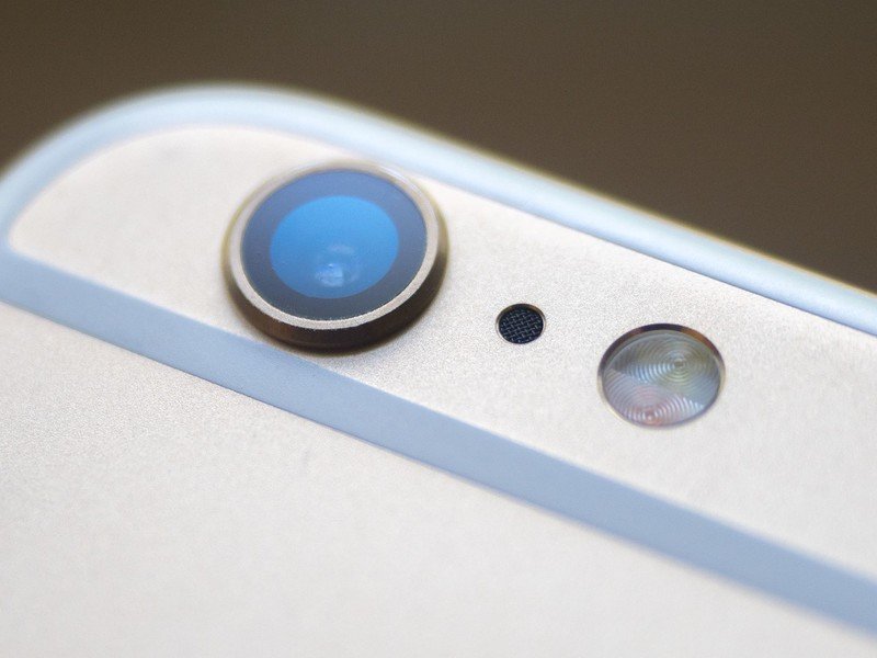
On the colors front the iPhone and Lumia tended towards warmer while the Galaxy S7 frequently produced video that was colder with more pronounced blue hues. As with photography, the iPhone 6s Plus struggled mightily in the darkness — it was fine in decent light, but as soon as the lighting grew dim it started offering video that was noticeably darker and muddier and less saturated. The Lumia 950's videos in the dark actually tended towards being too bright.
Stabilization also is a concern with photography (shaky video is bad video), and it's quite evident from the "wobble" you get with the Nexus 6P since its stabilization is exclusively electronic. While it would be fine for static shots, as soon as you introduce any movement to the 6P's camera — even the slight movement you inevitably get from just holding it while standing still — there's noticeable wobble in the picture. And when there's not a static point for the 6P to lock onto (the shot of the flowing waters of the Ohio River) you get to see all the shake that's not being removed. Considering how great the Nexus 6P is with photography, the stabilization's a serious disappointment here.
Audio quality varied noticeably between the phones as well. The indoor audio quality of the iPhone and Galaxy were the closest to the natural sound of the space, but once outside the iPhone's audio clarity noticeably degraded as it picked up more sound from outside the focus area of the camera and struggled to handle wind noise.
The Lumia 950's audio was, for all the emphasis on its quartet of microphones, remarkably flat and almost entirely absent bass. The Galaxy S7's audio, on the other hand, was picked up a huge amount of ambient noise with a "warmer" audio profile, but also picked up a lot of ambient noise. Both it and the Lumia handled wind noise far better than the iPhone or Nexus.
Interface
As we would hope with any smartphone camera app, the interface offered by each phone is dominated by the viewfinder. As each camera has a 4:3 sensor (at least they're set so by default), that leaves space for major camera controls that don't overlap the image you're trying to capture.
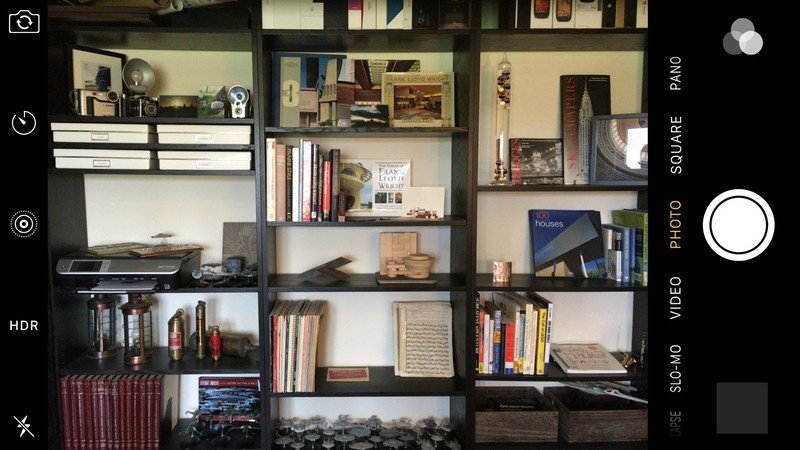
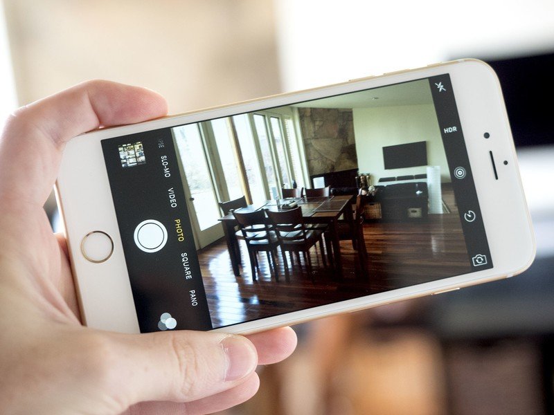
The iPhone camera app is one of the simpler offerings — nowhere will you find tools or settings buried under in-camera menus. Controls are on the short ends of the display — one side hosts small simple single- and two-touch toggles for features like the camera flash, HDR, and flipping between front and rear cameras, while the other end has large buttons to jump into the Photos app to view your captures, a big round shutter button, and to access filters (in photo modes).
Switching between modes is indicated by a strip of words along the edge of the viewfinder — they compress and fade away towards the sides of the phone as if to indicate a dial, and in fact swiping in either direction across the viewfinder will switch to the next mode with a blurred transition effect. This is simple, but it's also a pain in the rear if you want to switch from, say, pano on on end to a time-lapse video on the other and have to swipe across the screen five times to change modes.
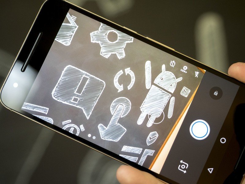
The Google Camera app on the Nexus 6P is even simpler. Primary controls are all on one side of the viewfinder: big buttons for the shutter, switching cameras, and jumping to Google Photos, plus one-touch cycle-buttons for the timer, HDR, and flash. Switching between photos and video is done with a simple swipe across the display, but it's not at all immediately obvious that you need to swipe to change — the only indicator is a pair of dots at the bottom of the viewfinder. More advanced modes like panoramas as well as general settings are relegated to a menu button in the top left corner of the display.
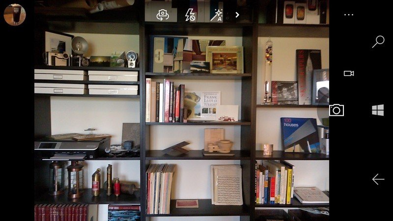
The Lumia camera app carries on the theme of simplicity — the jump-to-Photos button sits on one end with the shutter button on the other. Single-tap controls for switching cameras, the flash, and HDR/Rich Capture sit on top of the viewfinder, while accessing additional lens filters, the timer, and settings is accomplished through the three-dot menu button next to the shutter.
Where the Lumia camera steps above and beyond the others is the little > button next to the Rich Capture toggle. Tap that and you're switched into manual mode with full control over white balance, focus, ISO, brightness, and even shutter speed. No other default camera app offers so quick and intuitive access to manual camera controls.
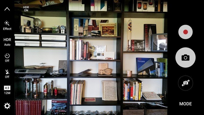
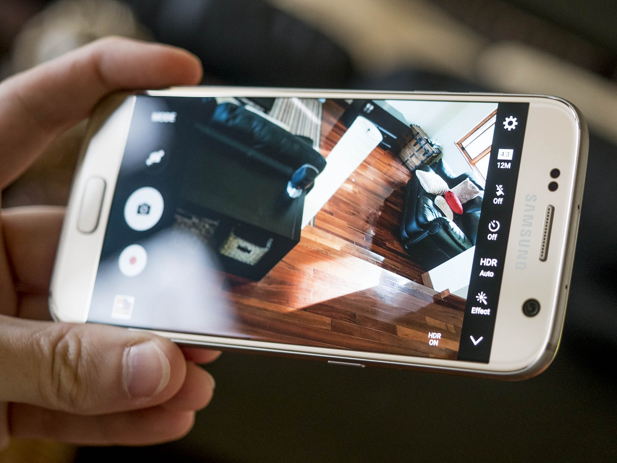
The Camera app on the Galaxy S7 takes after the camera app on the Galaxy S6, surfacing a huge number of options with a plethora of menus. It can be a little daunting at first, but it's not terrible. Along one side you'll find buttons to open the Photos app, start recording a video (this is the one default camera app here that doesn't require a preliminary tap or swipe to get to video mode first), capture a photo, switch cameras, or change modes (more on that in a bit). Along the other end of the viewfinder are a settings gear icon, menu for changing the aspect ratio and image size, a flash toggle, timer menu, HDR toggle, and a menu with live previews of various filters. There's also a > button, but unlike the Lumia where it unveils more controls, here it collapses this list of buttons.
The Mode button is where things really get interesting with the Galaxy S7, though. Tapping it opens as pop-over menu with 10 different camera modes. Some are useful, like pro (a manual mode with control over shutter speed, focus, ISO, white balance, and brightness), panorama, live broadcasts to YouTube, and hyperlapse. Others are of questionable value, like selective focus (refocusing after the fact by taking multiple photos at once), video collage, and food (which creates a fuzzy focused area circle you can drag around with everything outside that being slightly blurred).
But for all of the complication and silly features that Samsung's added to their camera app (and do note that they've pared things back a bit in the GS7), they've carried over the most useful camera feature of the Galaxy S6 to the GS7: double clicking the home button at any time, even with the phone off, will launch the camera app, and it will do so ridiculously fast. It's a shortcut that's been somewhat emulated on the Nexus 6P with a double click of the power button, but that's not been entirely reliable in our testing. And not nearly as fast as the GS7, and the placement of the 6P's power key about halfway up the edge of the phone means it's occasionally a stretch to reach.
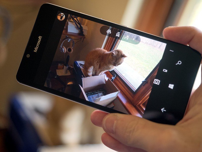
The Lumia 950 is the only one of these phones with a truly dedicated camera button — a hallmark of Windows Mobile devices. Press and hold it for just a moment at any time and it'll launch the camera, right? Just one problem: the default settings hobble this shortcut by relying too heavily on the proximity sensor to prevent accidental launches while in your bag or pocket. You can disable it, but it's not something an average user would think to look for — I thought I had a dud camera button at first. That camera button is also a two-stage shutter button; press halfway to focus, all the way to capture. It works really well and I definitely preferred it to tapping the on-screen button to capture a photo.
And then there's the iPhone. Where each of the other phones has a hardware shortcut to get to rapidly open your camera (and they're not even the quickest — double clicking the volume down button on the LG G4 or V10 will launch the camera app and take a photo), the iPhone 6s Plus offers no such option.
There are two ways to quickly get to the camera on the iPhone. If your phone is on the lock screen, dragging up from the bottom right corner will open to the camera, but that requires a click on the power or home button (which in this case we're hopefully doesn't unlock automatically with your fingerprint) and then a quick swipe up the screen. If your phone is already unlocked, you can swipe up from the bottom of the screen to access the Control Center and then tap on the camera button in the bottom right corner of the screen.
We'd love to see Apple implement a similar camera launch hardware shortcut on the iPhone. It wouldn't be a double click of the home button, as Apple's designated that action to launch Wallet, though double clicking the power button is unassigned and could be of use here.
Read the reviews
There's a lot more to each of these phones than just the camera. Want to know more? Check out our reviews!
Huawei Nexus 6P review
The bottom line
So who makes the best smartphone camera? More than ever, that's a toss-up — these are all four great cameras, with strengths and weakness in each.
A lot of it comes down to your personal photographic (or platform) preferences. If you want true-to-life colors, you'll want an iPhone or Lumia 950. But if colors that pop are more your thing, then the Galaxy S7 will serve you well. If you're taking a lot of photos or videos in the dark, then you shouldn't bother with the iPhone, and you should avoid the electronically-stabilized Nexus 6P if you intend to shoot a lot of video. If you need the most detail and intuitive manual controls, the 20MP Lumia 950 is the phone for you. And if you want the fastest possible access to the camera, double clicking the Galaxy S7's home button will serve you well.
For a long time Apple was king of the smartphone cameras hill thanks to their obsessive focus on camera quality over the megapixel race. Samsung's dialing back to 12MP in the Galaxy S7 over the 16MP in the GS6 is all the indication we need that the megapixel wars are over — the focus is on quality and everybody is delivering excellent sensors and software to match. If there's anything to take away from this match-up it's that you would be well-served by any of these cameras — and they're attached to some really great phones to boot.
If push came to shove and you needed us to offer a recommendation of the best smartphone camera — knowing full well that there's always another phone on the horizon that threatens to take even better photos — we would tell you the Samsung Galaxy S7 has the best camera of the bunch, but only by a hair. But, like we said, it comes down to your personal preferences. So which phone do you think took the better photos?

Derek Kessler is Special Projects Manager for Mobile Nations. He's been writing about tech since 2009, has far more phones than is considered humane, still carries a torch for Palm (the old one), and got a Tesla because it was the biggest gadget he could find. You can follow him on Twitter at @derekakessler.
