Bringing Google Now to your wrist: This is the Android Wear interface
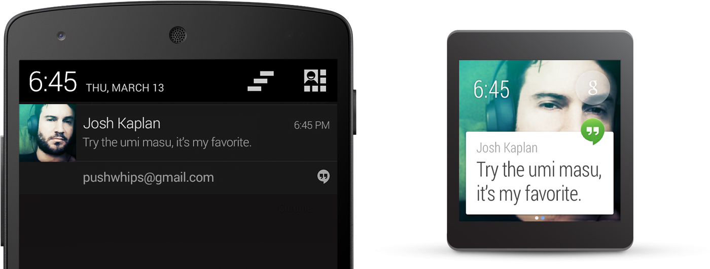
An interface that scales Google Now down to something usable on your wrist, with endless possibilities driven by developers.
Google has officially unveiled Android Wear, an operating system specifically tailored to wearable devices, and with that comes some new usability and interface challenges. Working with small wristwatch-sized devices and sub-2-inch screens, you quickly run out of room for interfaces and information. Alongside the launch of the new platform, Google has given developers an early look at design guidelines for putting Android Wear on your wrist.
While the documentation is far from complete at this stage, we're getting a pretty good look into what the interface will look like for Android Wear-powered devices like the LG G Watch and Moto 360. From the looks of it, you'll be able to accomplish quite a bit more than you'd expect on your watch, and the design implementations seem both intuitive and beautiful.
The context stream and cue card
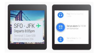
The main paradigm for interacting with Android Wear devices is called the "context stream" — a vertical list of cards showing information as it becomes available. Very familiar to anyone who has used Google Now on a phone or tablet, the context stream will collect all notifications sent to the watch in a scrollable card view. As we'll cover in more detail below, individual cards can display simple information on the main screen, with further information and actions that can be shown by swiping the card to the left.
For information that you need but isn't automatically offered to you, the "cue card" will help you find it. At the top of the Android Wear interface, a simple "g" icon — again, just like Google Now — can be tapped or summoned by saying "Ok Google" to then bring up actions that can be done explicitly. You can then scroll through available actions or speak your intended action, with options such as "take a note," "send a message," "navigate to" and other phrases you're used to if you've used voice controls with Google Now. Just like Google Glass, developers will be able to plug into this voice control interface to have their apps summoned when you make the right voice prompt.
Cards and notifications
On the surface, the best way to understand Android Wear notifications is to think of them as an alternate display of the notifications that arrive on the phone your watch is connected to, organized in the now-standard "card" style and placed in the stream. As illustrated by the pictures above, when a notification comes in to the connected phone, it is also pushed to the connected wearable by default and displayed in a new card — no additional developer interaction is required to make notifications show on the watch.
Be an expert in 5 minutes
Get the latest news from Android Central, your trusted companion in the world of Android
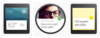
Notifications on your watch are meant to be simple and follow a general philosophy of "less is more." Only the most important notifications — messages from friends or time-based calendar reminders, for example — will chime or vibrate on your wrist, with all other cards being silently added for when you glance at your watch on your own terms. Cards make use of images behind the card text to give context to the notification, and also include a small app icon to denote which app sent the notification to your watch.
Notification Pages and Action Buttons
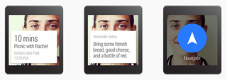
If developers want to take things to the next level, they can change their apps to offer a better experience on the watch. If a notification needs to contain more text, developers can use "Big View" to send more information by default. Additional information can be added to a new "page" that is found by swiping the card to the left — additional pages could show route information for a navigation card, or a three-day forecast for a weather card, for example.
An app can also add "action buttons," which are button overlays on top of the current screen to take basic actions on the content — an email, for example, would have Archive and Reply buttons. Action buttons can be made to take action all on the wearable or to open an app on the attached phone, and are displayed with a swipe to the left on the watch — they will always be to the right of all content, even if there are multiple pages of text.
Notification stacks
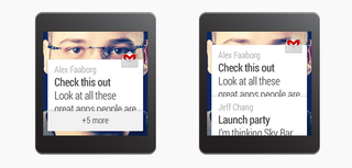
If a single app often has more than one notification being sent to the user at the same time, these notifications can be combined into "stacks," just like notifications on your phone combine into one item in the notification shade. Stacks are displayed with simple wording indicating "5 new messages" or "18 new emails," are expandable by the user to show individual notifications and are ordered with the most recent notification on the top by default. Developers can also define a custom order if they see fit.
Voice replies
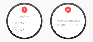
If a notification would normally prompt a response by text on a phone, it can now prompt the user to respond via voice on their watch instead. Primarily to be used by messaging apps, Voice replies can be either a set of simple canned responses — such as "yes," "no," or "message you soon" — that the user dictates and chooses, or can be full-on voice input like you'd see when hitting the microphone button on your Android device keyboard today. Developers can have voice replies available via a "Reply" action button on a message card, either as the first option or a deeper, secondary option.
And this is just the beginning
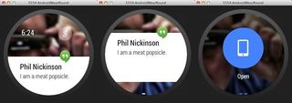
Google has released an "SDK preview" and a companion application for your Android phone today as well. Things are still early, and the SDK bits and baubles are a little buggy, but using the companion app and the Android Wear system image gives developers a hands-on look at just how it all acts. We've been playing with it all day, and we like the direction Google is taking here. All the heavy lifting is done on your phone, and only the things you need to see and know at a glance make their way to your wrist where you can act upon them.
If you want to give it a spin yourself, head to the Android Wear developer pages and get started.
As the Android Wear SDK gets into more developers' hands and actual devices start to get closer to market, we'll have a better idea of how these new Android Wear-powered watches will be able to interact with our favorite apps and devices. The frameworks outlined here seem promising, powerful and appropriately simple, and we can't wait to give them a try for ourselves.
For even more information, you can watch these Android Dev Bytes videos from Google.
Source: Android Developers; (2); (3); (4)
Andrew was an Executive Editor, U.S. at Android Central between 2012 and 2020.


