Brighter, whiter Google Play redesign rolls out after months of testing

What you need to know
- New Google Play UI is rolling out on Android and Chromebooks.
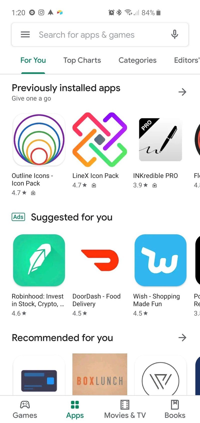
- New design is cleaner, uses new font, and moves the section carousel to bottom tabs.
- New update also brings customized store lisitng options for app developers.
The Google Play Store seems to go through a redesign about once or twice a year, but the new UI we've seen tested, teased, and leaked since this spring seems to finally be finalized and rolling out to all. This Material design refresh aims to provide a "cleaner, more premium store" that makes it easier to find new apps quickly.
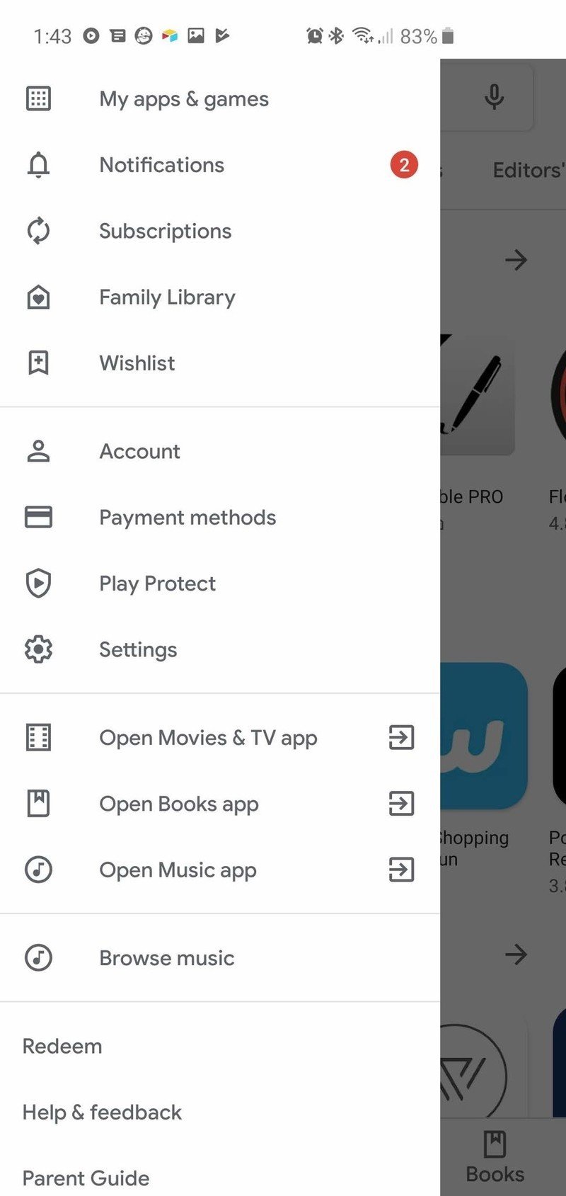
The new UI moves the content type sections from the top carousel to the bottom on phones (on the left on large tablets and Chromebooks), and the breakdown of sections now presents Apps and Games as two separate tabs and takes away the Music section. If you want to buy music, you have to open the three-line hamburger menu — yeah, that's still here — and find it hiding near the bottom of the list, in a separate section between the links to the Google Play apps and Redeem, or search for a specific song or artist.
I'm not sure about anyone else, but that's a bit of a red flag for me. Yeah, I'm a unicorn for still buying music, but some msuic just isn't available for subscription streaming, and for that section to be hidden away on the biggest media store for Android is disconcerting.
Otherwise, the new UI seems smooth, responsive, and a little less cluttered. It's really, really bright without any header colors or section colors to break things up, but I'm hoping that once dark theme support is added, things will be better. There are also customized store listing options for developers to use to better deliver an engaging experience to current and potential users.
This update also switches the Google Play app to the same font that many other Google apps — and the new Android Auto redesign — are now using. The update has rolled out to most devices today, but if it hasn't hit yours yet, give it a day or two.
What are your thoughts on the new look? And how impatiently are you awaiting the inclusion of a dark mode? Because like Gmail, Google Play now needs one ASAP.
Wear OS could be amazing if Google and Qualcomm took it seriously
Be an expert in 5 minutes
Get the latest news from Android Central, your trusted companion in the world of Android
Ara Wagoner was a staff writer at Android Central. She themes phones and pokes YouTube Music with a stick. When she's not writing about cases, Chromebooks, or customization, she's wandering around Walt Disney World. If you see her without headphones, RUN. You can follow her on Twitter at @arawagco.
