It leaves no question about why the phone was made or what you're supposed to do with it. Such is the case with the Blu Selfie, a phone with a name that's beyond obvious.
The quick take
The Blu Selfie comes with a pair of 13MP Sony-powered cameras, one for the front and back at a very reasonable price, but the software experience is at times frustrating and the design and hardware quality won't appeal to everybody.
The Good
- Low low off-contract price
- Incredibly bright flash
The Bad
- Mediocre cameras
- Non-standard default launcher design
- Huge top and bottom bezels
- 4.7-inch HD display
- IPS LCD panel
- 720x1280 resolution (312ppi)
- 13MP ƒ/2.0 lens rear camera
- Dual LED flash, Blu Final Touch software enhancement
- 13MP 88º lens front-facing camera with soft LED flash
- 1.7GHz Octa-core MediaTek MT6592 processor
- ARM Mali 450 GPU
- 2GB RAM
- 16GB internal storage
- microSD expansion
- 2300mAh battery
- HSPA+ 21Mbps
- Android 4.4 KitKat
It's all about the selfies, man.
Blu Selfie Review
Blu Products is an interesting company. They are primarily what's called a "white-label" phone distributor, taking phones produced by Chinese or Taiwanese manufacturers, slapping their label and software on it, and selling it as if it's their own device — like the Blu Vivo Air. The Blu Selfie is one such phone — Micromax's Canvas Selfie is for all intents and purposes the same phone, but running different software and a slightly different back plate.
Blu also has a history of building phones that slot towards the bottom and low-middle range of the smartphone market. Where Samsung is making a Galaxy S6 that runs from $700 on up, it's rare for a Blu phone to crack $300. The Blu Selfie prices at $249, and that's off-contract.
But is it worth the price? Is the phone worthy of staking a claim to the photographic phenomenon that is the selfie? Is this the one true selfie phone? That's what we're here to find out.
About this review
We've been using the Blu Selfie for about a week now, both on AT&T in the United States and Rogers in Canada. Though it's possible to install a replacement launcher on the phone, or the proper Google keyboard (or whatever third-party replacement you might prefer), we opted to use the phone in a more 'virgin' state, similar to how we'd expect most owners to use the phone.
Unapologetically plastic
Blu Selfie Hardware
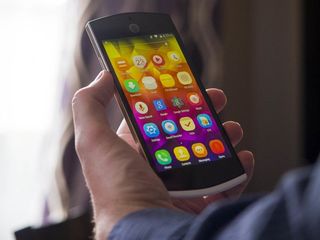
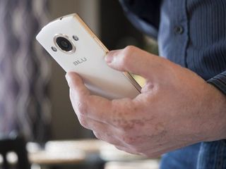
Despite what you might expect at the price point, the Blu Selfie is a decent-feeling phone, at least holding it in your hand. It comes in three colors — dark blue, black, and the white with silver trim model we have here. All three are plastic-bodied phones, with a single soft-touch plastic panel forming the back and wrapping around the bottom and rimming the lower edge of the front. That front side is a continuous sheet of Gorilla Glass 3, interrupt only by a small vertical slit for the phone speaker and ringed by a lip of glossy black plastic.
Under that front glass at the top is a 13MP front-facing camera, with a small pill cut-out for the sensors and a circle for the soft LED "glam" flash to the right. The camera has a silver accent ring around it, but that's under the glass, so it provides a bit of visual flourish without offering an unnecessary touch point and grime collection spot. We'll touch more on the camera later.


Dominating the front, as one should expect, is the display. It's a 4.7-inch IPS LCD panel, offering a resolution of 720x1280. That brings a pixel density of 312ppi, which while crossing the magical 300ppi "retina" threshold, doesn't quite compare to the 1080p and QHD displays of modern high-end flagship smartphones. But at $250, we shouldn't expect it to. It's a solid panel, offering deep blacks, vibrant colors, enough brightness, and even decent viewing angles (it darkens a bit at about 45º off center, which isn't awful). Under the display is a tall glass bezel housing a trio of standard Android navigation buttons.
You'll find something going on with every side of this phone. The top and both sides feature faux-brushed metal plastic panels meant to evoke a metal frame (unlike its Vivo Air stablemate, which actually has an aluminum-magnesium alloy frame). It's not immediately obvious though, until you catch the glinting sun off the glossy plastic or notice the tight seams in the band at the corners (you can see them, but they're not something I could feel even when I tried).


At the top are the power button 3.5mm headphone jack — which disappointing spills out from the framing plastic and requires a slight cut-out from the back panel; it's as if it were an afterthought in the design. The right side houses a SIM card tray with slots for two Nano SIM cards, as well as a camera button that's nearly centered on the side and sports a concentric ring texture.
The Blu Selfie has a serious mullet design going: business in the front, party in the back.
The only things on the curved/pointed bottom are a pinhole for the microphone and a Micro USB port, which is set at an angle to match the bend of the device. This means your plugs will sit flush, but there's no hope in using this phone in a dock. The left side offers up just the volume rocker, sporting the same concentric ring texture as the camera button.
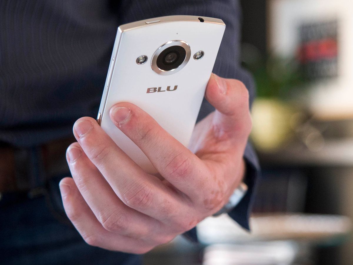
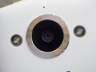
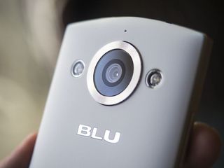
And the there's the back of the phone. If the front and sides were conservative, the back is ostentatious. It's a mullet type of design — business in the front, party in the back. Centered at the bottom is a chrome-ringed slit for the loud speaker, with a black grille set deep inside. But up to is the 13MP rear camera with dual-LED flash. Even though this is the same camera as we're seeing on the front, the rear camera is treated to some serious design flourish. Concentric dark gray rings surround the actual camera lens under ¾-inch-wide lens cover, itself surrounded by a raised silver ring etched with more concentric ridges. It's a really nice effect, but it's purely for aesthetics and to evoke the same sort of stepped rings you might find inside the lenses of a quality DSLR.
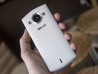
It's also perhaps a misnomer to call say the Blu Selfie has a dual-LED flash. It's more that it has dual LED flashes — one on each side of the camera lens. And while the Moto X (2014) and Nexus 6 both have dual LED ring flashes, the Blu Selfie has distinct and separated LED flashes. The two LEDs are separated by nearly 1-¼ inches, and are physically some of the largest flash units we've seen on a smartphone. And they're certainly among the brightest — they're downright blinding. It's a shame there's no easy flashlight toggle in the software here, because the Blu Selfie's rear LEDs are actually very capable as such.
All of this makes for a phone that's decent-looking and feels solid in the hand, but it's also rather awkward. This phone is very tall for how big the display is, and the designer's effort to balance the tall front bezel with its huge camera and unnecessarily vertical speaker mean that the bottom bezel is equally enormous. This sets the capacitive navigation buttons awkwardly far down, and the power button on top is a stretch to reach. Turning on and navigating around the phone required constant shifting in our hands.
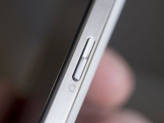
More frustrating, however, was the camera button. Sitting at the center of the right side, it fell right under under our thumb if we were holding it in our right hand, or under the middle finger if held in the left. Modern physical interface trends, from the Samsung Galaxy S6 to the HTC One M9 to even the iPhone 6 have taught us to expect a button in such a position to be the power button. But this isn't the power button, that's up top.
Making matters worse, this dedicated camera button doesn't actually unlock and open the phone to the camera — you have to hit the power button at the top first and then press down on the camera button to get there. Every other phone we've used with a dedicated camera button was able to launch straight into the camera by holding down on that button. The center-mounting of the camera button also means that if you're using the camera in landscape (as you should if you're a good human being) you're likely to cover up part of the screen with your palm trying to use it. It is, however, perfectly positioned for portrait orientation photos, falling right under a thumb or finger. Perhaps that's exactly how the phone's designers intended for you to use it.
The white label disconnect
Blu Selfie Software
When you get a phone from any of the major manufacturers, you're getting one where the hardware and software designers worked in concert, or at least had a design lead or somebody up on high dictating the direction they're going to take. When you get a phone from a company like Blu, you're likely getting a phone that was designed by separate company. In a way, Blu is a software development firm that happens to distribute phones. And it shows.
Even for as over-the-top as the back of the Blu Selfie is, it still has a "professional" vibe to it. It looks like a serious camera that means serious business. The software on the Blu Selfie, on the other hand, looks like a party. The default wallpaper is vibrant and geometric, full of bright yellows and magentas. Almost all of the app icons are forced into a rounded square, though a square that's more rounded than the famous rounded square icons of the iPhone. It crosses the boundary from welcoming and friendly to overly playful and childish. But open a folder and it's weirdly professional with a darkened and blurred background with the apps laid out in a spacious 3-wide grid. It's a strange dichotomy.
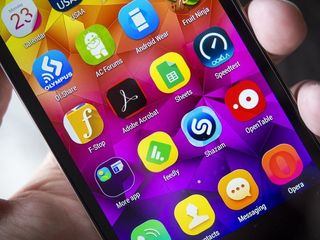
The rounded corners are at least smartly implemented. If it's an app with a square(ish) icon, the corners get lopped off. If it's an app that doesn't fill the full extent of the space, the background gets filled in with a color that compliments the palette of the icon. Green icons (like Sheets or the official Android Central app get a yellow gradient background, blue icons (Skype and Dropbox) get a green gradient. The notable exception are official Google apps, be they pre-installed or downloaded from Google Play. Those get by without the background, likely as part of the Google Play Services contract.
There's a glaring disconnect between hardware and software design.
Despite the visual differences between this launcher (dubbed "MYhome") and other Blu devices, the behavior is pretty much the same. There's no app drawer here — apps are instead dumped onto successive home screens as they're installed, just as if you were using an iPhone. And if the Blu launcher experience doesn't suit your needs, there's always the option to install your choice of launcher from the Google Play Store.
Around the rest of the phone, Blu's influence is light. The notification drawer works exactly as you'd expect from an Android 4.4-powered phone, and Blu's only added a few options to the otherwise standard Settings app. In fact, it's a much lighter customization than you'd see on other Blu devices like the Vivo Air. We rather prefer it this way, as the Vivo Air's customizations often felt laggy and jittery.
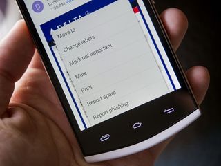
There's one glaring spot where the disconnect between hardware and software design is readily apparent: the navigation buttons. From left to right there's a standard Android mix of icons — multitasking, home, and back, all blacked out and illuminated from behind by LEDs (and only lighting once you touch near them). It's the sort of standard fare stuff we'd expect from any Android 4.0 or higher.
Here's the catch: the multitasking button is coded to act as a menu key. Hit that and you're not greeted with the vertical-scrolling line of recent apps; no, it opens the app menu like you're running Gingerbread. If you want to get to multitasking, you have to press and hold the home button, which is a perfectly logical interface metaphor if there wasn't already a button with a multitasking icon. And this is on a phone running Android 4.4; there's absolutely no reason for such an oversight.
Apart from that, it's standard Android 4.4 throughout. Blu has committed to pushing Lollipop updates for their phones starting in June of 2015, though we can't say for sure if or when the Selfie will receive an update. We can only hope that Blu puts a little more thought into how the controls are laid out if they do. If there's a menu button, that's fine, let it be a menu button. But when you purchase hardware with specific iconography on it, at least make sure the action that button triggers matches what the user should expect from it.
Embrace your big selfie
Blu Selfie Cameras
If it wasn't apparent from the hardware design of this smartphone, the cameras are the big deal here. Blu even makes a point in their marketing materials that these are Sony IMX135 sensors, which probably means nothing to you (as it should). Heck, they even put the sensor model on the box. Clearly, they're banking on the Sony name and Sony's prowess in camera sensor technology as a key selling point for the Blu Selfie.
But there's more to a camera than who made the sensor and how many pixels it has. Those are important to the base performance of the camera, sure, but the camera app interface and the image signal processing are equally as important. If we are to draw back a metaphor from years past, it's like touting the film you've put into your SLR camera — it's important, but there's so much more that influences the final result, including the lens, your ability to manipulate the camera's controls, and the minimum wage kid in the back of the drug store that's being paid to develop your film and convert that into a photo you can stick into a frame or tack onto the refrigerator door.
But lets run down the tech here, just to set the stage. The Sony IMX135 sensor offers up 13 megapixels for photos that measure 4163 x 3122 pixels. It's capable of 4K video, but the Selfie only does 1080p video at 30 frames per second. The sensor itself is a 1/3.06-inch unit with 1.1µ pixels. It's also a sensor that Sony first released in 2012, and one that can be found in phones such as the Moto X (2014) (which took large, but disappointing, photos).
It's a generally capable sensor, and Blu's dropped it behind an ƒ/2.0 lens that should let in plenty of light. And Blu has put one on the back as well as the front of the Selfie.
The back, as mentioned earlier, features a pair of LED flash units that flank the left and right of the camera. They're easily some of the most powerful flashes we've seen on a camera, if not the most powerful. But as with any other smartphone camera flash, we can't recommend you use it for taking photos. Flashes this close to the lens almost universally ruin photos — they flatten and wash out faces, and create nasty flash reflections. Avoid it whenever possible, or if you can, somehow get an offset (by a few feet or more) flash to make things look natural and give it some visual interest.
That said, there's a time and place for camera flashes. Sometimes you just need to illuminate a subject in the dark; you're not going for a "great" photo, you just want one that captures data. And for that, the Blu Selfie's obscenely bright flashes do the trick.


But up front there's also a flash. And this is where we need to take a look back at another "selfie" phone: the HTC Desire Eye. It too featured a 13MP camera on the front and back, with each also sporting a dual-LED flash. The rear flash was adequate, the front flash was overpowering. The Blu Selfie's front flash, on the other hand, is branded as a "glam" flash, offering a less powerful and softer light for the flash that you're holding just two or three feet from your face. It's a thoughtful touch, opting for something that's less impressive from a technical standpoint but more useable. But it could probably stand to be a bit brighter.
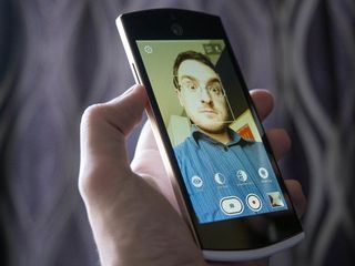
Blu uses their own custom camera interface here, one with relatively straightforward controls. In portrait, there's a large shutter button and smaller record button at the bottom with a shortcut to the camera roll on the right and a button to toggle between standard photos and panoramas on the left. Sitting above that are four buttons labeled Eyes, Slim face, Smoothen skin, and Whitening. Tapping on either gives you a slider and a brief description of what the slider does. And here's what they do, according to that description:
- Eyes: Enlarges your eyes, whitens the sclera, and sharpens the iris
- Slim face: Slims your face for a more youthful look
- Smoothen: Smoothens your skin, removes blemishes, wrinkles, and skin imperfections
- Whitening: Whitens your skin


In practice you'll mostly want to play around with these when using the front-facing camera. They use face detection to do things like finding your eyes and then blow up that part of the face. Slim face squeezes in from the side (make sure you're not in front of a pattern that'd be distorted), smoothen finds the bounds of your face and blurs things that are generally skin tone, and whitening actually made the entire photo brighter (though we'd pasty white tech bloggers would generally prefer something that would give us a fake tan instead). You can toy with all four sliders in conjunction to hilarious effect. Weirdly, these buttons rotate if you turn the phone while the camera app is open, but if you launch the app with the phone in landscape they actually line across the long side of the display instead.
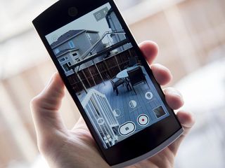
When it comes to the actual photos the Selfie takes, it's rather disappointing (not unlike the Moto X equipped with the same sensor). It's slow to focus and often misses focusing, and consequently leads to badly-sampled brightness management. Shutter speeds are frequently too slow, leading to blur with the movement of the subject and/or the camera. And the shutter itself alternates between firing almost immediately and taking up to a second to capture the image.
Having seriously bright LEDs on the back rapidly washes out and flattens any attempt at low-light photography. And the little soft flash on the front is hardly powerful enough to illuminate a subject (i.e. your face) that's not even three feet away.
When everything does come together and you get a passable image, it's often one where you're saddled with muted colors and a narrow brightness range. And while one of the benefits of a larger megapixel count is that you should be able to zoom in and get close detail on a photo, that's not something we'd recommend you do here. Look closely at a photo from the Blu Selfie and you'll see loads of noise and artifacts from the processing.
The Blu Selfie is designed and marketed around its photography prowess, just like the HTC Desire Eye. And just like its much more expensive counterpart, it's proving to be a disappointment in the photos department.


Performance, battery life, and your hands
Blu Selfie in real life
It's worth keeping in mind that we're talking about a $250 phone here. There are trade-offs in build quality and software performance that should be expected. It's not the best phone ever, it's not even in contention for the best phone ever, and that's okay. That out of the way, what's it actually like to use the Blu Selfie?
It's not bad, but it's not fantastic either. It's just okay. And almost all of that comes down to how the software and hardware interact. The mismatch in having the multitasking button actually acting a menu button is unnerving, if just because it's been completely unnecessary to have a dedicated menu button on an Android device for years.
And the entire package is simply awkward. The enormous top and bottom bezels make it unwieldy to handle — the Blu Selfie isn't anywhere near the largest Android phone out there, but most phones this size sport a larger display that requires less shifting of the phone around in your hand to reach the controls.
The Blu Selfie isn't the fastest smartphone ever, but it's still plenty capable.
The 1.7GHz octa-core MediaTek processor and 2GM of RAM were up to the task, regardless of what we threw at it. It's not the fastest set-up, but it was plenty capable. Apps launch quickly, games display with an acceptable frame rate, and any instances of staggering and lag were rare enough that they were the exception and not the rule (oh, how far Android has come in just a few years).
The 2300mAh battery was generally able to get us through the day. That's aided by the fact that the processor is running at a relatively low speed for a modern smartphone, the 720p display has fewer pixels to refresh (in fact, it's ¼ the pixels of a modern Samsung or LG flagship), and the radio only runs up to LTE. It's that lack of LTE that really hurt the most often — HSPA+ 21Mbps is often branded as "4G", but it's rarely anywhere near as capable as LTE. With networks worldwide invest heavily in their LTE networks, there's been no incentive for them to put resources into beefing up their lesser networks. And so HSPA-only phones like the Selfie suffer.


Blu Selfie: The Bottom Line
The primary selling point of the Blu Selfie is photography. It's right in the name. The design of the phone emphasizes the cameras. The marketing touts this as a phone that's about the photos you an take. So it's a shame that the cameras are kind of mediocre.
That's not to say that this makes this a bad phone. It's just a phone that isn't cashing the checks it's written. It's not a great phone overall, and there are some design choices here that are utterly frustrating. But things like a multitasking button being mapped to the menu button or a camera button that doesn't wake and unlock the phone are things that can be fixed with a software update, should Blu see that as a priority.
For $249, the Blu Selfie is a capable device. Just don't get it thinking it's going to seriously up your selfie game.
Derek Kessler is Special Projects Manager for Mobile Nations. He's been writing about tech since 2009, has far more phones than is considered humane, still carries a torch for Palm (the old one), and got a Tesla because it was the biggest gadget he could find. You can follow him on Twitter at @derekakessler.
