BlackBerry 'Mercury' hands-on: Riding into 2017 on a phone with no name
Under new direction, BlackBerry Mobile's smartphone business is poised for a relative revival. It's no big revelation to say that BlackBerry's market share and mind share are nowhere near what they were in its prime, but at CES 2017 BlackBerry is hoping to kickstart a new direction by announcing a new phone.
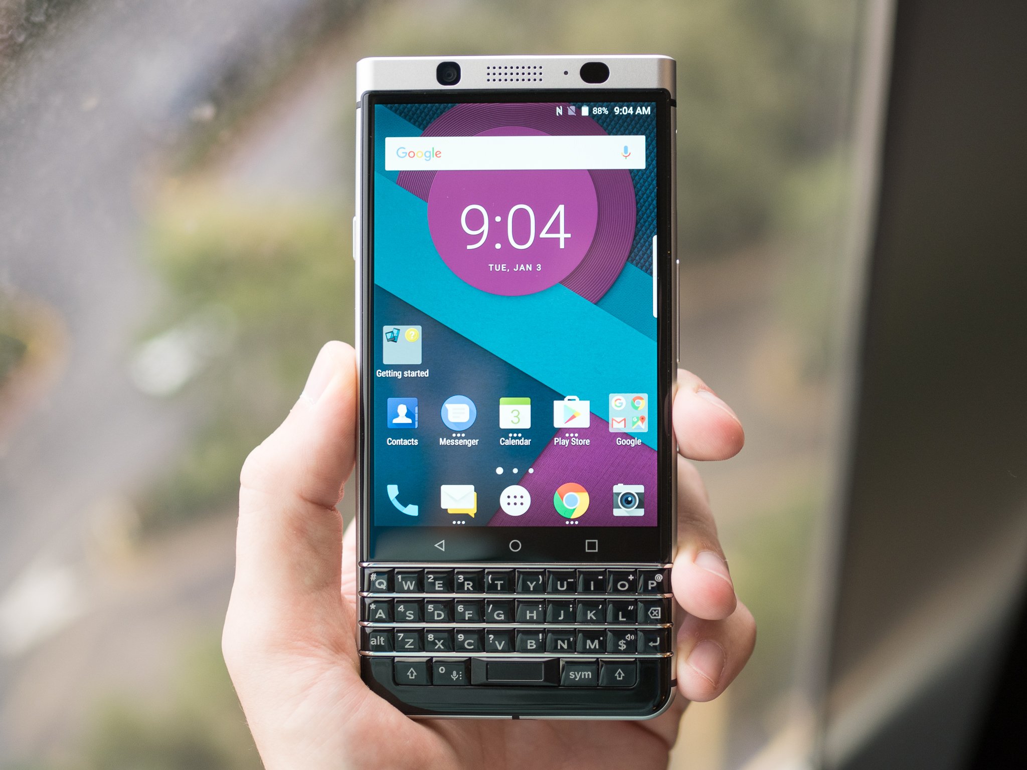
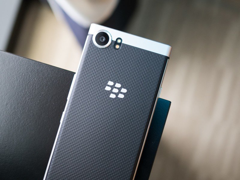
And even though the company won't actually tell us the specs, price, features, launch date or even the official name, many will recognize this smartphone as the rumored BlackBerry "Mercury." So in lieu of a proper name, that's what we're calling it. The Mercury is real, that much has been established now — it's a solid metal phone that fits the overall size mold of a modern slab smartphone, but manages to fit in a full hardware keyboard on the bottom without a Priv-like slider.
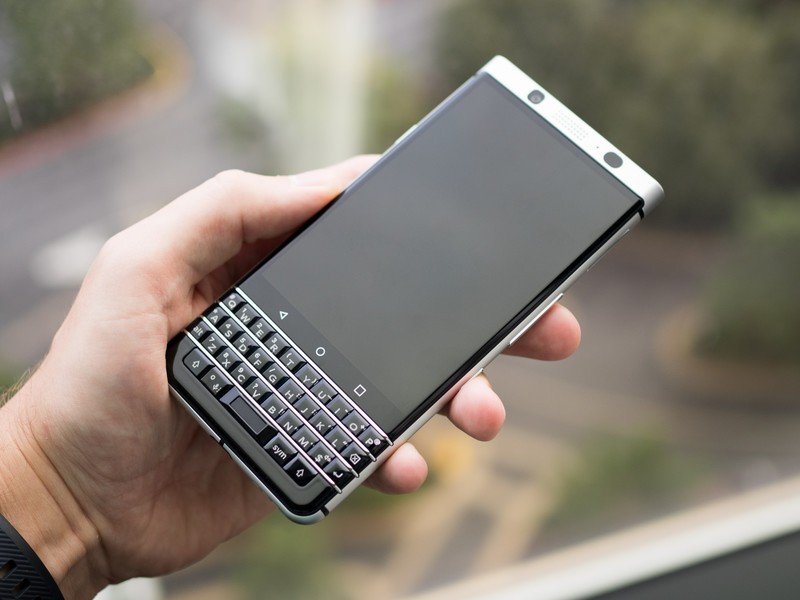
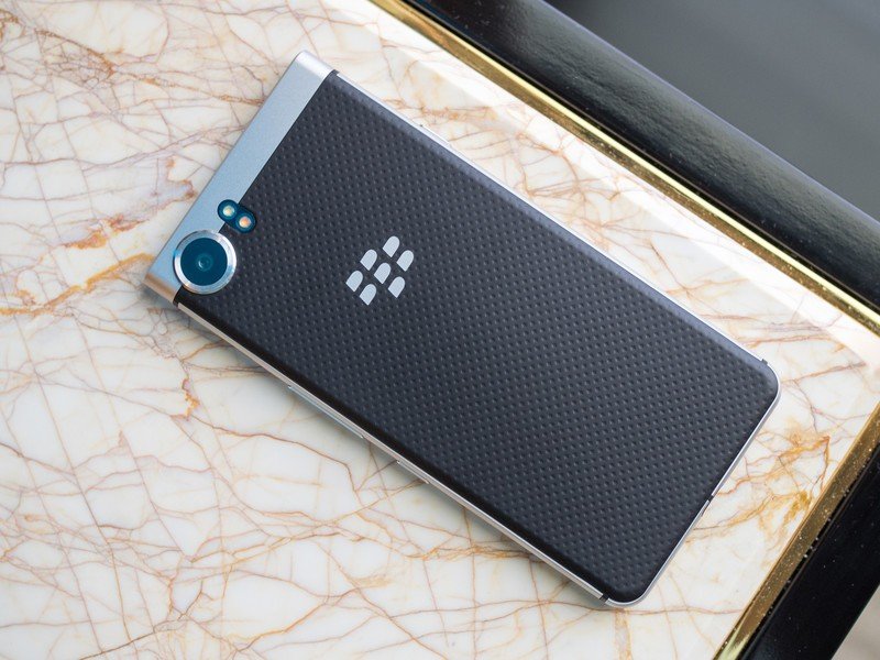
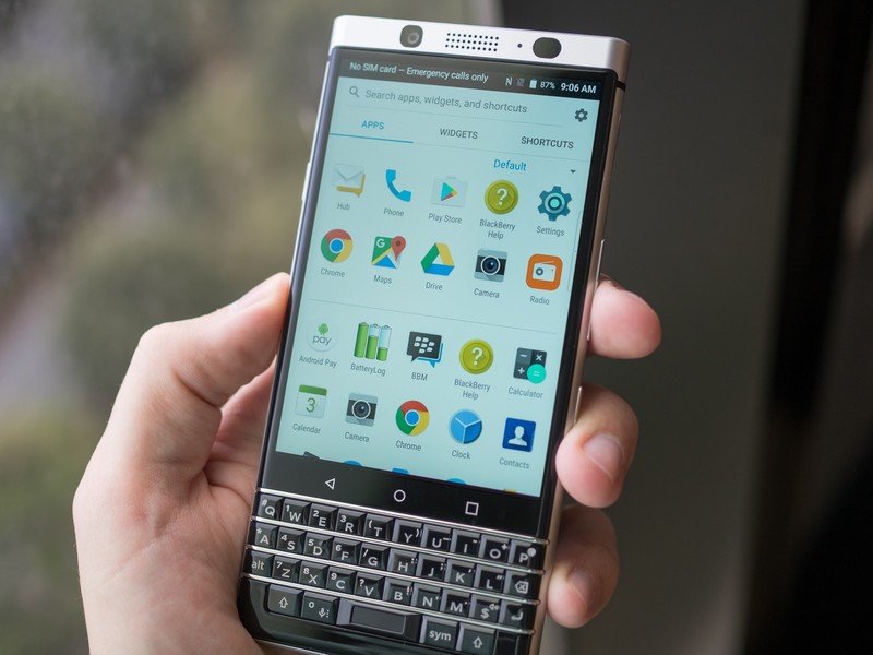
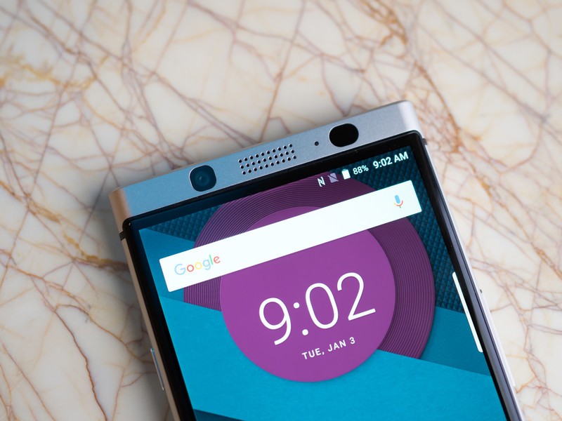
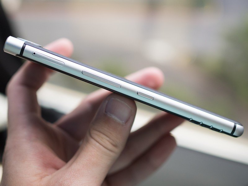
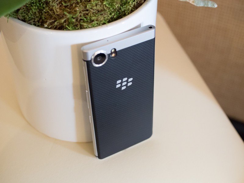
The incorporation of the fixed keyboard leaves a somewhat-awkward aspect ratio to the screen since it has to be a little shorter in order to make room — but if it wasn't, the phone would be absurdly tall, like a Priv with its keyboard out. As it stands the Mercury is nearly the same height as the BlackBerry DTEK60, though notably narrower. The Mercury itself isn't very thin, though the solid metal build with a nicely textured soft touch back are far more important than the actual thickness of the phone.
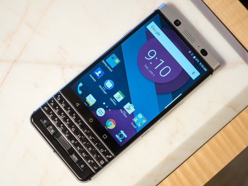
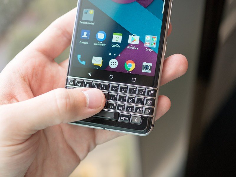
There's a full hardware keyboard, but the phone isn't particularly big or tall because of it.
As a welcomed sight for the BlackBerry faithful who may have been put off by the all-screen DTEK60, the Mercury has a full-featured and gorgeous hardware keyboard. And not only is it good for typing, but it also retains the great capacitive swiping gestures we saw in the Priv — you can swipe on the keyboard to navigate the interface, and swipe up on it during typing to help with word corrections and suggestions. Above the keyboard you'll notice BlackBerry chose to move back to fixed capacitive navigation keys, which is a tad odd after going with software keys on the Priv and DTEK60.
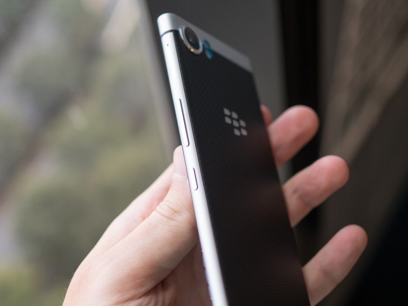
The rest of the phone hardware really rounds out in a typical layout as if the keyboard wasn't even there. You get a volume rocker and programmable key on the right edge, a power button the left edge, a headphone jack on the top and USB-C port on the bottom centered between two speaker grilles. Again we don't know details like the battery capacity, but I was able to confirm that there won't be wireless charging under that soft touch back.
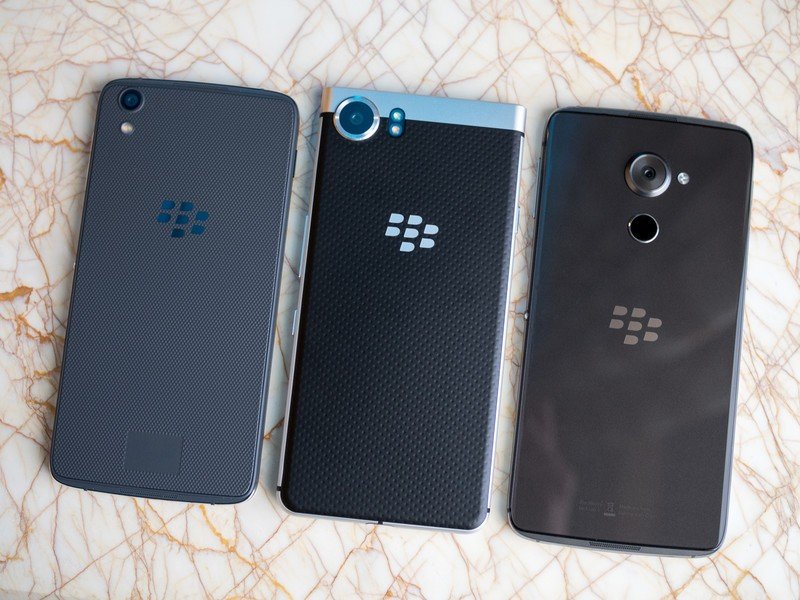
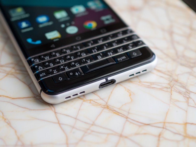
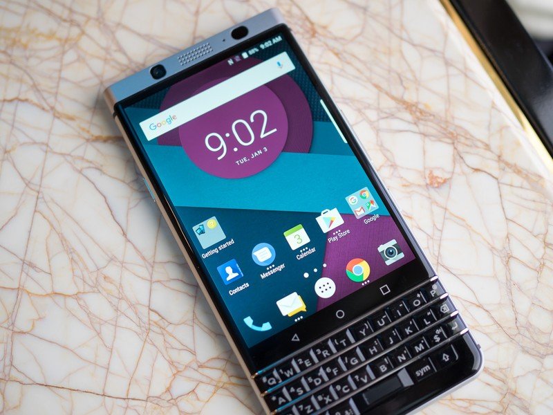
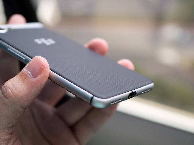
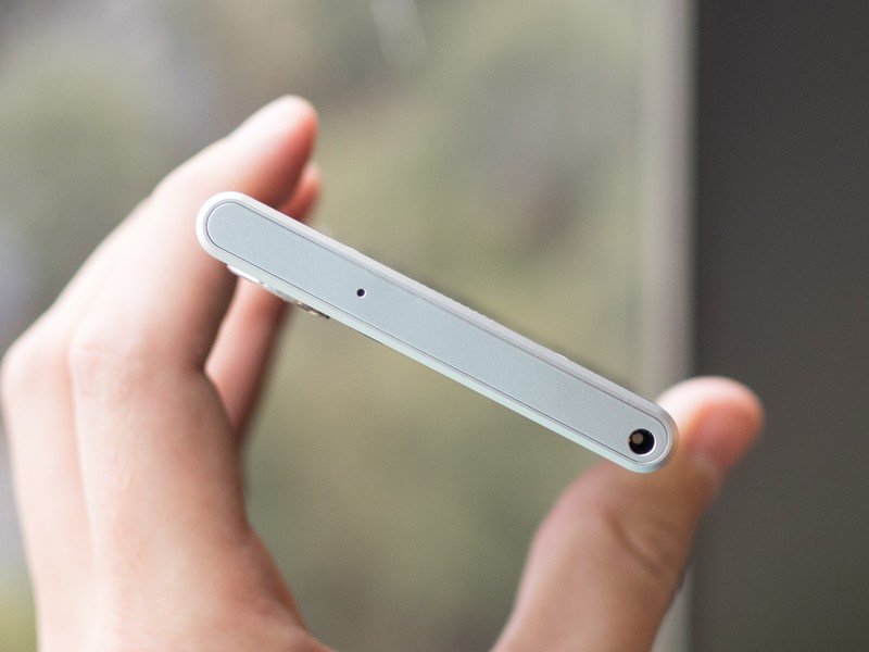
The biggest thing that stands out about the Mercury is how decidedly BlackBerry the whole design is. After seeing somewhat simple repurposed hardware designs in the DTEK50 and DTEK60, it's refreshing to see an altogether fresh — yet entirely familiar to BlackBerry fans — hardware design. The phone has a proper heft to it, the keyboard has a trademark clickiness and when you see it on a table you couldn't mistake it for a phone from any other company.
This is the first BlackBerry with Nougat, and it carries on smoothly from Marshmallow.
The Mercury holds the distinction of being the first BlackBerry to be running Android 7.0 Nougat, though the pre-production software version I was able to see wasn't final and the company couldn't commit to much on that front. From what I was able to use it looked very similar to Marshmallow you'll find today on a modern BlackBerry, including the messaging Hub, DTEK security suite, and productivity-focused launcher tweaks.
Be an expert in 5 minutes
Get the latest news from Android Central, your trusted companion in the world of Android
So where does this leave us? Well, we're all going right back into a holding pattern to rely on leaks and speculation about the final details of the BlackBerry Mercury. BlackBerry Mobile says that more information will be coming around the same time as Mobile World Congress, which kicks off February 27, but until then you can simply look at the photos and try to decide where this phone will fit in the big world of Android. At the very least, it has us excited about BlackBerry in 2017.
Andrew was an Executive Editor, U.S. at Android Central between 2012 and 2020.

