From the start, the Android Wear community quickly split into two factions. There are fans of the round watch, a form currently populated only by the Moto 360 and LG G Watch R. Then there's the square camp, which is everyone else. The original LG G Watch, Samsung Gear Live, the Sony SmartWatch 3.
Round? Or square. Both have their merits. The Moto 360 has been nearly universally declared the most attractive of the bunch.
That is, until the ASUS ZenWatch appeared.
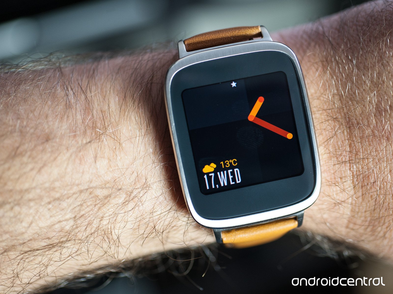
The ZenWatch sports a square face with rounded corners, and a body that should inspire the most stern smartwatch non-believer.
We now have more than one Android Wear smartwatch that you won't be ashamed to wear with a nice suit. And this is our ASUS ZenWatch review.
About this review
We've been wearing a retail version of the ASUS ZenWatch as purchased from BestBuy and Google Play for the better part of a month before writing this long-overdue review.
We used the watch primarily with Android 4.4W.2 (Build KNX01W). Android 5.0.1 for Android Wear became available as we were finalizing this review, and we spent a few days with build LWX48S, which added new notification and display options. An update to ASUS' ZenWatch Manager app added a few new watch faces, but the functionality and battery life of the watch mostly remained the same.
ASUS ZenWatch 3 hardware
Finally, we get sophistication in the square form factor
ASUS is one of those companies that surprises us every now and then. For as nondescript as some of its tablets and computers have been, it also comes out with some real gems from time to time.
And the ZenWatch definitely is a diamond in the rough.
Meet the best-looking square(ish) Android smartwatch.
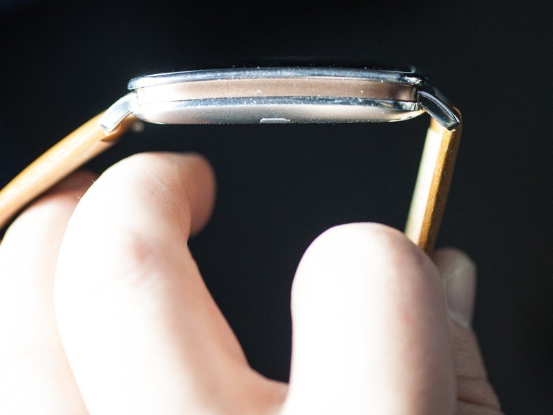
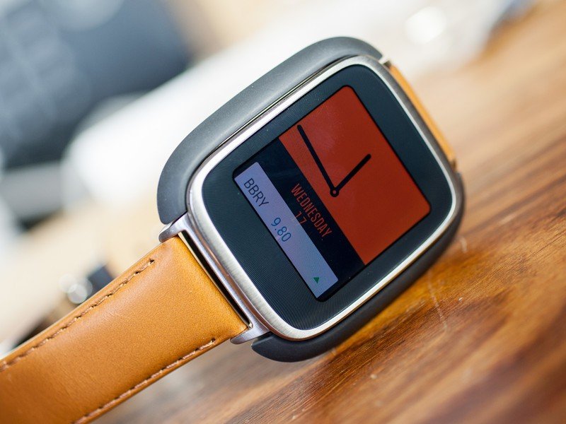
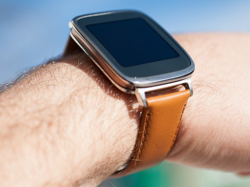
While the watch face is square — with the corners rounded off — the body is all kinds of curvy. The glass on the face is ever so slightly rounded. The chrome edge bezel is beautiful with the rounded corners, and the way it transitions into the rose gold-colored mid-section shows some real attention to design and detail.
The ZenWatch has some pretty profound lugs where the leather strap attaches to the body. But even these are nicely designed, even if they do stand out quite a bit. (More on that in a bit.)
The ZenWatch's 320x320 display isn't all that much to write home about, and that's a shame considering how great the body looks. That disparity isn't all that surprising given where we're at in the world of Android Wear, but it's still a letdown. Individual pixels are apparent, and the bezel immediately surrounding the 1.63-inch AMOLED panel is a sore spot. The body of the ZenWatch is begging for a more edge-to-edge display like in the Moto 360. (Yes, we're ignoring the physical ramifications of doing something like that.)
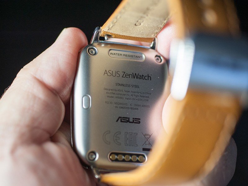
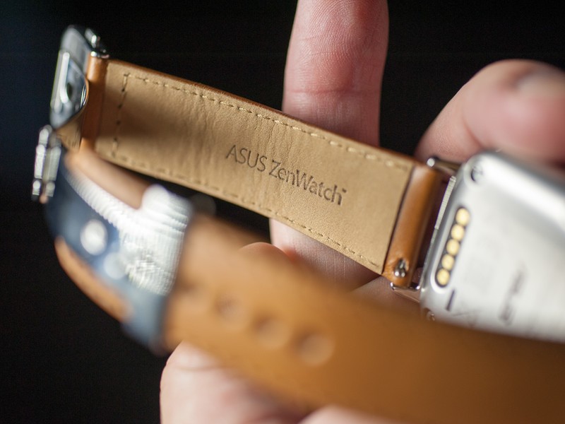
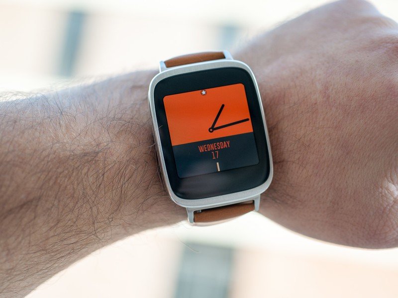
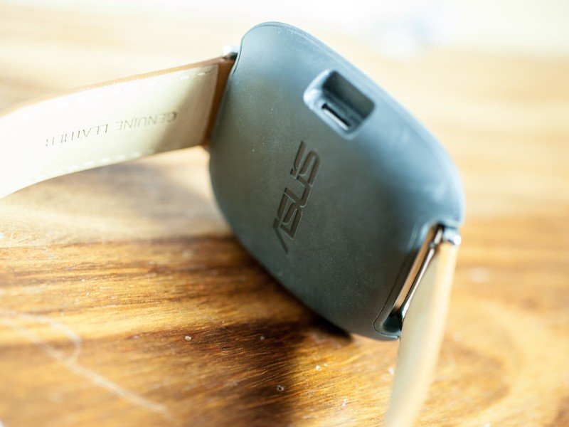
The underside of the watch deserves a few words — mainly because the heart-rate sensor that we still don't really want or need has been moved from there to the front of the watch, hidden in the lower bezel. It's actually not a horrible way to check your heart rate, though it doesn't make us want to do it any more than before.
The back also has a sort of emergency power button that you'll probably never actually use, and you'll find the gold contacts for the charging dock here back there as well. There's also a reminder that the ZenWatch is water-resistant — IP55 to be precise.
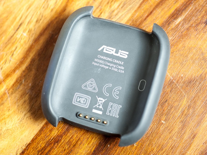
Speaking of the charging dock, you'll be needing it once a day, at least. Usage from the 360 mAh isn't any more than a single day, about par for the course. (You might be able to eke out a little more if you turn off the dimmed always-on mode and lower the brightness, but even then don't expect to extend things too much.) The dock itself is pretty slim and connects via microUSB (which also means you can use it for some Android Wear hacking, if you so desire), and it feeds in your pocket easily enough. As of the time of this writing you can't yet buy a spare dock, so you might well want to carry it with you.
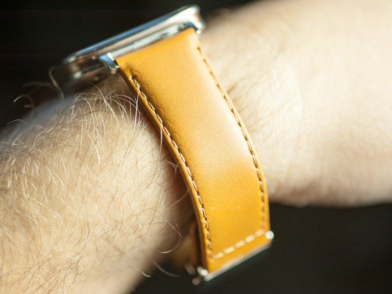
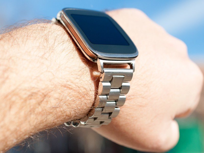
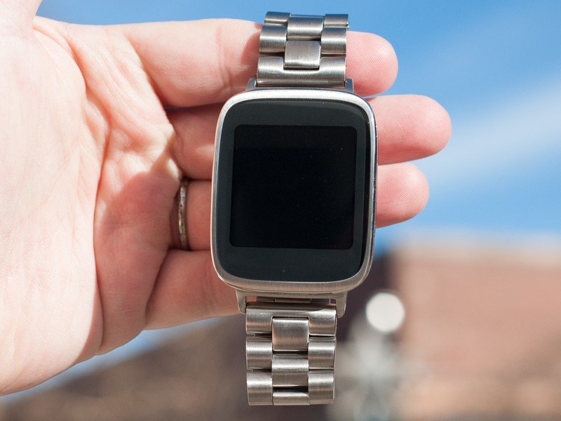
ASUS has used some gorgeous leather on the ZenWatch. And it's made it easy for fans of metal to swap in a bracelet.
Back to the leather straps and those lugs for a minute. ASUS has included a really nice leather strap. It's a natural brown color with a deployment clasp and a little bit of ASUS branding, with stitching down the sides. It's right up there in quality with the Horween leather on the Moto 360, but it's also thicker.
If you want to change it out for another 22mm bracelet or strap, you're welcome to do so, and the ASUS leather strap has quick-release pins, making removal easy. I've opted for a metal bracelet instead, and it pretty much looks like it came with the ZenWatch, a testament to the design of the lugs.
It's real tempting to call the ZenWatch the best looking Android Wear smart watch so far. And truth be told we've been struggling with that internally. There's still something about the (nearly) full face of the Moto 360 that makes it more of a complete experience, whereas the bezels on the ZenWatch make it look and feel more like a display on your wrist. Some of that has do to with the touch points, I think, and that your brain subconsciously knows that you're aiming for a display within the watch, and not just for the watch itself.
Regardless, this is still one gorgeous first-generation product for ASUS.
ZenWatch specs
Par for the course for Android Wear
The ZenWatch doesn't do a whole lot to progress the basic specs of the Android Wear ecosystem. You're pretty much looking at the same display and internals as the other watches. It's really the way they're all put together that make this watch something special.
| ASUS ZenWatch | |
|---|---|
| Weight | 75 grams |
| Dimensions | 50.6 x 39.8 x 7.9-9.4 mm |
| Battery | 360 mAh |
| Display | 1.63-inch AMOLED |
| OS | Android 5.0.1 Lollipop |
| CPU | Snapdragon 400 with 1.2 GHZ CPU |
| RAM | 512 MB |
| Storage | 4GB |
| Water resistance | IP55 |
| Wireless | Bluetooth 4.1 |
| Sensors | 9-axis sensor, heart rate, microphone |
ZenWatch software
It's Android Wear with a few ASUS additions
The ASUS ZenWatch as we're reviewing it is running Android 4.4W.2, with an update to Android 5.0 Lollipop to come any time now. The basic experience is the same as any other Android Wear device, which is, of course, the idea.
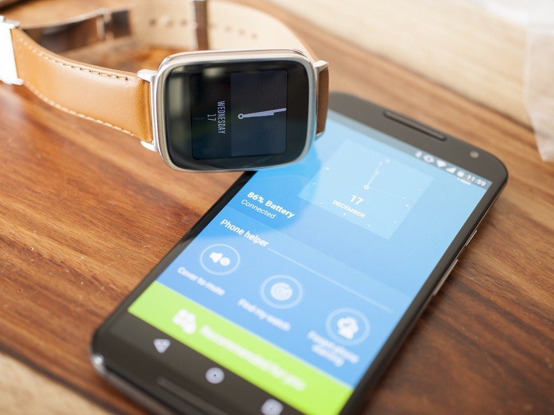
Just like with Motorola and Moto Connect, ASUS also has a companion app — actually, it has a whole bunch — that gives some extra functionality to the ZenWatch. The ZenWatch Manager app is the main one. With it you can easily see the remaining battery percentage first thing. Then you get a bunch of optional features, including:
- Cover to mute: Lets you place your hand over the watch face to mute an incoming call or alarm.
- Find my watch: Makes the ZenWatch vibrate so it's a little easier to find.
- Forgot phone warning: Makes the watch buzz when your phone is no longer connected.
(Annoyingly, you turn on the Cover to Mute feature with an "Apply" button. The forgot phone warning turns on with a toggle switch. That's a small but ridiculous disparity.)
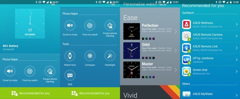
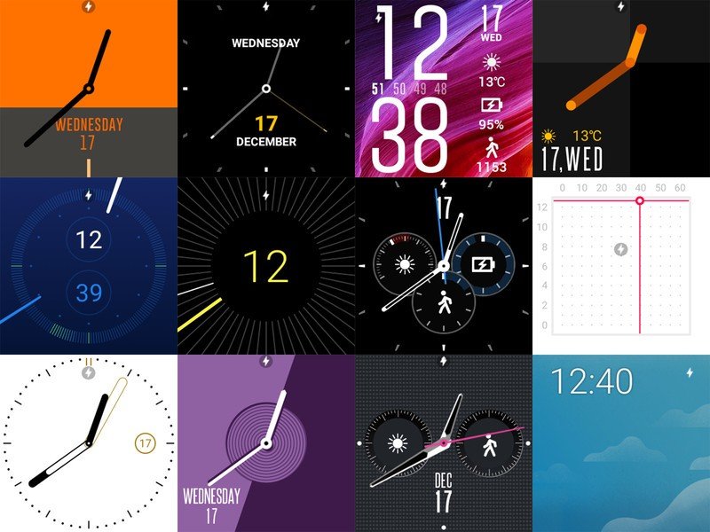
The ZenWatch Manager app also is where you can customize the colors on the various watch faces. Speaking of that, there are 18 watch faces built in. Some are stock Android Wear faces, and others are custom ASUS jobs. And ASUS has done pretty well with its designs, offering watch faces that simple look nice, and some with extra notifications. (I'm not overly crazy about them, but to each his own.) It's a nice mix. And with the addition of proper third-party watch faces with Android 5.0, we'll soon see many more designs.
ZenWatch Manager also includes shortcuts to three features you're more likely to launch directly from the watch — compass, flashlight (as in the watch face lights up in a solid color) and SOS, which can send an alert to a predetermined contact. ZenWatch Manager also will push you to install one of the other seven recommended ASUS apps, including ASUS Wellness. But given that Android Wear ties directly into Google Fit, there's not much sense in locking yourself into that closed ecosystem. (Same goes for the Jawbone UP service, which keeps nagging us from the watch. ASUS: Consider that what not to do.) In fact, the duplication of a few apps — and to be clear ASUS isn't the only manufacturer doing this — is really the only annoyance on the software side. You just get used to it. More choice usually is a good thing. But we see little reason to not use Google Fit if you're using an Android Wear smartwatch.
All in all, not a bad software experience, and any real hangups have more to do with Android Wear than the watch itself.
ASUS ZenWatch
The bottom line ...
Until now, it's been pretty easy to pick out a "best" Android Wear smartwatch. The Moto 360 from the beginning ran away with that title, but the ASUS ZenWatch now threatens to take over that top spot. And, really, there's no reason why the two can't live in the same house. A good bit of that decision will just come down to personal taste. Maybe a truly round watch just looks better to you. We could (and will) make an argument that a round watch face provides a more immersive touch experience than a square one, particularly a square one that's inset as much as the ZenWatch's display is.
Hands-down, you can't go wrong with the ASUS ZenWatch.
If that's the biggest complaint we have about the ZenWatch — and it pretty much is — ASUS has a clear winner on its hands. The watch body is an example of how tech doesn't have to look like tech. How a smartwatch can be more than just a display on your wrist. (Even if we do keep coming back to those bezels. What we wouldn't give to see a more edge-to-edge experience in this same form factor.) The leather strap is as stylish is it is functional, and while it might well attract second glances when worn with a suit, it won't be for the wrong reasons. It's also not the most expensive smartwatch of the bunch.
The overall experience might be just a touch lesser than what you get with the Moto 360. But at the same time we're completely confident in saying that you absolutely cannot go wrong with the ASUS ZenWatch.
