YouTube rolls out more immersive, clean video pages on mobile and web
More pronounced icons and better eye-catching elements.
What you need to know
- YouTube is beginning to roll out new visual updates for Android, iOS, and web users.
- The visual updates bring in new pill-shaped icons and some rearranging of page elements.
- The new pill-shaped top comment has been made more prominent on mobile while the description box has been improved on web browsers.
YouTube is beginning to roll out new visual improvements to elements around its video pages for mobile and web users.
According to 9to5Google, the highlight of these new visual changes rolling out for Android, iOS, and the web are the new pill-shaped buttons and rounded UI elements. For mobile, the thumbs-up and down icons are joined together in one pill but with a separate line between the two icons. Other options like Share, Create (for Shorts), and Download has received the same new icon update.
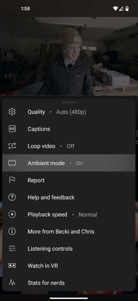
9to5 also highlights YouTube's proposed "Ambient Mode" feature, which allows the colors of a video to bleed into the area around the player and could be toggled in the video's settings via the gear icon.

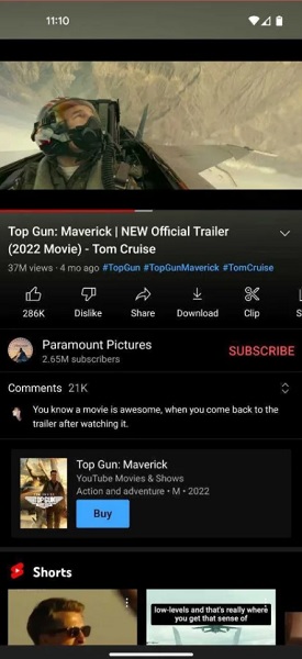
What's notable on mobile is the rearranging of some elements. YouTube has placed the channel's name between the video's title and the interactable buttons such as liking or disliking. Beneath the sidescrolling list of buttons comes a newly updated visual for the top comment of a video.
These new pill-shaped buttons have been made to pop off your screen a little more compared to the old style, which had everything sort of blending into the background. With this new update, YouTube has added a background to its new rounded icons to make them spring off the app whether you're using a light or dark theme. This new eye-catching improvement is also evident with the top comment of a video looking much more prominent now and also continuing the rounded edge theme of the other buttons.
Web users are also set to receive the same visual updates coming to mobile. It also seems as though the description of the video has gained a more eye-catching appearance for browser viewers.
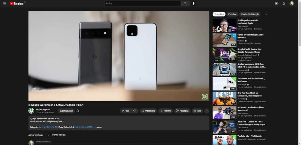
The elements of the page on the web version of YouTube have also been touched on a little. Some elements, like the channel name and page buttons, are displayed all within a single horizontal space, and everything appears more condensed.
Be an expert in 5 minutes
Get the latest news from Android Central, your trusted companion in the world of Android
This isn't the only change that may find its way to mobile YouTube users. YouTube has been testing a new "Explore" tab that could replace the separate Explore page in favor of a navigational drawer. It could keep things much simpler than the current layout, allowing users to jump into different topics faster.

Nickolas is always excited about tech and getting his hands on it. Writing for him can vary from delivering the latest tech story to scribbling in his journal. When Nickolas isn't hitting a story, he's often grinding away at a game or chilling with a book in his hand.
