YouTube Music's Now Playing controls are moved around in latest test
The scrubber now mimics the main YouTube app.

What you need to know
- YouTube is testing a redesign of YouTube Music's Now Playing screen for a number of users.
- The company last tweaked the look of Now Playing in September 2023, and is beginning to make new changes a little over a year later.
- Highlights of the changes include the main play/pause set of controls appearing directly below the album artwork and song title.
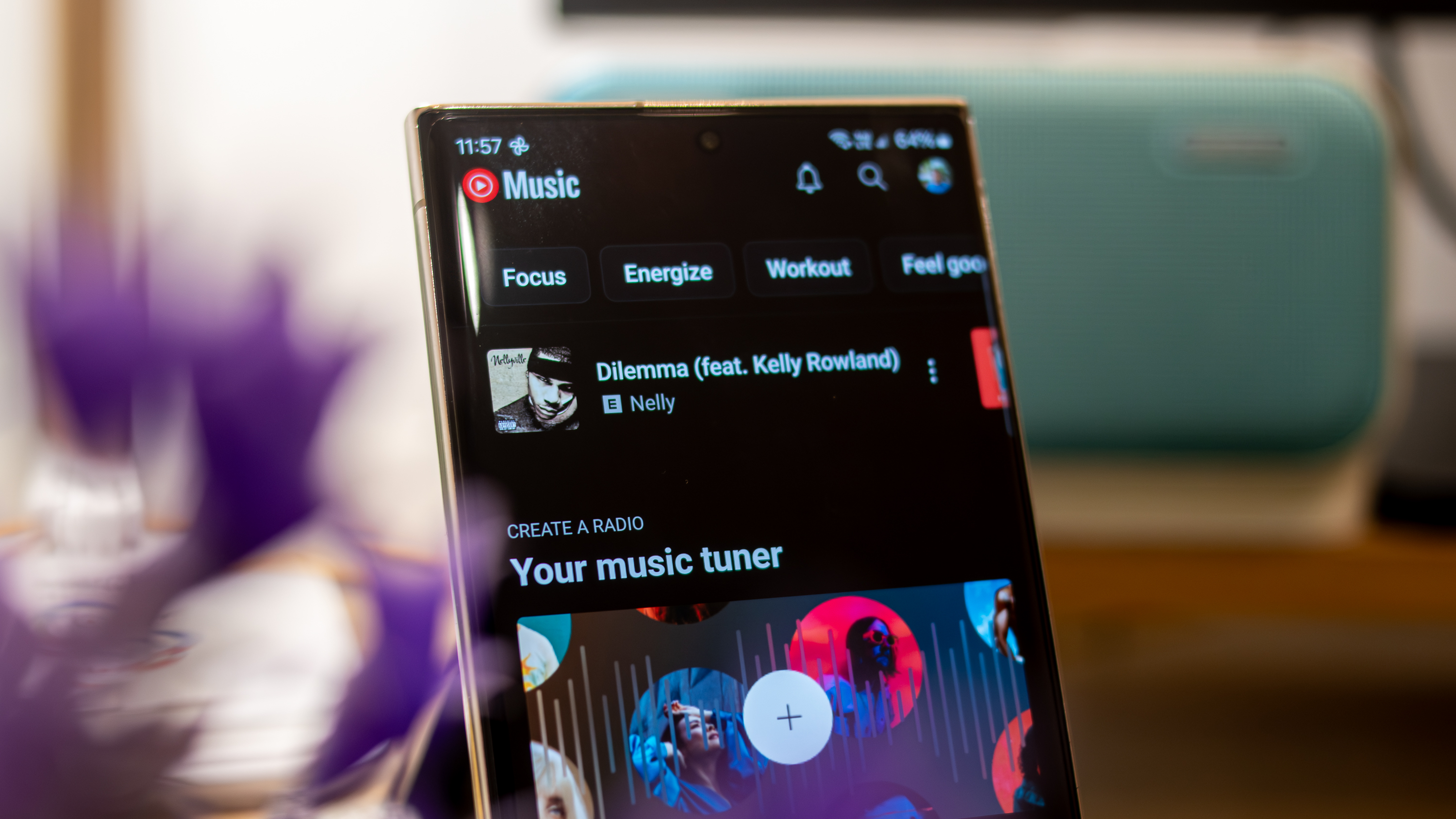
Over a year after YouTube last tweaked the Now Playing screen in the YouTube Music app, new changes may be coming. Multiple reports from Reddit users and 9to5Google indicated that YouTube Music's Now Playing page was testing a significant shakeup, with buttons moving around and a new-look scrubber. Android Central can confirm the test firsthand, as the redesigned Now Playing screen has appeared on at least one of our devices.
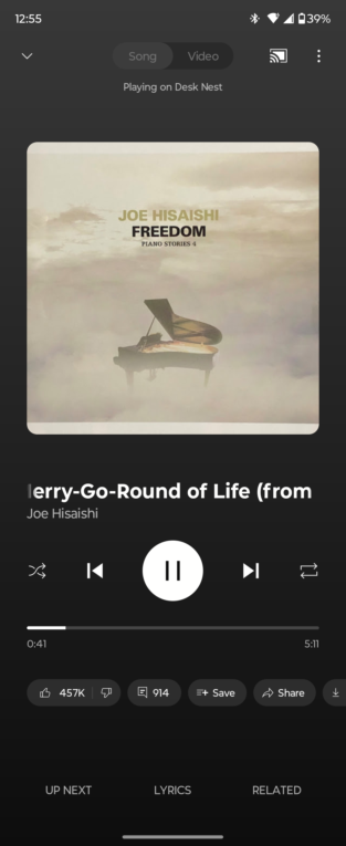
Previously, the actions carousel appeared directly under the song title, artist, and album artwork. This carousel gives users access to buttons for like, dislike, comments, sharing and more. However, the new test moves the main playback controls — including play/pause, forward/rewind, and shuffle/loop — directly under the song title and artist name.

The test moves those crucial Now Playing buttons closer to the center of the screen, and the song details. It also shifts them further away from the bottom of the screen, which may cause reachability issues when using your phone one-handed. This is a unique problem for YouTube Music, because it has the actions carousel that forces the main Now Playing buttons upward or downward on the screen. Other streaming apps, like Spotify and Apple Music, don't have this problem because they don't have an actions carousel or equivalent.
Article continues belowAdditionally, the timeline is redesigned, taking cues from the main YouTube app. It's now a rectangle without a visible dot for the scrubber. Instead, the scrubber will appear if you try and hold and drag along the timeline to skip or go back. It's a more minimalist design that will feel familiar if you're used to other Google timeline scrubbers.
Of course, since the Now Playing buttons are moved up, the actions carousel must be moved down. It's now in between the up next/lyrics/related buttons at the very bottom of the screen and the main Now Playing buttons.
While these changes may take some getting used to, it has been a while since YouTube Music updated its Now Playing screen, so maybe it was time for a tweak or two. This seems to be a somewhat limited test for now, and we're not sure when it might roll out to all YouTube Music users. You might have to wait and hope you get lucky, like those YouTube Music users who got their Rewind stats early.
Get the latest news from Android Central, your trusted companion in the world of Android

Brady is a tech journalist for Android Central, with a focus on news, phones, tablets, audio, wearables, and software. He has spent the last three years reporting and commenting on all things related to consumer technology for various publications. Brady graduated from St. John's University with a bachelor's degree in journalism. His work has been published in XDA, Android Police, Tech Advisor, iMore, Screen Rant, and Android Headlines. When he isn't experimenting with the latest tech, you can find Brady running or watching Big East basketball.
You must confirm your public display name before commenting
Please logout and then login again, you will then be prompted to enter your display name.
