YouTube Music gives the Now Playing screen a cleaner look on the Web
The web version of the Now Playing screen looks like its Android app version.

What you need to know
- YouTube Music for the Web has a new, revamped Now Playing screen.
- It comes with a cleaner look and matches with the app version of it.
- The update is reportedly rolling out to the users over the past few weeks.
YouTube Music for the Web has been seeing significant changes lately and seemingly wants to look more like the app version of it. It recently introduced offline downloads, and now the desktop version is being redesigned.
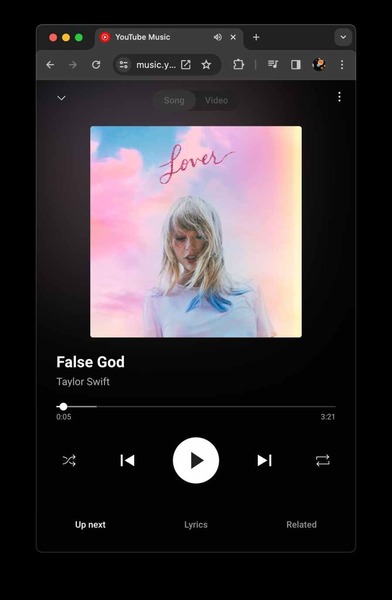
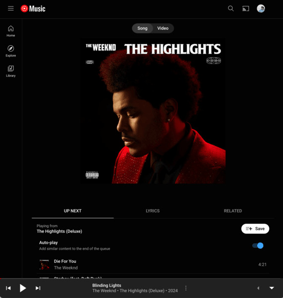
As noted by 9to5Google, YouTube Music for the Web is getting a new Now Playing revamp akin to the Android version of the music streaming platform. The redesign gives users a much cleaner look than the earlier version, as it hides the app bar at the top with an accompanying drop-down button. The bottom music controls are being moved under the album art, very similar to what we see on the YouTube Music app on Android phones.

9to5 notes a new overflow menu on the top right of the revamped Now Playing screen where users can like or unlike songs. The album artwork also appears larger than before, with a gradient background and a significantly visible track name accompanied by the artist’s name. As mentioned, these are followed by timeline scrubber and play controls, which are moved up from the bottom bar of the previous version of YouTube Music web.
As we see the Up Next, Lyrics, and Related sections at the bottom part of the screen on the Android app, the revamp for the desktop is also implementing the same version. As mentioned earlier, it also hides all familiar, discovered, and popular charts in the overflow menu.

While the web version of the Now Playing screen appears similar to the app version, the cast screen option is nowhere to be seen on the Web as opposed to the app version of Now Playing.
Lastly, 9to5 points out that there is a new mini-player design on the Web accompanying the Now Playing revamp. It will also look familiar to the app version of the music streaming app, featuring basic functionalities like playing/pausing the tracks next to skipping tracks and album artwork. The Now Playing revamp has been rolling out to YouTube Music web over the past few weeks, notes 9to5, meaning users can experience it soon.
Be an expert in 5 minutes
Get the latest news from Android Central, your trusted companion in the world of Android

Vishnu is a freelance news writer for Android Central. Since 2018, he has written about consumer technology, especially smartphones, computers, and every other gizmo connected to the internet. When he is not at the keyboard, you can find him on a long drive or lounging on the couch binge-watching a crime series.
You must confirm your public display name before commenting
Please logout and then login again, you will then be prompted to enter your display name.
