YouTube Music upgrades the Library tab with a new look on Android and iOS
Jump into your recent activity much faster.
Update (Jan 11, 1:00 pm ET): The Library redesign is rolling out more widely across devices.
What you need to know
- YouTube Music is rolling out a redesign to its "Library" tab on Android phones.
- The update removes the "Recent Activity" side-scrolling menu in favor of a list view of music for users to get into quickly.
- While this update also brings some filtering options, it is only rolling out for Android phones and not tablets or iOS devices at the moment.
YouTube Music is getting a redesigned "Library" tab, at it seems to be rolling out across Android phones.
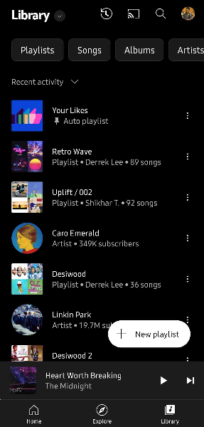
As spotted by 9to5Google, the newly redesigned library gets users right into their recently played tunes without the need for extra steps. This is a much different look from the previous library view. Originally, users would be met with a "Recent Activity" side-scrolling menu that would show some of the recently played songs and playlists before needing to hit the arrow to get a full view.
Following this new redesign, recent activity is now in full view, although users have the ability to sort this list by recently added or recently played as well. Meanwhile, other views such as "Downloads," "Uploads," and "Device files" are now hidden in an overflow menu at the top left. Your "Library" is the default content shown to you, but you can switch your view by tapping on the title of the section in the top left of the app to bring up the menu.
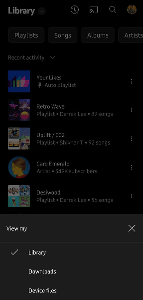
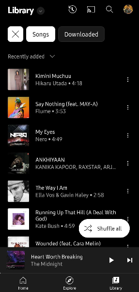
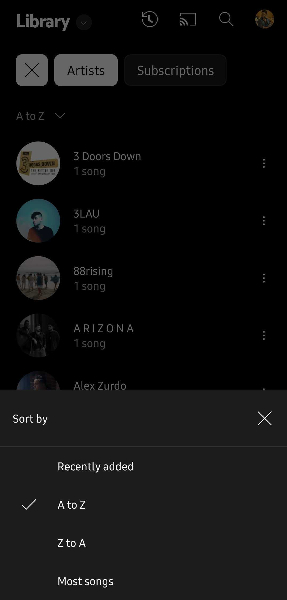
Your choice for the "View My" menu persists even after visiting the main home page or exiting the app entirely. Reopening the app and going to the library will show you the view you left on.
Additionally, there are new pill-shaped chips included with this new update. The new chips include playlists, songs, albums, and artists to easily filter your tunes. This isn't unlike some changes Spotify has been making to its home screen experience. You can further filter these in another overflow menu located under the chips.
There are also new floating action buttons for creating a new playlist and shuffling all songs. Lastly, as 9to5 states, this update is rolling out across Android phones, with Android tablets and iOS devices being left out for the time being. That said, these changes have yet to appear on our devices.
Be an expert in 5 minutes
Get the latest news from Android Central, your trusted companion in the world of Android
In June, YouTube Music received an album interface redesign for some Android phones and tablets. The latest change appears to further clean up the app's navigation by making it easy for users to focus on the music that matters most to them.
Update
After briefly appearing last year on some devices, the new Library tab redesign is now rolling out widely across Android phones and iOS devices. 9to5Google points out that the new look appears on YouTube Music version 5.38, although we've noticed the redesign pop up on a few devices with app version 5.36. On iOS, the redesign appears to be associated with version 5.39.
If you don't immediately notice the new UI, you can try closing the app, force-stopping it, and reopening it.

Nickolas is always excited about tech and getting his hands on it. Writing for him can vary from delivering the latest tech story to scribbling in his journal. When Nickolas isn't hitting a story, he's often grinding away at a game or chilling with a book in his hand.
- Derrek LeeManaging Editor
