YouTube might change the web video player drastically, and users aren't thrilled
It could be the biggest change to YouTube's UI in years.

What you need to know
- YouTube is testing a redesigned video player on the web that moves the title and comments to the sidebar.
- A social media account for the site confirmed that this new view is only a test for now.
- Users expressed disdain for the feature, and YouTube suggested they submit feedback through its website.
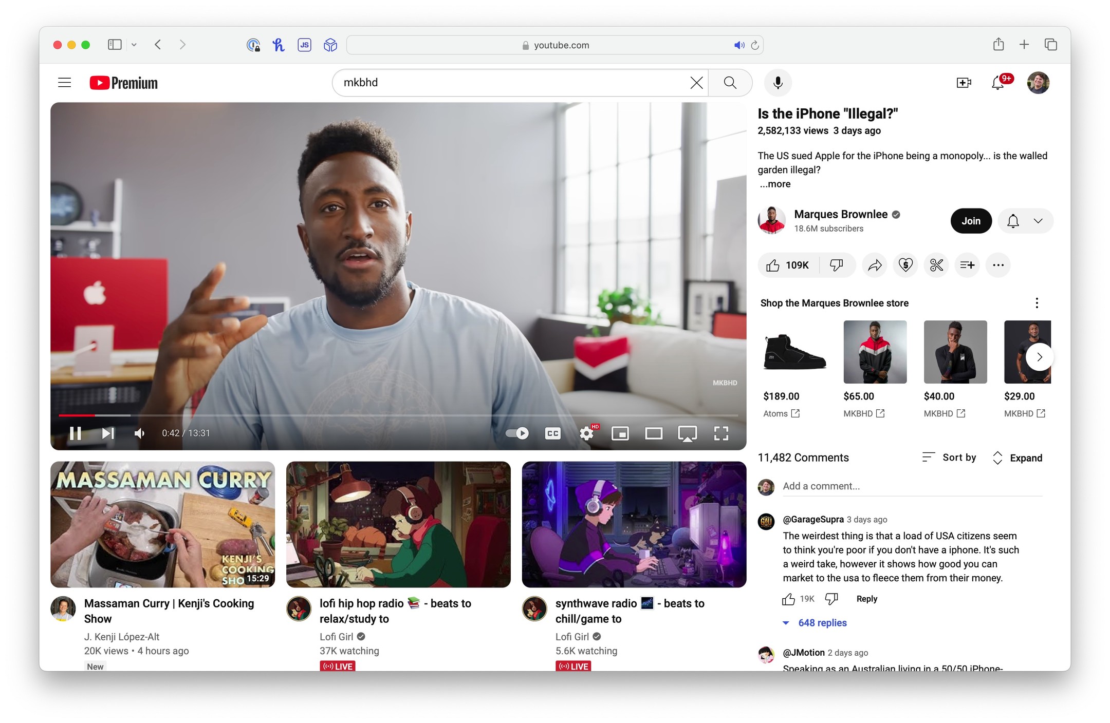
YouTube is experimenting with new ways to show video players on the web, and the latest one could represent one of the biggest UI changes in years. Earlier this month, YouTube Shorts started appearing in the recommended videos sidebar for some users. Now, an even more drastic change is showing up for a limited number of users. The latest redesign test moves the title, description, and comments to the sidebar and shifts recommended videos under the currently playing one.
Though this user-interface change is indeed only a test, users aren't thrilled about it for now. The redesign drew the attention of all the major social media sites, including X (formerly Twitter), Threads, and Reddit. One user on Threads, Brian Hamilton, shared a screenshot of the visual overhaul, and over 100 mostly negative replies ensued.

The benefit of this change appears to be that you get to see more of the video title, comments, and description. Meanwhile, less recommended videos appear on the same page as your now-playing content. Instead of a long list of recommended videos with smaller thumbnails and titles, YouTube shows three recommended videos with larger thumbnails and titles in this test.
However, users responded to this change in a similar way to YouTube's last test with YouTube Shorts. In both cases, the bigger thumbnails for recommended videos were found to be distracting from the main content.
jumping in! it sounds like you’re seeing an experiment/test feature. diff teams at YouTube often test new ways to improve features & experiences. you can share your feedback here: https://t.co/NnQpe4fbHH also, you can check out recent experiments here: https://t.co/p3uu6MOOr2April 10, 2024
The Team YouTube account on X clarified that this is an experimental test feature that isn't rolling out for everyone yet. The account advises users to submit their feedback through their YouTube account. To do so, users can click on their profile picture on the YouTube site and select Send feedback. After writing feedback or including a screenshot, you can hit Send to submit your thoughts to Google.
Although the redesigned YouTube video player isn't available to all users and Google accounts on the web, the social media buzz around the change suggests that it is somewhat widespread. Currently, it looks like YouTube is testing a few new ways to improve the web video player, so we'll be curious to see which—if any—of these tests survive.
Be an expert in 5 minutes
Get the latest news from Android Central, your trusted companion in the world of Android

Brady is a tech journalist for Android Central, with a focus on news, phones, tablets, audio, wearables, and software. He has spent the last three years reporting and commenting on all things related to consumer technology for various publications. Brady graduated from St. John's University with a bachelor's degree in journalism. His work has been published in XDA, Android Police, Tech Advisor, iMore, Screen Rant, and Android Headlines. When he isn't experimenting with the latest tech, you can find Brady running or watching Big East basketball.
You must confirm your public display name before commenting
Please logout and then login again, you will then be prompted to enter your display name.
