YouTube is testing a more useful, PC-like UI change for foldables
This slight redesign would make for a more modern YouTube app experience on mobile.

What you need to know
- YouTube was spotted testing a new version of its landscape orientation for mobile devices.
- The updated UI test shows a better use of the dead space its orientation currently struggles with as it displays content clearer.
- YouTube was testing a new version of its video page earlier this year for desktops, but users were quick to voice their displeasure.
YouTube is reportedly involved in a new test that could provide a much better experience for larger mobile devices.
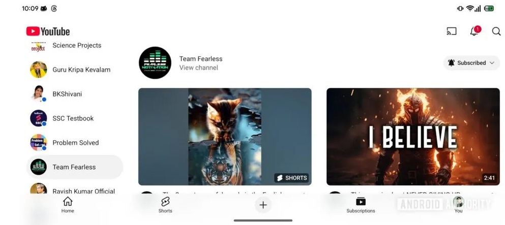
Spotted by X tipster AssembleDebug (Android Authority) during an APK teardown, YouTube is testing a redesigned UI layout for foldables and tablets. The early look suggests the platform is changing the styling of its "landscape" orientation for those larger devices. One of the primary changes is that a user's list of subscribed channels will now appear on the far left side.
Preceding this list of subscriptions will be an "All Channels" button. Tapping that opens a full view of subscriptions, likely in order of upload.
The publication offered a quick glimpse at this revamped subscriptions page. One thing to highlight is that the amount of dead space is cut down severely. As the post notes, previously, a video's thumbnail would sit off to the left with its title, channel, views, and upload time to the right. However, beneath that was a void where nothing was present until the next video came in after the large thumbnail.
Currently, the test shows that the landscape view for videos on YouTube will be placed in pairs down the screen. Shorts also enter the spotlight, but since those are vertical videos, the redesigned orientation displays several of them in a row.
Tapping on a subscribed channel will adopt a similar layout scheme. The test shows a "View channel" option beneath the channel's name to take you to the full scope of that creator's content.

Unfortunately, AssembleDebug's demo didn't expand on what sort of layout changes concern YouTube channels. It's likely safe to assume the same layout present in the subscriptions tabs and elsewhere will fall into the full channel view for content creators. It's worth mentioning that the changes present in this test might bring mobile devices closer to the wide experience on computers. For now, these landscape orientation changes are still in testing as of YouTube v19.50.36.
Be an expert in 5 minutes
Get the latest news from Android Central, your trusted companion in the world of Android
The post states that "some" users will likely see this limited test before a wider, stable rollout.
More importantly, while this benefits larger devices, the tipster suggests mobile devices could see these landscape changes, too.
It's been a while since YouTube redesigned the visual elements of its app, especially following the more immersive video pages. These redesigns benefited mobile and desktop devices as the platform reformatted its icons and shifted several page elements. On mobile, users now see the top comment more prominently following the title, channel name, and interactable video buttons.
PCs gained a similar update; however, that visual upgrade brought more attention to the description box.
Elsewhere, YouTube was spotted testing a radically different desktop UI experience when watching videos. While the video player would remain off to the left, YouTube tested shifting the video's core bits of information to the right, followed by a store, description box, and comments.
Users who spotted it expressed their disdain for the change vocally on social media.

Nickolas is always excited about tech and getting his hands on it. Writing for him can vary from delivering the latest tech story to scribbling in his journal. When Nickolas isn't hitting a story, he's often grinding away at a game or chilling with a book in his hand.
You must confirm your public display name before commenting
Please logout and then login again, you will then be prompted to enter your display name.
