WhatsApp announces major design changes and a darker dark mode
The Meta-owned messaging platform is bringing changes to both Android and iOS devices.
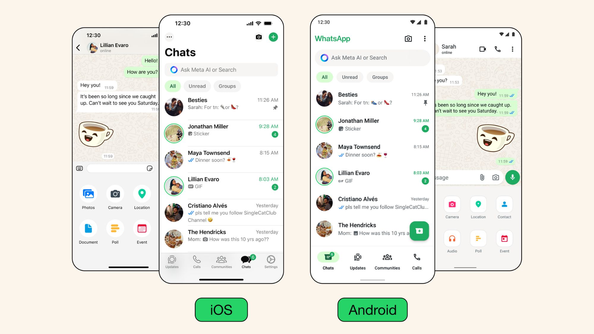
What you need to know
- WhatsApp changes the app to make it "feel more fresh and modern."
- The changes include a design overhaul and new features for iOS and Android devices.
- The primary ones, however, include chat filters, darker dark mode, and the inclusion of a Meta AI chatbot, which is yet to be launched.
WhatsApp has had a significant design revamp over the past few weeks, and Idit Yaniv, VP, Head of WhatsApp Design, Meta, indicates that these changes to the product are to "feel more fresh and modern" while keeping the messaging platform's core functionality.
While some design changes have been rolling out to WhatsApp for some time now, Yaniv explains the three principles on which these changes were built in an accompanying blog post:
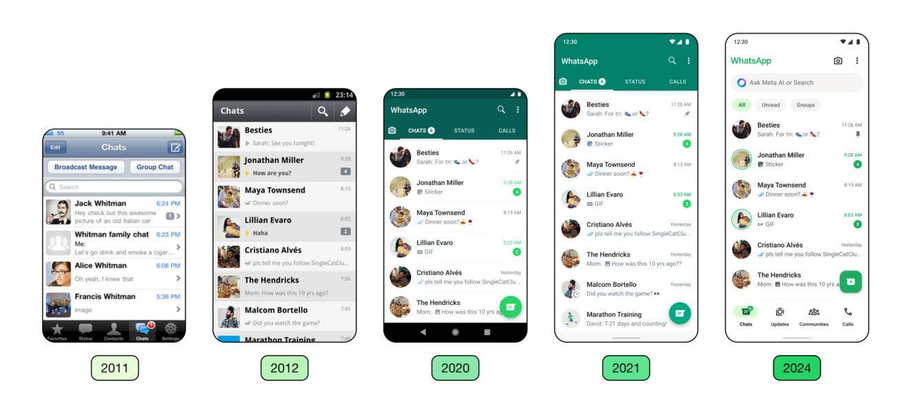
- Fresh: WhatsApp should feel fresh, fun, and yours with a look familiar and native to your device.
- Approachable: Everyone should feel comfortable using WhatsApp. It's accessible at home within the OS and feels unmistakably WhatsApp—friendly and slightly quirky.
- Simple: The new design should enhance simplicity, be scalable, and be future-proof.
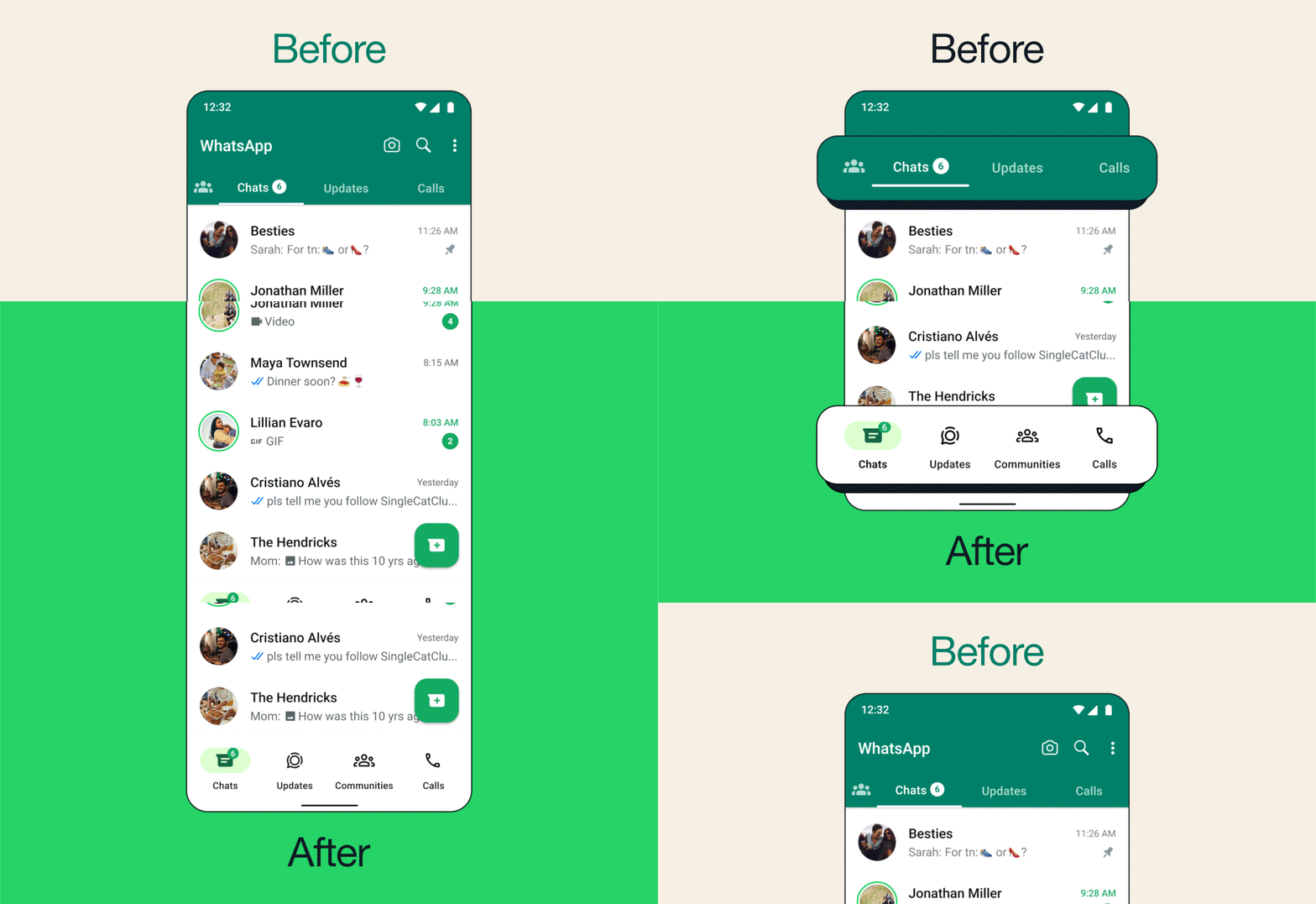
The primary design changes have included shifting the navigation bar comprising Chats, Status, and Calls tabs from top to bottom. This should help people who use bigger, at least 6-inch screens (and above) on Android phones navigate more quickly as it is closer to the thumb.
The change also means the addition of chat filters at the top that should help people to set apart between "All," "Unread," and "Group" chats — these were introduced very recently on the messaging platform.
The popular green shade at the top has also been replaced with a much cleaner look. Besides, WhatsApp has also chosen a new consistent green palate that should be visible across the app and its menus and settings.

Yaniv also notes that users have been requesting a darker dark mode. WhatsApp has made relevant changes with higher contrast and deeper tones, which promises to reduce strain when using the app in darker environments.
While the intended changes are for both iOS and Android platforms, iOS users have also seen a new attachment layout: an expandable tray replacing a full-screen menu that should allow people to send photos and videos effortlessly.
Be an expert in 5 minutes
Get the latest news from Android Central, your trusted companion in the world of Android
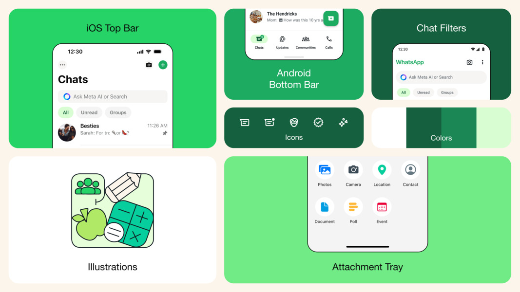
As mentioned, most of these changes have already been made through WhatsApp app updates and server-side updates. The other prominent changes on the messaging platform are the overall icons on the app, next to refreshing doodles for background on WhatsApp chats.
One common thing to note across the changes and accompanying images is the inclusion of a new Meta AI chatbot in the messaging app's search pane.
While the blog post does not mention it or its launch time frame, we expect it to roll out in the coming days or weeks,
as the wider rollout was recently seen for users across regions.

Vishnu is a freelance news writer for Android Central. Since 2018, he has written about consumer technology, especially smartphones, computers, and every other gizmo connected to the internet. When he is not at the keyboard, you can find him on a long drive or lounging on the couch binge-watching a crime series.
You must confirm your public display name before commenting
Please logout and then login again, you will then be prompted to enter your display name.
