Progress bars and sliders in Material You are changing in a big way
The sliders are getting thicker, while bars now feature a gap.

What you need to know
- Google is continuing to update Material You with redesigned progress bars and sliders, which are starting to roll out now.
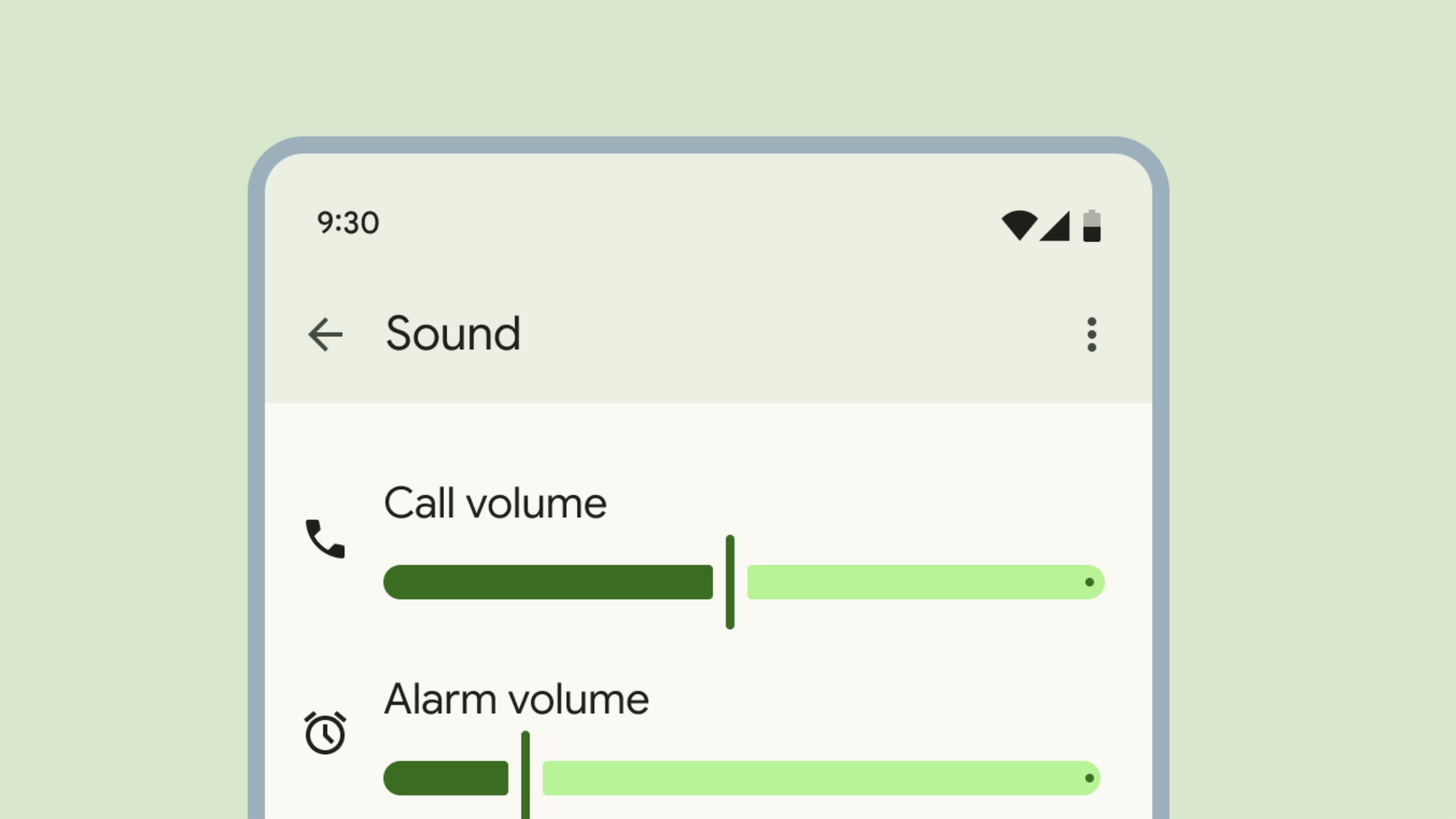
- Sliders are thicker and now have a vertical line head for scrubbing content. Previously, they were thinner and featured circular heads.
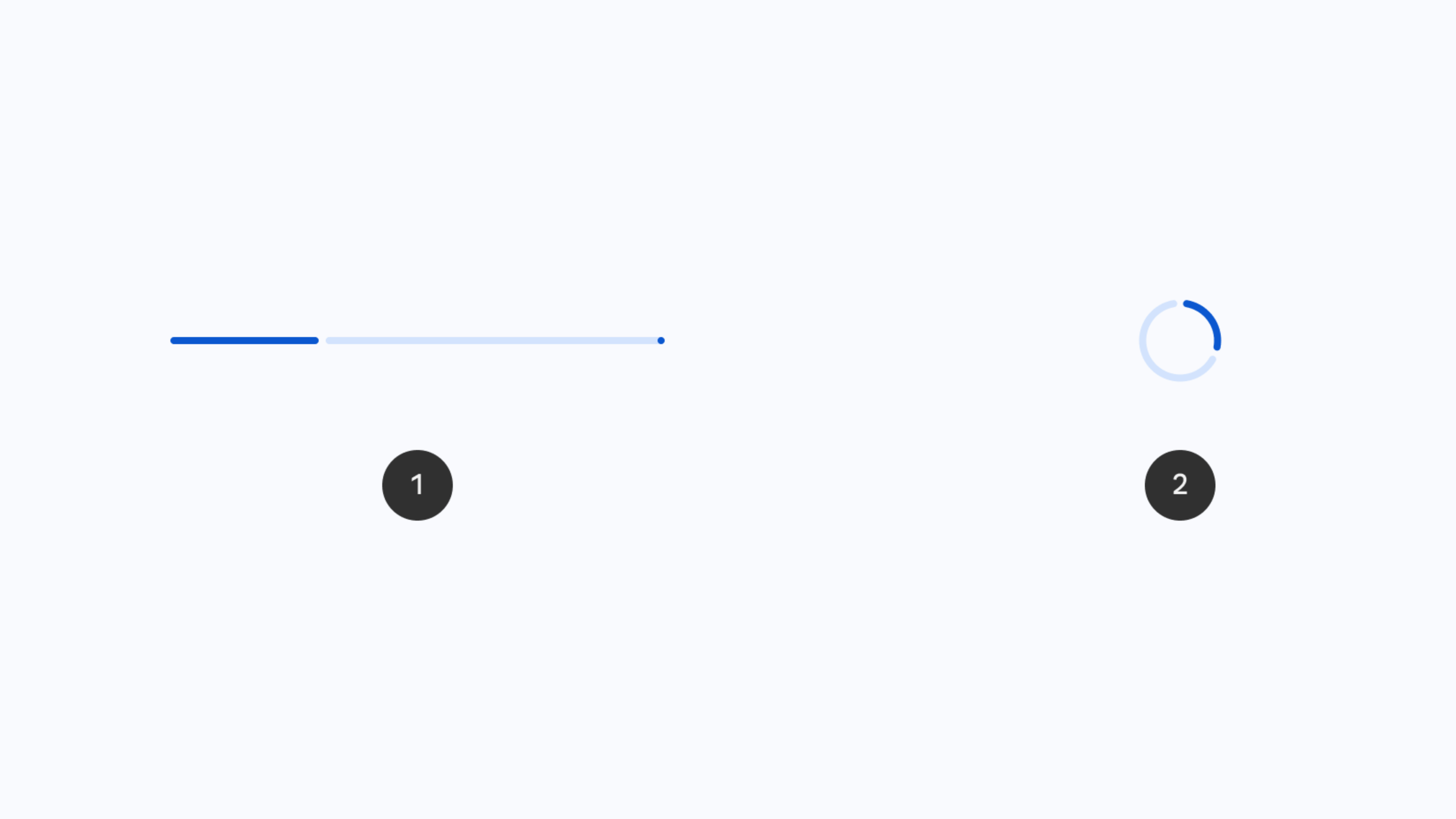
- Progress bars now have a gap between the current progress of something and the end of the bar.
Google is changing the way progress bars and sliders appear and work in Material You, as detailed in updated Material 3 interface guidelines (via 9to5Google). They were first introduced late last year, and the new UI elements are starting to reach users now.
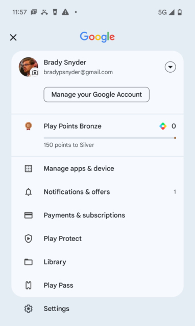
Eventually, the new progress bars and sliders will extend throughout Material You on Android. For now, the progress bar is confirmed to work in the Google Play Store app (to show Play Points) and in the Photos app (to show available storage). We haven't seen the slider roll out publicly yet, but it could soon be coming.

So, what's different? It comes down to two main design tweaks: thickness and spacing. Previously, sliders in Android were extremely thin lines with large and circular scrubber heads. Now, the slider itself is much thicker and has an ovular shape. The scrubber head is now a thin line, instead of a circle, with gaps separating it from the timeline bar.
It's reminiscent of older sliders, especially skeuomorphic ones used in early music apps in the late 2000s. Those sliders had thin scrubber heads that resembled the lines on physical radio tuners that would let you know what station you've landed on. The new Material You sliders look like a modern take on this old UI element, extending far beyond music and media.
The spacing changes are also present in Material You's new progress bars. The updated bars are slightly more curved, but most will be too small for you to notice the subtle rounded corners.

You will notice how Google accentuates the current and end points of the progress bar. There's now a gap between your current progress and the remaining progress. Additionally, Google makes the endpoint of the progress bar a solid color point, which is the same opacity as your current progress. The space in between is a much lighter version of the same color.
The changes are also reflected in circular versions of the progress bar. It's much less noticeable, but there will also be a gap between your current progress and the rest of the bar in the circular icon.
Be an expert in 5 minutes
Get the latest news from Android Central, your trusted companion in the world of Android
We'll likely start to see the new design language for Material You roll out throughout sliders and progress bars in Android soon. The progress bars are available now, and sliders are probably on the way.

Brady is a tech journalist for Android Central, with a focus on news, phones, tablets, audio, wearables, and software. He has spent the last three years reporting and commenting on all things related to consumer technology for various publications. Brady graduated from St. John's University with a bachelor's degree in journalism. His work has been published in XDA, Android Police, Tech Advisor, iMore, Screen Rant, and Android Headlines. When he isn't experimenting with the latest tech, you can find Brady running or watching Big East basketball.
