OxygenOS 13 hands-on: Broken promises
OxygenOS 13 still feels like a paltry imitation of ColorOS.
OnePlus held two media roundtables over the course of the last 12 months to talk about its software efforts. The first (in August 2021) outlined a vision for a unified OS that would make its way to all OnePlus and OPPO phones outside China. The idea was to merge the best of OxygenOS with ColorOS, creating an interface that's "fast and smooth" while being "stable and feature-rich."
In a second roundtable (in February 2022), OnePlus walked back most of those claims. OnePlus CEO Pete Lau and head of software Gary Chen announced instead that OxygenOS would continue to exist alongside ColorOS, and that OxygenOS 13 will be a "light and clean" interface that will be "familiar" to OnePlus users. That sounded too good to be true considering just how tightly integrated OxygenOS 12 was with ColorOS 12 — for all intents and purposes, OxygenOS is an offshoot of ColorOS with a few extra features.
My internal sources confirmed as such, stating that there wasn't a dedicated software team for OxygenOS anymore; it had been dissolved and subsumed into OPPO. Nevertheless, I wanted to withhold judgement until I actually used the Android 13-based OxygenOS 13 and see if OnePlus at least made an effort.
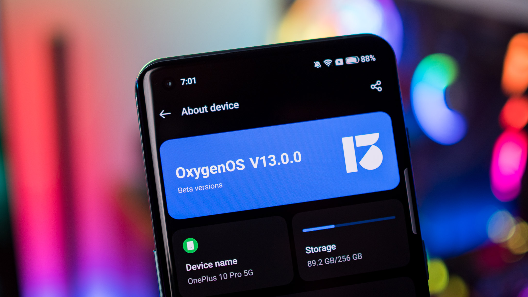
After using OxygenOS 13 for just over a day on my OnePlus 10 Pro, I can say that this isn't the case. The software doesn't feel anywhere close to vanilla Android, and while I haven't used ColorOS 13 just yet (it's launching August 18), it's a safe bet that it is virtually indistinguishable to OxygenOS 13.
OxygenOS 13 uses a new Aquamorphic design that takes cues from aquatic elements, and while there are subtle tweaks to make the interface look a little more modern, the broader design language hasn't changed by too much.
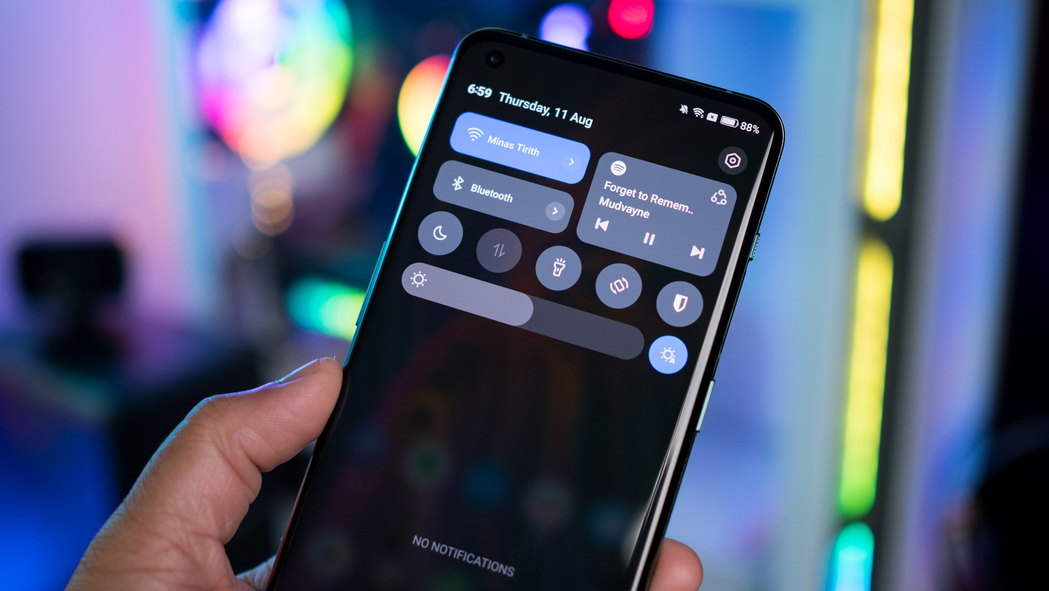
A big change this time is the notification pane; there are two large rectangular tiles — similar to what you'll find on a Pixel — and a media player tile that sit above the rest of the rounded toggles; it looks much better to what was present in OxygenOS 12. The settings page has also been refreshed, with new icons and a cleaner layout.
There are new icons for the network and battery in the status bar, and the battery indicator is now vertical (you can change it back to horizontal). At a Glance is intact as well, and it does a good job surfacing upcoming events. The Spotify AOD feature isn't available in this build just yet, nor is the Zomato/Swiggy integration that lets users in India view the status of their food order directly from the lock screen.
Be an expert in 5 minutes
Get the latest news from Android Central, your trusted companion in the world of Android
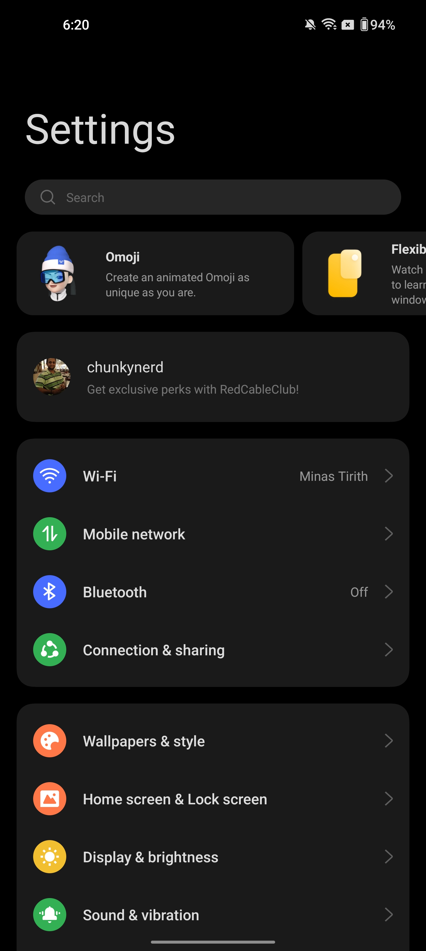
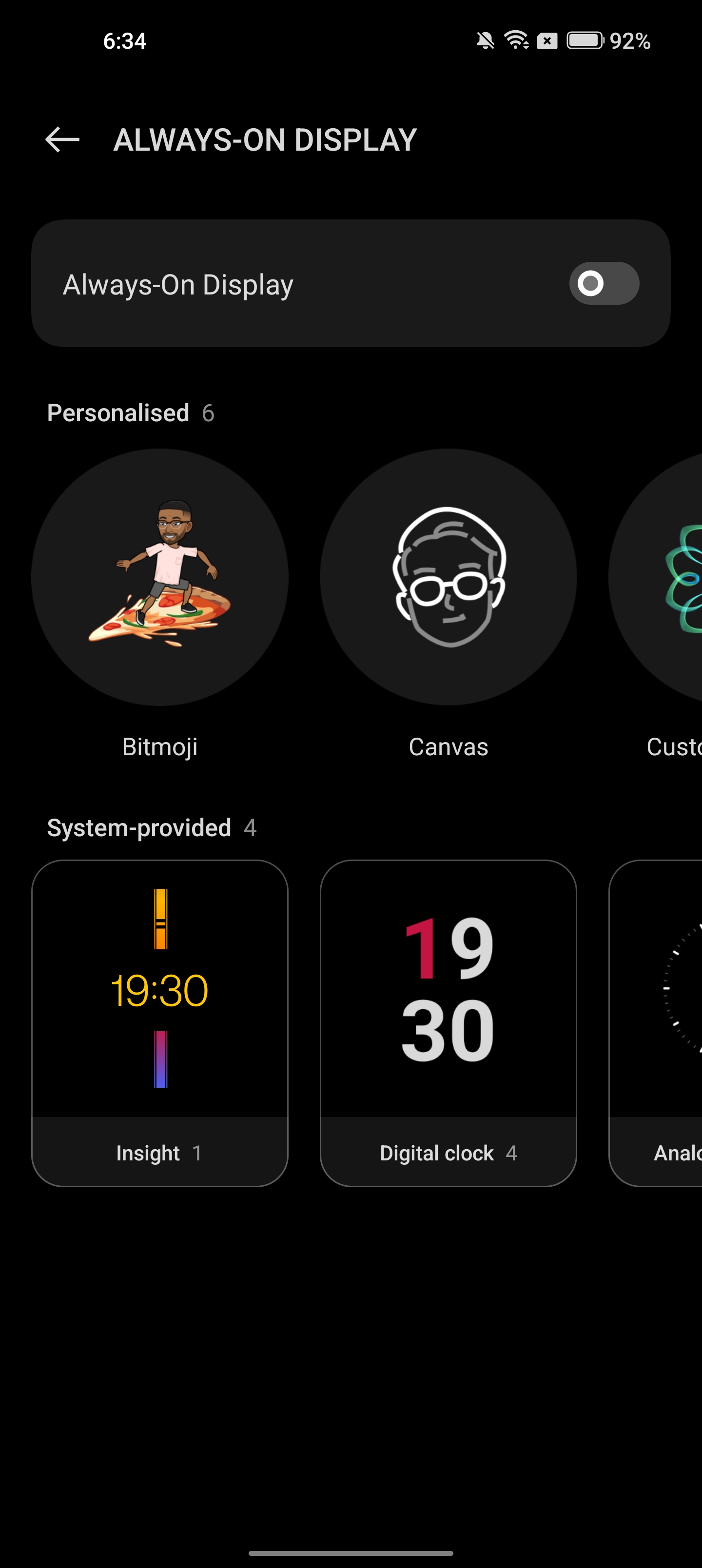
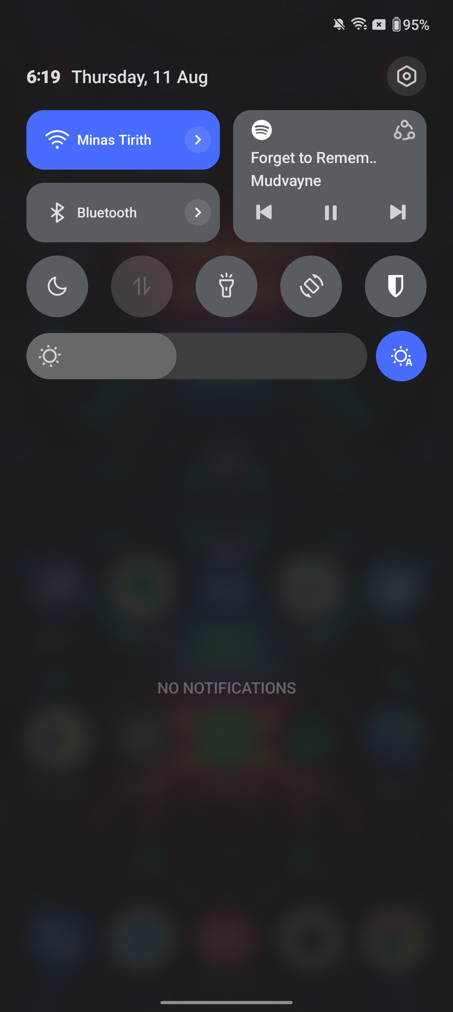
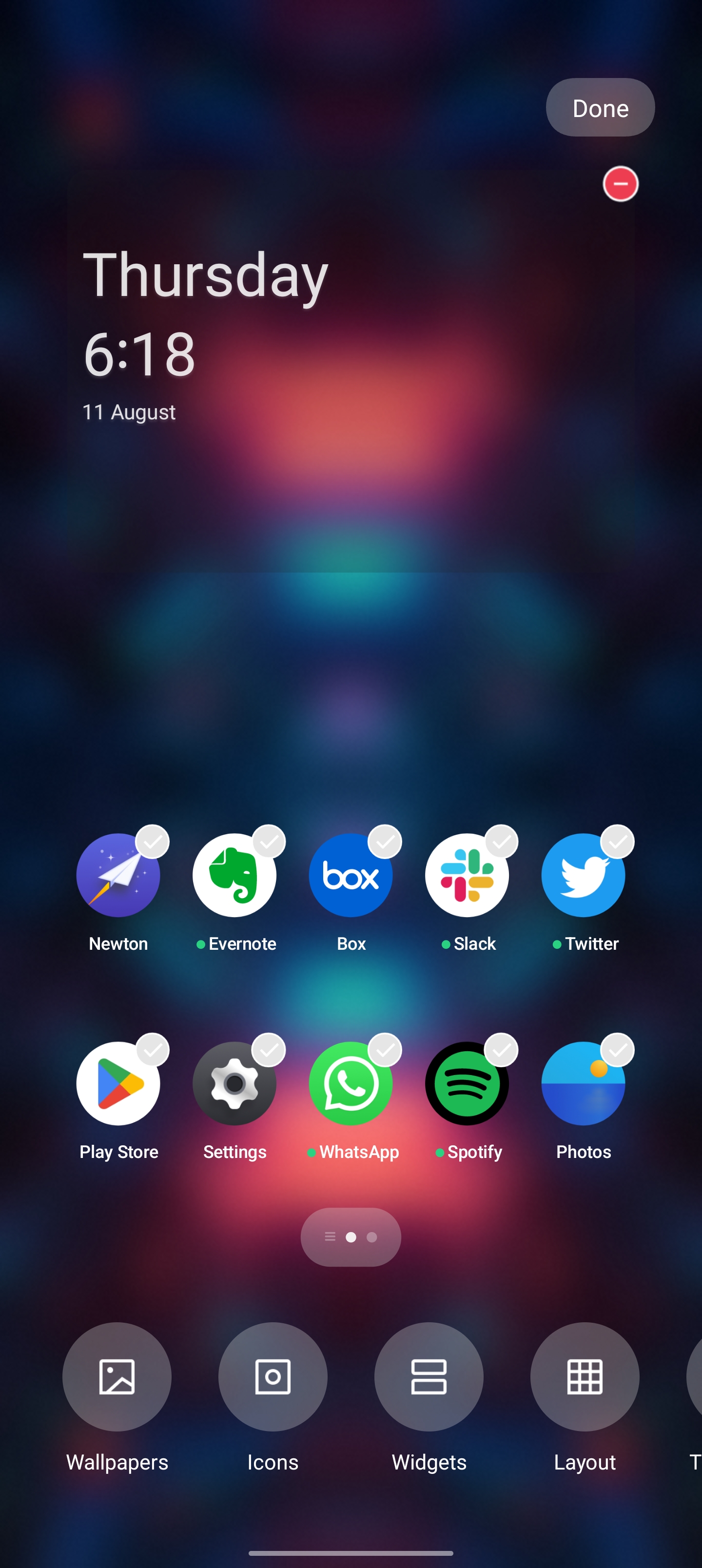
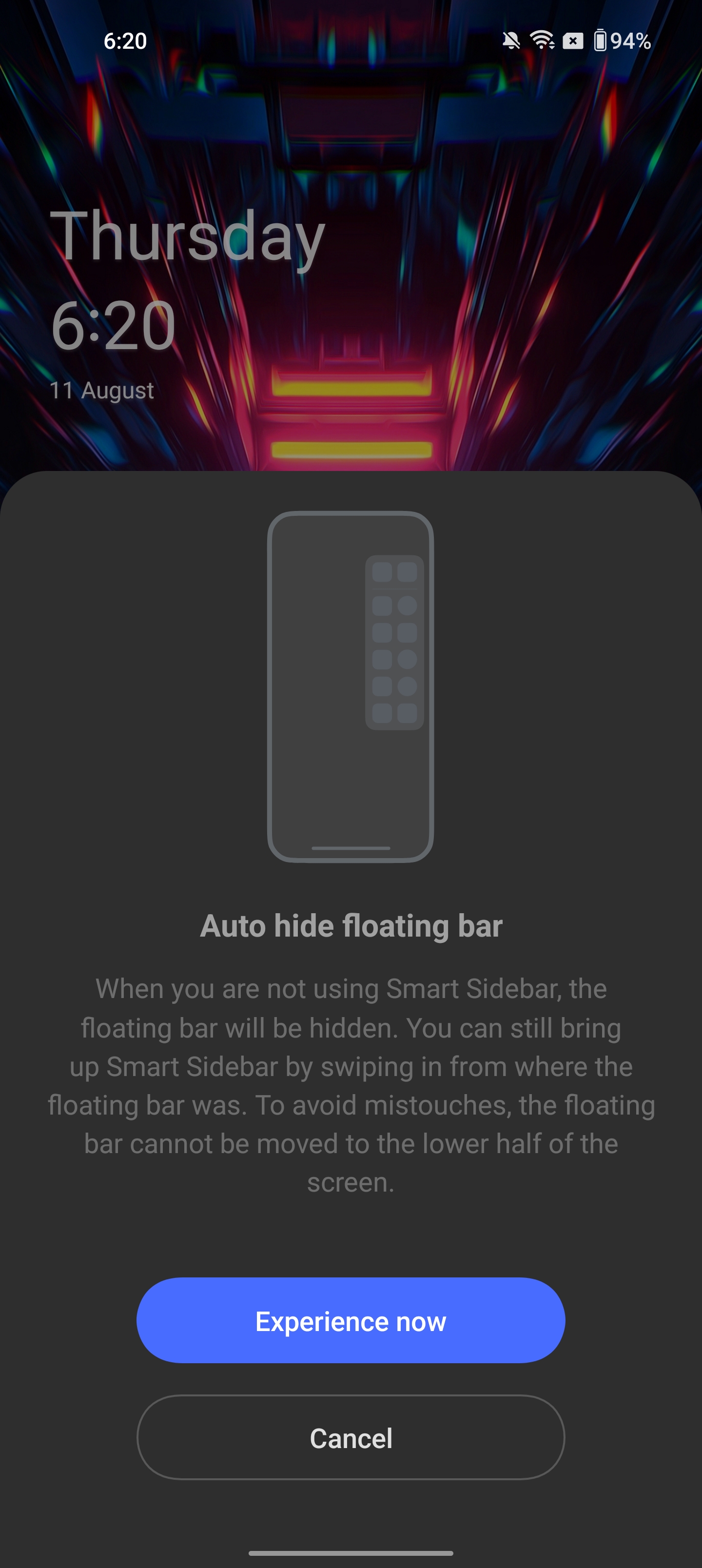
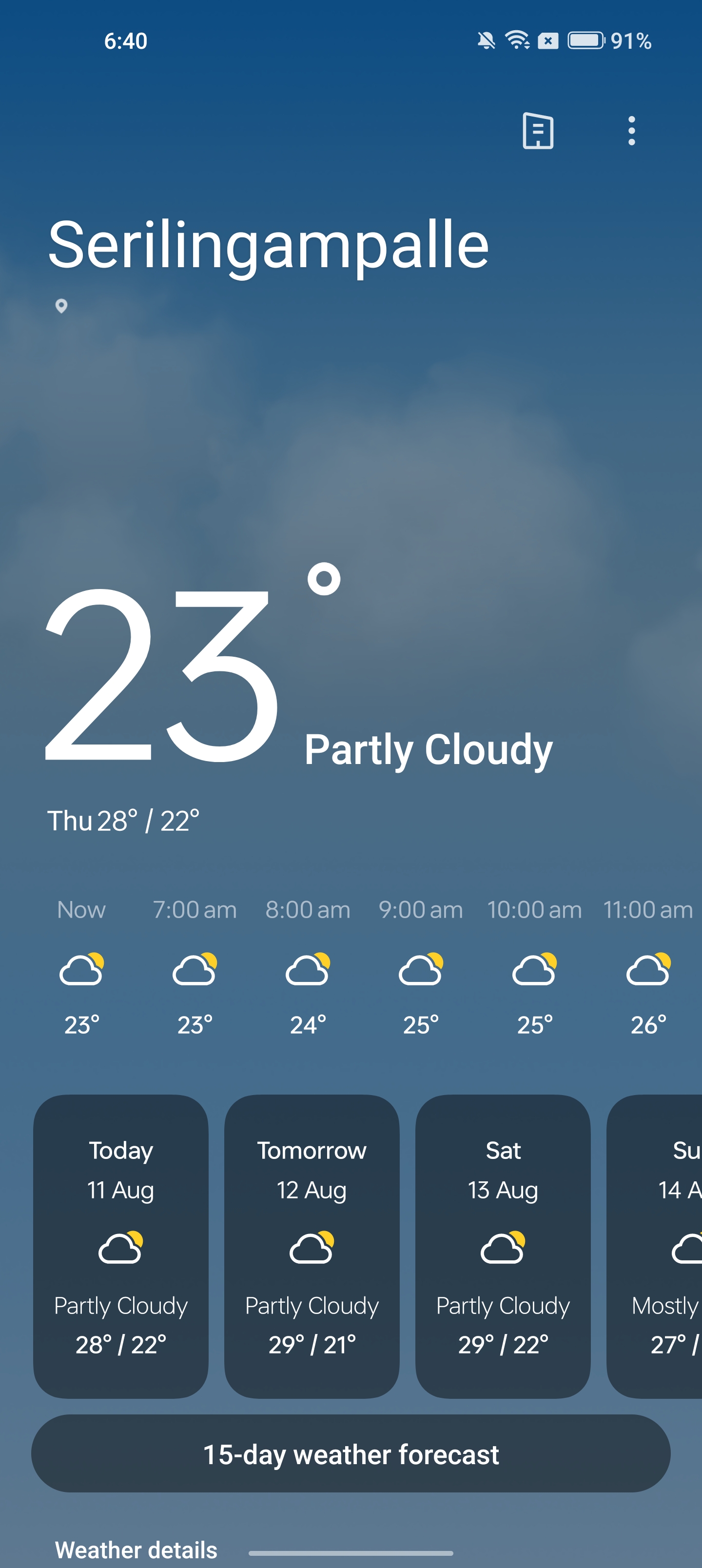
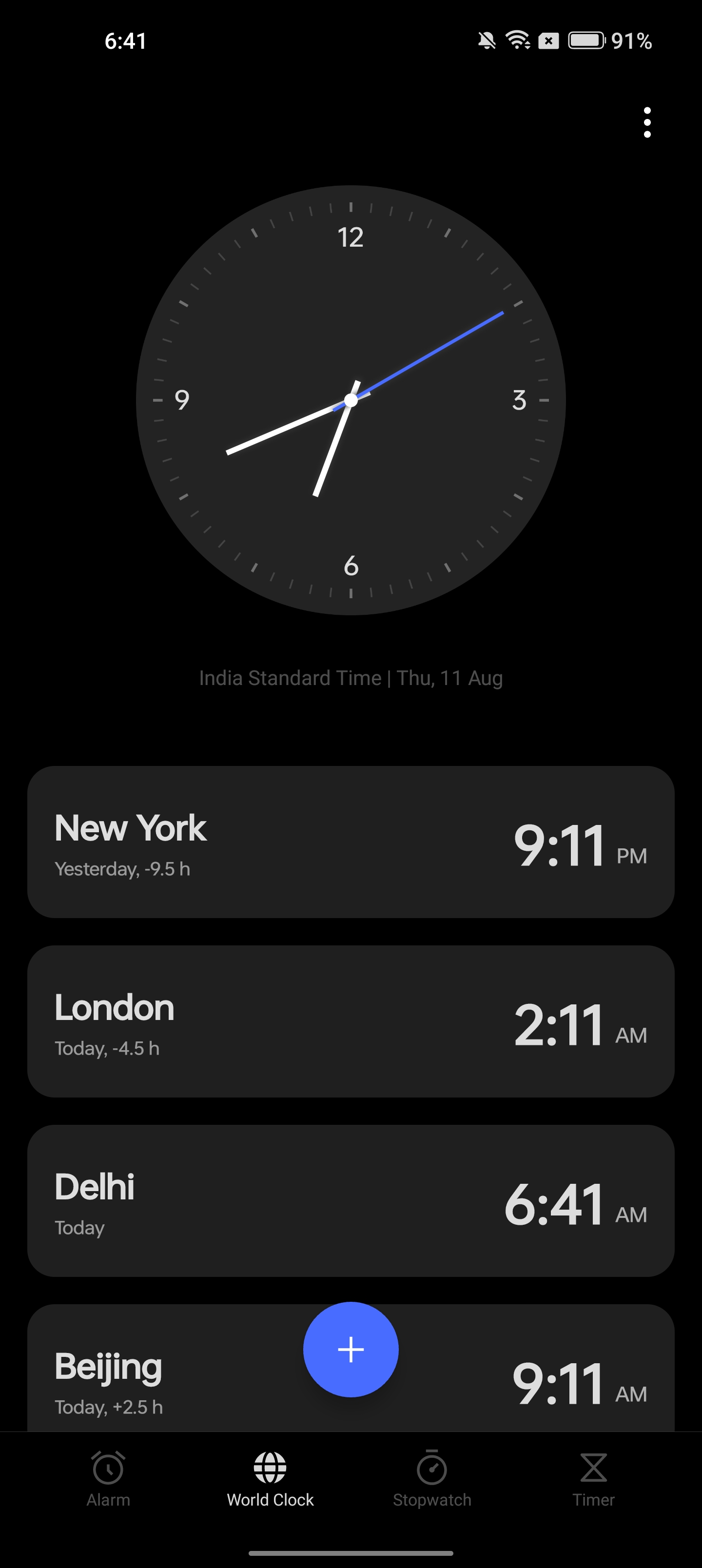
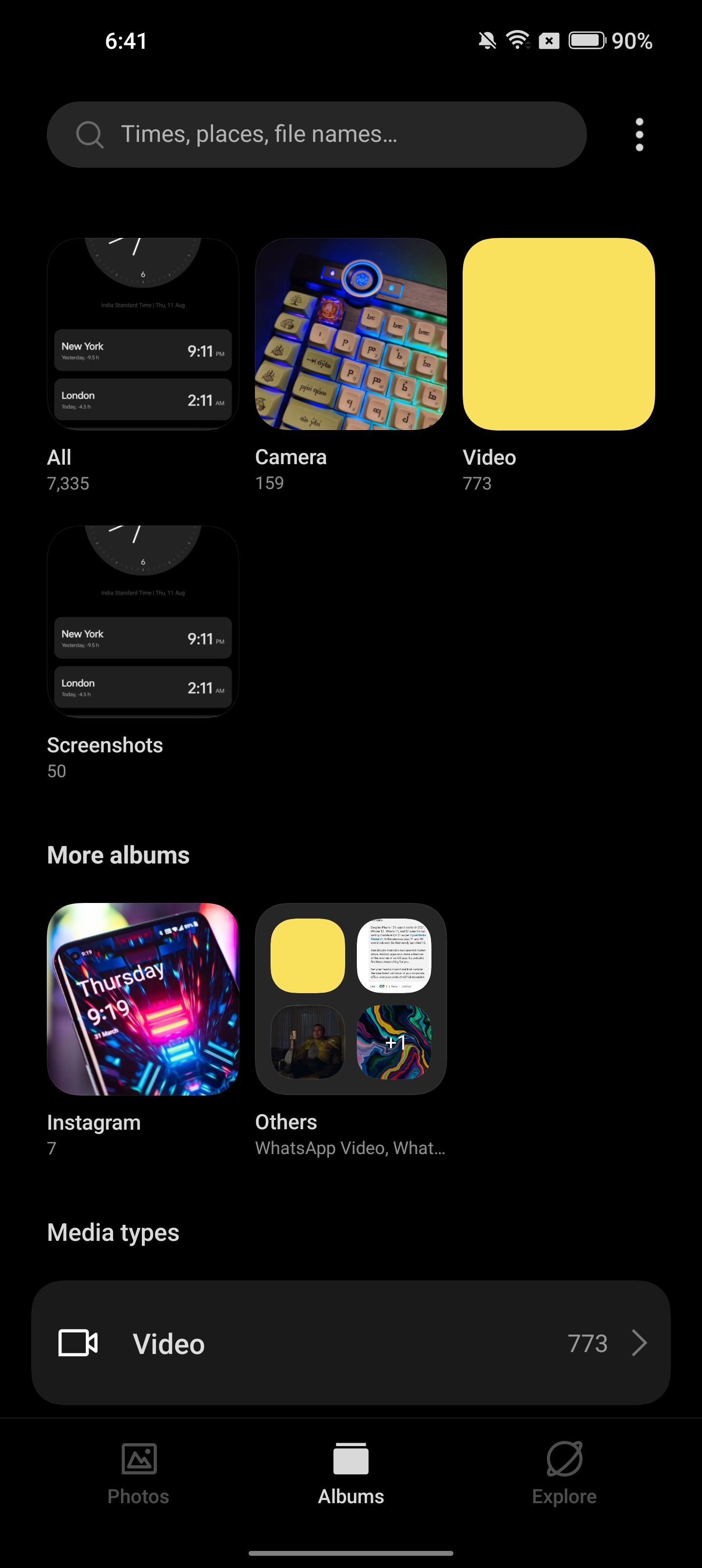
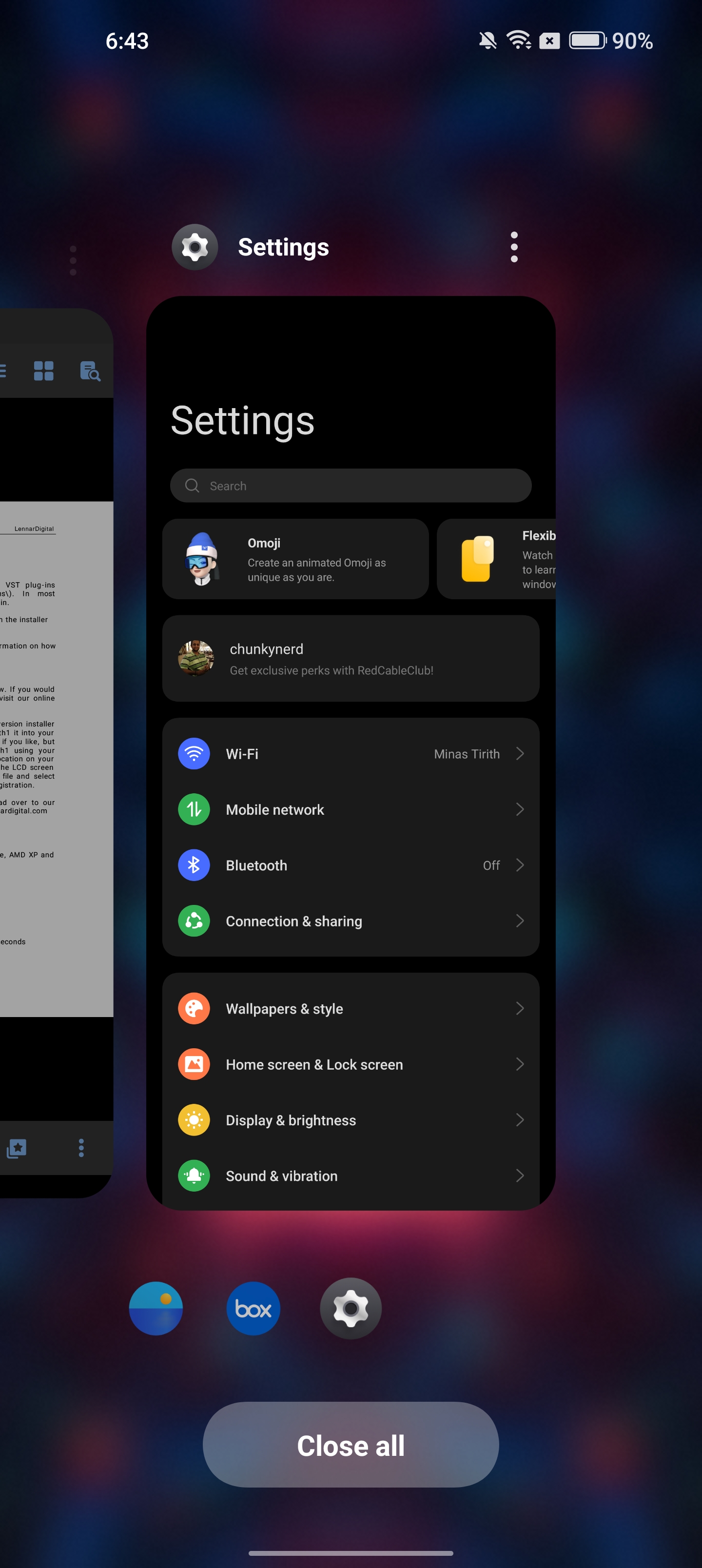
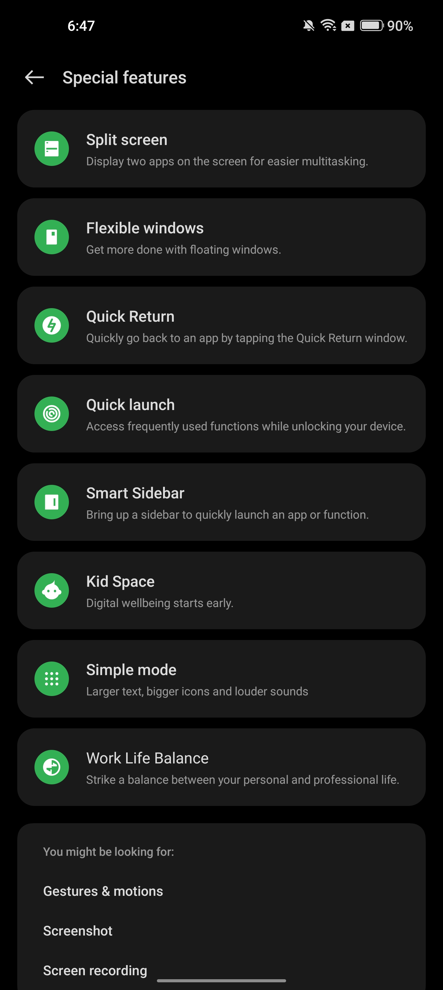
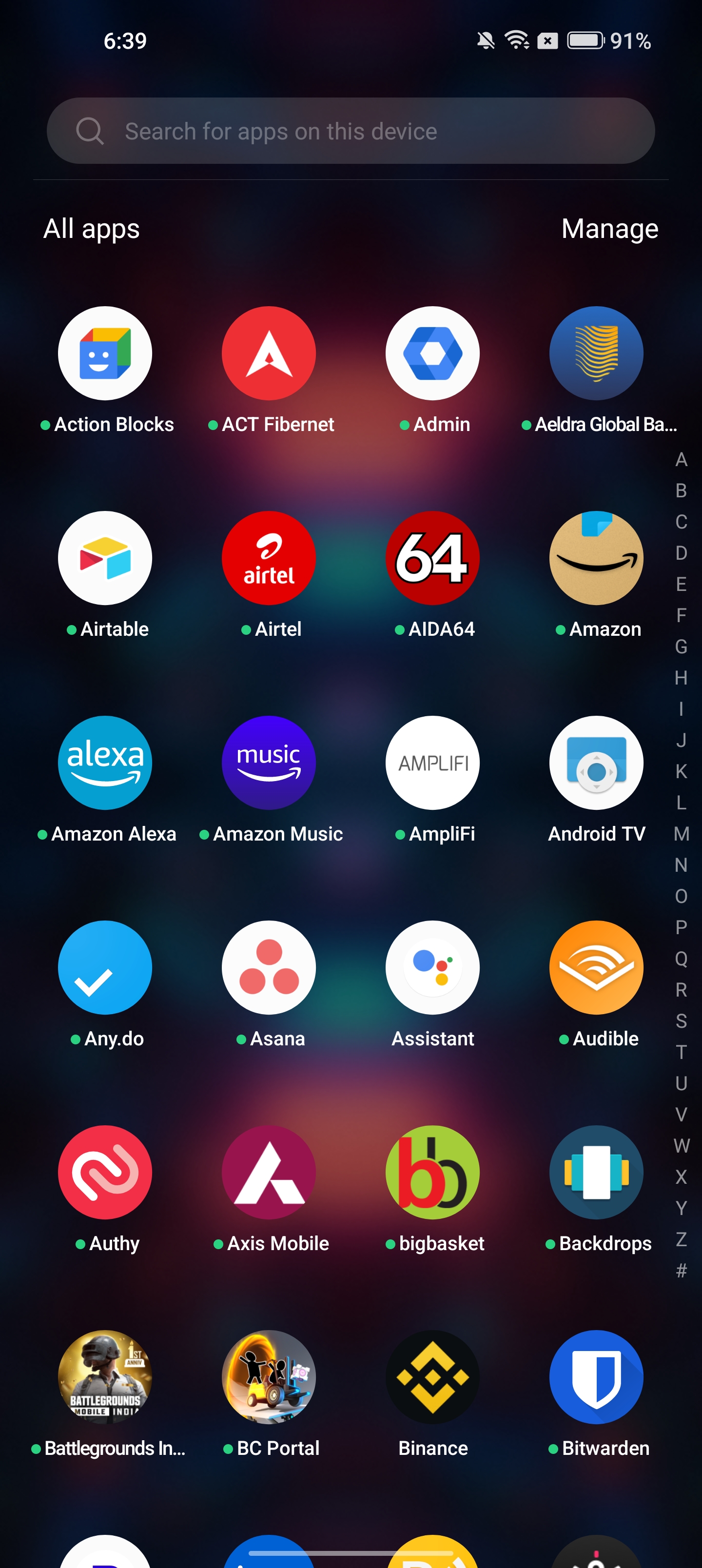
While there are a lot of new features, the underlying foundation and design aesthetic is identical to what you'll find within ColorOS. Essentially, what OnePlus said it would do isn't in line with what you're getting with OxygenOS 13. As a reminder, this is what Lau mentioned earlier this year:
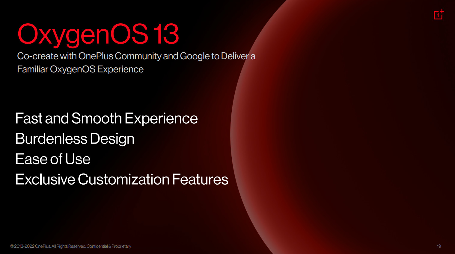
"Our software philosophy for OxygenOS has always been to offer users a light and clean experience that is close to stock Android and oriented towards usage globally. With OxygenOS 13, we want to deliver an experience that long-time OnePlus users will be familiar with while ensuring it upholds hallmarks of OxygenOS, like a fast and smooth experience, burdenless design, and ease of use. OxygenOS 13 will retain its unique visual design and a range of exclusive customization features."
OxygenOS 13 doesn't offer a "light and clean" interface; it broadly has the same look and feel as ColorOS 12. Devices like the ASUS Zenfone 9 and Nothing phone (1) have a clean interface without any overt customization, and I figured OnePlus would follow suit, but that hasn't materialized.
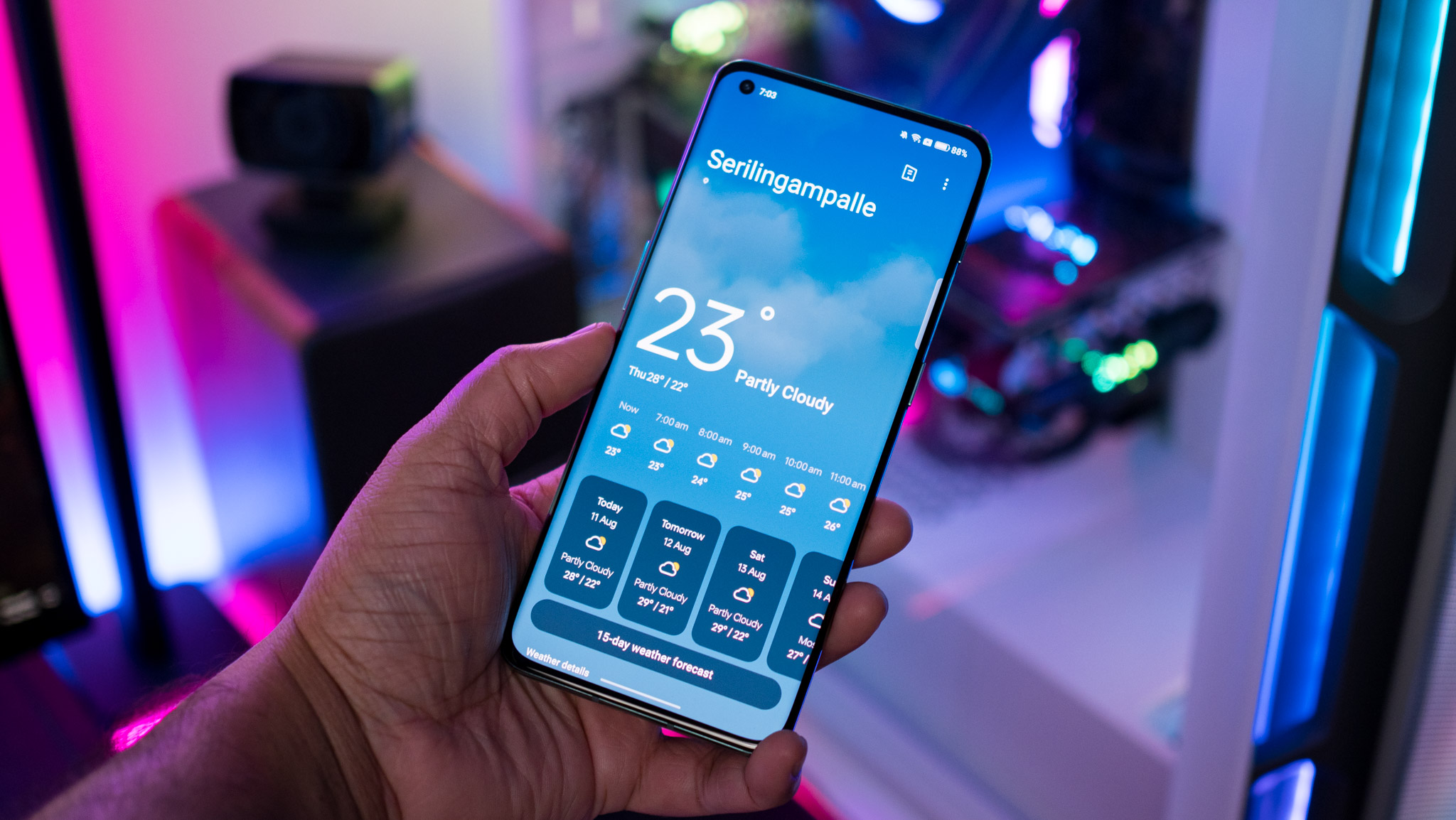
If you were holding out for OxygenOS 13 to be meaningfully different to ColorOS, you're going to be let down by what's on offer here. It's clear that OnePlus doesn't intend to go back to its roots, and that OxygenOS will be a rebadged ColorOS with little to no difference. And that's fine; OnePlus gets to decide what to do with its software, after all, but willfully misleading users into thinking OxygenOS 13 would be different to its predecessor is an inexcusable move.
I'll go into some more detail over OxygenOS 13 once I get started with ColorOS 13 next week and see if there are any differences between the two interfaces. Until then, what you need to know about OxygenOS 13 is that it's more of the same.
If you're a long-time OxygenOS user and are looking for a phone with a clean interface and high-end hardware, the Zenfone 9 is my go-to alternative in 2022. It is among the best Android phones, and while it won't get as many software updates, it is a joy to use.

Harish Jonnalagadda is Android Central's Senior Editor overseeing mobile coverage. In his current role, he leads the site's coverage of Chinese phone brands, networking products, and AV gear. He has been testing phones for over a decade, and has extensive experience in mobile hardware and the global semiconductor industry. Contact him on Twitter at @chunkynerd.
