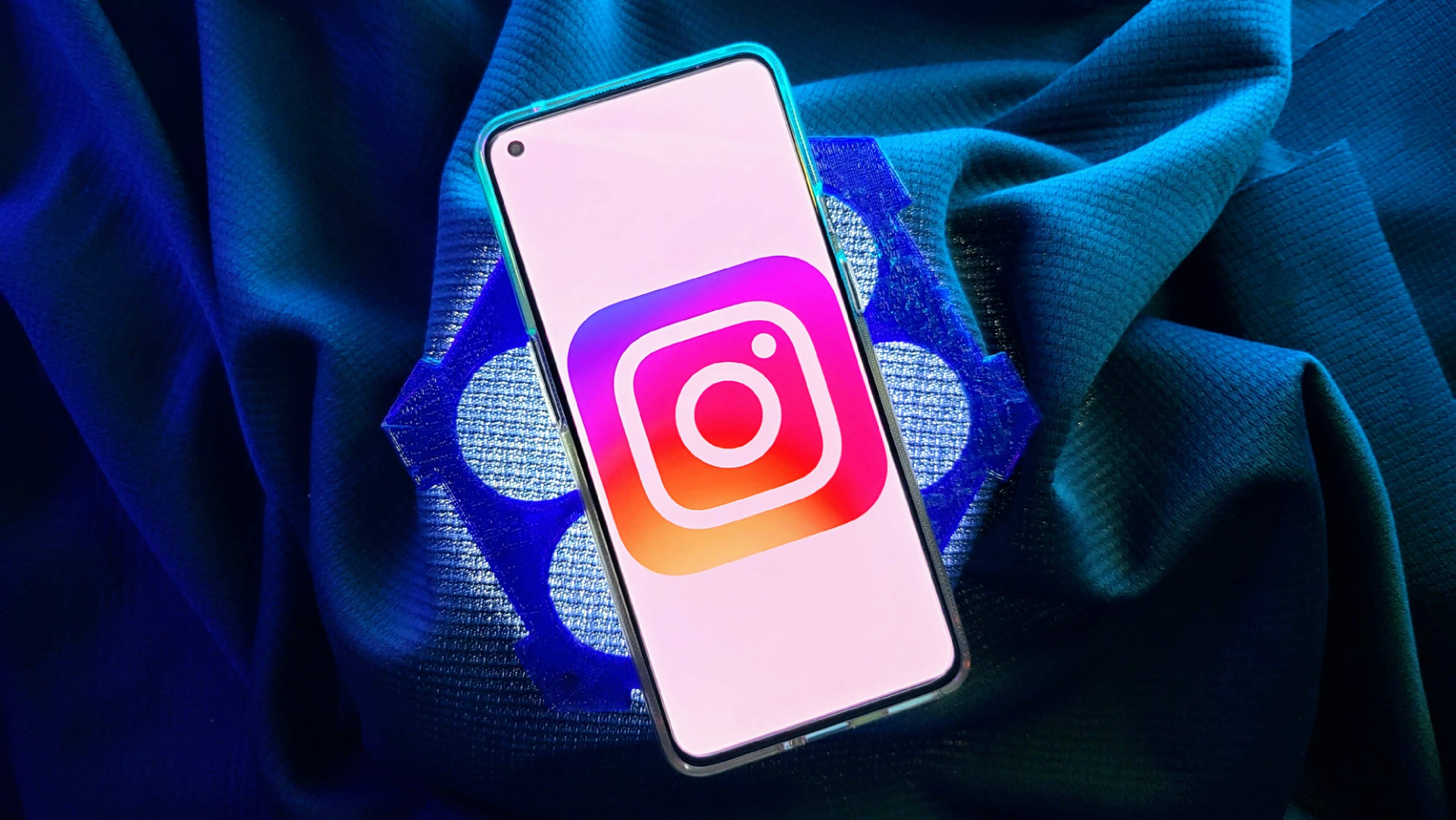
Instagram's Android app icon now matches your phone's wallpaper colors
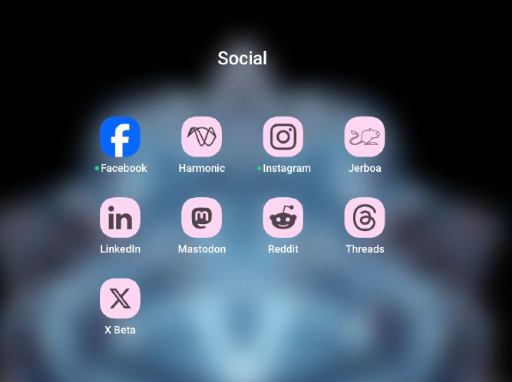
In the meantime, you can give your home screen a temporary makeover with forced dynamic theming while you wait for all your apps to join the fray.

What you need to know
- Instagram is among the latest apps to adopt dynamic theming, offering a dual-tone app icon that reflects the dominant color of your phone's wallpaper.
- However, Meta's other apps like Facebook are stuck in the past, clinging to their outdated design while other social media apps have moved on to the trendy world of themed icons.
- Most apps from Google also support this customization feature, and more apps are expected to adopt dynamic theming in the near future.
Say goodbye to Instagram's static icon on Android. The app is finally adopting dynamic theming, meaning its icon will now adapt to your phone's wallpaper colors for a more personalized look.
The latest version of Instagram's Android app (v307.0.0.0.30) contains evidence that it is finally catching up with the dynamic theming trend, as spotted by Mishaal Rahman on Telegram (via Android Police). The latest update brings a Material You-themed icon that matches your phone's wallpaper colors. This new feature is available for devices running Android 13 or later.
This means your Instagram app icon will now blend with your phone's wallpaper, adopting a dual-tone design that reflects the core color of your chosen wallpaper. This color adaptation is powered by Android's Monet theming engine.

The Meta-owned service joins the dynamic theming party, following in the footsteps of other popular Android apps like X (formerly Twitter), LinkedIn, Reddit, Telegram, and WhatsApp. This trend is also embraced by most apps from Google, making dynamic theming a widely adopted customization feature.
While Instagram starts to embrace the dynamic theming trend, Meta's other apps, like Facebook, seem to be stuck in the past, still sporting their outdated designs. That said, we can expect more apps to jump on board as dynamic theming gains popularity. This trend highlights the ongoing commitment of developers to improve the visual appeal of their apps.
Android 13 set the stage for dynamic app icons, although many apps didn't adopt this feature from the get-go, leaving a visual inconsistency on users' home screens. Now, over a year later, more app developers are catching on to this trend.
Be an expert in 5 minutes
Get the latest news from Android Central, your trusted companion in the world of Android

Jay Bonggolto always keeps a nose for news. He has been writing about consumer tech and apps for as long as he can remember, and he has used a variety of Android phones since falling in love with Jelly Bean. Send him a direct message via Twitter or LinkedIn.
