Instagram gets a new typeface and a brighter logo gradient
The social networking service also has a new layout that "puts content at the center."

What you need to know
- Instagram has gained a new typeface, design system, and a slightly tweaked logo.
- Its logo has been given a more vibrant gradient, making it "feel illuminated and alive."
- The new Instagram Sans typeface features various global scripts.
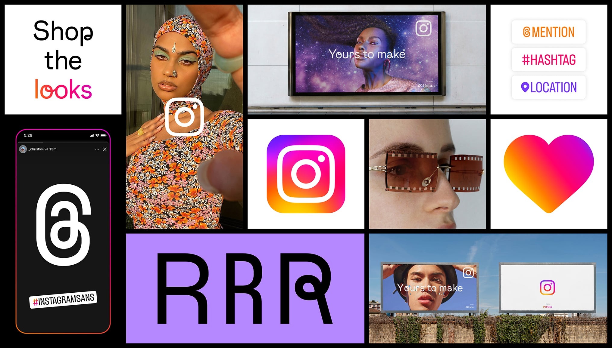
Instagram has refreshed its visual identity with a new font, a more vibrant gradient for its logo, and a fresh layout that prioritizes content. The visual refresh is essentially part of the service's new branding and marketing strategies, which place an emphasis on "simplicity and self-expression."
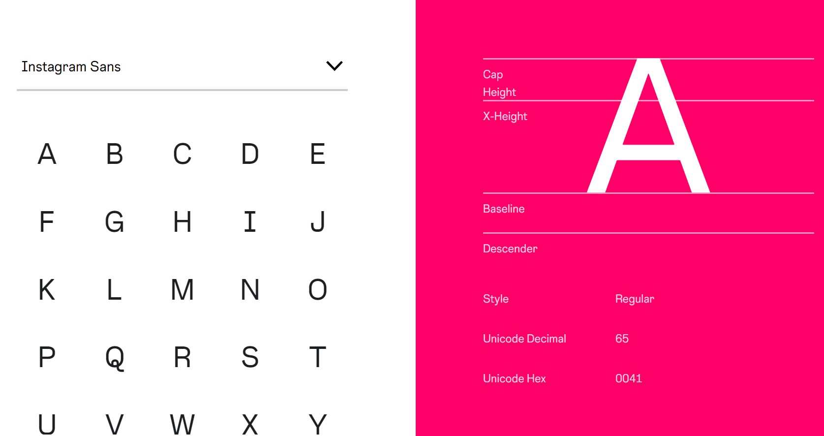
The Meta-owned service calls its new typeface "Instagram Sans," which is obviously inspired by its logo and wordmark from 2010. Instagram said in a blog post that the new font will be used in its marketing campaigns and on its websites.
"Instagram Sans is also a new way for our global community to express themselves on Instagram in places like Stories and Reels," the service said. "While designing this new typeface, our goal was to make Instagram Sans globally accessible."

Instagram Sans features multiple global scripts, thanks to Instagram's collaboration with language experts worldwide to adapt the typeface to be more inclusive of other languages, including Arabic, Thai, and Japanese.
The typeface is clearly influenced by Instagram's obsession with squares and circles, or "squircles." It combines both grotesque and geometric styles, with the ability "to express a range of styles in any language."
"We want to support all of our creators and community members who push culture forward to express themselves fully in any language they choose," Instagram said.

The tweaked logo has a vibrant gradient to make it feel "illuminated and alive," according to Instagram. It noted that the refreshed branding was designed using "an innovative 3D modeling process." The brighter gradient will be visible in the app’s stickers, Create mode, and Story rings.
Be an expert in 5 minutes
Get the latest news from Android Central, your trusted companion in the world of Android
As for its new marketing layout, Instagram said it's meant to be “content-forward” and celebrate "simplicity, simplicity and self-expression."
Instagram hasn't said when the new visual upgrade will be available to everyone, but it's only a matter of time before it appears on all platforms where the service is available, including the best Android phones.
It will be interesting to see how Instagram users react to the new aesthetic revamp. The change comes just a few weeks after the service began testing a new TikTok-like full-screen feed, which may not go down well with users who dislike TikTok.

Jay Bonggolto always keeps a nose for news. He has been writing about consumer tech and apps for as long as he can remember, and he has used a variety of Android phones since falling in love with Jelly Bean. Send him a direct message via Twitter or LinkedIn.
