Google's password manager is finally getting a Material You makeover
It now has a swipeable menu at the bottom for easier access to your passwords, checking for weak ones, and settings.
What you need to know
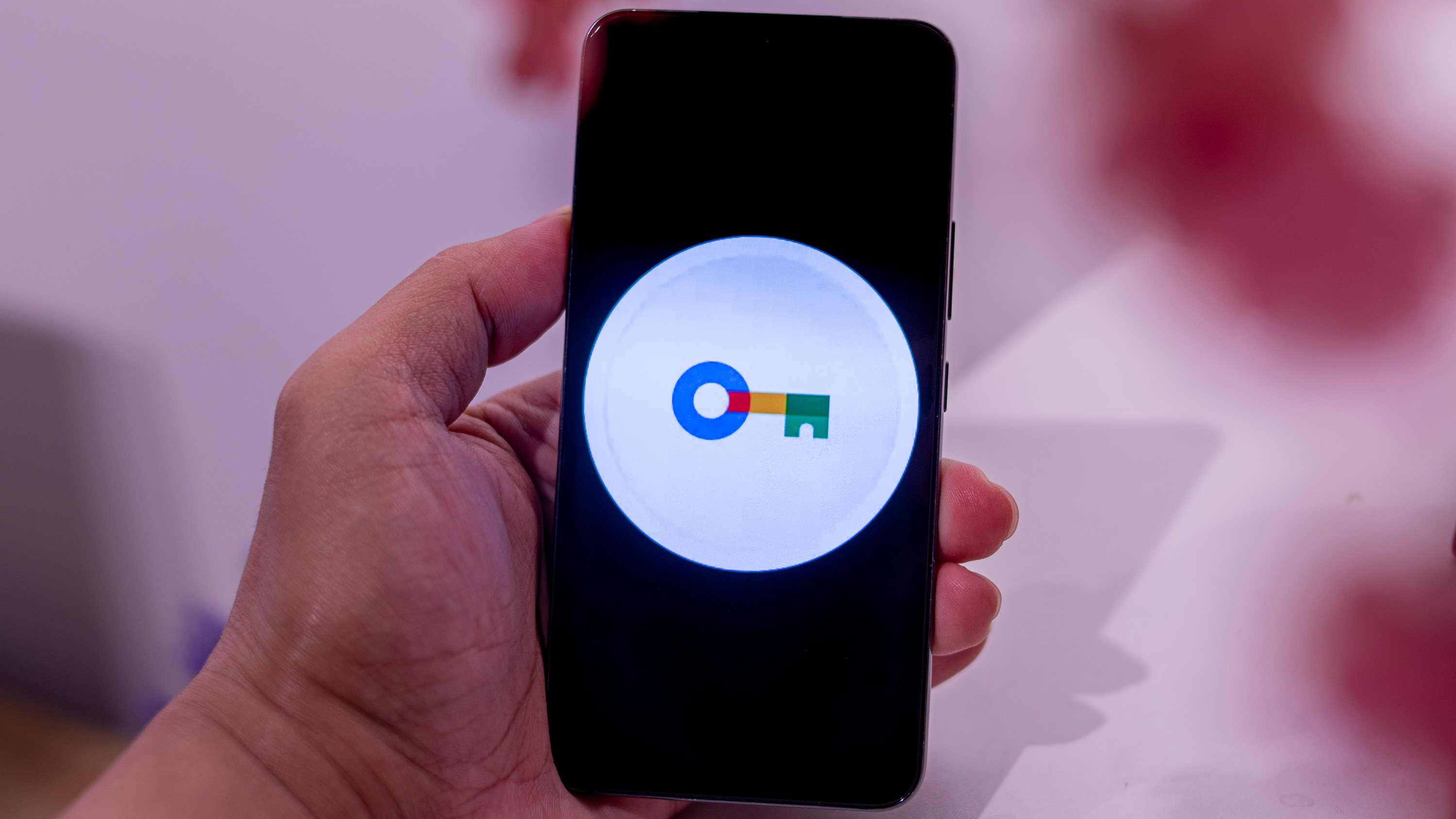
- Google's Password Manager is getting a sleek update, making it look more modern, consistent with the Material Design 3 guidelines.
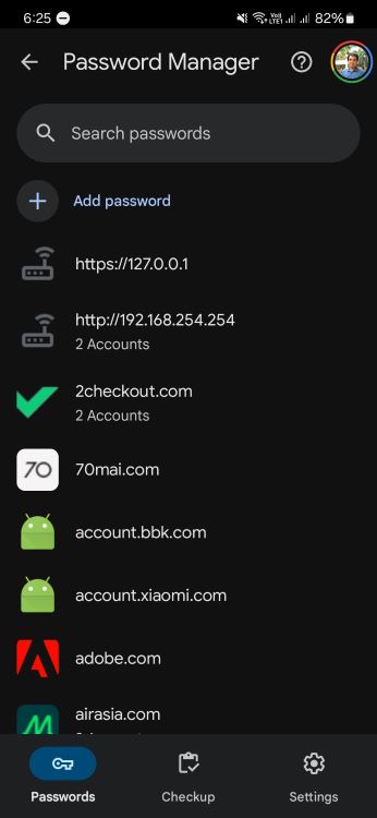
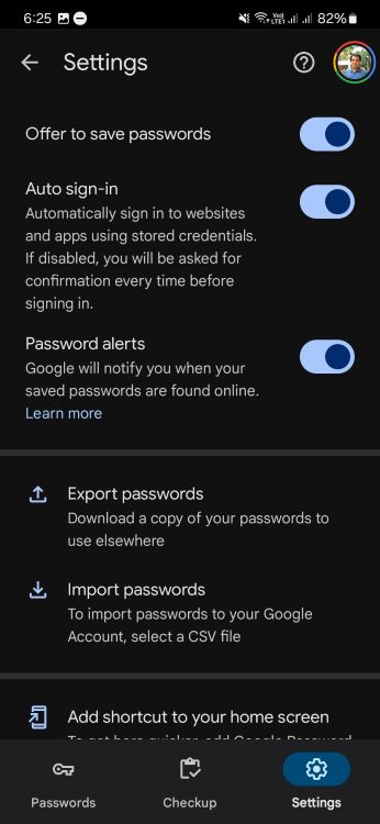
- There's a new tall bottom bar that makes it easy to switch between managing passwords, checking their strength, and tweaking settings.
- This update is rolling out with the latest version of Play services (24.16.16).
Google is giving its Password Manager a visual refresh to make the interface look smoother and more modern.
The folks over at 9to5Google spotted a new design with a tall bar at the bottom for easier switching between passwords, checking for weak ones, and settings. The new look follows the Material Design 3 guidelines and is coming through a server-side update in the newest stable version of Play Services (24.16.16).
With Android being around for a while now, a lot of the tweaks you see now are mainly about looks, making sure everything sticks to the Material Design 3 style.
We've seen this in a bunch of places—from the Fitbit app's sleep data page to Google's new account sign-in page and various other Google apps. Now, it’s the password manager’s turn to get a facelift.
The "Passwords" tab is up first, featuring a pill-shaped search bar at the top and a profile switcher on the right for managing device-specific passwords. Right up front, there's an "Add password" button, followed by all your saved credentials.
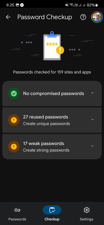
Swipe next to the "Checkup" tab to see if any of your passwords are weak, reused, or have been exposed in a data breach. It'll scan them every time you check. Last but not least, the "Settings" tab stays the same—it already had those Material Design switches.
We've also spotted the redesign on one of our devices.
Be an expert in 5 minutes
Get the latest news from Android Central, your trusted companion in the world of Android
Before this update, the Android password manager looked pretty similar to the website version. It had a search bar at the top and then just a long list of your passwords in alphabetical order.
Of course, your passwords still reside inside the Settings app, powered by Google Play Services. The theme doesn't use Dynamic Color, sticking with blue as the accent color.
For those using Android tablets in landscape mode, the password manager redesign uses a navigation rail on the side instead of the bottom bar, as per 9to5.
Material Design 3 has been out since 2021, but many apps and UIs managed by the company still haven't adopted it. Still, with the password manager getting a refresh, it looks like more Google apps are finally getting on board.

Jay Bonggolto always keeps a nose for news. He has been writing about consumer tech and apps for as long as he can remember, and he has used a variety of Android phones since falling in love with Jelly Bean. Send him a direct message via Twitter or LinkedIn.
You must confirm your public display name before commenting
Please logout and then login again, you will then be prompted to enter your display name.
