Google Photos' settings interface could soon be a lot less cluttered
The app looks ready to roll out a cleaner settings menu.

Get the latest news from Android Central, your trusted companion in the world of Android
You are now subscribed
Your newsletter sign-up was successful
What you need to know
- A much cleaner settings interface of Google Photos has appeared for a limited set of users.
- The decluttered interface eliminates minute options and sections in favor of six top-level sections that house the app's various options and preferences.
- A few users have spotted the change in version 6.39 of the app, though it seems to be under development at this moment.
Google appears to be decluttering the settings interface of the Photos app and organizing specific options and preferences into proper sections.
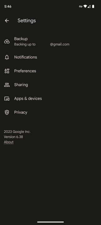
The cleaner look was first unearthed by a Telegram user who goes by the handle Cătălin, whose findings were corroborated by Android sleuth Mishaal Rahman (via Android Police). As seen in the screenshot below, the redesigned settings menu displays six sections, each containing appropriate options and preferences.
The new top-level sections include Backup, Notifications, Preferences, Sharing, Apps & devices, and Privacy. It has gone live for a limited group of users who have version 6.39 of the Google Photos app installed on their phones.
Article continues below 
Currently, the app's settings interface includes a jumble of very detailed and uncategorized options alongside sections for the rest of the settings. Simply put, the current settings interface has a befuddling array of options, some of which are rarely used by most users. This can make it difficult to find the settings you need and can lead to confusion.
In addition, some of the wording used in the settings interface is either unclear or ambiguous. This could make it difficult to understand what the settings do and lead to users making incorrect changes.
The lack of organization can also make it difficult to find the settings you need, which can lead to users spending more time than necessary trying to find them.
Decluttering the settings interface would make it easier for users to find the settings they need and make changes to their settings without confusion. This would improve the user experience and make Google Photos a more user-friendly app.
Get the latest news from Android Central, your trusted companion in the world of Android
It's not known when the refreshed interface will become public, but it's a welcome makeover for what's otherwise an untidy settings menu and will help Photos retain its spot in our top picks for the leading photo editing apps.

Jay Bonggolto always keeps a nose for news. He has been writing about consumer tech and apps for as long as he can remember, and he has used a variety of Android phones since falling in love with Jelly Bean. Send him a direct message via X or LinkedIn.
