Google Messages loses 'top contacts' as more UI changes roll in
That pin feature might get a lot more useful now.
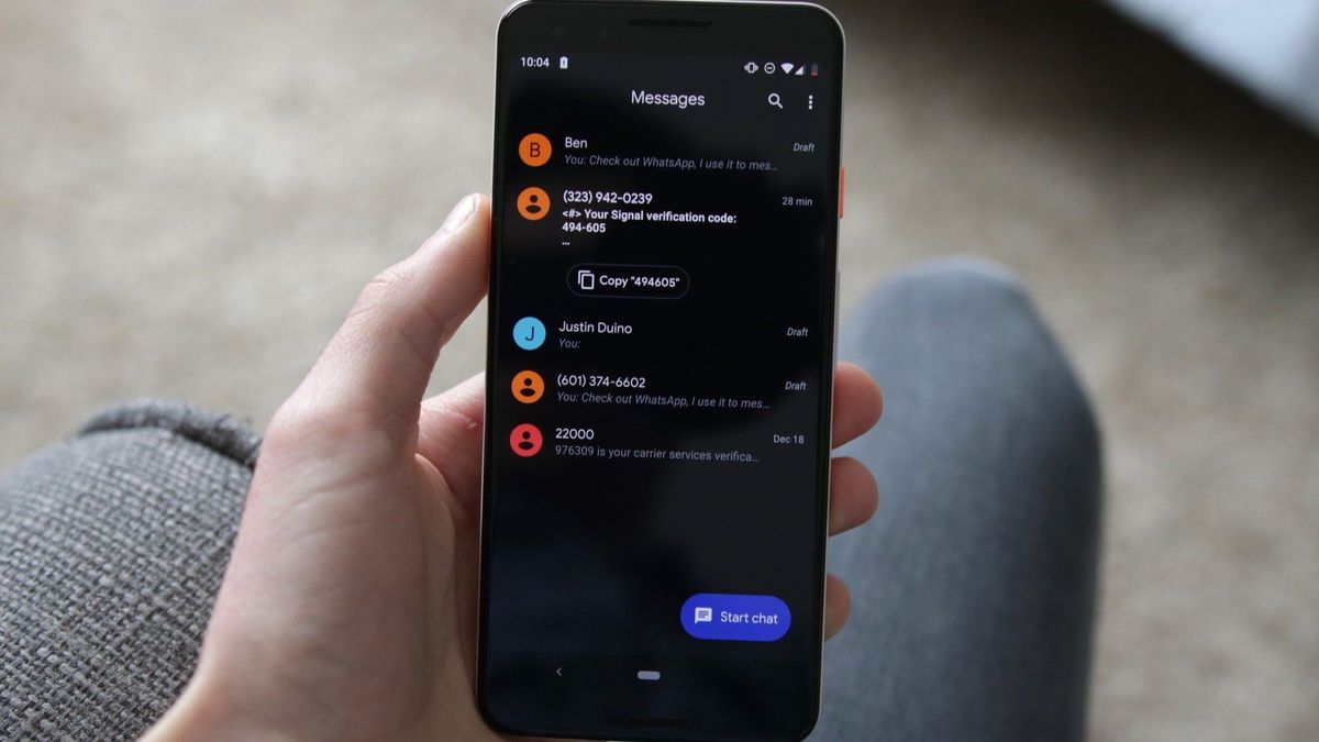
What you need to know
- Google has started removing "top contacts" from Messages when users go to create a new conversation.
- The change has left users with no other option but to search or scroll through their contacts or use the above search bar.
- Google has continuously updated Messages as of late, removing its nav drawer, and beta testing a new streamlined design for sharing media.
More changes have been spotted on Google's default text messenger, which could take up an extra second or two of your time.
Google Messages' "top contacts" have disappeared from the app when moving to create a new conversation, as spotted by 9to5Google. Due to the change, Google has rolled out a UI alteration that now only sports a pill-shaped "create group" button between the top search bar and the ensuing list of contacts.
Previously, tapping the name of a person you frequently talk to would pop you over to their chat so you could get back to chatting more easily. So, this change is quite frustrating as users will now have to either type the name of the person they're looking for or start scrolling through their personal lists.
While annoying, users could pin their favorite people to the top of the app as a workaround to Google's sudden removal.


It appears as though this change wasn't so widespread in its infancy but has possibly started covering a much broader range of individuals. We have spotted the same change on our devices, so more users should begin receiving this change, as well.
Google has been on quite a tear going through Messages as it changes things (for better or worse). At the end of September, the company rolled out an update that removed the app's lefthand-side nav drawer after only having it for a little over a year. Instead, all of the hamburger menu's contents, like Archive and Mark all as read were shoved into your Google account icon at the top right.
The search bar also disappeared and is now tucked inside a magnifying glass icon, which users can tap to begin searching through their currently opened chats.
Be an expert in 5 minutes
Get the latest news from Android Central, your trusted companion in the world of Android
Another UI change, currently available through its beta channel, is seemingly streamlining users' ability to share content. The change's preview showed users could soon share media with several people with ease instead of only being restricted to one person at a time — and without the necessity of creating a whole group chat for a funny post you saw.
There are also signs of a new camera button appearing Messages that could make sharing your pictures a whole easier.

Nickolas is always excited about tech and getting his hands on it. Writing for him can vary from delivering the latest tech story to scribbling in his journal. When Nickolas isn't hitting a story, he's often grinding away at a game or chilling with a book in his hand.
-
Mr. Lucky I don't have a problem with Google streamlining things. What bugs me is the lack of documentation. Even when changes are done within the app, versus on the back end, the 'What's new' section on Play Store always just says "Bug fixes and performance improvements." There's never an advisory of what they're changing, so users can decide for themselves whether to update.Reply
