Google Maps redesign gives its UI more space and user convenience
Users can quickly hop in and out of informational elements.

What you need to know
- Google Maps is rolling out a redesign for its UI on Android, which changes how users experience its directions search.
- The UI no longer encompasses your entire display, giving users more room to quickly get back to the map and find where they're headed.
- Another UI change involves Google bringing its row of transportation methods to the bottom of the display for more convenient access.
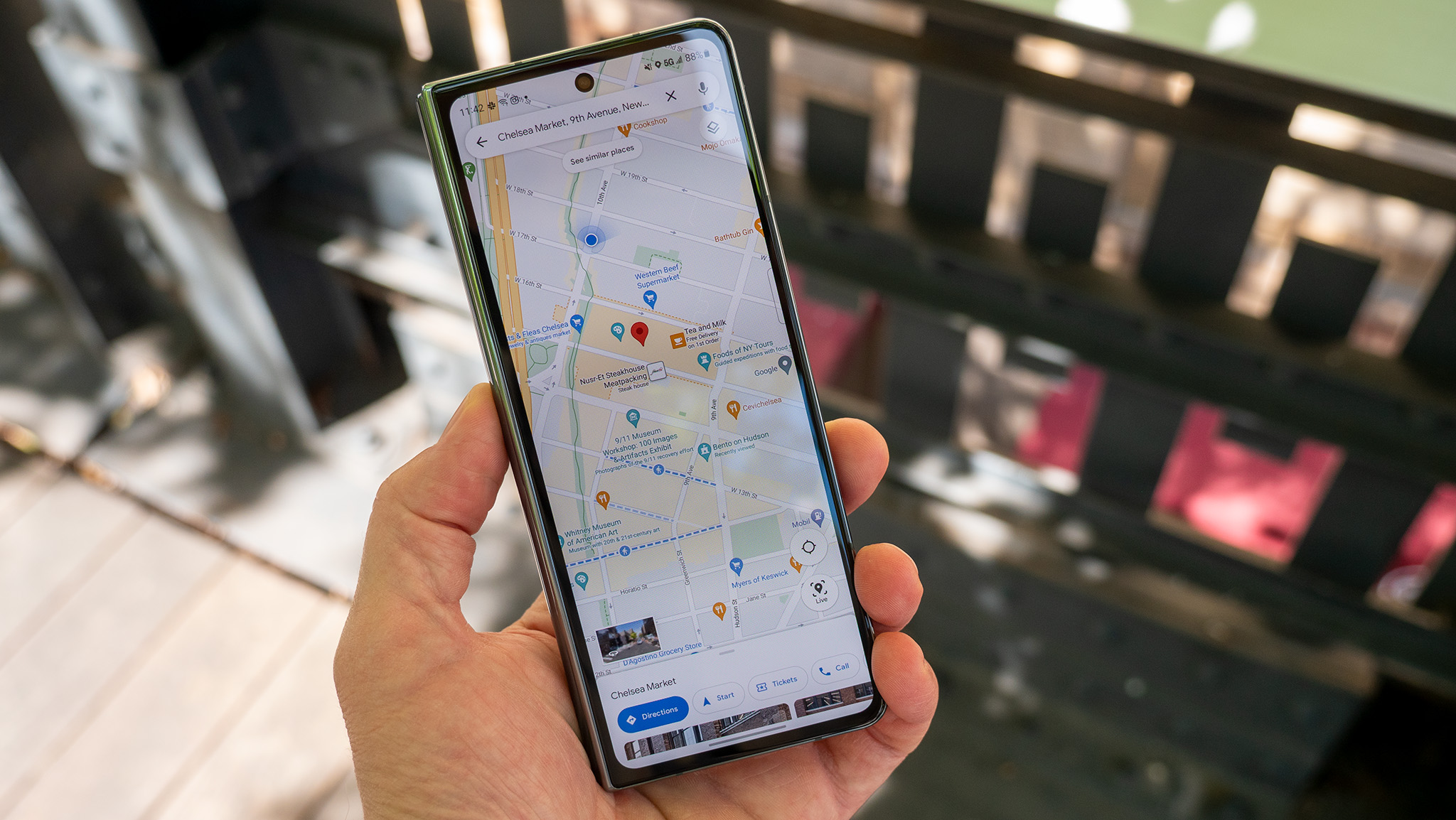
Google is starting to roll out a redesign for Maps that gives various aspects of its UI some more space. As spotted by 9to5Google, the company is pushing an update marked as version number 11.113.x on Android, though it's reportedly not widespread just yet. The download will drastically change how users experience Maps' directions search.
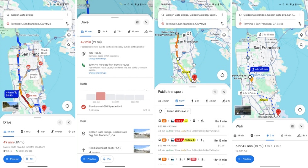
The UI no longer encompasses your entire display. Additionally, the bar is now strictly for entering addresses for a place you're visiting.
The other side of this is the offered list of transportation methods users may take. The redesign has moved this row of options down to the bottom of Maps' UI, making it easier to reach. Moreover, swiping up to expand the sub-menu no longer stretches the entire length of your display, so users can still see the bulk of their potential route.


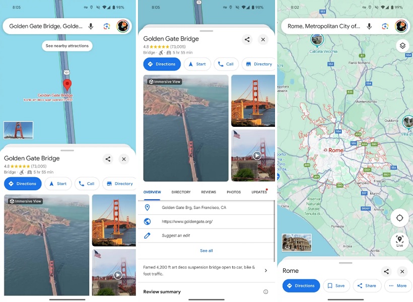
Another aspect of this redesign involves Google Maps' information page for locations. The new information menu will appear at the bottom and can expand toward the top of your display without consuming it entirely. Google also includes a convenient "close" and share button for users.
Since the update was only recently spotted, it may take some time before everyone picks it up. The publication adds that iOS users are also expected to grab this update, but its arrival time is unknown.
Google Maps has picked up a few features early this year, such as identifying food items based on user photos. Users checking out reviews from the Photos tab of a restaurant can now learn about the item they've photographed as Google matches it to that establishment's menu. Maps will also display relevant tags for food, such as "Popular" and "Vegetarian."
Android finally picked up a feature that arrived for iOS in October, bringing a small box of temperature, weather conditions, and air quality information to the app. Lastly, Google teased new Gen AI features for Android users in Maps. The software would let users ask the app about specific places they'd like to visit, and the AI would pull data from reviews, photos, and ratings within Maps.
Be an expert in 5 minutes
Get the latest news from Android Central, your trusted companion in the world of Android

Nickolas is always excited about tech and getting his hands on it. Writing for him can vary from delivering the latest tech story to scribbling in his journal. When Nickolas isn't hitting a story, he's often grinding away at a game or chilling with a book in his hand.
-
Mooncatt All I care about is if they do away with that fugly as heck pastel color theme they rolled out a few months back that makes it harder to see everything.Reply -
spARTacus For me on tablet, the app is still all screwed up since earlier update a while ago. Completely takes up half the screen showing search results and basically not enough screen space left for showing a useful map view. Disappointing.Reply
