Google is testing an unnecessary change to Chrome's new tab page on Android
Chrome on Android may replace the grid layout for recently visited sites on the new tab page with a carousel.

What you need to know
- Google appears to be testing a minor redesign of Chrome's new tab page on Android.
- The revamp replaces the grid layout for recently visited sites with a carousel.
- The experimental layout briefly went live on the latest version of Chrome on Android.
Google seems to be preparing a minor change to Chrome's new tab page on Android. The web browser momentarily showed a carousel of recently visited sites on the new tab page, replacing the current grid layout.
Android Central can confirm that the new design is being tested on Chrome's Android version. 9to5Google first spotted the visual change. The carousel went live on the app's latest stable version (102.0.5005.78).
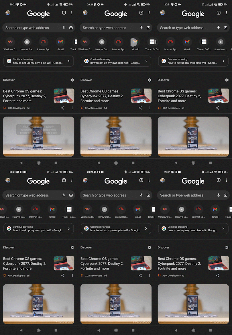
The redesign swaps out the grid layout for your recently opened sites on the new tab page for a carousel. As you can see in the GIF below, your recently visited pages appear in a single row that displays each site's favicon. You can only see five pages at a time.

While this is not a major change, the revamp limits the number of sites you can glimpse in one go versus the grid layout. The current design allows you to view eight sites arranged in a 4x2 grid. This makes it easier to quickly navigate to a page you've recently opened with a single tap.
Assuming the new layout is made public, it may not go down well with longtime Chrome users who have grown accustomed to the ease with which they can view multiple sites they've frequently visited. The redesign eliminates that convenience by requiring you to spend more time scrolling through the carousel.
It's unclear how widespread the experiment is, but it did appear briefly on some of the best Android phones, including this writer's device. However, the carousel layout disappeared a few moments later.
The latest experiment arrives on the heels of Google's earlier attempt to revamp the new tab page with a "Continue browsing" carousel. This would replace the tab grid by displaying your open tabs in a row of cards. Regardless, the visual change was never made widely available.
Be an expert in 5 minutes
Get the latest news from Android Central, your trusted companion in the world of Android
Given Google's proclivity to abandon some of its experiments, there's no guarantee the carousel layout will become available to everyone.

Jay Bonggolto always keeps a nose for news. He has been writing about consumer tech and apps for as long as he can remember, and he has used a variety of Android phones since falling in love with Jelly Bean. Send him a direct message via Twitter or LinkedIn.
