Google Drive brings a more PC-like experience to tablets and foldables
Making larger Android devices feel like portable computers.

What you need to know
- Google is rolling out an update for Workspace users that brings a new folder hierarchy in Drive for tablets and foldables.
- A new data column lets users see file-specific information like size and last date modified alongside a Material 3 color palette.
- These updates follow swiftly after Docs, Sheets, a Slides gained subtle changes for larger Android devices.
Google is preparing to bring a few improvements to Drive for owners of larger Android devices.
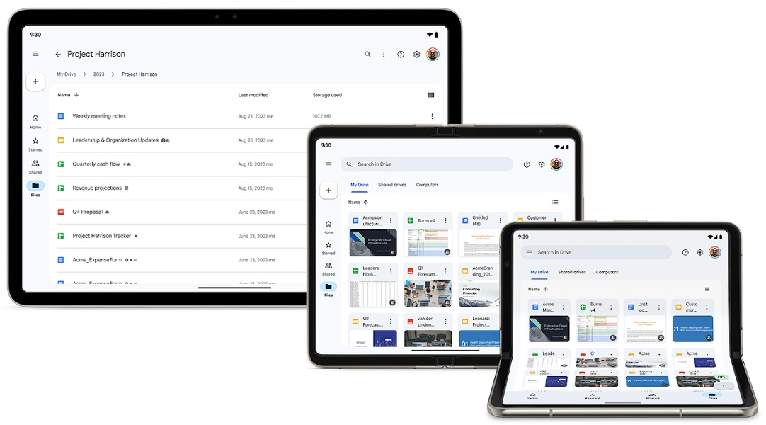
According to a Google Workspace post, the company is looking to shift Android tablets and foldables closer to the Drive's appearance on computers. This update is three-pronged, beginning with a new folder hierarchy above the main doclist. Google states this change should be a better option for users looking to keep track of where they've gone in the app.
Similarly, it will let users return to the main Drive view easily.
A new "data column" per file has made its way in, showing when a document was last modified and how large it is. Additionally, it appears that Google Drive will display who the last person was to make modifications to a document.
Lastly, tablets and foldables will receive Google's latest Material 3 design language in the app, which the company has been moving many of its apps to.

Businesses and others using Workspace on a rapid release schedule domain have started to receive the latest changes. As the rollout continues, Google is planning to release the update for scheduled release domains on November 27. Users with a personal Google account should gain this update, as well.
The Google Drive update aimed at larger Android displays is the second in seven days. The company rolled out a smaller patch that improved how users can edit their files in Docs, Sheets, and Slides. For Docs, Google added a "mode switcher" to let users swap between placing edits, suggestions, and various viewing modes.
Be an expert in 5 minutes
Get the latest news from Android Central, your trusted companion in the world of Android
Slides now provide a persistent editing bar, while Sheets automatically selects a cell when opening the app. These changes are planned to arrive on November 28 for scheduled release domains — personal accounts will have access to these, too.
Google Drive's visual refresher for larger mobile devices started back in March. This involved the app shifting its navigational bar from the bottom to the left side of the screen. Devices also gained the floating action button atop the bar, similar to what users on desktops see.
Several other aspects were changed, such as reducing the size of the "Suggested" and "Notifications" tab so users see more of their files as opposed to UI elements.

Wider is better
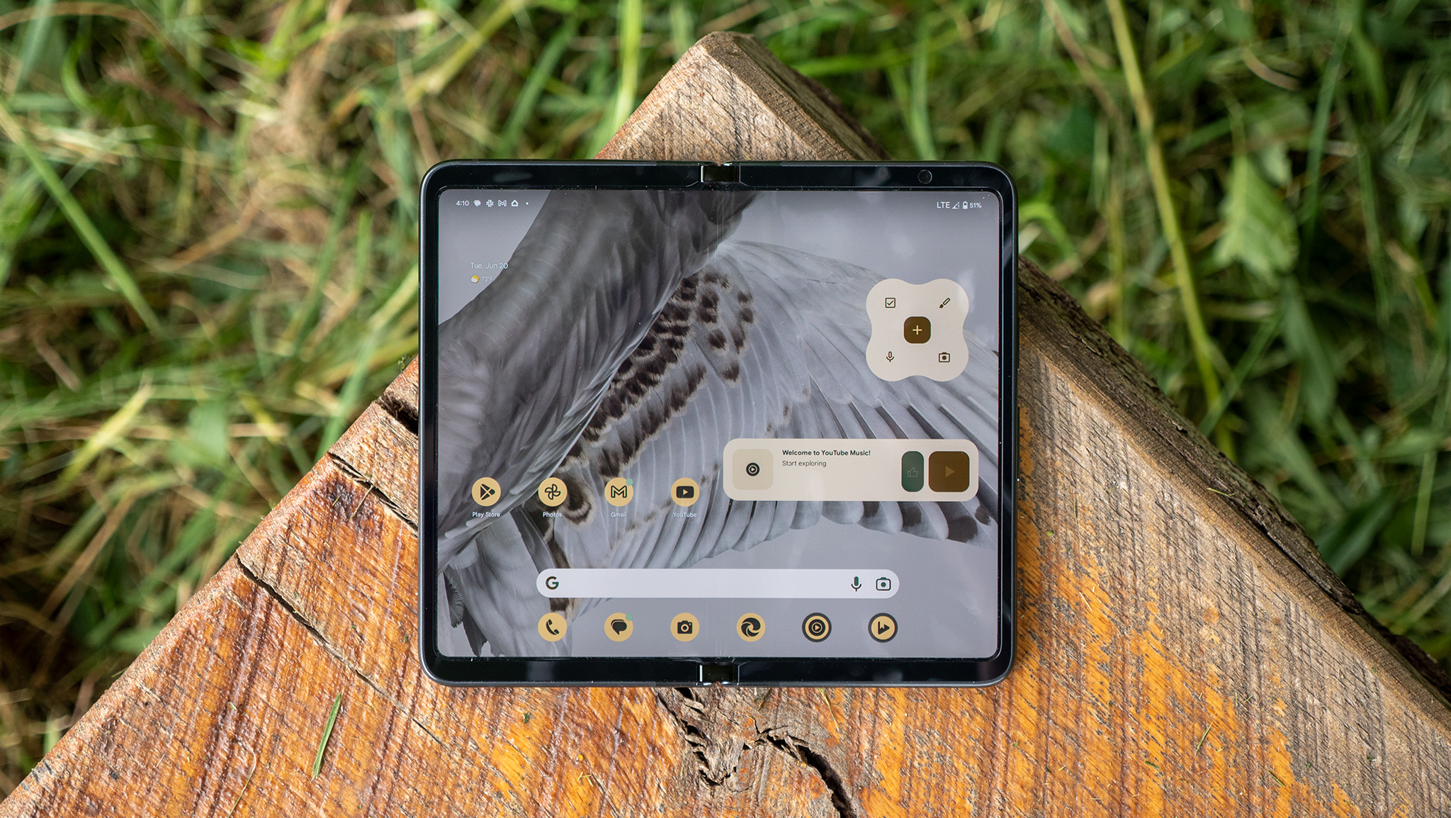
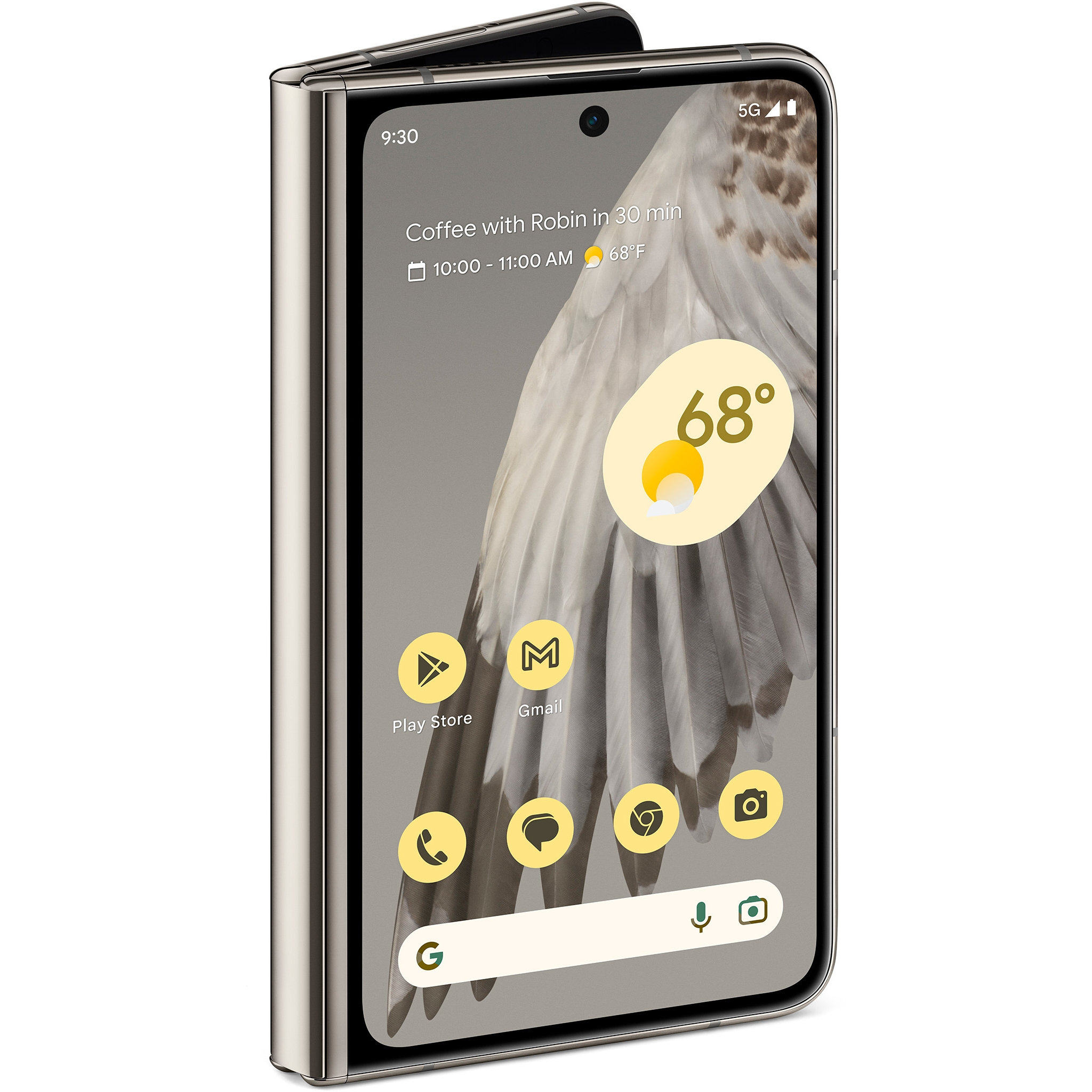
When folded, the Pixel Fold is small and compact like a passport. When opened, the device reveals its immersive 7.6-inch internal display with 120Hz max refresh rate. Despite the device being a foldable, Google has placed some pretty impressive cameras when you want to make some memories.

Nickolas is always excited about tech and getting his hands on it. Writing for him can vary from delivering the latest tech story to scribbling in his journal. When Nickolas isn't hitting a story, he's often grinding away at a game or chilling with a book in his hand.
