Google could give its Phone app a fresh coat of Apple-inspired paint
Android might be getting simpler call controls with dedicated accept and reject buttons.

Get the latest news from Android Central, your trusted companion in the world of Android
You are now subscribed
Your newsletter sign-up was successful
What you need to know
- The Google Phone app is set for a makeover, swapping out the single call button for a new look featuring dedicated buttons for accepting and rejecting calls.
- The accept button will be on the right, and the reject button on the left, unlike Samsung’s layout, which is flipped.
- This feature seems to be in limited testing, so not everyone will see it right away, even if they have the latest app version.
The Google Phone app on your Android devices could be getting a fresh look soon, replacing the single button that currently shows up when you get a call.
According to Android Authority, Google is testing a new incoming call screen in the latest Phone app update (version 145.0.672690850), and it looks a lot like the iPhone’s call interface.
Right now, the Google Phone app uses a swipe method to manage calls—swipe up to answer, swipe down to decline. This is different from iPhones and Samsung phones, which have separate green and red buttons for answering or rejecting calls. People familiar with those setups will probably find Google’s upcoming interface change more user-friendly.
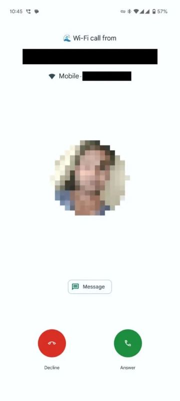
Article continues belowSitting above the phone button is a "Message" option that makes it easy to fire off a quick text, letting the caller know you're tied up or can’t talk at the moment.
The report shows off a screenshot of the Phone app's refreshed incoming call screen, replacing the old swipe-to-accept button with dedicated buttons for answering and rejecting calls. This shift mirrors the iPhone’s dialer and the call screens on many other Android devices, like Samsung’s.

The color-coded buttons make the interface easier to use, providing quick visual cues that help users respond faster, especially in busy situations.
To make things easier to reach, the accept button is on the right side of the interface, while the reject button is on the left. In contrast, Samsung takes a different approach, with the accept button on the left and the reject button on the right.
Get the latest news from Android Central, your trusted companion in the world of Android
It’s hard to say how many people are seeing this feature since it looks like it’s just being tested with a small group of users who updated to the latest app version.
Google appears to be rolling out the new incoming call screen UI with a server-side toggle, so even if you’ve got the latest Phone app version, you might not spot this feature just yet.

Jay Bonggolto always keeps a nose for news. He has been writing about consumer tech and apps for as long as he can remember, and he has used a variety of Android phones since falling in love with Jelly Bean. Send him a direct message via X or LinkedIn.
You must confirm your public display name before commenting
Please logout and then login again, you will then be prompted to enter your display name.
