
What you need to know
- Google is said to be testing a new UI for incoming calls on its phone app.
- An APK deep dive reveals that it might be ditching the usual swiping up and down mechanism to answer voice calls.
- The new UI looks a lot like how older versions of accepting calls, with a side-to-side mechanism.
Google is reportedly testing out a new way to answer calls on its Phone app. It might be letting go of its usual sliding up and down motion to answer/reject calls to something that looks a lot like a blast from the past.
An APK teardown by Android Authority revealed as much when tested with a phone running on the Phone app's version v166.0.735169223 beta, the publication added.
Google apparently wants to change things up with Android 16, and this could include the way we answer phones as well. But instead of bringing a new-looking UI, it seems like it's hitting us with some old-school memories.
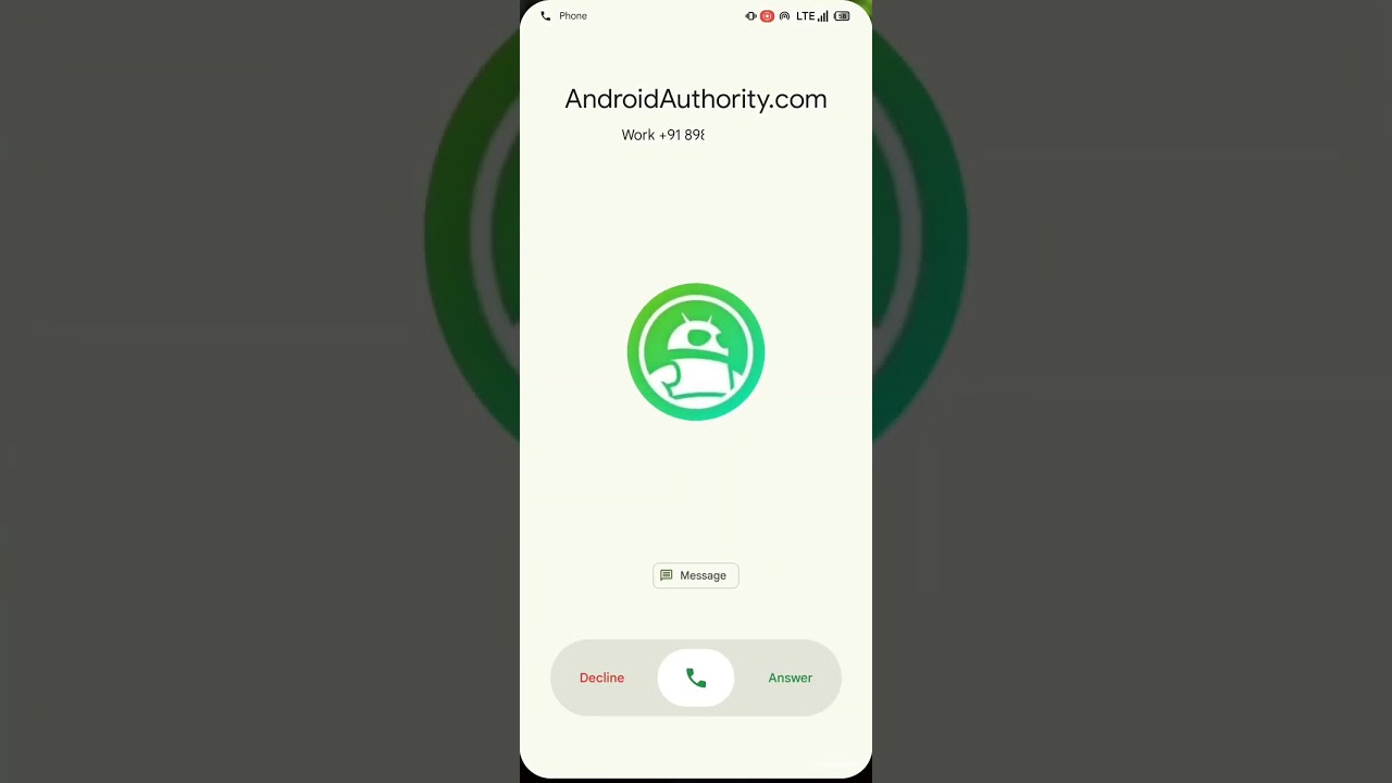
As seen in the above video by the publication, it looks like we might be in for a more side-to-side gesture of picking up a call. It features a pill-shaped bar at the bottom of the screen, with an icon in the center— which can be dragged to the left to decline and right to accept a call. Additionally, you also see a "Message" option above the pill-shaped bar, to send people a text if you choose to decline their calls.
While Google has stuck to the same UI for years, it would take some practice for the fingers to stop swiping up to pick up a phone call. It remains unclear when this feature will show up on the app itself.
However, if this change does occur, it can change the way people answer calls not just on Pixel devices but also on all other phones where the Google Phone app comes pre-loaded. This means Android phones from companies like Motorola, Sony, and others could be graced with the new UI.

Last year, the Google Phone app was testing out an Apple-like incoming call screen where the accept call button would be staged on the right and the reject button on the left, unlike the other way around on most Samsung phones. This UI showcased color-coded buttons for the action, allowing it to be easily recognizable. While this shift looked promising, it was only being tested on a handful of devices and didn't see a wider rollout.
Similarly, this redesign could be in a small testing phase as well, but it remains unclear when or if we will ever see this shift in UI. However, to clarify things, Android Central has reached out to Google and will update this article once we have more information.

You must confirm your public display name before commenting
Please logout and then login again, you will then be prompted to enter your display name.
