Google Contacts widget may soon display the latest message someone sent you
Google Contacts' widget seems to be getting a fresh messaging feature.

Get the latest news from Android Central, your trusted companion in the world of Android
You are now subscribed
Your newsletter sign-up was successful
What you need to know
- Google Contacts is working on a widget update that allows users to view text messages directly on their home screen.
- The feature description emphasizes the need to allow notification access for Contacts to view and respond to the latest message from a chosen contact.
- Additionally, the main Contacts screen seems to be undergoing a design overhaul, with the phone, email, and company icons moving behind a three-dot menu.
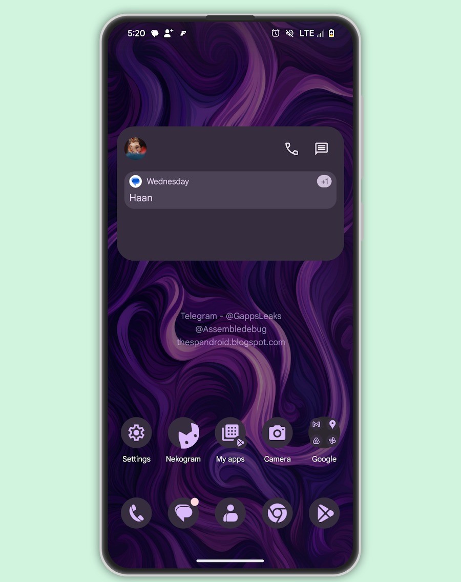
Google Contacts may soon have a home screen shortcut that lets you see your texts without opening your messaging app.
TheSPAndroid's AssembleDebug uncovered this change after toggling some developer settings in the app's 4.26 version. The widget lets users check out chats with chosen contacts right on their home screen.
The idea behind this change is to simplify reaching out to your favorite contact swiftly, at least if it goes public. 9to5Google speculates that this functionality should be compatible with any messaging app on your device. The outlet also mentions that this feature is likely designed for the Individual contact widget.
At the moment, that particular widget only shows a quick link to the Google Messages app. If you tap it, you'll be taken straight to a specific conversation with your selected contact.
Once the as-yet unreleased feature hits your device, be ready to give the Contacts app the required permission to display your messages. This is because, with the update, your messages will be more readily accessible, potentially attracting unwanted attention.

"To see and respond to the latest messages from your contacts, allow notification access for Contacts," the feature's description states.
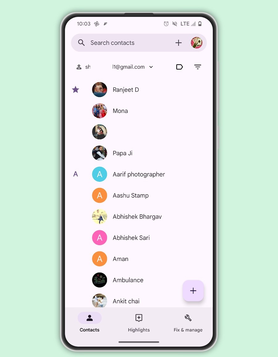
AssembleDebug also caught a visual tweak in the Contacts app—the main Contacts tab is getting a design overhaul. The usual phone, email, and company icons are getting moved behind a three-dot menu. This shift opens up room for a fresh "+" icon in the search bar, making it simpler for users to add contacts.
Get the latest news from Android Central, your trusted companion in the world of Android

Moreover, when you interact with contact details such as email and labels, you'll get a handy bottom sheet with options rather than the usual sidebar that's accessible through the hamburger menu.
Right now, these features are in the testing phase, and there's no set timeline for when they'll be officially rolled out. Typically, updates like these are saved for Pixel feature drops.

Jay Bonggolto always keeps a nose for news. He has been writing about consumer tech and apps for as long as he can remember, and he has used a variety of Android phones since falling in love with Jelly Bean. Send him a direct message via X or LinkedIn.
You must confirm your public display name before commenting
Please logout and then login again, you will then be prompted to enter your display name.
