Google Contacts update to streamline creating a new entry
The update shows what's most important and leaves its extra options out of sight until you need them.
What you need to know
- Google is preparing an update for Contacts that redesigns its "create contact" page with a less overwhelming design.
- The update will let Contacts show the most important fields like name, company, and phone number first before displaying extra options.
- Most importantly, all of the "additional fields" for a contact will tucked into a new submenu that lets users select what they want.
Google is preparing a new update for Contacts that will rework the user experience surrounding its "create" page.
As detailed by AssembleDebug at Android Authority, Google's upcoming 4.30.50.62 build for the Contacts refreshes the "create contact" page by shoving the necessities front and center. There's also a convenient "Favorite" star icon at the top of the page. Users will soon find boxes for a person's first name, last name, company, and phone number directly below the "Add picture" option.
After, Google chucks away the rest of the text box fields in favor of a few pill-shaped buttons.
Contacts will display a few auxiliary options for adding an email, "significant date," address, or a "label." Additionally, Contacts provides loads of extra fields that will soon slide into an "Add Fields" button at the very bottom of the redesigned page. The deep dive shows that tapping the option produces a floating menu from the bottom of the UI, containing fields like middle name, prefix, suffix, nickname, and more.
Lastly, when creating new contacts, Google seems to draw more attention to the "Notes" field. The redesign's early preview shows the text box is much larger as it finishes the original list of available contact options before adding more.
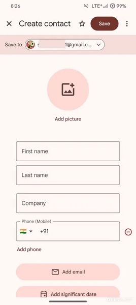
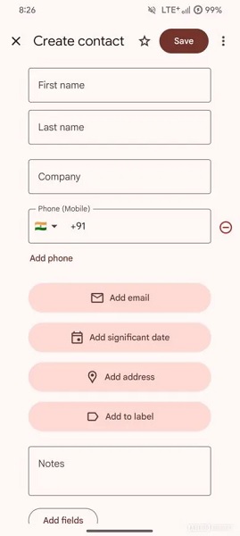
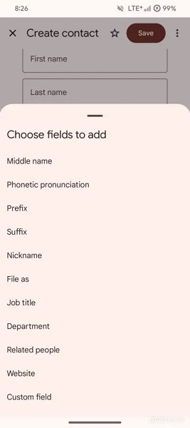
The change to the creation page for Google Contacts should streamline the user experience. Currently, the page displays everything as a mundane list full of fields you probably aren't interested in filling out. Now, the redesign only shows what matters most alongside the option of adding a field of your choosing. A "more fields" option exists on the current (old) Contacts view, but it throws everything in, adding to its clutter.
These changes should arrive as a Play Store update for Google Contacts under the 4.30 build. However, as the publication notes, it hasn't started rolling out yet.
Be an expert in 5 minutes
Get the latest news from Android Central, your trusted companion in the world of Android
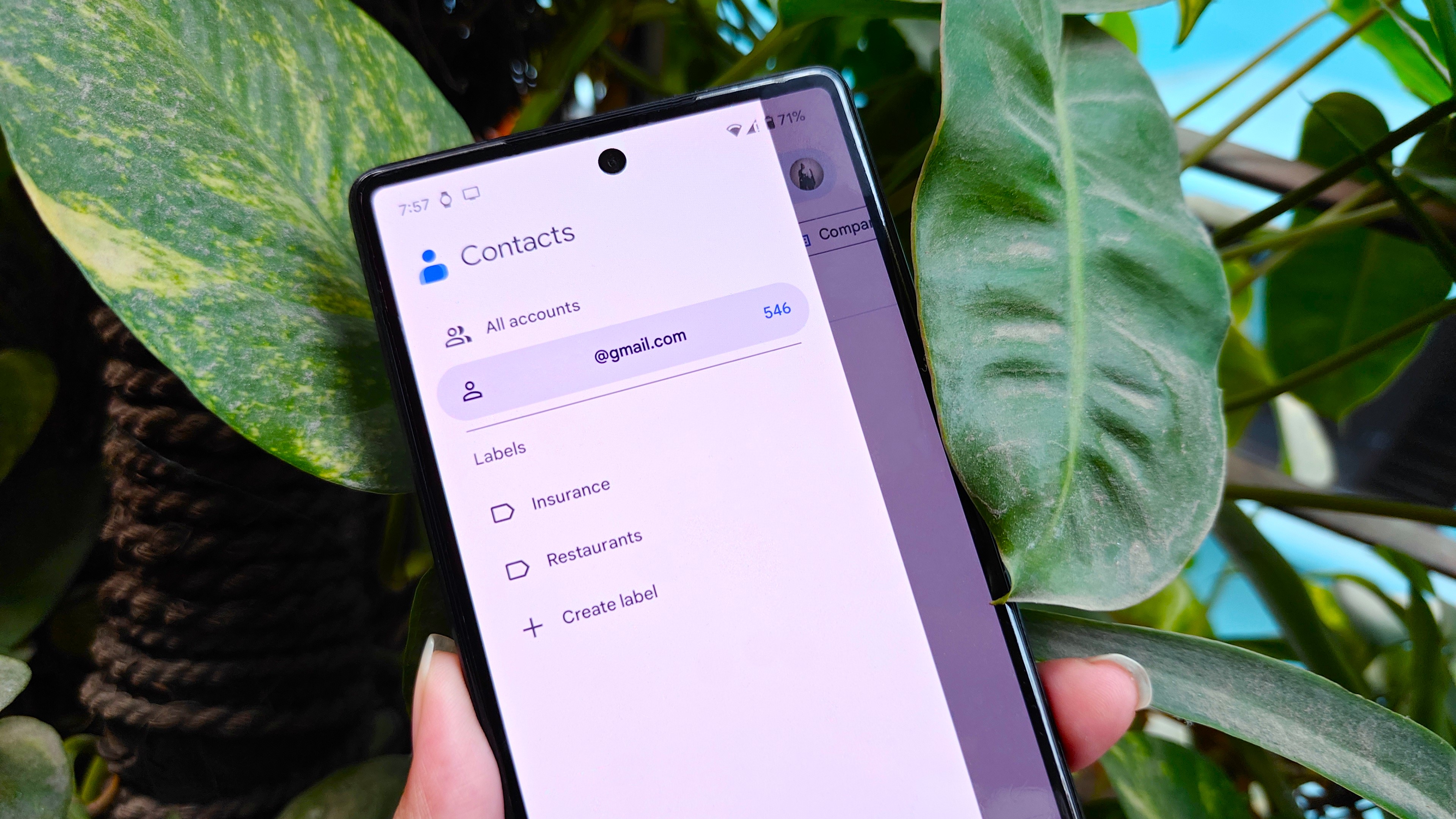
The company has been slowly reworking the experience Contacts gives users and its most recent one rolled out in March. The update dropped the app's old navigation drawer as Google slowly moves away from the UI design trend. A drop-down menu beneath the search bar lets users quickly customize their view. There's also a custom ringtone page tucked into the "Fix & manage" tab.

Nickolas is always excited about tech and getting his hands on it. Writing for him can vary from delivering the latest tech story to scribbling in his journal. When Nickolas isn't hitting a story, he's often grinding away at a game or chilling with a book in his hand.
You must confirm your public display name before commenting
Please logout and then login again, you will then be prompted to enter your display name.
