Google Contacts now sorts information in cards to match your Material You theme
A new update gives the contact app a fresh coat of paint.

What you need to know
- Google has rolled out a new visual design to the Contacts app.
- The makeover gives the app a post-Material You aesthetic and organizes your contacts' information into cards.
- The update seems to be rolling out as a server-side change.
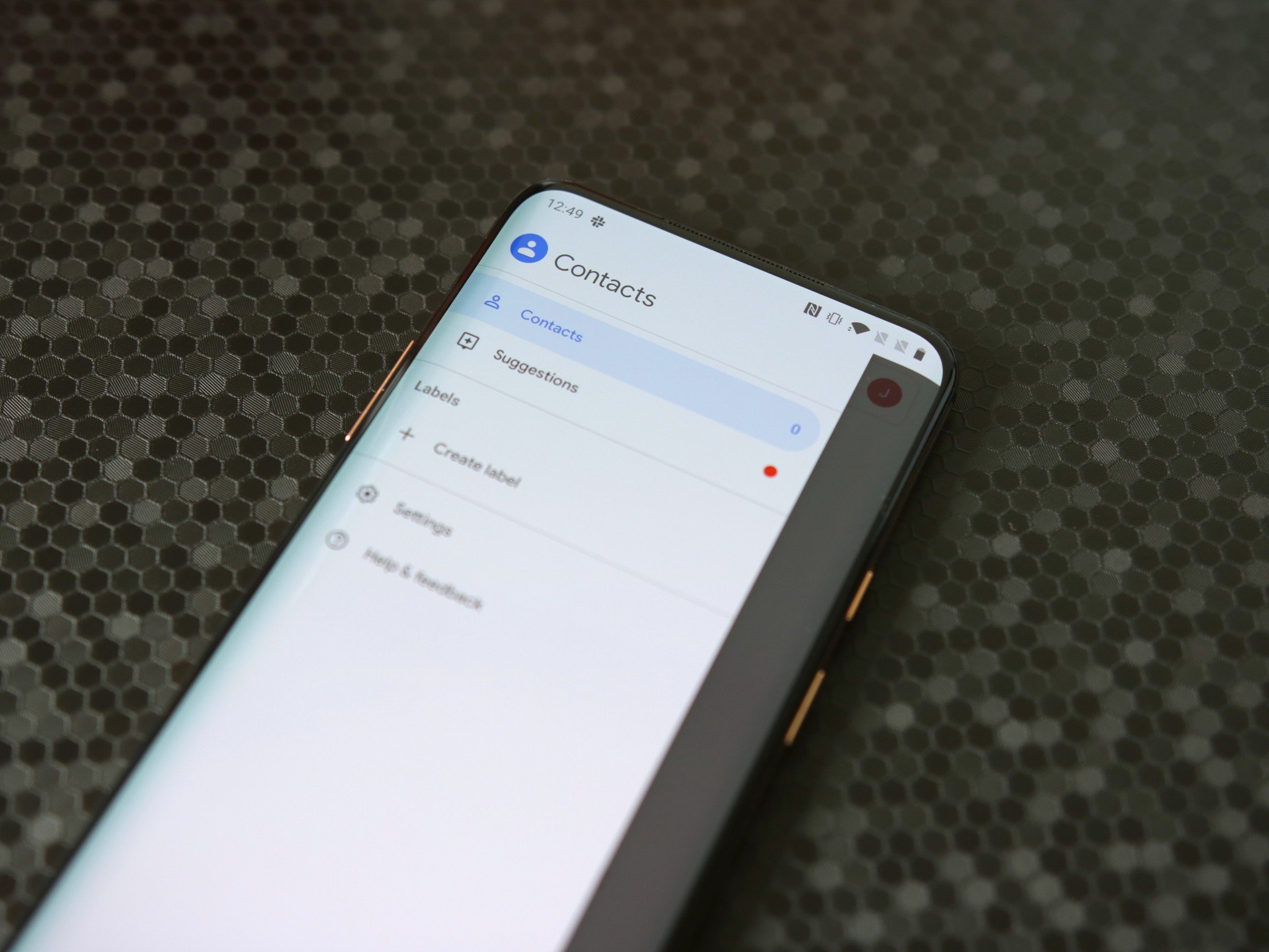
Google Contacts was the first app to receive the Material You redesign last year, complete with squircles. Now, its makeover goes a step further with a new look that organizes your contacts' information.
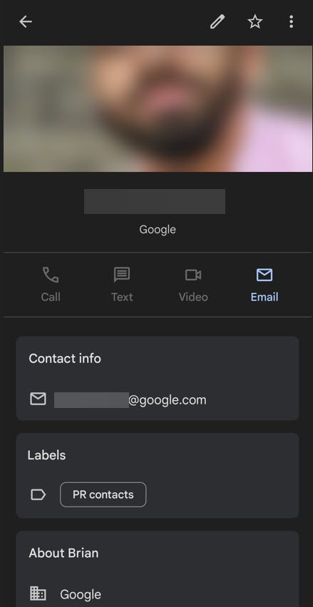
The latest tweak replaces the list style of contact information with Material You-style cards with rounded corners. It was discovered by Twitter user Prajjwal Porwal and reported first by Android Police.
In the new design, the phone numbers and email addresses are located in a separate category called "Contact info," along with the "About" and "Labels" categories beneath it. Meanwhile, your contact’s picture and name still appear above a list of action buttons, just like in the old version.

The headline change is the card-style grouping of contact information. Previously, all contact details were placed below the action bar in a simple list.
Furthermore, Google Contacts has replaced the bottom floating action button with an edit icon in the top right corner. The redesign brings it more in line with the rest of Google's products that recently picked up their own Material You redesign.
But that's not the only change coming to the Contacts app. Google was recently spotted working on a fresh UI change for it, featuring a bottom bar that will let you toggle between your contact list and certain settings.
If you have the Contacts app version 3.70.3.453319987 installed on your phone, the new card design should be available by now. Android Police noted, though, that the change is also available in previous versions of the app on many of the best Android phones. This means the redesign is being rolled out as a server-side update.
Be an expert in 5 minutes
Get the latest news from Android Central, your trusted companion in the world of Android

Jay Bonggolto always keeps a nose for news. He has been writing about consumer tech and apps for as long as he can remember, and he has used a variety of Android phones since falling in love with Jelly Bean. Send him a direct message via Twitter or LinkedIn.
