An early Google Chrome Web Store preview shows a 'modern' redesign
A cleaner design, bringing it closer to others in Google's ecosystem.

What you need to know
- Google opens its door on a preview for the Chrome Web Store redesign, bringing an aesthetic similar to the Play Store.
- While the main page removes the category sidebar, the preview's "extensions" and "themes" pages bring it back.
- Google hasn't stated a timeframe for its official arrival, however, it's looking to users and developers for feedback before doing so.
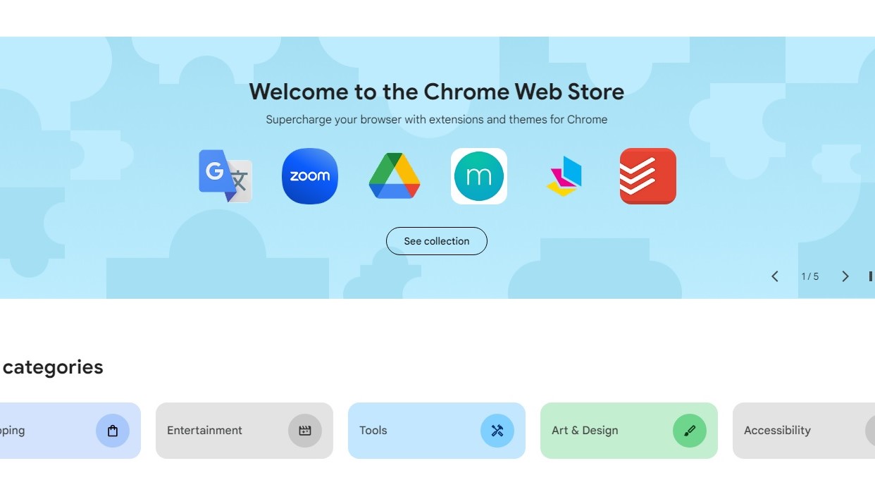
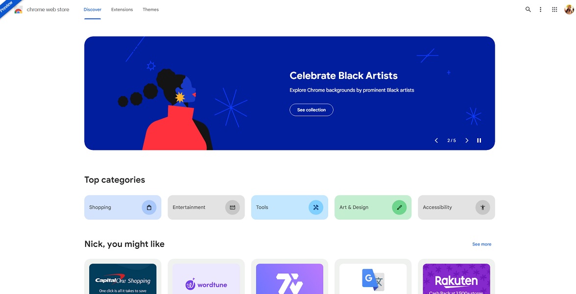
Google is working on revamping the design of its Chrome Web Store, and an early preview gives us a look at what's to come. As spotted by 9to5Google, the new Chrome Web Store redesign is pretty similar, aesthetically, to the Play Store on mobile and desktop. The easiest to spot change is how the new Web Store fills the view of a PC's monitor horizontally, doing away with the category sidebar.
Instead, right beneath the initial side-scrolling rotating list of extension highlights, users can find "top categories." The page then recommends extensions based on your habits with others following the further down you go.


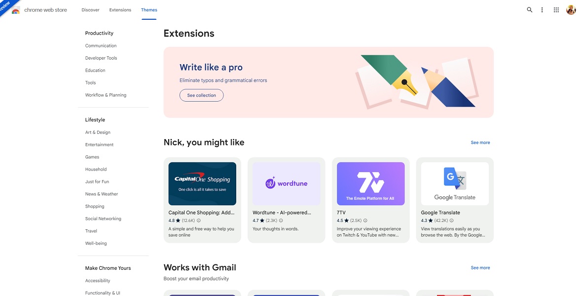
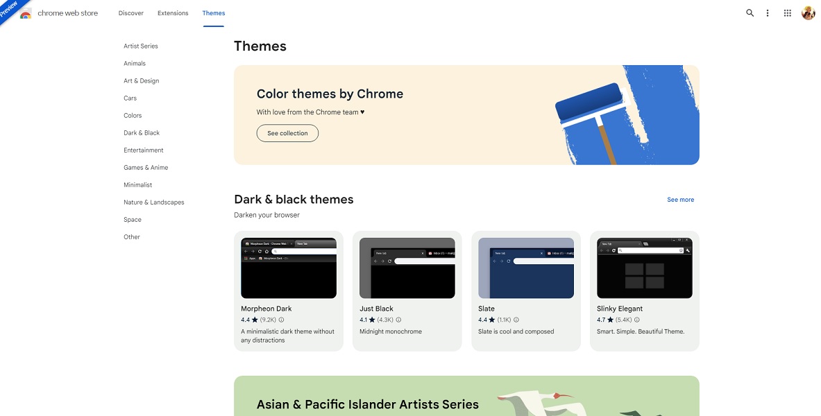
Hopping over into the "extensions" and "themes" pages quickly brings back that old sidebar full of categories. On these pages, Chrome's new Web Store lists broader categories with sub-categories directly below so users can click on exactly what they're looking for from the get-go.
Both pages offer recommendations that you may be interested in. However, unlike the extensions page, which offers a "you might like" section, the themes page forgoes such a section.
Much of the design choices made for the Chrome Web Store's upcoming redesign are pretty standard (now) for Google. Much of it fits the theme of its Material You design language, with rounded corner boxes to boot.
9to5 also mentions a Google Chrome community post that quietly detailed the preview a few days ago. The company states the goal for the Web Store redesign is to usher in "a modernized interface, personalized extensions, and curated recommendations."
There's no word on when users can expect the new look to officially arrive, but if you're curious, you can check it out for yourself. Furthermore, Google is looking to collect as much feedback from users and developers before making the switch for good.
Be an expert in 5 minutes
Get the latest news from Android Central, your trusted companion in the world of Android

Nickolas is always excited about tech and getting his hands on it. Writing for him can vary from delivering the latest tech story to scribbling in his journal. When Nickolas isn't hitting a story, he's often grinding away at a game or chilling with a book in his hand.
