Google app preparing to bring 3 new info-packed weather widgets
The widgets pair well with the Google app's weather redesign.

Get the latest news from Android Central, your trusted companion in the world of Android
You are now subscribed
Your newsletter sign-up was successful
What you need to know
- Code in the latest Google app beta showcases several new weather widgets for Android.
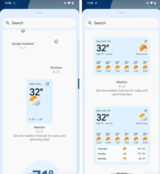
- The widgets are info-packed with the largest, a 4x3 variant, containing the current temp, location, highs, lows, and a three-day outlook.
- Google changed its weather experience in the app last year with Pixel devices picking it up several months after followed by other Android devices in 2024.
It seems Google is finally preparing to refine its weather widget space on Android following its UI redesign in the app.
The folks at Android Authority conducted an APK deep dive into the latest beta version (15.28.37.29) of the Google app and discovered a few new widgets. The three newly discovered widgets bring a little more information to users interested in getting the most weather data at a glance. The one that packs the most is a 4x3 square widget with rounded corners.
The beta version's code shows that the widget will display the day's hourly weather information with the current temperature, location, highs, and lows. Additionally, this larger box expands its content, providing a brief outlook of the weather for the following three days.
Article continues below 
The second widget takes things down a notch from the larger 4x3 entry, arriving with a 4x2 dimension. Early signs show this secondary option will only provide a day's hourly outlook beneath the current temperature and other data from the previous widget.
The third option is a simple vertical, rounded corner box that displays your location, current temperature, and more. This is the most minimalistic choice of the coming three and might attract users who don't like the pre-existing version's design. Currently, the Google app offers another minimalistic widget that only displays the current temperature and a weather icon indicative of the status outside.
Its design is diagonal with rounded corners and might not fit symmetrically with the balance of our home screen and apps. As the publication notes, it had to "manually" surface the widgets, meaning they're still deep in development, and changes are likely.
Google started redesigning the weather experience of its Android app a year ago in May. The UI changes started rolling out to the company's Pixel devices in September, bringing with it a streamlined view. Before, the app's weather section provided a three-tab overview. Now, users will find a "Now" section packed with important information for the day, followed by a 10-day outlook.
Get the latest news from Android Central, your trusted companion in the world of Android
What's more, it wasn't until this year that even more Android devices were finally given a weather section overhaul.

Nickolas is always excited about tech and getting his hands on it. Writing for him can vary from delivering the latest tech story to scribbling in his journal. When Nickolas isn't hitting a story, he's often grinding away at a game or chilling with a book in his hand.
You must confirm your public display name before commenting
Please logout and then login again, you will then be prompted to enter your display name.
