I've used foldable phones for months — here are four software issues I noticed
I’m in love with book-style foldable phones, but even I admit the experience isn’t perfect.
I’ve been daily driving a book-style foldable phone for the past few months now, and I don’t want to go back to a traditional candybar phone. Watching videos, reading manga, and browsing the web are all much more comfortable to do on the inner screen of a book-style foldable than on a candybar phone. Unfortunately, my experience with the software on the two book-style foldables I’ve used so far — the Samsung Galaxy Z Fold 5 and the OnePlus Open — hasn’t been perfect, and it’s not because of anything Samsung or OnePlus has done.
I’m sure you’ve heard reviewers say that many apps aren’t “optimized” yet for foldables, but what exactly do they mean by that?
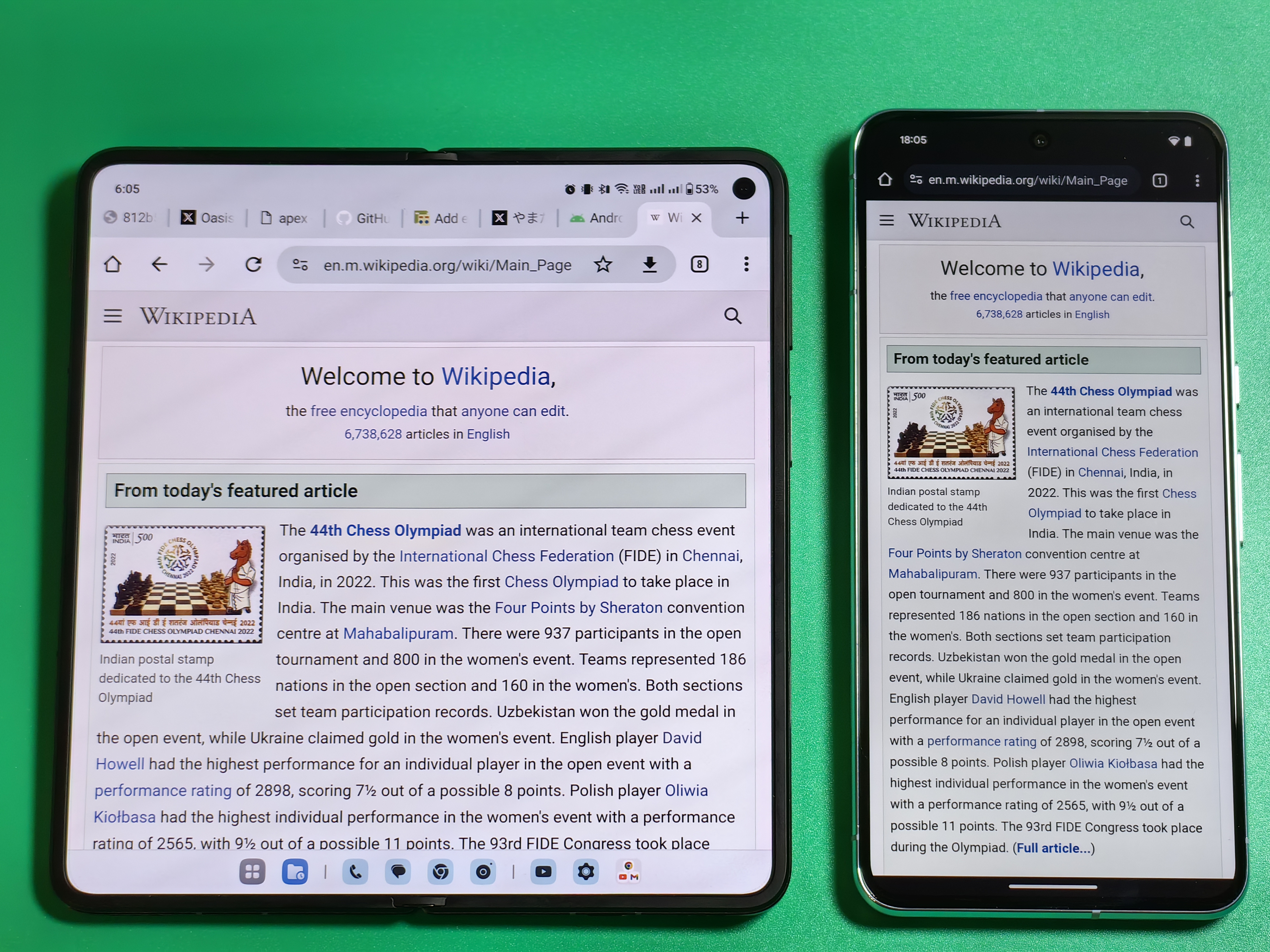
Broadly speaking, there are four categories of software issues that I’ve identified while using book-style foldable phones. These include size, layout, awareness, and advantage. I’ll explain what I mean by each of these and also talk about how Google and OEMs are working to address them.
My first issue: Size
If you compare the number of candybar Android phones that are on the market versus the number of large-screen Android devices (which includes tablets, foldables, and Chromebooks capable of running Android apps), you’ll find that the former far exceeds the latter. That’s why it’s no surprise that the vast majority of developers focus on optimizing their Android apps for candybar phones first. If they have the time and resources, they may optimize their app for larger screens, but many developers do not.
Developers that don’t or can’t optimize their apps have two options: Block the app from running on devices with larger screens or lock the app into portrait orientation. The first option would shut out some potential users, so many developers choose not to do that. The second option lets those users access the app, although they may have to flip their device 90° to actually use it. Apps like BeReal, Authy, Venmo, Zipcar, Lyft, Delta, Chase, and Amex lock themselves to portrait orientation, for example.
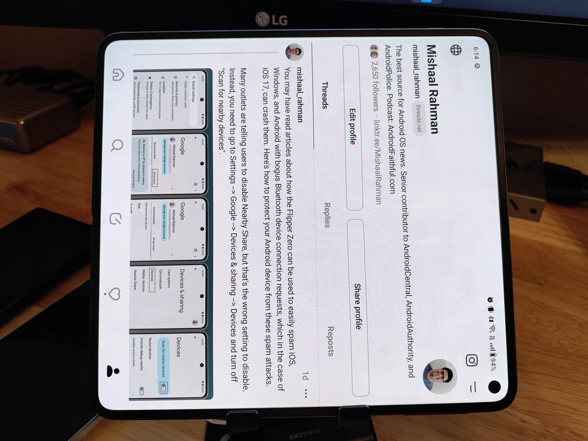
It’s obviously not ideal that there are so many apps that aren’t optimized for landscape orientation, but forcing developers to tweak their apps to support what may be a relatively small number of users isn’t something Google can justify. Instead, Google found a solution that lets OEMs override an app’s orientation preference while still displaying the app in its intended aspect ratio.
At a system level, OEMs can override an app’s orientation preference, allowing them to be shown in landscape mode. By default, this places the app in a letterbox surrounded by gray bars, but you can stretch the app to fill the screen if you want. In Samsung’s One UI, this is done by going to Settings > Advanced features > Labs > Landscape view for portrait apps. In OxygenOS/ColorOS, this is done by going to Settings > Main screen > Display size. Finally, in stock Android, this is done by navigating to Settings > Apps > Aspect ratio.
Get the latest news from Android Central, your trusted companion in the world of Android
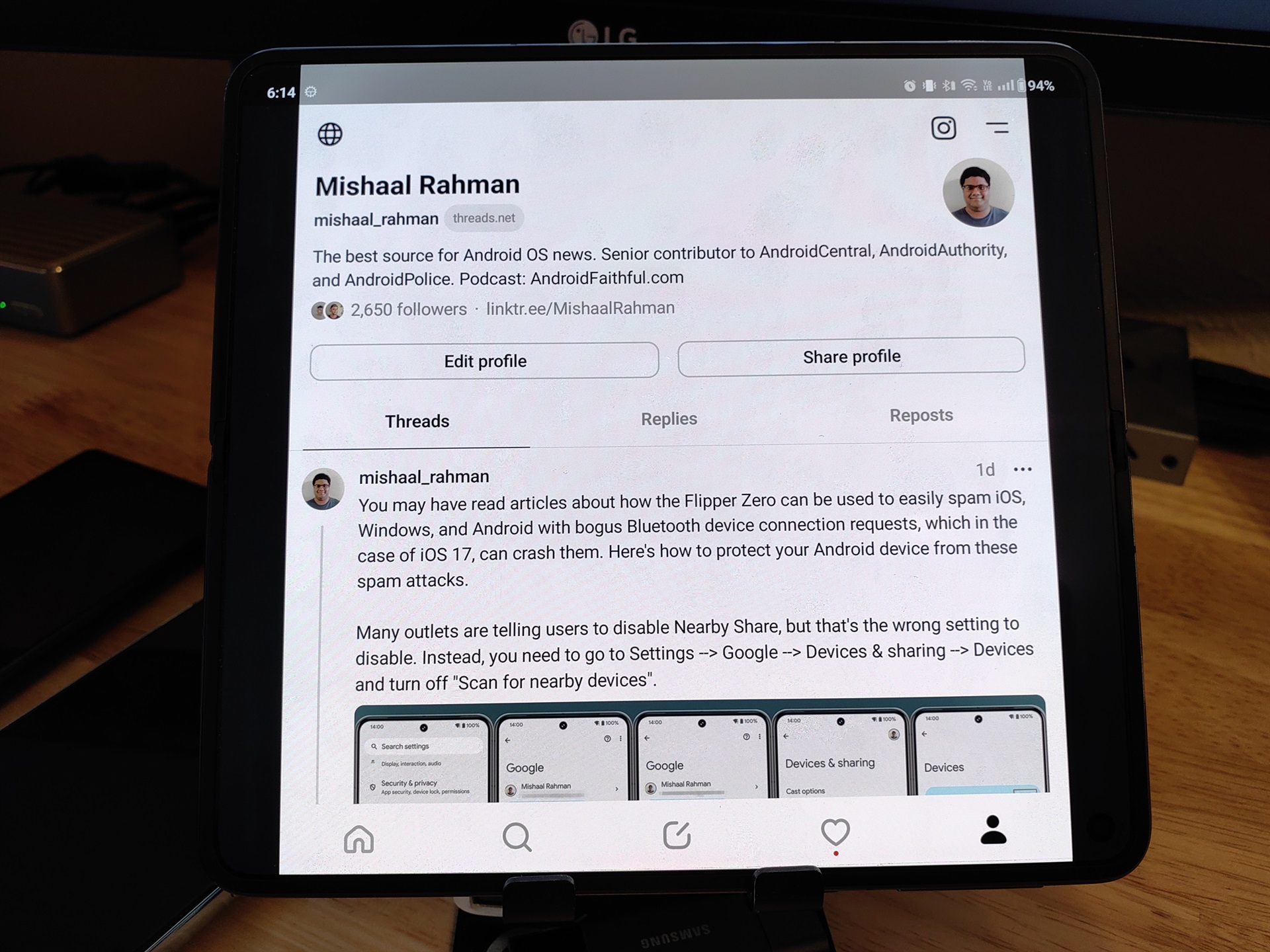
While overriding the orientation preference and aspect ratio of an app solves some problems, it leads to other problems or simply doesn’t address some existing issues. These issues have to do with the app’s layout.
My second issue: Layout
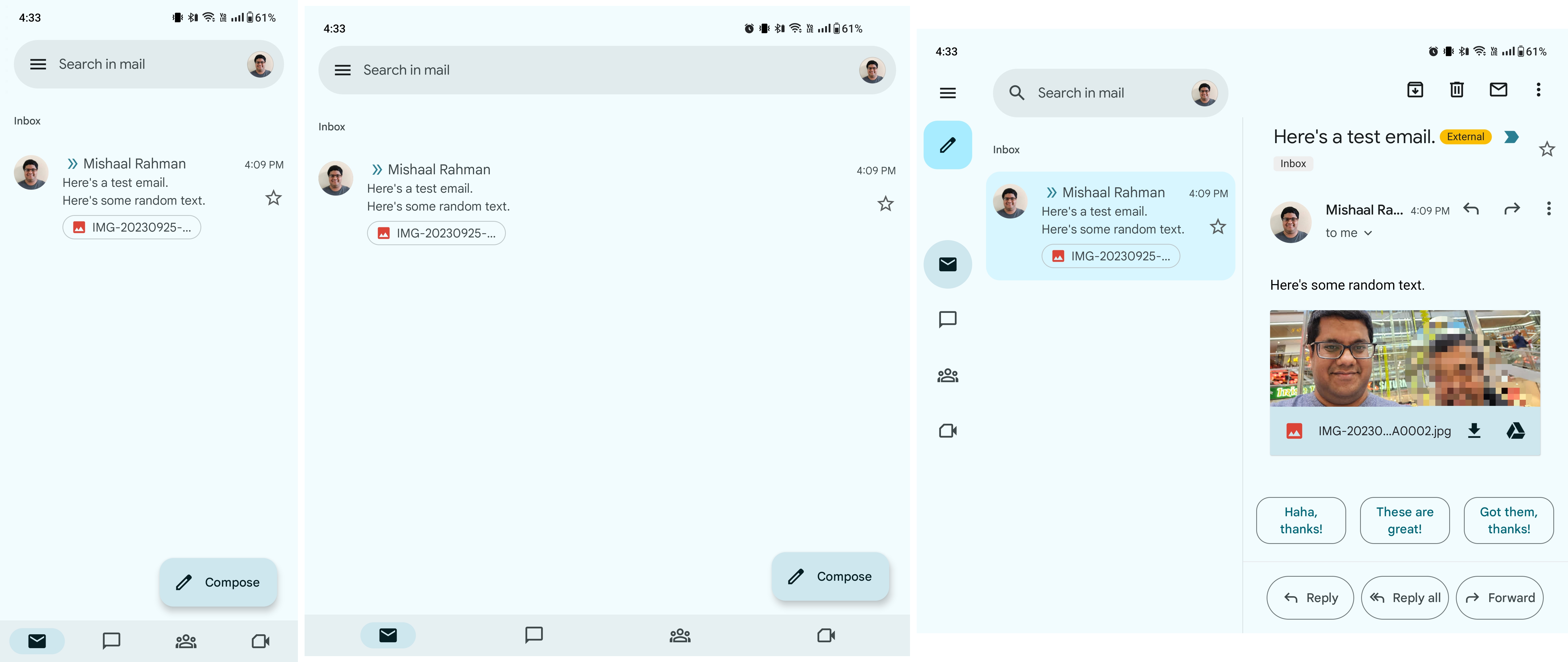
By layout, I’m referring to the placement of UI elements within an app, such as buttons, tabs, text, and images. Many apps designed for candybar phones use a bottom navigation bar, i.e., a row of buttons at the bottom that lets users navigate to different screens in the app. These buttons are close enough together on candybar phones that they’re easy to reach without stretching your thumb, but they’re harder to reach when the app is stretched to fill the screen on devices with much wider screens. The solution to this problem is for the app to switch to a side navigation rail when it’s opened on a device with a larger screen.
Here are some screenshots showing Gmail on a candybar phone with a bottom navigation bar, Gmail stretched to fill the screen of a book-style foldable but with a bottom navigation bar, and finally, Gmail optimized for large screens with a side navigation rail:
In-app navigation isn’t the only layout challenge to consider. Book-style foldables, when unfolded, have enough screen space to accommodate two panes of content, yet most apps only show a single pane of content at a time. Often, this results in text and images being unnecessarily stretched to fit the entire width of the inner display, such as in the case of the X app.
Creating a two-pane layout requires some work on the part of the app developer, of course. Many Google apps, such as Gmail, as shown above, have a two-pane layout, but most apps from other developers do not.
Some OEMs have implemented features that force select apps to open in a two-pane layout, but this only works with apps that have a multiple-activity architecture, as the system essentially forces these apps to support Android’s “activity embedding” feature. However, these kinds of features have to be specifically coded to support certain apps, so you’ll find that one OEM’s OS can force a two-pane layout in one app while another OEM’s OS cannot. A key example of this is X, which can be forced into a two-pane layout on the Honor Magic V2 but not on the Samsung Galaxy Z Fold 5 or OnePlus Open.
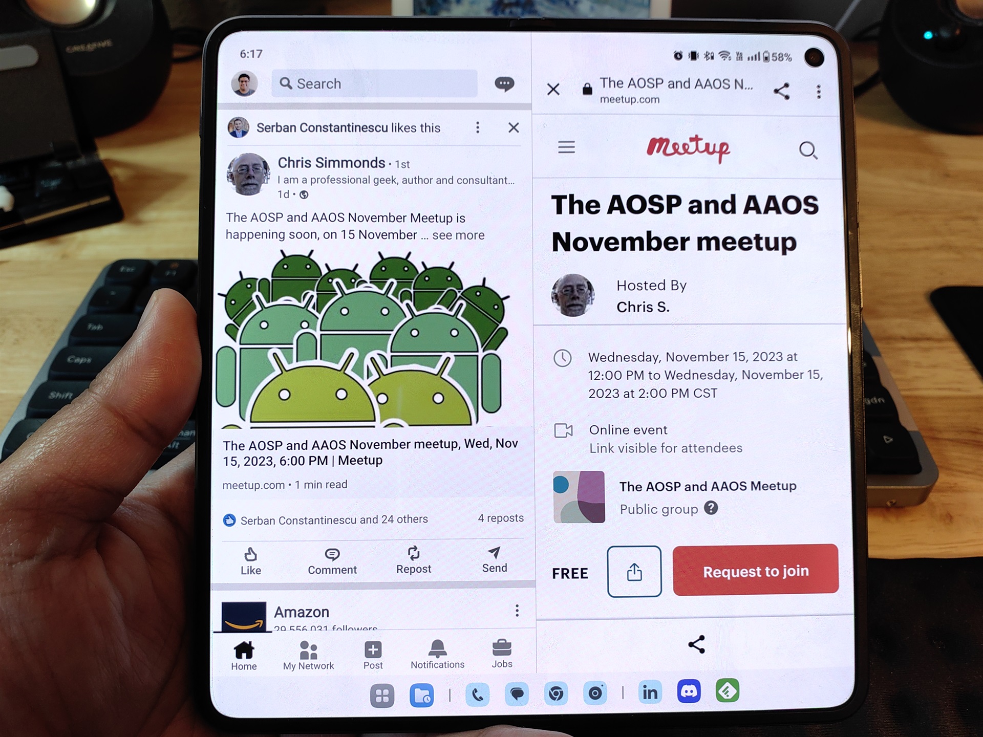
Stock Android, unfortunately, has no solution to this problem. Google’s answer is to provide developers the tools they need to create a two-pane layout, regardless of whether their app follows modern Android development (MAD) guidelines.
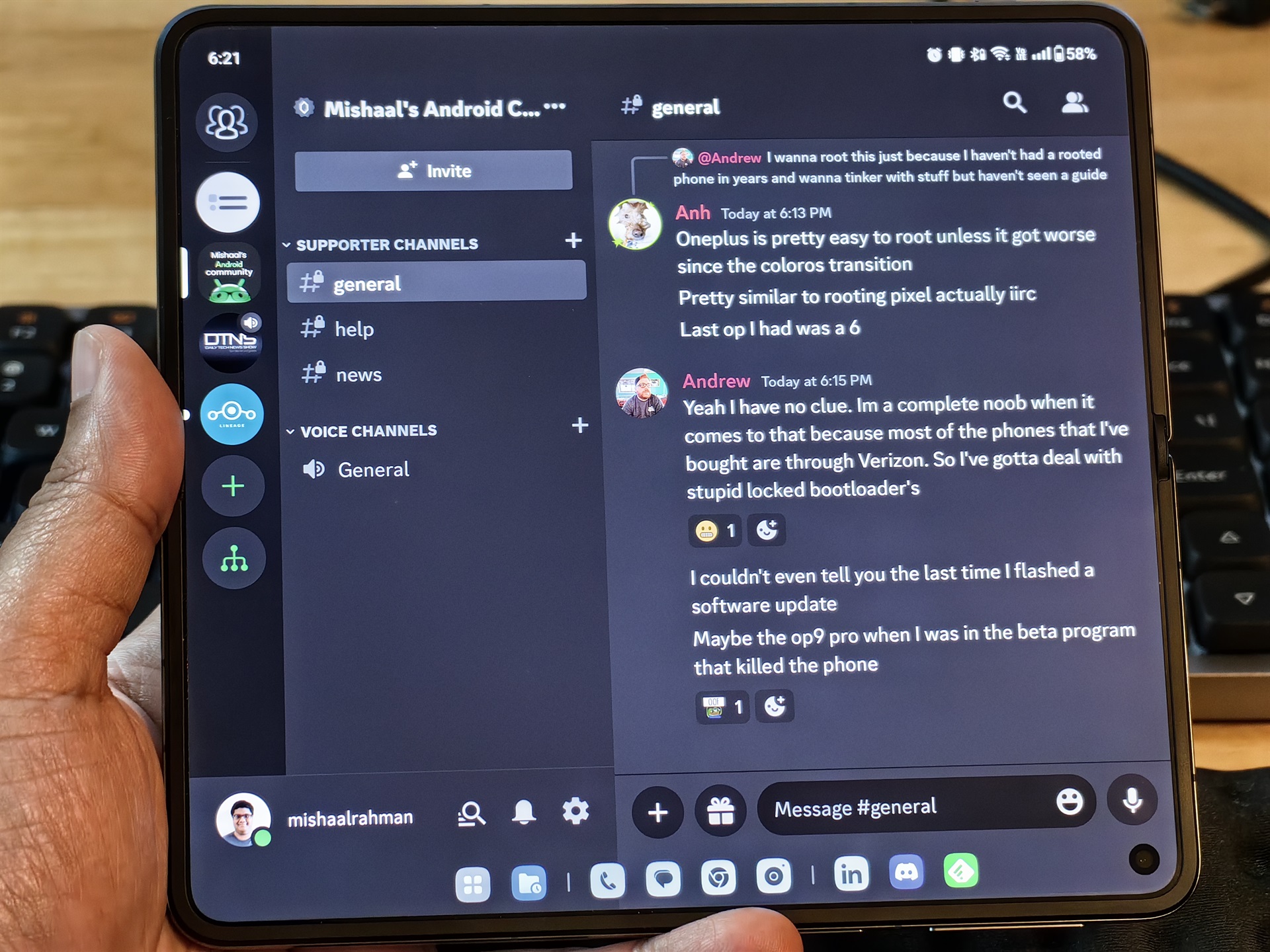
Another layout-related issue is that, even if the app on paper does all the right things to support large-screen devices, it doesn’t show users that optimized layout by default. Those Gmail screenshots I shared earlier were all taken on the OnePlus Open, first on the outer display, second on the inner display in its default portrait orientation, and lastly on the inner display when flipped over to landscape orientation. The OnePlus Open, as well as the Galaxy Z Fold 5, has a much narrower inner screen aspect ratio compared to the Google Pixel Fold, which means its natural orientation when unfolded is portrait.
This means you don’t have to flip the phone 90° to deal with portrait-locked apps, but it also means that apps with a large screen optimized layout, like Discord and Gmail, won’t show you that layout unless you flip the phone 90°.
My third issue: Awareness
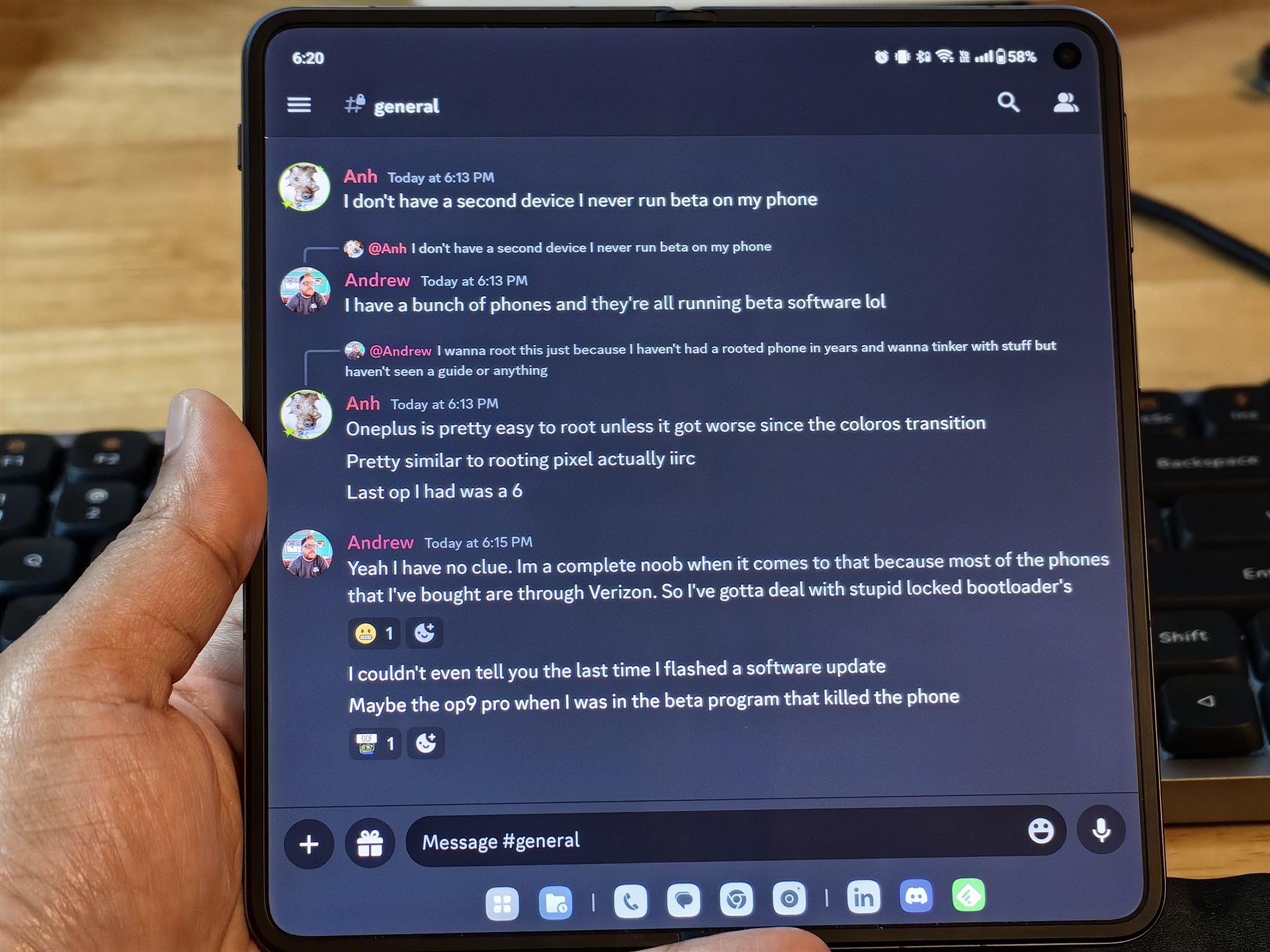
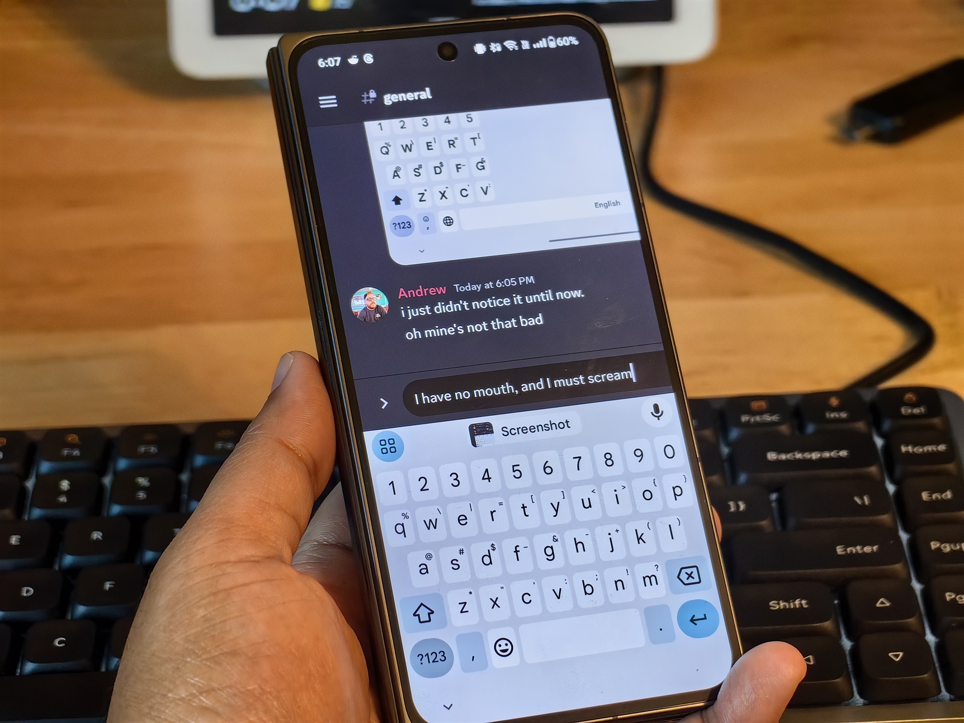
This next issue is a lot more minor compared to the previous two, but it’s something that’s happened to me often enough that I need to bring it up. There are a few things that apps need to do to become “foldable aware,” and one of them is to handle the change in display size that happens when the user folds or unfolds their device.
Unfortunately, I’ve noticed that some apps, like Discord, don’t handle this configuration change gracefully. For example, I’ve often found that the send button is hidden off-screen when I fold the device while Discord is open. To resurface this button, I have to close out of the app and then reopen it.
Many foldables also have a hinge angle sensor that apps can listen to to adjust their UI based on the folded state of the device. Very few apps take advantage of the hinge angle sensor, though. YouTube is one example of an app that does. When the device is half-opened, YouTube’s Premium controls are shown at the bottom half of the screen while the video is shown at the top half.
My last issue: Advantage
Speaking of apps taking advantage of features only found on foldables, the last issue I wanted to highlight is that very few apps are taking advantage of the fact that foldables have two displays. The Pixel Fold’s Dual Screen Interpreter mode lets you show translated text on the outer display and the original text on the inner display. This feature wasn’t available on the Pixel Fold at launch, however, as it relies on new capabilities introduced in Android 14.
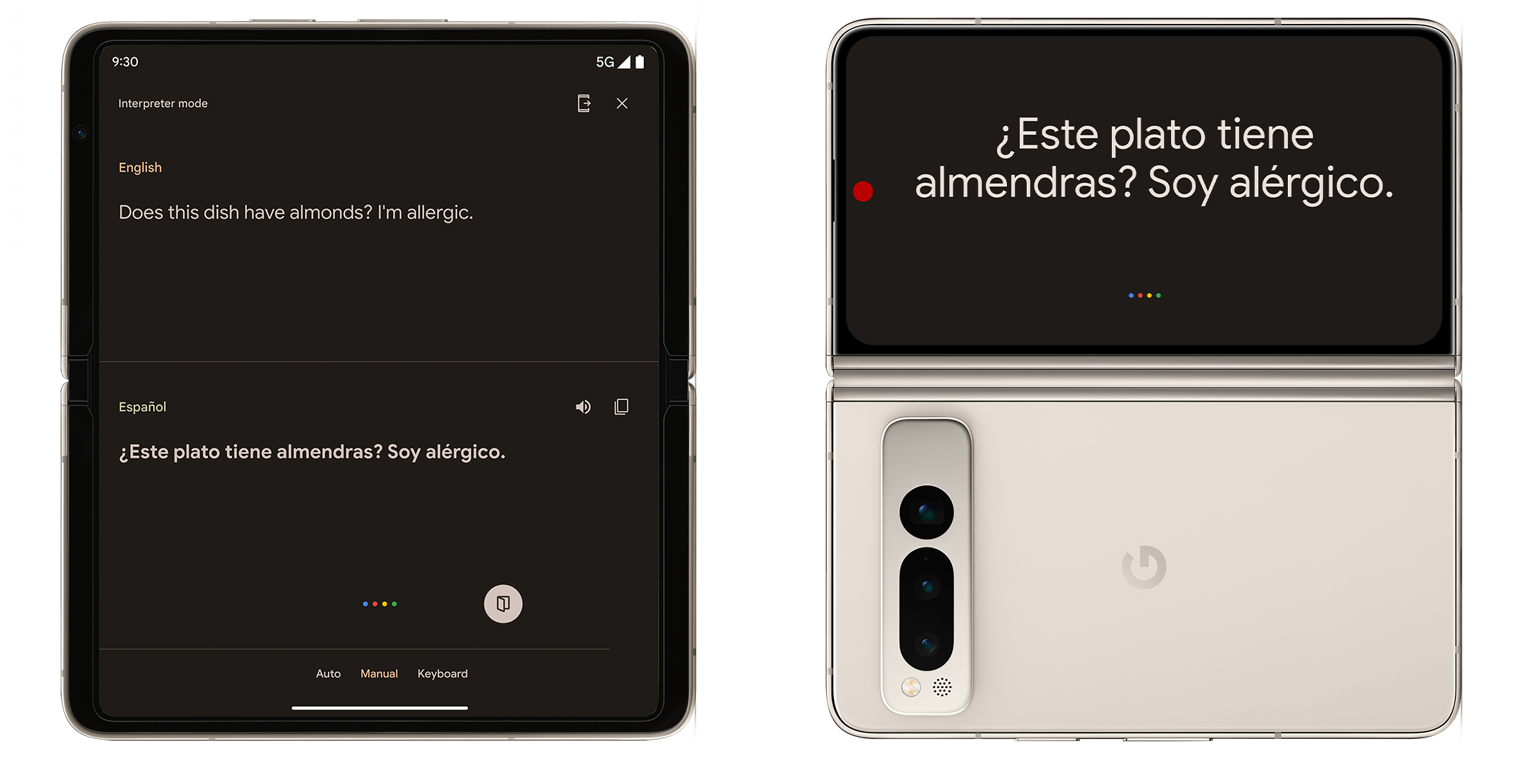
Fortunately, Android 14 makes it possible for other apps to utilize both screens on a foldable, so hopefully more apps get updated to take advantage of this unique aspect of foldable phones.
Book-style foldable phones tick all the right boxes for me, and despite these issues, I don’t see myself carrying a regular candybar phone as my personal device anytime soon. Once book-style foldables drop in price and become more mainstream, I’m hoping their increased popularity will encourage developers to optimize their apps.
Until then, if you’re looking to pick up a book-style foldable like the Galaxy Z Fold 5, Pixel Fold, or OnePlus Open, then you should be aware of the issues I mentioned in this article and the potential workarounds that are available or are in development.
