Every feature Google should copy from Samsung's Galaxy Z Fold 5
Bringing these software features to the Pixel Fold should benefit other foldables too.
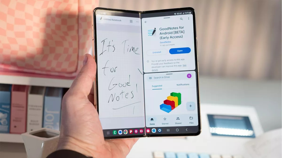
For a couple of years, there wasn’t any doubt about who made the best foldable phone. Samsung kickstarted the new category in 2019 and didn’t face a lot of serious competition for a good while, but the field has changed significantly in 2023. Other smartphone makers have not only caught up to Samsung but arguably surpassed the Korean tech giant when it comes to making book-style foldable hardware.
But hardware isn’t the only factor to consider in a head-to-head comparison of two foldables, as the device that has the better software arguably provides a better overall experience as it actually takes advantage of all that extra space. Samsung’s years-long head start on making foldable phones has given them more time to optimize Android for foldables, and it really shows.
I’ve been using the Samsung Galaxy Z Fold 5 for a little over a month now, and I’m continually surprised by just how many useful features I keep finding in its One UI 5.1.1 software. It would take ages to explain every change Samsung made to Android that I like or dislike, so instead, I wanted to highlight just the changes that improve the experience of using a book-style foldable phone.
A lot of the features I’m going to mention aren’t found in the open-source version of Android (AOSP) — at least not yet, which means they also aren’t found in the Google Pixel Fold. If Google were to add these features, it would improve the experience of using the Pixel Fold and other foldable devices. Of course, Google can’t copy every feature from the Galaxy Z Fold 5 since they have a lot to consider before they can add any new feature to stock Android. Still, there’s a lot that Google could pull from Samsung and other OEMs, especially when it comes to multitasking and productivity features.
Split-screen
To begin with, let me show how multitasking is better in One UI than on stock Android, thanks to the changes and improvements that Samsung made to split-screen mode, windowing, and the taskbar.
Android on the Pixel Fold supports putting two apps side-by-side in split-screen mode, but Samsung takes things a step further by letting you put three apps on screen at once. One app takes up half the screen, while the other half of the screen is split between the other two apps of your choice.
To be fair, the Galaxy Z Fold 5’s inner display is only 7.6 inches diagonally, so giving an app a quarter of the screen doesn’t give it a lot of breathing room. Three-way split-screen mode isn’t something you’ll use very often, but the option is nice to have. I’m sure some people will find it useful from time to time or very often. That’s kind of the thing with One UI: it’s packed full of features to the point that it can feel overwhelming to a new user, but once you find a feature or two that really suits your fancy, you’ll miss them when you switch devices.
Be an expert in 5 minutes
Get the latest news from Android Central, your trusted companion in the world of Android
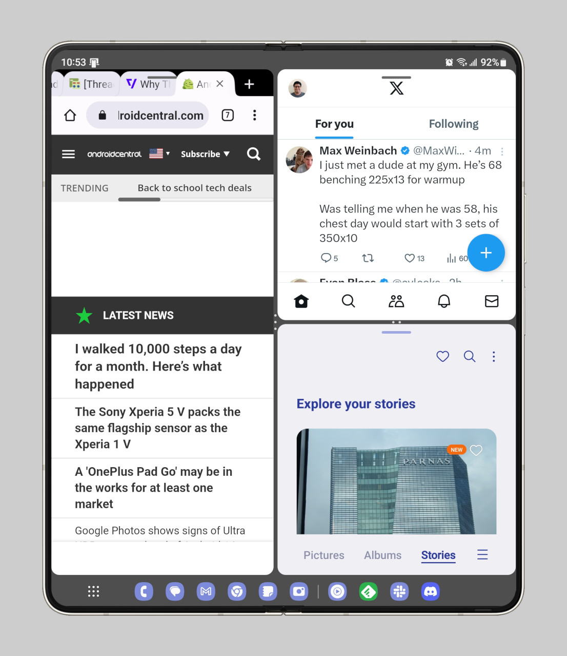
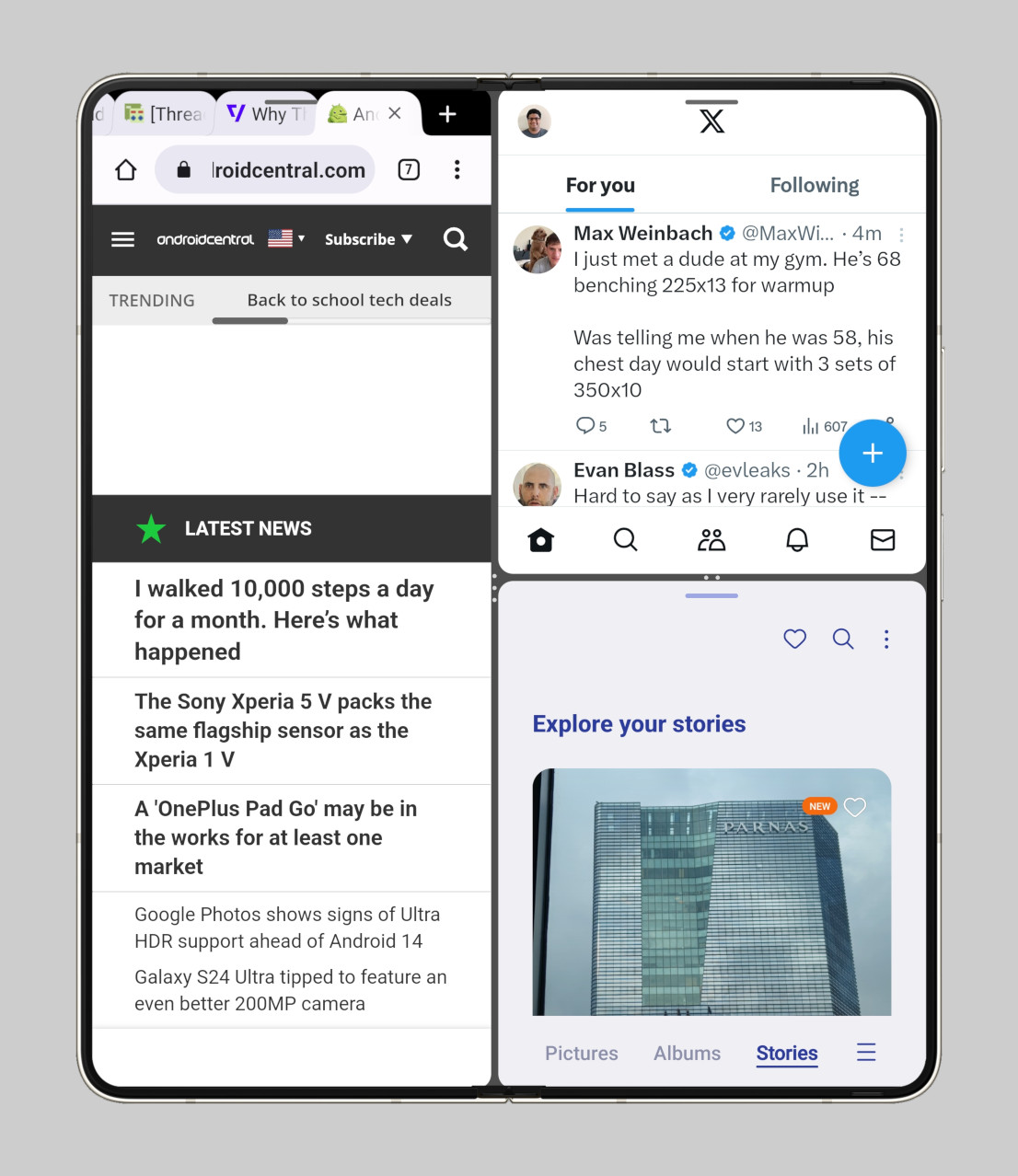
But I digress. It’s actually possible to fit a bit more content into 2-way and 3-way split-screen mode through another feature not present in stock Android: “full screen in split screen view.” This feature, found under Settings > Advanced features > Multi window, lets you hide the status and navigation bars when you’re in split-screen mode. I personally leave this option off, as I like having the taskbar visible at all times so I can quickly switch between apps.
That leads me to my next point: initiating split-screen is just generally faster on the Galaxy Z Fold 5.
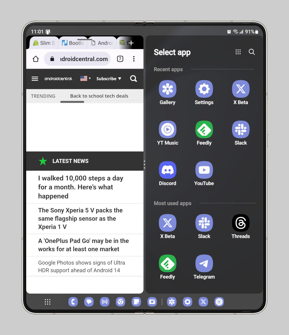
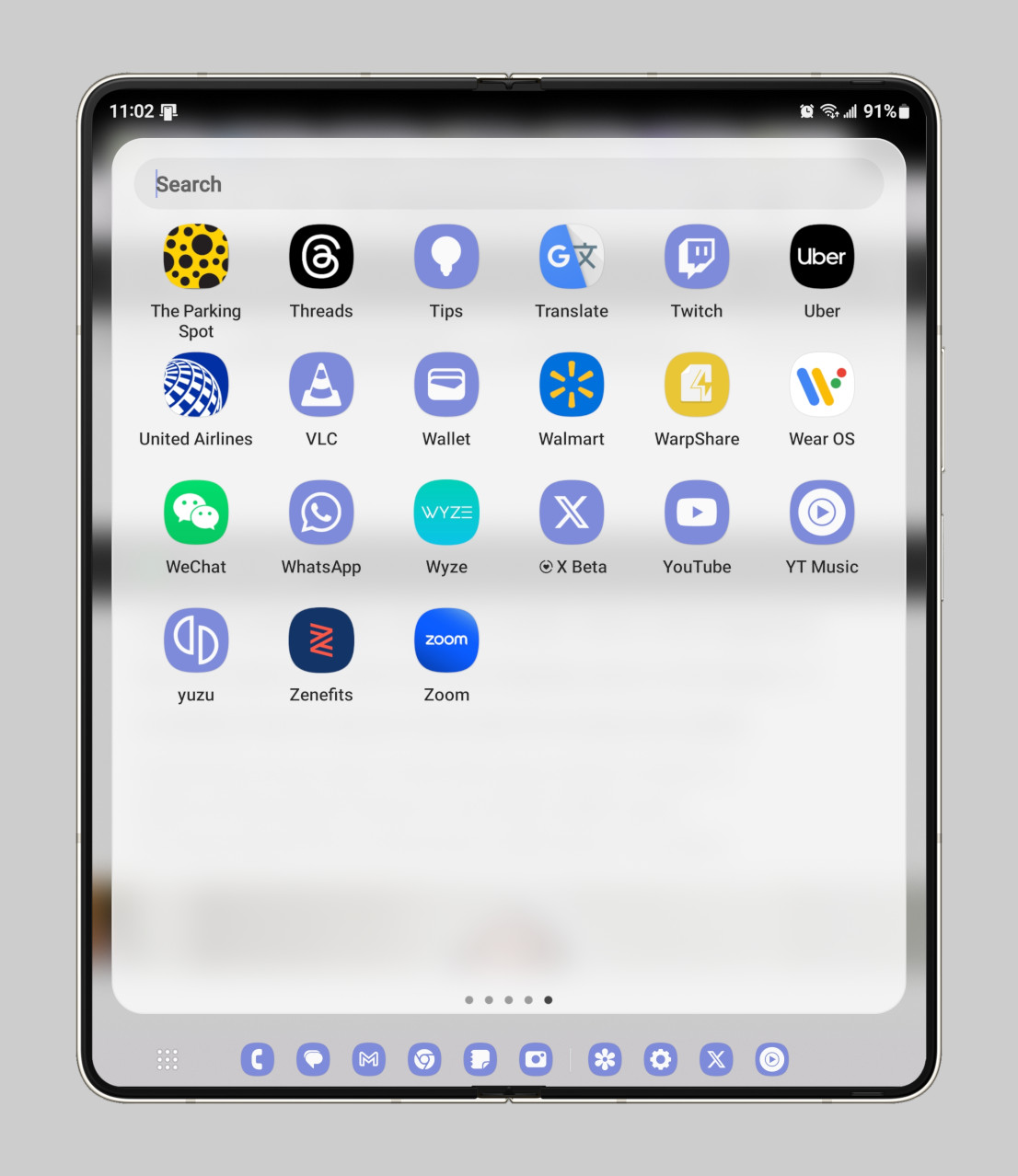
For one, when you open your first app to start split-screen mode (through either the “swipe for split screen” gesture or the multi-window menu), One UI immediately opens an app selection screen on the other half. This app selection screen neatly categorizes your apps by section by your recent apps, followed by your most used apps, and finally, all your apps sorted alphabetically. Also, you can tap the search button to quickly find the app you want to launch.
The Pixel Fold, in contrast, doesn’t even have a search bar in its taskbar (yet), so it’s awkward to select a second split-screen app when you initiate split-screen mode from the recents menu. Google’s software does, at least, let you launch apps in split-screen mode from the home screen, unlike One UI. On the other hand, Google’s software lacks arguably the best feature for split-screen multitasking: saving app pairs.
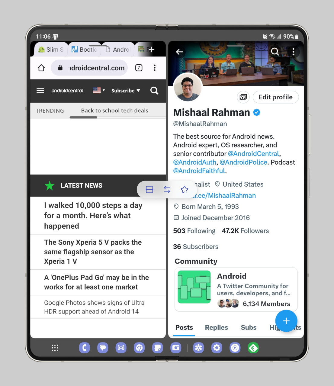
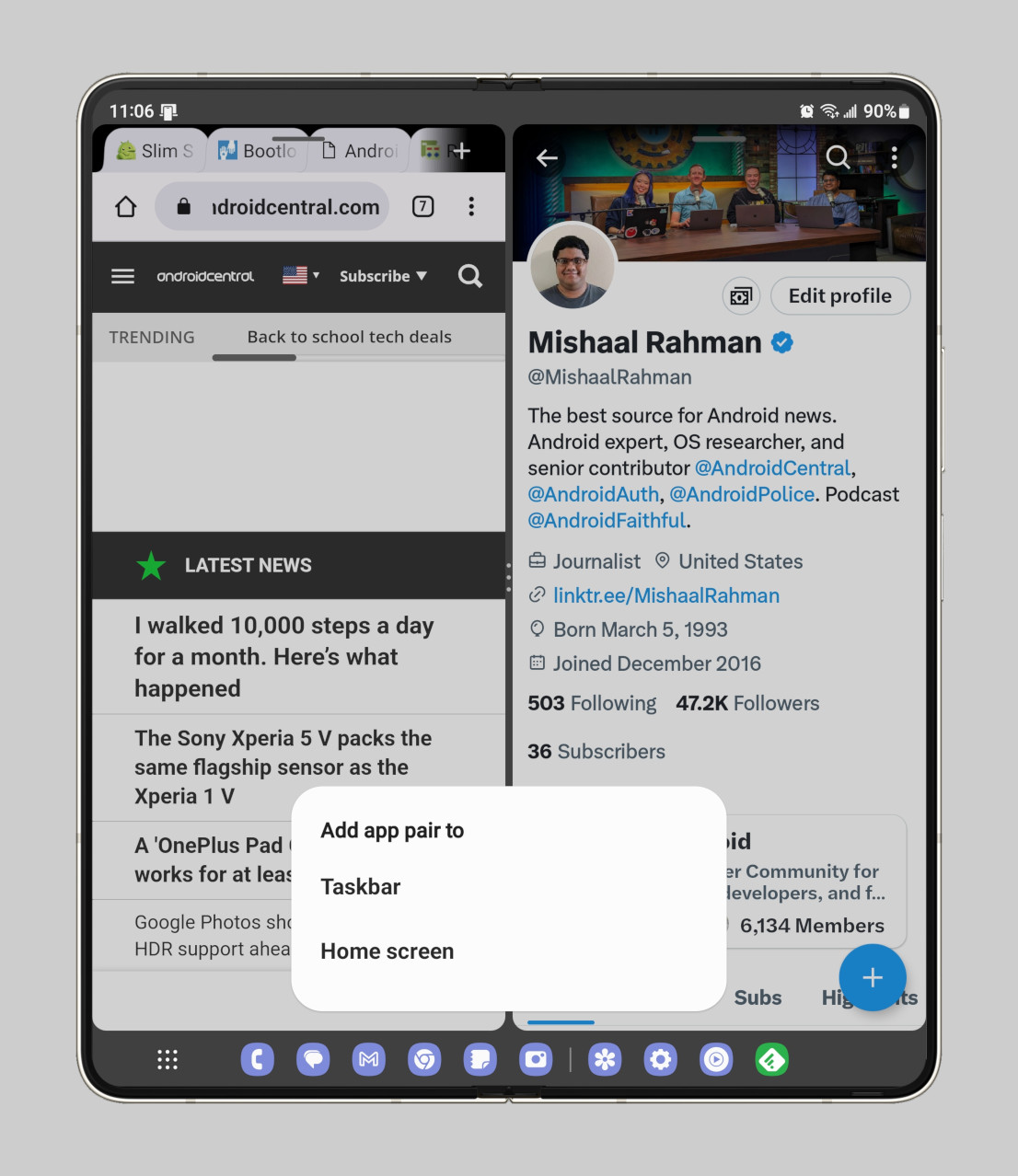
One UI lets you save your split-screen layout as an app pair that you can pin to the taskbar or home screen. You can later relaunch the duo or trio of apps saved in the app pair by tapping an icon. This is a feature that the Pixel Fold currently lacks, but Google could be introducing the feature soon in a future Android 14 release.
Saving an app pair in One UI requires tapping the divider when in split-screen mode and then hitting the star icon when the pop-up appears. This is due to the fact that Samsung chose not to display a context menu when long-pressing an app icon in the recents menu. Instead, long-pressing an icon in the recents menu or taskbar lets you drag the app to one half of the display to launch it in split-screen mode or to the center to open it in a pop-up view.
Freeform multi-window
Freeform multi-window is a multitasking mode Google introduced all the way back in Android 7.0 Nougat, but it was left in an unfinished state. Google looks to finally be sprucing it up for a future Android 14 release, but Samsung long ago decided to take matters into their own hands and make something out of freeform multi-window.
Enter pop-up view, One UI’s version of a freeform multi-window. At a base level, the pop-up view is basically a more versatile version of Android’s chat bubble feature. Under Settings > Notifications > Advanced settings > Floating notifications, One UI lets you choose whether to open notifications in a bubble or in a pop-up view window. You can also, as mentioned before, open any app in a pop-up view from the recents menu or taskbar.
Once an app is in a pop-up view window, you can use the buttons in the window’s title bar to minimize it, expand it, change the opacity, launch it in split-screen, or close it. You can even long-press the title bar and then drag and drop it to initiate split-screen mode. Pop-up view is one of One UI’s most useful multitasking features, which is why so many other smartphone makers have made their own version of it.
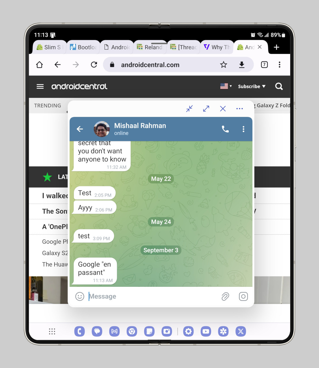
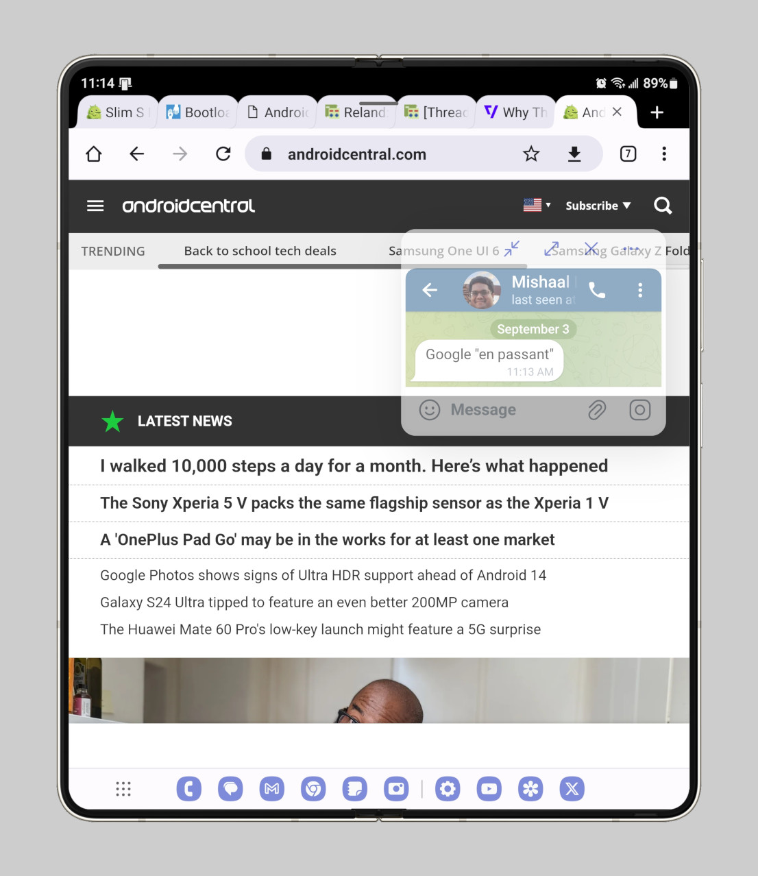
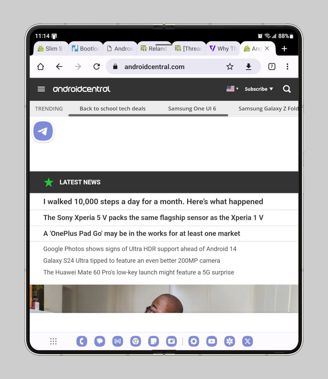
The last freeform-related change I wanted to highlight is the nifty “show multi window menu with 1 window” option (as I said, One UI can feel overwhelming…). This option is found under Settings > Advanced features > Multi window, and it adds a mini handle at the top of each app window that, when tapped, shows buttons to launch the app in split-screen mode or pop-up view. I personally keep this feature enabled instead of the “swipe for split screen” or “swipe for pop-up view” gestures, as I feel it’s easier to launch split-screen/pop-up view this way than remembering the specific swipe gestures I need to perform.
Taskbar
Launching apps in split-screen/pop-up view is also made easier in One UI thanks to the persistent taskbar. The taskbar on the Pixel Fold, in contrast, is “transient,” as it only appears for a few seconds after you swipe up from the gesture pill. The transient taskbar is aesthetically better as it gives you more screen space, but it’s worse for multitasking. You have to swipe up to reveal the transient taskbar anytime you want to switch apps, which is awkward enough since it’s easy to swipe too far and return home or show the recents menu.
Samsung’s persistent taskbar, in contrast, is always on screen by default and can even show up to 4 recent apps (on One UI 5.1.1 and later). It also has a search bar in its app drawer to make it easier to find the app you want to launch.
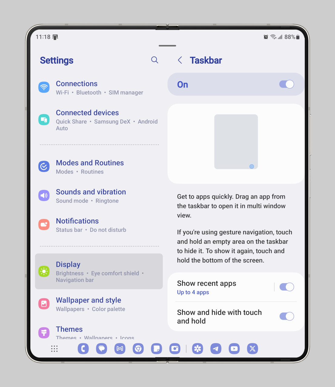
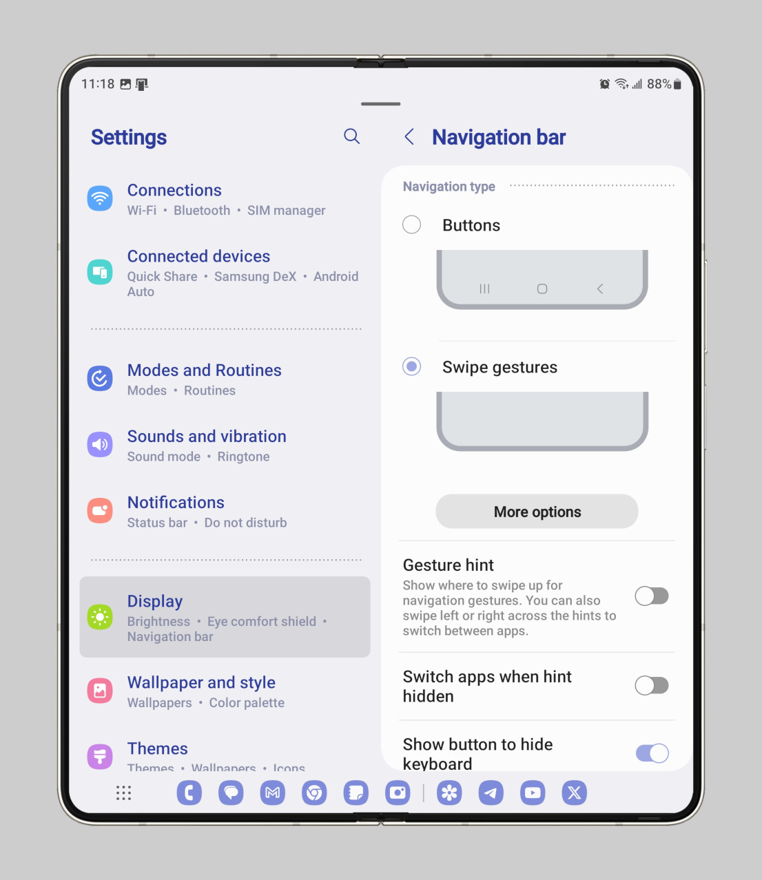
The persistent taskbar isn’t always superior, though. It takes up precious screen space which you can reclaim by “stashing” the taskbar through a long-press on an empty spot. However, it’s a bit awkward to “unstash” the taskbar as the touch target area is very small. This may be due to the fact that I hid the gesture pill through the “gesture hint” toggle in settings, but I think it’s better visually not to have the gesture pill always showing underneath the taskbar.
The transient taskbar became Android’s default approach after Android 13 QPR2, but I think there are clear benefits to both the old persistent taskbar and the new transient taskbar. That’s why I hope Google follows through on its work to add a toggle that lets us switch between the two.
Cover screen & inner screen
Let me tell you upfront: I’m not a big fan of the cover screen on the Galaxy Z Fold 5. While its narrow profile does make the phone easier to hold in one hand, it also makes it awkward to type or use many apps. The flip side is that the inner screen gets to be less wide, which means it works better with apps that don’t have tablet-optimized layouts. That brings up its own share of problems and workarounds, which I’ll get into below.
First, though, the cover screen. Samsung developed two features that I’d like to see Google add in some form to the Pixel Fold. The first is “continue apps on cover screen” under Settings > Display. By default, folding the device turns the screen off, but this feature lets you “choose which apps you want to continue using on the cover screen when you close your phone.” This is useful for when you want to initiate something while using the inner display, like navigation, music playback, or viewing a list, that you want to continue accessing from the cover screen as you move about.
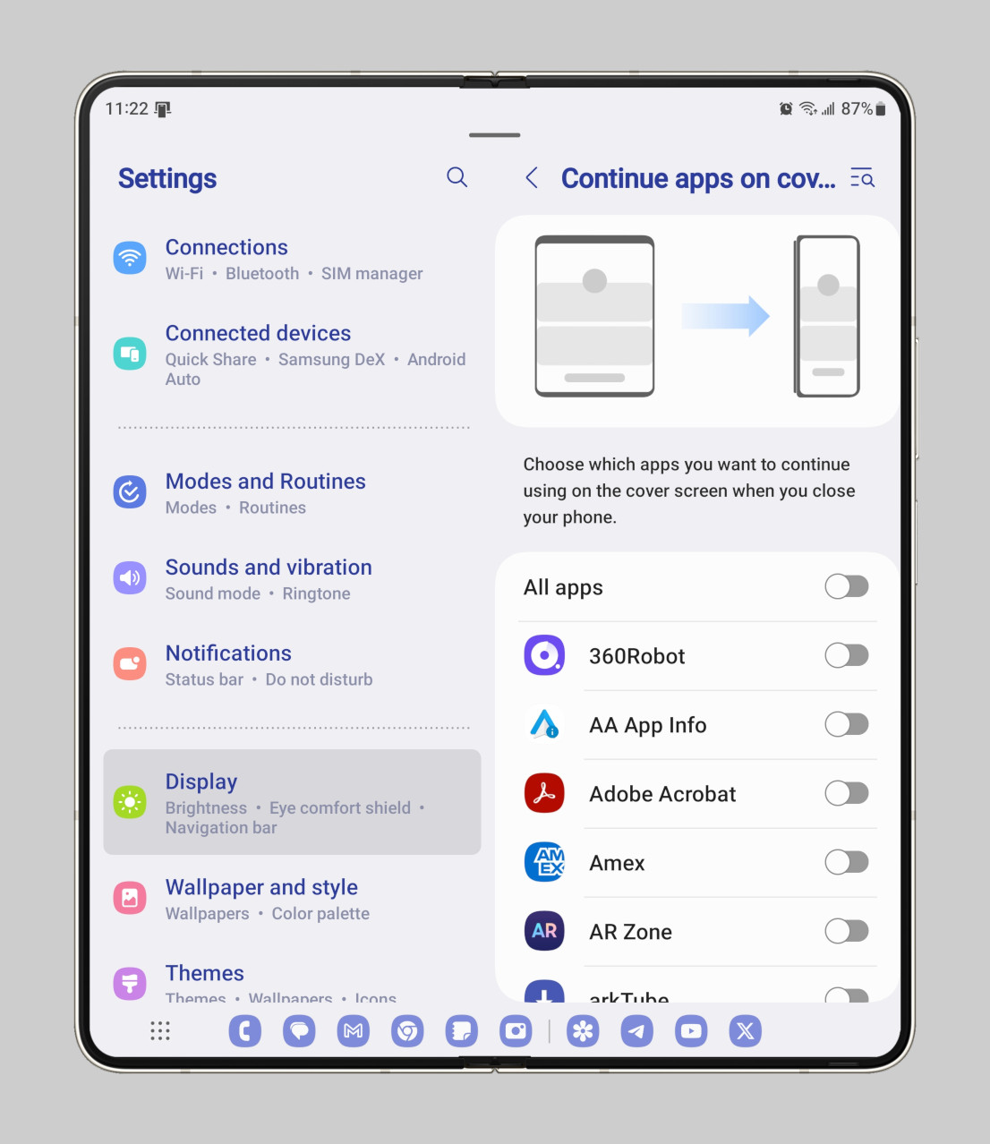
The Pixel Fold doesn’t have an option like this, though, by default, it does transition apps to the cover screen when you’re watching a video or using Google Maps. It would be nice if Google added a menu like Samsung’s to control this behavior on a per-app basis, but at the very least, an additional option should be added that keeps the cover screen on until the screen timeout is reached.
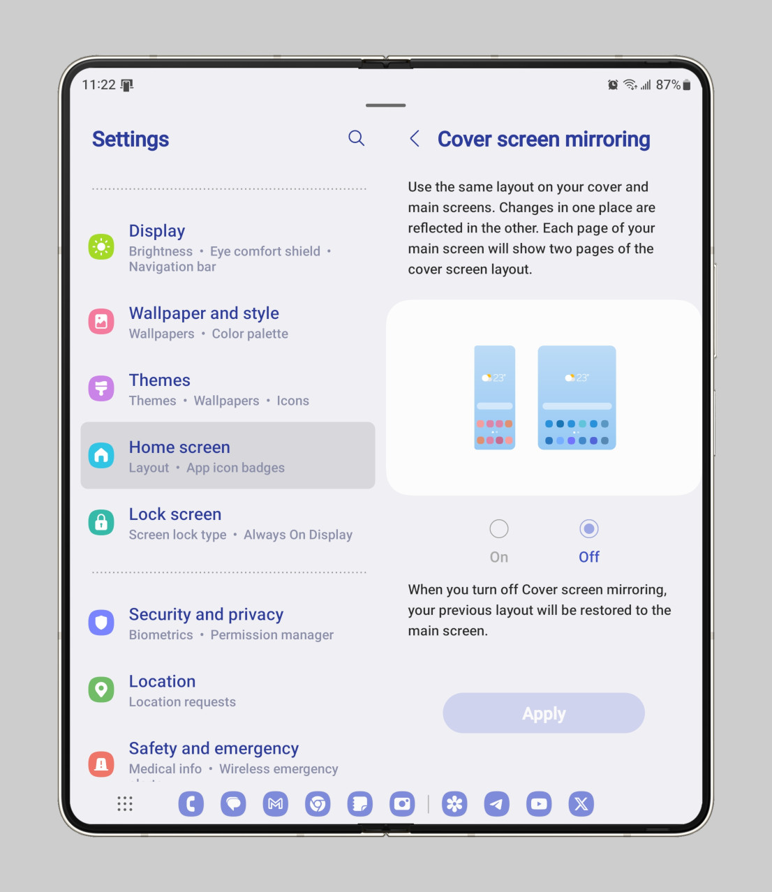
The other cover screen-related feature Google should consider is a toggle to turn off home screen mirroring. By default, the Pixel Fold syncs the home screen layout between the cover and inner screens. In contrast, Samsung lets you choose whether you want to do that through Settings > Home screen > Cover screen mirroring. I personally keep cover screen mirroring off, as I like to use the cover screen for quick access widgets and the home screen for my full app collection.
Next, the inner screen. Earlier, I mentioned that Samsung’s choice of aspect ratio has some benefits but also some downsides. Well, Samsung solves some of these downsides through optional settings you can enable on a per-app basis. Since the aspect ratio of the Galaxy Z Fold 5’s inner display isn’t wide enough to be considered a tablet, and its default unfolded position is considered its “portrait” orientation, most apps show their phone UI instead of their large screen-optimized UI. You have to flip the Z Fold 5 over to get apps like Discord, Gmail, and YouTube to show their two-pane layouts.
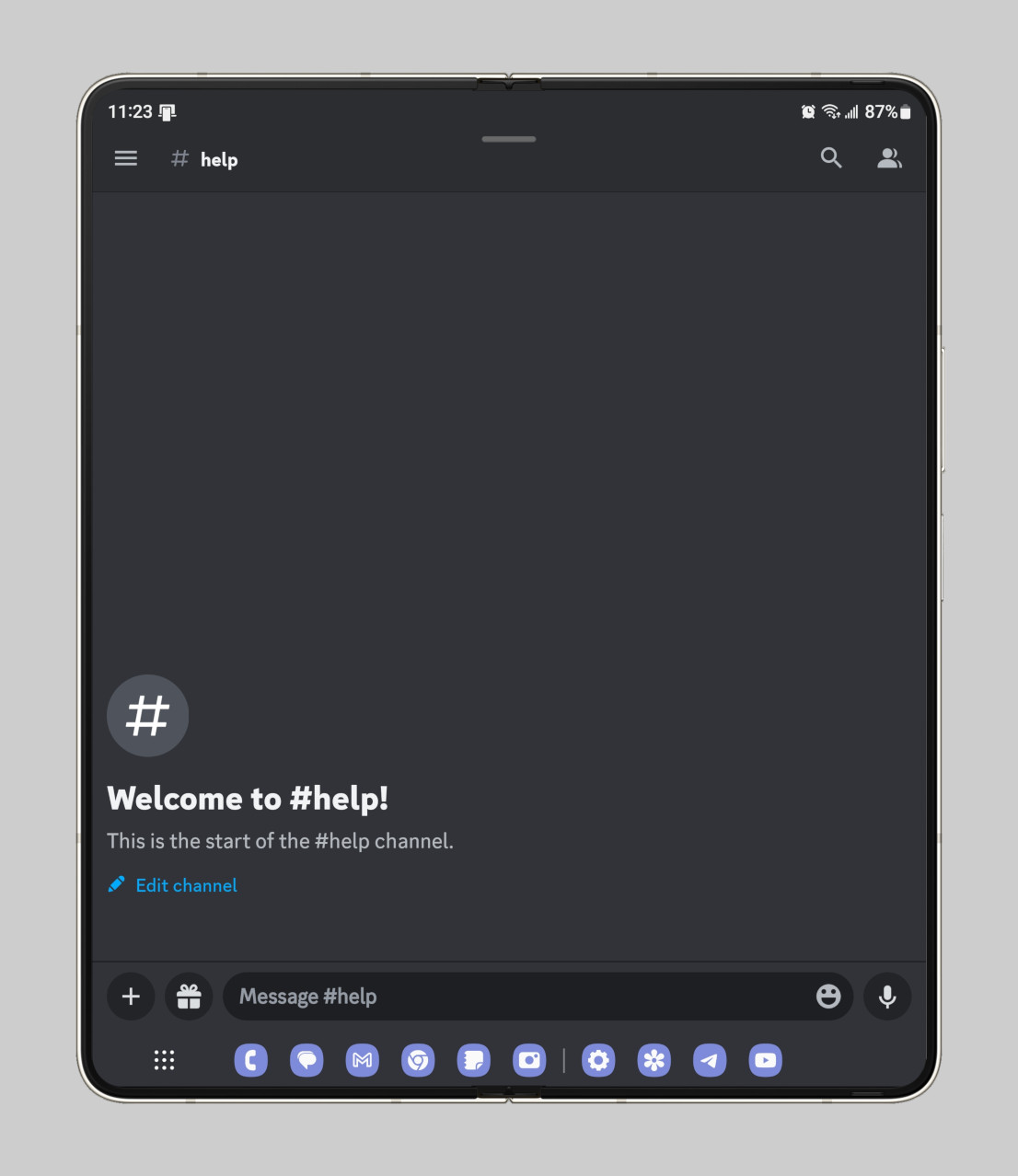
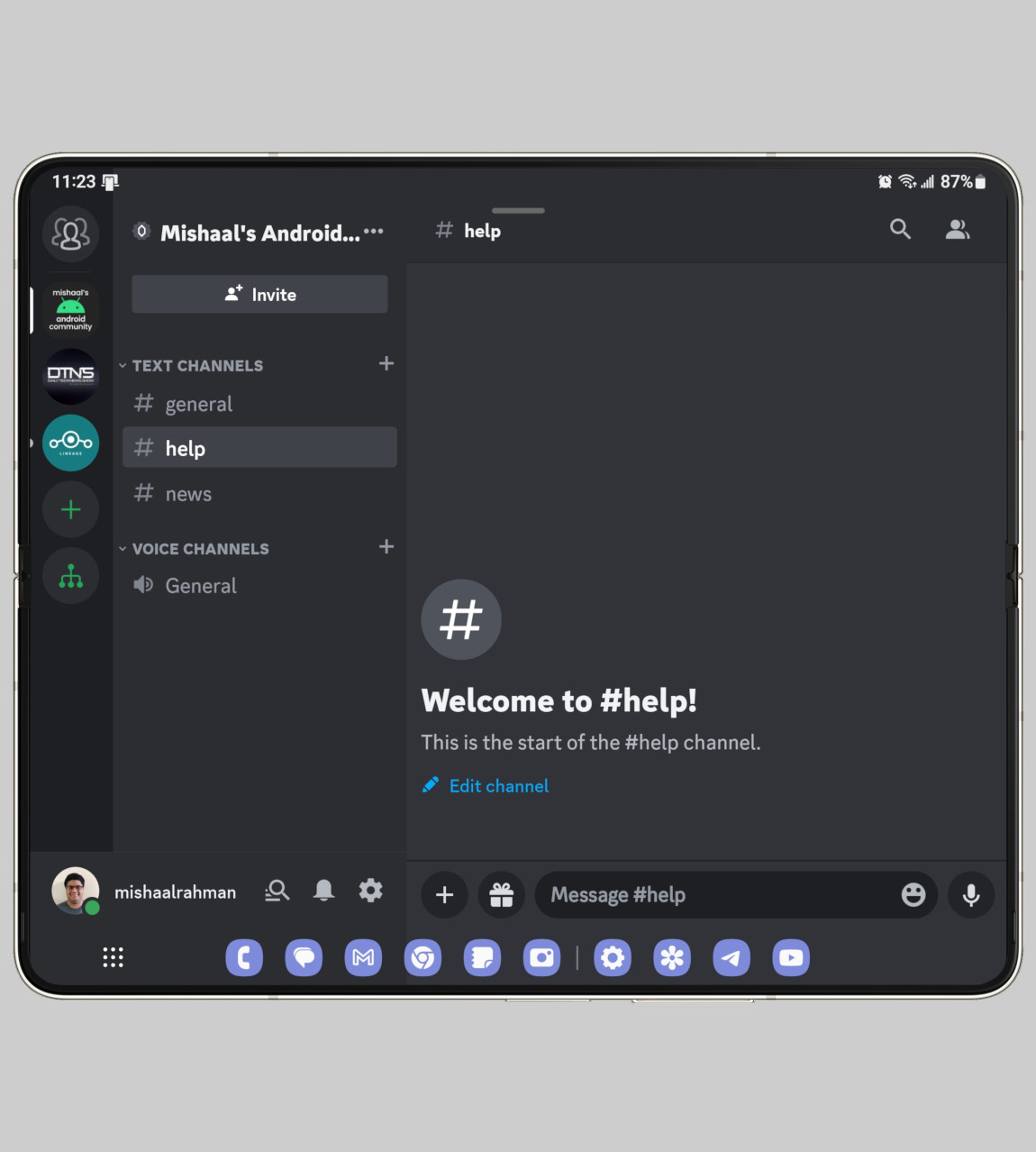
The Pixel Fold’s inner display, in contrast, has a wide enough aspect ratio and by default is in its “landscape” orientation, so you don’t have to flip the phone over to get apps to show their large screen-optimized UI. However, this causes an issue with many apps that are locked to portrait mode. Google worked around this by forcing portrait-locked apps into a letterbox, but this means that apps are shown with black bars on both sides.
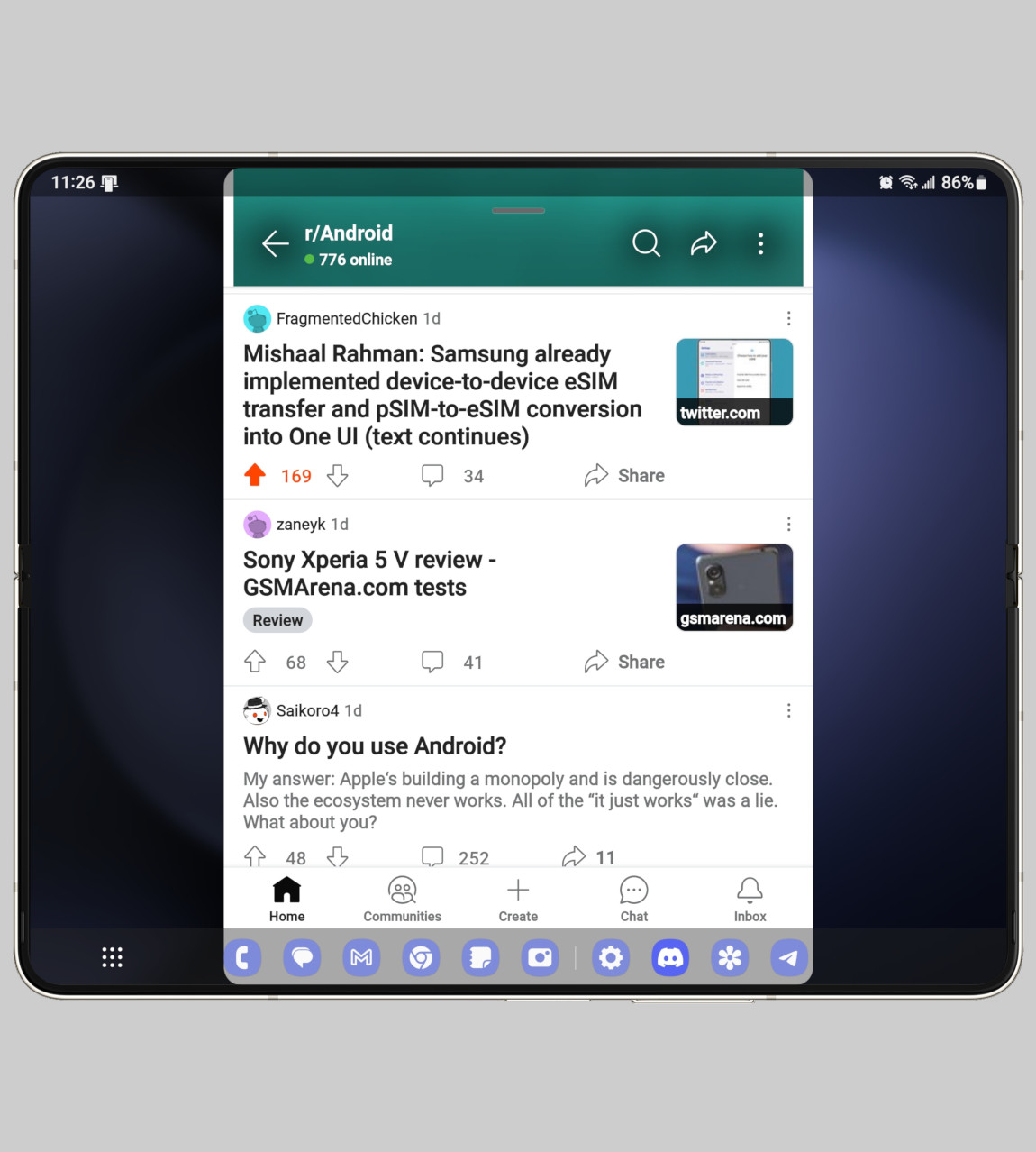
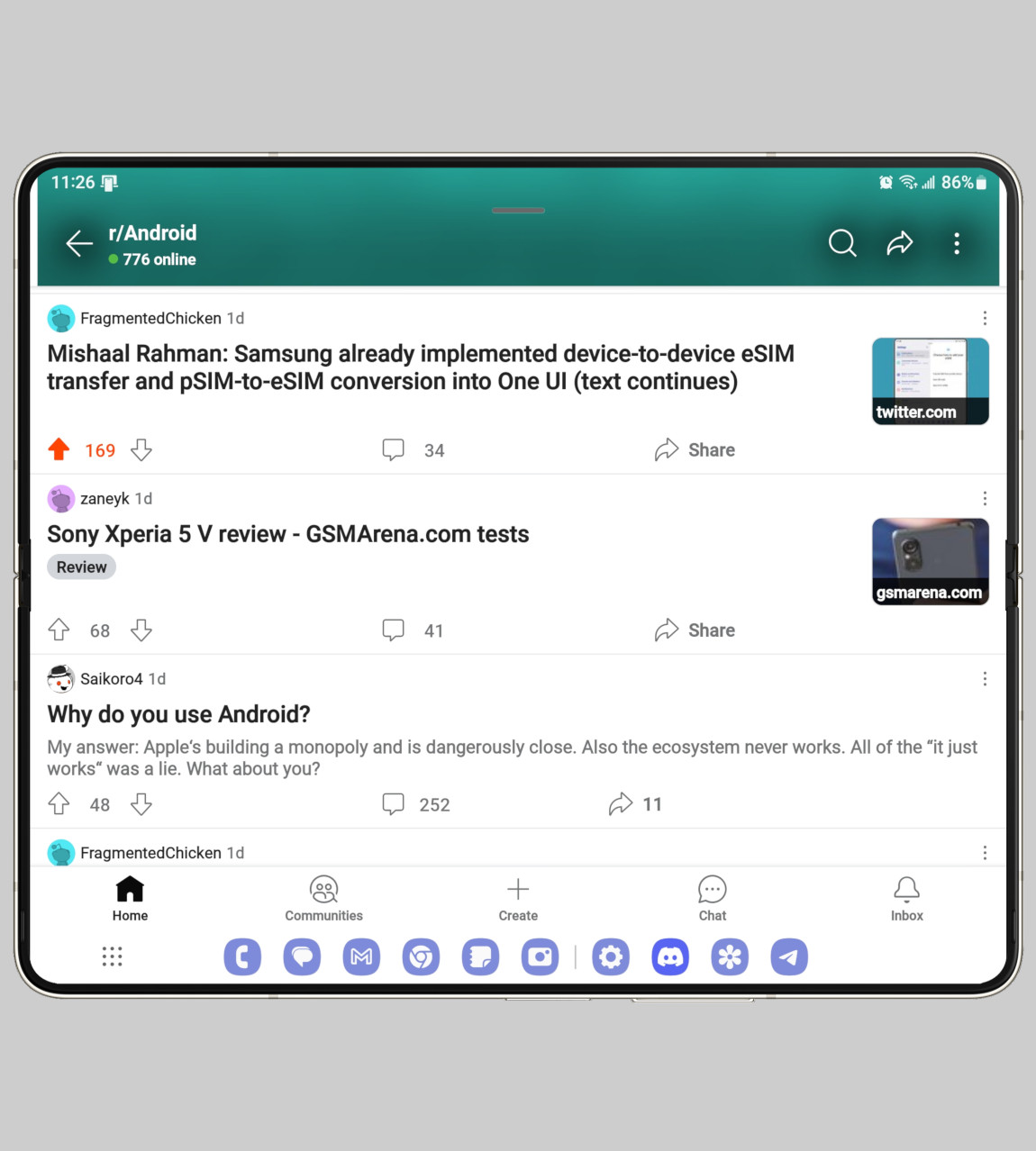
Samsung’s workaround for portrait-locked apps like Reddit and Twitter (sorry, X) is through the “landscape view for portrait apps” under Settings > Advanced features > Labs. This feature is more powerful than Android’s built-in orientation override, as it not only lets the user select which apps to override orientation for but also lets the user choose to stretch the app to fill the screen. One UI separately has another menu, Settings > Display > Full screen apps, that lets users force a full screen, 16:9, or 4:3 aspect ratio on apps.
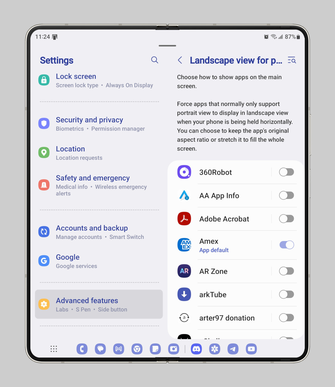
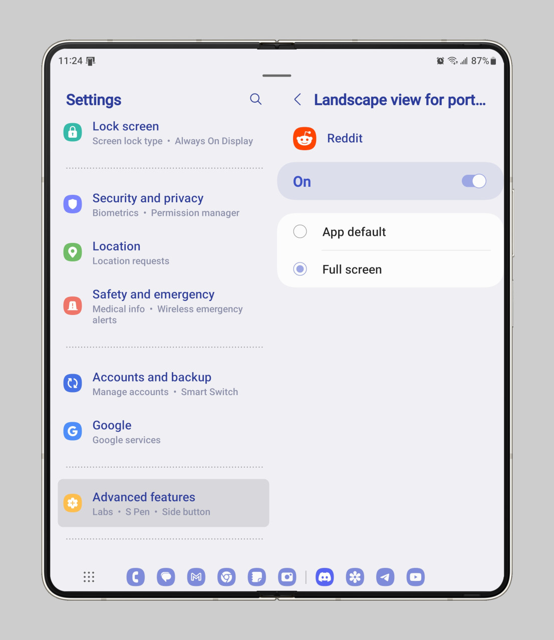
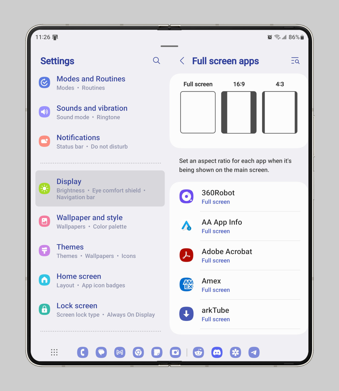
Google really needs to add a compatibility option that lets users force a particular aspect ratio on apps rather than patiently wait for developers to optimize their apps for large screens. If Google were to add this, then I think the app experience on the Pixel Fold might become better than on the Galaxy Z Fold 5, but until then, I’ll take a blown-up phone UI over a letterboxed one.
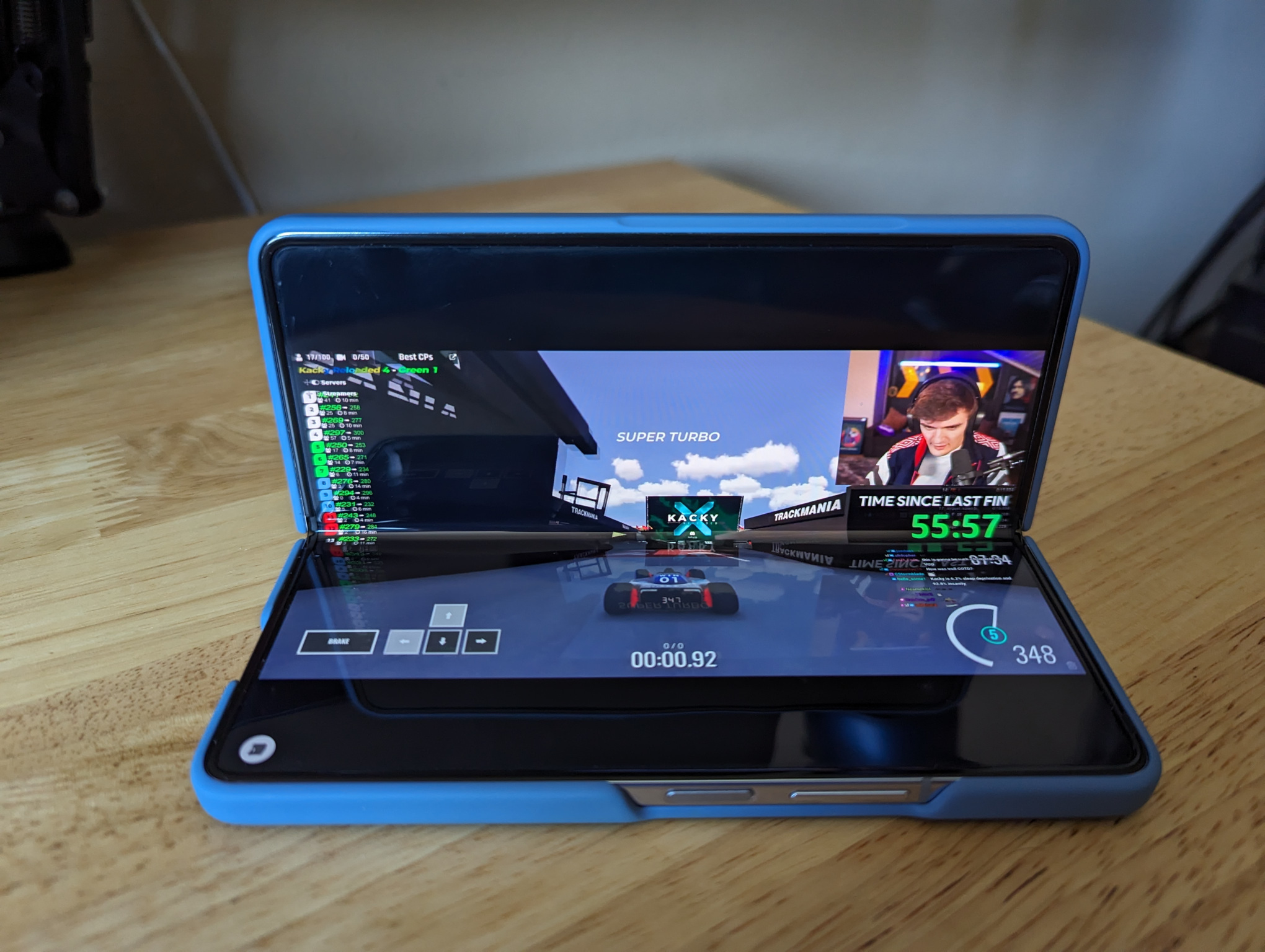
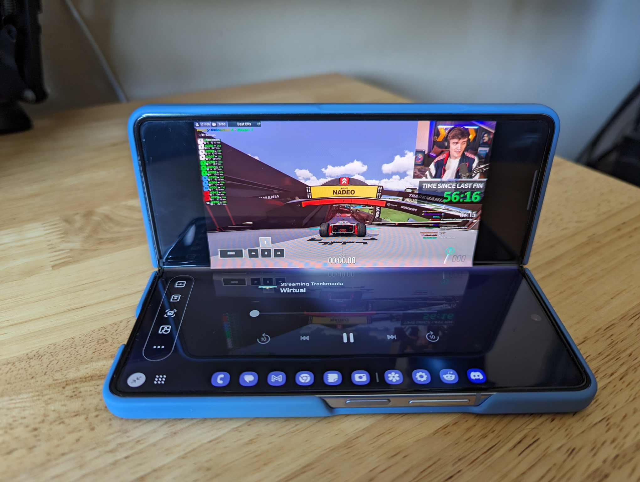
Lastly, Samsung’s “flex mode panel” feature deserves a shout-out. Currently, only a select number of media apps support tabletop/flex mode. YouTube, for example, shows media controls on the bottom half of the screen when a foldable is placed in tabletop mode. But not every media app does this, which is where the flex mode panel comes in.
Flex mode panel is accessed through a button that appears at the bottom left when the Galaxy Z Fold 5 is folded in half. This panel shows media controls for whatever is playing and has shortcuts to launch split-screen mode, pull down the notifications, take a screenshot, and more. While the “flex mode panel” sadly shows the same media control actions for every app, it’s a useful stopgap until more apps implement tabletop/flex mode support.
Miscellaneous
Here’s a quick roundup of some other features in One UI that I think Google should implement themselves:
Desktop mode support
I could spend all day talking about Samsung DeX, but this article is already too long. Google is working on better desktop mode support in Android 14, but sadly, the Pixel Fold lacks display output support. Maybe next year.
Edge panels
While the default edge panel has been made redundant thanks to the taskbar, the clipboard and especially the smart select panel are incredibly useful. The former gives you quick access to your clipboard on any screen, which is even more useful on One UI since Samsung inexplicably took away Android’s clipboard overlay.
The latter lets you draw a rectangle or oval to select text or images on screen, create a GIF out of a part of the screen, or pin a part of the screen as a floating window. (Pixel lets you select text/images from the recents overview, but I still think Samsung’s smart select panel is more useful since you have more space and features to work with.)
Double tap to turn off screen
One UI has an option that lets you double-tap on an empty spot on the lock or home screen to turn off the screen. This is useful when the phone is unfolded because it can sometimes be hard to reach the power button on the side (especially true for the Pixel Fold with its wider inner display).
Stylus support
One UI has stylus support integrated into the default keyboard and notes apps, so you can handwrite, precisely select, or draw. Google is working on improving stylus support in Android and in their first-party apps, but unfortunately, only their tablet supports stylus input. Maybe next year.
One-handed mode
Google bafflingly decided to disable Android’s one-handed mode on the Pixel Fold, which is definitely a bad decision since it’s not easy to reach the top of the screen with one hand. The reason they disabled it is because one-handed mode isn’t intended for large screens, which doesn’t apply to the Pixel Fold’s cover screen.
One UI offers even more features than I’ve touched upon in this article.
I’m well aware that, through various Good Lock modules, One UI offers even more features than I’ve touched upon in this article. As I mentioned in the intro, though, One UI simply has too many features to list to begin with, at least if I want to keep this article a reasonable length. That’s why I’m cutting things here, but I do briefly want to mention some features that other smartphone makers introduced for their own foldables that I think Google (and Samsung) should look into.
Features for foldables from other OEMs that Google should copy
Since I don’t have a lot of experience with other foldables, I asked two experts, Michael Fisher, aka Mr. Mobile, and Ben Sin from XDA-Developers, for their input. One feature highlighted by Ben on social media comes from the Honor Magic V2. Honor’s software, according to Ben, “can force Twitter to open in [a] two-pane layout” in contrast to the blown-up phone UI you get on the Galaxy Z Fold 5.
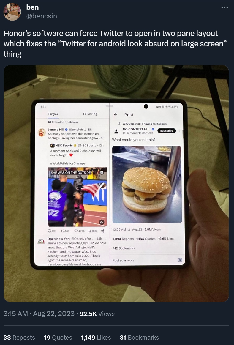
Samsung does have a feature that’s similar to this, but it doesn’t work with Twitter. Under Settings > Advanced features > Labs > App split view, you can force select apps like Line and WeChat to open in a two pane layout.
Michael, meanwhile, brought up a good point about Samsung’s “swipe for split-screen” gesture. Samsung’s gesture requires swiping with two fingers across the inner display. In contrast, the equivalent gesture on the OPPO Find N2 involves swiping down with two fingers, which is more ergonomic. He also noted that, in his experience, other foldables handle cover screen mirroring better.
Conclusion
Samsung’s head start over its competition definitely gave it an advantage in developing new features and optimizing Android for foldables, but the gap between its software and that of other foldable phone makers will shrink over time. Samsung currently offers the most features for foldables out of anyone, but even it's behind in some areas. Honor, for example, has a feature that makes its Magic V2 the better foldable to browse Twitter on. Google, meanwhile, has a smarter auto-rotate system than Samsung (and a much better keyboard app, in my view).
I’m interested in seeing what additional features for foldables Samsung plans to add to One UI. The company’s next version of its OS, One UI 6, is currently in beta for its flagship non-foldable device, so we’ll have to wait and see what Samsung will bring to the table. Google, on the other hand, has already announced that it plans to bring a dual-screen interpreter mode in Google Translate with the Android 14 update.
Apart from the features that we’ve already uncovered in the Android 14 betas, we don’t know what else the company plans to bring to the Pixel Fold. Hopefully, Google is already working to bring some of the features I mentioned in this article, like the per-app aspect ratio one, as foldables across the ecosystem stand to benefit from whatever Google introduces to AOSP.
-
PookiePrancer It's funny: after years of being lambasted for its bloat, people are finally realizing the benefits of Samsung's additions.Reply
That's why the Z Fold series is unbeatable in the foldable segment. You simply don't get the most thorough, thought-out, dynamic, and refined experience on any other foldable. -
firestarter99 the other thing i think they need to copy is how well Samsung phones work with the Windows phone link app. i switched to a pixel and some of the features that my note could do with the phone app are so great that now my pixel can't.Reply
